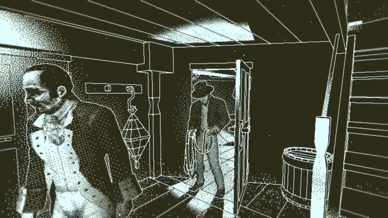
[dukope] was writing a game, Return of the Obra Dinn, with a fantastic visual style. One of the choices was to make everything in glorious one-bit color, otherwise known as black and white, and then dither it back to monochrome. You know, like they used to do on the Mac Plus.
If dithering is your aesthetic, then it makes a ton of sense to take it seriously. And it’s absolutely beautiful – check out the video below.
But what’s even more amazing is [dukope]’s attention to detail on the dithering. For instance, this post on the TIG forums details the problems and solutions when you have a dithered image that needs to also be animated. You want the dots to stay relatively constant on the object as the virtual camera pans across the scene, and that’s going to necessitate a custom algorithm. And if you think that’s cool, have a look at how the book at the center of the game is animated.
What can we say. We loved dithering before, but this post has made our love even deeper.
Thanks [JohnU] for the tip!


I’m unsure what to call those invasive visual artefacts when there’s motion (aliasing?), but one word pops into my head: annoying!
There is Moire kind of effects when the lines are crossing pixel lines, is that what you’re on about?
You can see the aliasing (“jaggies”/”staircase”) right in the beginning when zooming in on the skeleton (look at the mast shadow).
There’s Moire (add the accent yourself) too in a few scenes (and in some sense the ‘ripples’ on the aliasing artifacts are due to the camera movement being misaligned with the aliasing artifacts).
It’s an interesting effect, but I don’t think I could play a game like that – the video alone gives me a headache and a bit of nausea.
well, do not play if you are weak.
Not everybody had the good fortune to be raised in the times were you moslty only got to set up your low res 8 bit on the spare flickery black and white telly. Some of the kids now claim they get cancer just from seeing a frame rate drop below 60fps. RIP.
It probably actually look better on an old monitor with scanlines, which would naturally antialias it via chopping.
I’m really bothered when the camera pans over a scene, e.g. 0:49-1:13 and the dithering pixels stays stationary over the objects.
If you read the forum post, this was intentional – that’s what most of the work was done to do. The pixels changing was called “swimming dither.” I don’t actually agree with fixing it either, but figuring out how to do it is interesting.
I think what I was expecting was something more like halftoned newspaper comics, cut out and sliding across each other like cel-overlay animation. So the halftoning would be fixed to the object and the dots would move with it, even rotate with it.
I’m sure we’re all excited to see your much-better game, so you can show us all how it’s done.
I’m waiting for the hatching / woodcut/ engraving shader to be invented. Then it will be art. The Bayer dithering just sucks in my opinion, but it’s the most notoriously “retro” scheme so there you have it I guess.
Good news! There’s already loads:
https://www.youtube.com/watch?v=508pwYME-w4
In actual gameplay it doesn’t really cause a problem. It looks a lot more blatant in the video, presumably because movements are slow and at constant speed, highlighting the temporal aliasing.
“One of the choices was to make everything in glorious one-bit color, otherwise known as black and white, and then dither it back to monochrome.”
That doesn’t sound right. Dithering goes from more information to less, not the other way around.
Reading the linked forum post, I believe it’s supposed to be rendering in 8-bit grayscale and then dithering to 1-bit.
I only seem to notice a few levels of dither though so it’s possible it could have been 4 bit… or it dumbed it down to 4 in the process.
“Dukope is writing a game”? Return of the Obra Dinn was released in 2018.
Next article is about building a time machine.
2018 is going out of range, old Sol is barrelling along at 220km/sec and the furthest we’ve managed to get an object is Voyager 1, which is a distance equivalent to 1280 Sun travel days away and it took since 1977 to get there. If we launch now, and in the right direction (Voyager went out, we wanna go “down”) we might be able to get you to 2067 in 2070.
Doh! Sorry. Was new to me, and I didn’t look at the date.
Also note that [dukope] or Lucas Pope is the same person who created “Papers, Please”, another award-winning game.
This seems possibly foundational, like that lecture from Arc System Works on how they manage to make 3d models look like they’re hand drawn or have textures of infinite resolution by a bunch of easy tricks.
Would you care to elaborate on those? Some links maybe?
Thanks.
GuiltyGearXrd’s Art Style : The X Factor Between 2D and 3D (GDC 2015)
https://youtu.be/yhGjCzxJV3E?t=93
That’s a pretty fascinating technical post. I had no idea it was so complicated, it worked extremely well in-game.
The weirdness of objects moving but individual pixels in the dithering staying still would have made the game unplayable for me. I’m glad they found a solution.
I was going to write about this “standing still” effect of dithering. It’s really eerie-looking. Did they really get rid of it in final version?
Looks fantastic, though I’d be interested to see what happens if it’s run with DLSS / FSR
It’s fun to see the “cloud” of artifacts. Also looks like the silkscreen artifact from old newspaper pictures turned into video.
There is a free app on Android that’s a fun way to see reality in a different way. No ads, it’s called Wire Goggles, it looks something like this live.
I would love to see it on an a normal black/white TV via antenna input (RF).
Hm. If the game’s resolution could be set to 640×480 or 800×600, an ordinary VGA-Composite converter box could be used to get CVBS. Then, an UHF modulator can be used to convert it to RF, for reception on the b/w TV set. Optionally, a video low pass can be used to remove NTSC or PAL information.
With a connection lossy enough, that way, the dithering effects should smear into grayscale again.
This would work well fo the Hackaday retro edition and/or some of the retro-style things people build.
Probably work well on singl-colour OLED screens too.
I was actually not 100% satisfied with the dithering. It probably was much worse before. But in the trailer at 0:30, it looks like the body is transparent and the dithering pattern is much further away behind the body. The entire floor is similar, but on the body it is extra distracting.
I wonder if you had textures with dithering patterns on the objects, if that would result in a more stable dithering? Would probably need a lot of anisotropic filtering to look good and hand crafted Mip Maps.
Also the aliasing on deck looks really bad IMO. Sure having gray anti aliased pixels would be weird. But I think it might have looked better
Oh well I guess he tried that and and I guess he also had problems with Mip Mapping and also aliasing…
What’s missing is temporal anti aliasing. While doing B&W (1 bit), it’s still possible to re-create grayscale by temporal dithering so that moire effect is reduced.
Do you have any animated examples of this? I’m curious what this looks like – I assume the dither pattern has to change completely with each frame, in order to temporally average (say, around 6 to 12 frames?) into a higher bit depth. I imagine it looking noisy in motion.
“I imagine it looking noisy in motion.”
I mean… dithering *is* adding noise, soo….
I played though this whole game on PS4 and loved it. It’s great to have a game so different from everything being created today
This would be super amazing if the dithered pixels didn’t stay fixed to the background :(
Gives me a damn headache that way