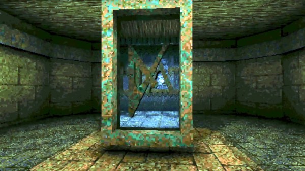
Black Graphics On Your TV, For A Greener World?

Can you really save energy by carefully choosing the colors displayed on a TV screen? Under some conditions, yes. Or at least that’s the conclusion of a team at the BBC that looked at reducing the energy consumption impact of their output by using what they call Lower Carbon Graphics. In short, they’re trying to ensure that OLED displays or those with reactive backlights use less energy when displaying BBC graphics, simply by using more black.

It turns out that a lot of British households play radio stations on their TVs, and the BBC sends a static image to each screen in this mode. As part of a redesign across the organisation, the BBC removed the bright background colours from these images and replaced it with black, with a remarkable reduction in power consumption, at least on OLED and FALD screens. (On normally backlit screens, 89% of British TVs, this does nothing.)

If you look hard at their numbers, though, listening to radio on the TV is horrendously inefficient; can you imagine a radio that consumes 100 W?  If the BBC really wants to help reduce media-related energy consumption, maybe they should stop broadcasting radio programming on the TV entirely.

Anyway, as we move toward a larger fraction of OLED screens, on TVs and monitors alike, it’s fun to think that darker images use up to 40% less power. Who knew that Hackaday was so environmentally friendly? Black is the new green!

Header: RIA Novosti archive/ Igor Vinogradov, CC-BY-SA 3.0.

Adding Portals To Quake

For those who have played Quake extensively, adding portals seems unnecessary, as teleporters are already a core part of the game mechanics. What [Matthew Earl] accomplishes is more of the Portal style of portal by rendering what is on the other side of the portal with a seamless teleportation transition.

Of course, Quake is an old game with a software renderer. Just throwing another camera into the scene, rendering to another texture, and then mapping that texture to the scene isn’t an option. Quake uses an edge rasterizer and generates spans along scanlines that track where edges intersect the current scanline. Rather than making expensive per-pixel comparisons, [Matt] stashes the portal spans and renders them in a second render, so even with multiple portals, only a single screen’s worth of pixels are rendered.

However, this technique has no near clipping plane, which means objects can appear in the portal that don’t make any sense as they are in front of the portal’s viewpoint. Luckily, Quake has an ingenious method for polygon occlusion: the BSP. While [Matt] is manually checking polygons, the BSP is the perfect tool for bisecting a room along a plane. It’s an incredible hack, and we’re excited to see Quake expand into a puzzle game. [Matt] dives into greater detail on how the software renderer works in another video that’s well worth a watch.

Perhaps the most incredible aspect of this technique is that it could run on original hardware. If you want to bring a little more Quake to life, why not get the Quake light flicker in your house? Video after the break.

Continue reading “Adding Portals To Quake”

Signed Distance Functions: Modeling In Math

What if instead of defining a mesh as a series of vertices and edges in a 3D space, you could describe it as a single function? The easiest function would return the signed distance to the closest point (negative meaning you were inside the object). That’s precisely what a signed distance function (SDF) is. A signed distance field (also SDF) is just a voxel grid where the SDF is sampled at each point on the grid. First, we’ll discuss SDFs in 2D and then jump to 3D.

SDFs in 2D

A signed distance function in 2D is more straightforward to reason about so we’ll cover it first. Additionally, it is helpful for font rendering in specific scenarios. [Vassilis] of [Render Diagrams] has a beautiful demo on two-dimensional SDFs that covers the basics. The naive technique for rendering is to create a grid and calculate the distance at each point in the grid. If the distance is greater than the size of the grid cell, the pixel is not colored in. Negative values mean the pixel is colored in as the center of the pixel is inside the shape. By increasing the size of the grid, you can get better approximations of the actual shape of the SDF. So, why use this over a more traditional vector approach? The advantage is that the shape is represented by a single formula calculated at many points. Most modern computers are extraordinarily good at calculating the same thing thousands of times with slightly different parameters, often using the GPU. GLyphy is an SDF-based text renderer that uses OpenGL ES2 as a shader, as discussed at Linux conf in 2014. Freetype even merged an SDF renderer written by [Anuj Verma] back in 2020. Continue reading “Signed Distance Functions: Modeling In Math”

Dithering Makes Everything Cooler: Now Even Animated

[dukope] was writing a game, Return of the Obra Dinn, with a fantastic visual style. One of the choices was to make everything in glorious one-bit color, otherwise known as black and white, and then dither it back to monochrome. You know, like they used to do on the Mac Plus.

If dithering is your aesthetic, then it makes a ton of sense to take it seriously. And it’s absolutely beautiful – check out the video below.

But what’s even more amazing is [dukope]’s attention to detail on the dithering. For instance, this post on the TIG forums details the problems and solutions when you have a dithered image that needs to also be animated. You want the dots to stay relatively constant on the object as the virtual camera pans across the scene, and that’s going to necessitate a custom algorithm. And if you think that’s cool, have a look at how the book at the center of the game is animated.

What can we say. We loved dithering before, but this post has made our love even deeper.

Continue reading “Dithering Makes Everything Cooler: Now Even Animated”

Book Teaches Gaming Math

If we knew how much math goes into writing a video game, we might have paid more attention in math class. If you need a refresher, [Fletcher Dunn] and [Ian Parbery] have their book “3D Math Primer for Graphics and Game Development” available free online. The book was originally a paper book from 2011 with a 2002 first edition but those are out of print now. However, math is math, so regardless of the age of the book, it is worth a look. For now, the online version is a bunch of web pages, but we hear a PDF or E-reader version is forthcoming.

There’s quite a bit of discussion about vectors, matrices, linear transformations, and 3D graphics. The last part of the book covers calculus, kinematics, and parametric curves. Some of these topics will be of interest even if you don’t care about graphics but do want to learn some math with practical examples.

Continue reading “Book Teaches Gaming Math”

Mindblowing Graphics From An ATtiny85

[Görg Pflug] wrote in with his really nice graphics library. It’s got multiple layers, two text consoles, greyscale, internal halftoning, and sprites. It can pull off a number of classic graphics tricks and demos. Oh yeah, and did we mention it runs on a freaking ATtiny85 and an I2C OLED screen?!

This is an amazing piece of work — if you’d asked us if this was possible, we would have probably said “no”. And now it’s yours to use in your own projects. The GitHub repo is full of demos showing off everything from switching between multiple layers, extremely rapid text scrolls, animations, boing balls, and even a Wolfenstein-style raycaster. On an ATtiny85.

There’s a demo video, embedded below, that shows it all off, but honestly you have to think about what’s going to to be suitably wowed. The first demo just seems to have a graphic wave over static text, for instance. No big deal? It’s blending the greyscale layers together and dithering them out to black and white for the OLED in real time! On an ATtiny85.

While the library is written in straight C++, there are even a couple examples of how you’d integrate this with Arduino’s Wire library if you so wished. We don’t know about you, but this makes us want to whip together an ATtiny85 and SSD1306 OLED demo board just to start playing around. This isn’t just an amazing hack, but it would also be a useful way to add graphics and a nice console to any project you’re working on.

Did we mention it’s all done on an ATtiny85?  Over I2C? Kudos!

Continue reading “Mindblowing Graphics From An ATtiny85”

Advanced PCB Graphics With KiCAD 6 And Inkscape

There are many, many video tutorials about designing the functional side of PCBs, giving you tips on schematic construction, and layout tips. What is a little harder to find are tutorials on the graphical aspects, covering the process from creating artworks and how you can drive the tools to get them looking good on a PCB, leveraging the silkscreen, solder and copper layers to maximum effect. [Stuart Patterson] presents his guide for Advanced PCB Graphics in KiCAD 6.0 and Inkscape, (Video, embedded below) to help you on your way to that cool looking PCB build.

Silkscreen layers in yellow, solder mask opening in red

The first step is to get your bitmap, whether you create it yourself, or download it, and trace it into a set of vectors using the Inkscape ‘trace bitmap’ tool. If you started with an SVG or similar vector shape, then you can skip that stage.

Next simply create a PCB outline shape by deleting all the details that aren’t part of the outline. A little scaling here and there to get the dimensions correct and you’re done with the first part. [Stuart] has an earlier video showing that process.

The usability improvements in KiCAD 6.0 are many, but one greatly demanded feature is the ability to group objects, just like you do in Inkscape and any other vector graphics tool for that matter. That means you can simply import that SVG outline into the Edge.Cuts PCB layer and all the curves will be nicely tied together. Next you select the details you want for the silkscreen layer, solder mask removal layers and any non-circuit copper. In Inkscape it would be wise to use the layers feature to assign the different material types to a uniquely named layer, so they can be hidden for exporting. This allows you to handle silk, mask and copper PNG exports from a single master file, in addition to any vector details for outline, slots and holes.

Once you have PNG bitmap exports for the silk, mask etc. you need to create a footprint inside a board-specific library, using the KiCAD image converter tool. It was interesting to note that you can export a new image footprint from the tool and paste it straight into the footprint editor, and tweak all the visibility details at the same time. That will save some time and effort for sure. Anyway, we hope this little tutorial from [Stuart] helps, and we will be sure to bring you plenty more in the coming months.

Need some more help with KiCAD? Checkout this tutorial, and if you want a bit more power from the tool, you need some action plugins!

Continue reading “Advanced PCB Graphics With KiCAD 6 And Inkscape”