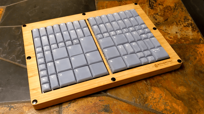
We see all kinds of custom keyboard builds around here. Most of them are intended to optimize typing to the user’s desires. This glorious build from [Attoparsec] isn’t one of those, and is instead part of the growing joke keyboard genre. The so-called Two-Thirds Keyboard is inspired by the long-gone typesetting era.
The build is based on the typecases used in the era when type was assembled by hand. Typesetters would grab “majuscule” letters from the upper case of type, and “miniscule” letters from the lower case of type, when setting a page, which would go on to influence how we refer to those letters today. Letters that came up more often, like e and s, would get larger compartments in the type cases, while rarer letters like z and q would get smaller compartments. The Two-Thirds keyboard replicates this by giving the most common letters the biggest keys, while rarer letters and upper-case majuscule letters get smaller keys. The overall layout matches that of the popular Two-Thirds California Case of type that grew popular in the US in the typesetting era.
There were some engineering issues in building the keyboard. While stabilizers are available for wide keys like Enter and Space in regular keyboard designs, stabilizing keys that are wide and high is fussy. The build relies on multiple switches to enable them to move cleanly. Nor were 2×2 and 2×3-sized custom keycaps readily available. In the end, resin printing was key to producing all the necessary components.
Typing on the keyboard is not quick, but lower speeds were probably acceptable in the typesetting era. Regardless, [Attoparsec] used it for a full week to do it justice, going from around 10 wpm to 22 wpm by the end of the test.
It’s a fun build, but by no means the slowest keyboard we’ve ever seen.
Thanks to [Smellsofbikes] for the tip!


reminds me of the keyboard from a linotype machine:
https://en.wikipedia.org/wiki/Linotype_machine#/media/File:Linotype_keyboard_with_Star_Quadder_attachment.jpg
etaoin shrdlu
I’d rather eat that than qwerty uiop. Sounds like a sweet dessert vs. an upchuck. I had 9th grade jr. high shop which included a quarter of typesetting. Get to make your own business cards and look professional. I didn’t.
I faced off and cut grooves into the sides and face of a chunk of aluminum of my dad’s picking off the scrap pile at Alcoa. The shop teacher suggested making it type high (I asked why) to print targets for sharpshooting. OK, not today. From artsy paperweight to years later setting it on a LP record and getting more bass definition out of vinyl!
…Why is my furniture suddenly floating around the room? What did you do?
small alphabet, in my alphabet is 32 chars in french much more
admin blocking my comment, and this block too
That sharp edge on the front reminds me of the godforsaken Macbook Pro. Horrible machine. Using it made me want to slash my wrists, but it helpfully would do that for me, daily. (And then it would administer electroshock therapy because of Apple’s dumb power supply design that made the chassis float up to 50 volts relative to ground. Awful, awful machine.)
The old plastic Macbooks were also really horrible. They had a bit of a step around the edge so you had two sharp edges, and they were thicker too so they pressed into your wrists more.
Unless you and Wade are trying to get carpal tunnel syndrome, your wrists shouldn’t be anywhere near the edge of a laptop…
(Not a “you’re holding it wrong” fanboi. I don’t own or use any rotten Apple products…)
Very true, this was back in my college days when I didn’t know any better. I did in fact ultimately end up developing RSI and then spend a long time learning how to manage ergonomics better. That said there was still no reason for the edge to be as sharp as it was on that computer, which I otherwise loved to death.
What do you mean by “slowest keyboard”? I never see a keyboard moving.
You don’t live on the Pacific Rim, I reckon 😉
Oh lord. I should have recognized that layout. Freshman year high school shop class; one quarter spent in wood shop, one quarter spent in metal shop, one quarter spent in electrical shop, and one quarter in print shop where students learned how to set type. Geeez I’m old. I stole a few letters for myself to tape together my initials as an ink stamp.
There’s a spelling error, (or a typo), in the article. The correct spelling is “minuscule”. The easy way to remember it is to think of it as a “minus size” letter.
Thanks for introducing me to a very cool word – I’ve never encountered “majuscule” before.
Almost correct. The terms “upper case” and lower case” mean just that. We had upper case characters positioned there and lower case ones there. Along with punctuation characters, and even the odd dingbat series, the so called “sort”. Typesetting was once a family business with me.
I’d guess that to stabilize a wide and tall key, you’d want 2 stabilizer bars arranged in an X pattern, with each going from one keycap corner to the diagonally opposite keycap corner. Of course, you might need to have a U in the middle of each bar in order to avoid the key stem, assuming that it’s in the middle. Well, that might not really be a problem, since the bars are normally offset already between the base and the keycap.
I was first thinking you’d need 3 stabilizers, with two going horizontally corner-to-corner, and one going vertically (or vice versa). I felt that 2 stabilizers arranged in a + configuration wouldn’t work so well if you pressed on the corner. I started writing this before realizing that a x configuration might work.
Now I want a keyboard with a delay before allowing the next key, accompanied by the sound of the Linotype dropping another form. Maybe two seconds, and then that curious cacophony of sounds.
I’m old enough to have hand-set type onto a composing stick as a hobby. (Holy sh*t, am I really *that* old? 😮 Old-school manual letterpress was cool and a lot of fun though, seeing the ink rollers pass over the ink plate, then over them type, then the platen press the paper against the inked type
I still remember the mnemonic for the main row of the lower-case type drawer: “Be Careful Driving Elephants Into Small Ford Garages” :-) (b,c,d,e,i,s,f,g)
The type case drawers were laid out to minimize the hand motion required to compose English text.
Why the hell would anyone stop using qwerty keyboard to something that looks like a Bridgeport controller?