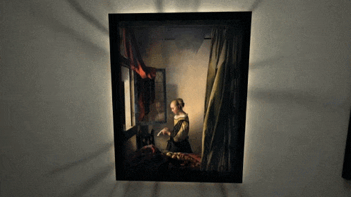
The process of creating something is always chock-full of things to learn, so it’s always a treat when someone takes the time and effort to share it. [Teadrinker] recently published the technique and workflow behind bringing art into VR, which explains exactly how they created a virtual reality art gallery that allows one to step inside paintings, called Art Plunge (free on Steam.)
It walks through not just how to obtain high-resolution images of paintings, but also discusses how to address things like adjusting the dynamic range and color grading to better match the intended VR experience. There is little that is objectively correct in technical terms when it comes to the aesthetic presentation details like brightness and lighting, so guidance on what does and doesn’t work well and how to tailor to the VR experience is useful information.
One thing that is also intriguing is the attention paid to creating a sense of awe for viewers. The quality, the presentation, and even choosing sounds are all important for creating something that not only creates a sense of awe, but does so in a way that preserves and cultivates a relationship between the art and the viewer that strives to stay true to the original. Giving a viewer a sense of presence, after all, can be more than just presenting stereoscopic 3D images or fancy lightfields.
You can get a brief overview of the process in a video below, but if you have the time, we really do recommend reading the whole breakdown.


wow!
Nice for a niche experience.
https://www.statista.com/statistics/1407105/ar-vr-headset-companies-shipment-share/
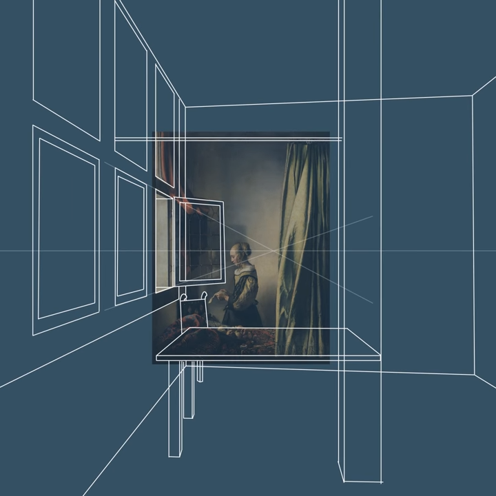
I feel that seeing what is outside through the windows, even if it is something from another painting by the original artist, is an unacceptable alteration.
If that is your position isn’t all the invented detail required to provide that 3d depth at all equally unacceptable? Unskewing and shifting the POV of that 2d isometrically painted image must create invented details somewhere…
Really as it is so very clear this is another artist’s reinterpretation of the original work I can’t see the problem with it. I’d hope the historical research is done to make any of the invented details fit the setting properly (unless deliberately tossing modern day New York outside the window for a contrast was the goal).
This becomes difficult to pull off for artists that didn’t use camera obscura to get the perspective right, because the geometry of the scene will be wonky in subtle ways even for the best of them.
As the real world is so very wonky anyway I don’t think it will actually be much harder to make convincing for anything that isn’t really grossly out. And as wild perspectives can be a deliberate part of art anyway it may just work anyway. Seems like it would still be an interesting an experience.
You’ll get some psychedelic results. Perspective errors and discrepancies in the scene are not immediately obvious in a 2D painting, because the painter only paints what “looks right”. Earlier art paid no attention whatsoever to geometric correctness, didn’t even use perspective, or used simple isometric-like projections with no systematic rules to them.
When the perspective error is extracted by algorithm and applied to a 3D scene, objects tend to stretch and deform in various ways that no longer make sense, or may not even parse at all in 3D.
https://upload.wikimedia.org/wikipedia/commons/6/67/William_Hogarth_-_Absurd_perspectives.png
That image you linked I don’t think would really lose much at all – it is in effect a few layers of different distances stacked ontop of each other. So if you want to pop it out into 3d space you can treat each effective focal plane differently if you like. Or you could not and just enjoy the stylised image getting skewed, with how giant and clear the far distant objects have been made and the clear separation between the bridge and the stuff behind it etc I think it would still work quite well – its going to be exaggerated and weird, but you can argue the original image is that too, yet it is very parse able.
Ultimately though its art if Picasso and Dali can do their things why can’t this popup art be weird. You might not like it, as with so much art its going to be polarising, but that just makes it art…
Look closer…
Dude nothing about the fore and backgrounds overlapping in slightly odd ways really stops you popping that image out if you want to. Can even keep that overlap if you want with that step into 3d type look, it just makes the image a bit more surreal than if you separate all those layers as it pops out so the guy on the hill becomes just a guy on a hill with no connection to the candlestick and that hanging sign turns out to be a feature of both buildings that just happened to be occluding each other at that point etc.. Either way pick your option and that image would parse once popped out IMO. Just one way is weirder than the other – but art can do that if it likes, there need be no rules when apparently even an unmade bed counts…
Look closer still…
This image does not parse correctly in 3D because nearly every “depth layer” in it has a different perspective. In one case, you can see the roof of the building from above, in the other from below… etc.
Sure, you can “pop it out”, but you have to choose an arbitrary perspective and then fit the objects in as interpreted from that perspective. It’s like an M.S. Escher painting – there is no consistent perspective, and forcing one will break the illusion.
So don’t force one perspective if you don’t want to Dude, it won’t really break the illusion no matter how to pop it out. Having real depth perception in the popped out image will create an interesting effect, that in many ways will be breaking or highlighting the illusion by its nature, and the telescoping moment will rather define the way the image will be interpreted. Just how weird it becomes really doesn’t matter though – art can be that…
There are lots of things very wrong with that image even as its presented – it is kind of the point, popping it out to 3d with continuing incorrect perspectives or actively unwarping the world a bit as you go 3d would both be possible, and still quite parse able as each element is so clear and contrasting to everything around it. You can argue you should do both methods and have it zoom in and out between them both to really highlight to interesting perspective choices of the original art.
Now if you had a ‘photorealistic’ type art doing these perspective tricks so the edges of each object may be far less defined and what everything is meant to be less clear even before you try to pop it out. Then I could agree it won’t work very well, but here its so highly stylised with so much contrast between the objects, and many of them warped to buggery already while still being very clearly what they are – that chapel for instance is clearly a banana in the original image, yet also clearly a traditional small chapel building – it will still just work.
This has been done by Samsung for an ad for their 3D TVs 15 years ago:
https://www.youtube.com/watch?v=Og8YhUzu2ek
Absolutely hilarious! (Somehow I think the original was deleted by youtube…)