
Once the nerve center of Windows operating systems, the Control Panel and its multitude of applets has its roots in the earliest versions of Windows. From here users could use these configuration applets to control and adjust just about anything in a friendly graphical environment. Despite the lack of any significant criticism from users and with many generations having grown up with its familiar dialogs, it has over the past years been gradually phased out by the monolithic Universal Windows Platform (UWP) based Settings app.
Whereas the Windows control panel features an overview of the various applets – each of which uses Win32 GUI elements like tabs to organize settings – the Settings app is more Web-like, with lots of touch-friendly whitespace, a single navigable menu, kilometers of settings to scroll through and absolutely no way to keep more than one view open at the same time.
Unsurprisingly, this change has not been met with a lot of enthusiasm by the average Windows user, and with Microsoft now officially recommending users migrate over to the Settings app, it seems that before long we may have to say farewell to what used to be an intrinsic part of the Windows operating system since its first iterations. Yet bizarrely, much of the Control Panel functionality doesn’t exist yet in the Settings app, and it remain an open question how much of it can be translated into the Settings app user experience (UX) paradigm at all.
Considering how unusual this kind of control panel used to be beyond quaint touch-centric platforms like Android and iOS, what is Microsoft’s goal here? Have discovered a UX secret that has eluded every other OS developer?
A Simple Concept
Settings which a user may want to tweak on their computer system range from hardware devices and networks to the display resolution and wallpaper, so it makes sense to put all of these configuration options within an easy to reach and use location. Generally this has meant something akin to a folder containing various clickable icons and accompanying text which together make clear what settings can be configured by opening it. In addition, the same setting dialogs can be accessed using context-sensitive menus, such as when right-clicking on the desktop.
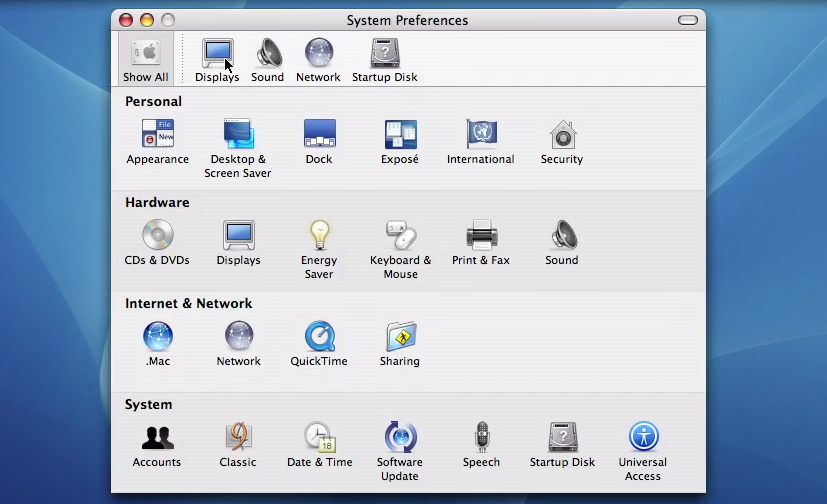
It’s little wonder that for the longest time operating systems have settled for this approach, as it is intuitive, and individual items can have stylized icons that make it even more obvious what settings can be configured by clicking on it, such a keyboard, a mouse, a display, etc. As graphical fidelity increased, so did the styling of these icons, with MacOS, Windows, BeOS and the various desktop environments for OSs like the Linuxes and BSDs all developing their own highly skeuomorphic styles to make their UIs more intuitive and also more pleasant to look at. A good overview of the Windows Control Panel evolution can be found over at the Version Museum website.
Coming from the still somewhat subdued style of Windows XP after years of Windows 9x and Windows NT/2000, Windows Vista and Windows 7 cranked this style up to eleven with the Windows Aero design language. This meant glass, color, translucency, depth and high-fidelity icons that made the function of the Control Panel’s individual entries more obvious than ever, creating a masterpiece that would be very hard to beat. The user was also given two different ways to view the Control Panel: the simplified category-based view, or the ‘classic’ view with all icons (and folders for e.g. Administrative Tools) visible in one view.
Meanwhile Apple did much the same thing, leaning heavily into their unique design language not only for its desktop, but ultimately also for its mobile offerings. Everything was pseudo-3D, with vivid colors adorning detailed renderings of various physical items and so on, creating a true feast for the eyes when taking in these lush UIs, with efficient access to settings via clearly marked tabs and similar UI elements.
This way of organizing system settings was effectively replicated across a multitude of environments, with operating systems like Haiku (based on BeOS) and ReactOS (re-implementing Windows) retaining those classical elements of the original. A truly cross-platform, mostly intuitive experience was created, and Bliss truly came to the computing world.
Naturally, something so good had no right to keep existing, ergo it had to go.
The World Is Flat
The first to make the big change was Microsoft, with the release of Windows 8 and its Metro design language. This new visual style relied on simple shapes, with little to no adornments or distractions (i.e. more than a single color). Initially Microsoft also reckoned that Windows users wanted every window to be full-screen, and that hot edges and sides rather than a task bar and start menu was the way to go, as every single system running Windows 8 would obviously have a touch screen. Fortunately they did backtrack on this, but their attempt to redesign the Control Panel into something more Metro-like with the Settings app did persist, like an odd growth somewhere on a body part.
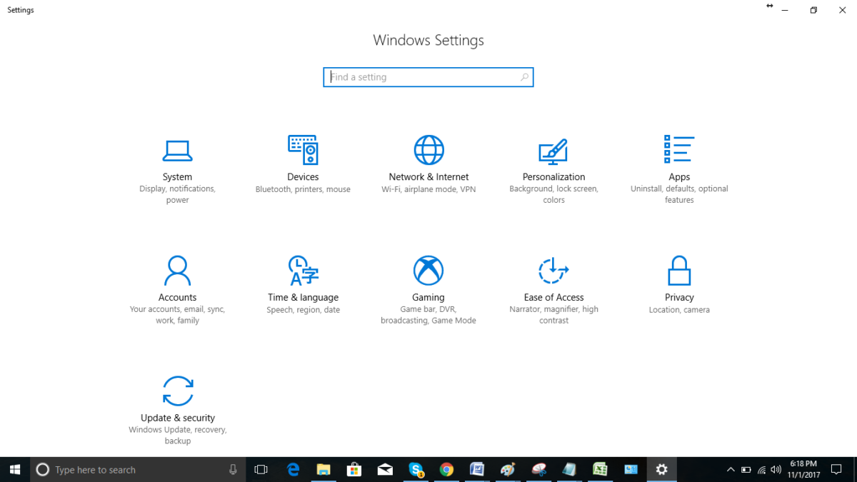
Although the Control Panel remained in Windows 8 as well, the course had been set. Over time this small lump developed into the Settings app in Windows 10, by which time Metro had been renamed into the Microsoft Design Language (MDL), which got a recent tweak in what is now called the Fluent Design Language (FDL) for Windows 11.
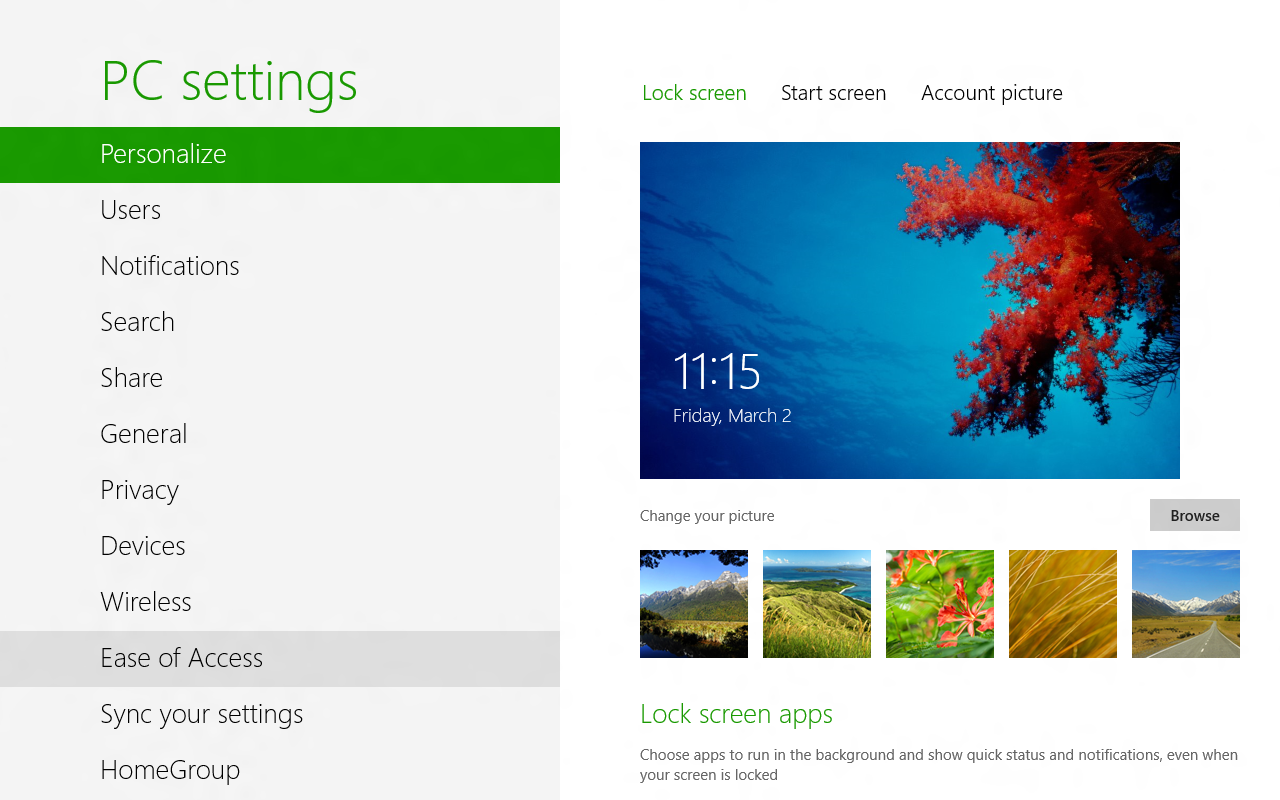
Central to this is the removal of almost all colors, the use of text labels over icons where possible (though simple monochrome icons are okay) and only rectangles with no decorations. This also meant no folder-centric model for settings but rather all the items put into a text-based menu on the left-hand side and an endless scroll-of-doom on the right side containing sparsely distributed settings.
This led to the absolutely beautifully dystopian Settings app as it exists in Windows 10:
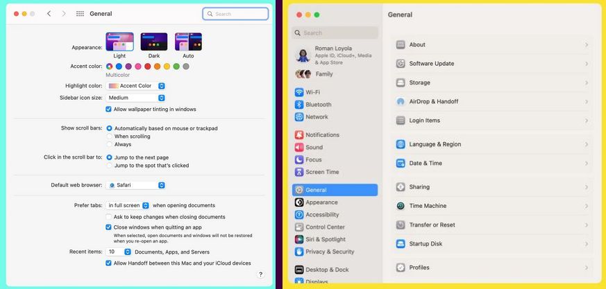
All of this came as skeuomorphic designs were suddenly considered ‘passé’, and the new hotness was so-called Flat Design. Google’s Material Design as developed in 2014 is another good example of this, with the characteristic ‘flat UI elements adrift in a void’ aesthetic that has now been adopted by Microsoft, and a few years ago by Apple as well starting in 2022 with MacOS Ventura’s System Settings (replacing System Preferences).
Rather than a tabbed interface to provide a clear overview, everything is now a blind hierarchy of menu items to scroll through and activate to access sub-, sub-sub-, and sub-sub-sub- items, and inevitably realize a few times that you’re in the wrong section. But rather than being able to click that other, correct tab, you now get to navigate back multiple views, one click at a time.
It isn’t just Windows and Apple either, but many of the big desktop environments like Gnome have also moved to this Flat Design Language. While various reasons have been provided for these changes, it’s undeniable that FDL makes a UI less intuitive (because there’s less useful visual information) and makes for a worse user experience (UX) with worse ergonomics as a result (because of the extra scrolling and clicking). This is especially obvious in the ‘independent applets’ versus ‘monolithic settings app’ comparison.
One-Track Mind
Imagine that you’re trying out a couple new wallpapers in Windows while keeping an eye on Windows Update’s latest shenanigans. You then need to quickly adjust the default audio device or another small adjustment unrelated to any of these other tasks. If you are using Windows 7 or earlier with the Control Panel applets, this is normal behavior and exceedingly common especially during hardware troubleshooting sessions.
If you’re using the Settings app, this is impossible, as only view can be active at a given time. You think you’re smart and right-click the desktop for ‘Personalize desktop’ so that the other Settings view stays intact? This is not how it works, as the Settings app is monolithic and now shifts to the newly selected view. Currently this is not too noticeable yet as many applets still exist in Windows 10 and 11, but as more and more of these are assimilated into the Settings app, such events will become more and more common.
It would seem that after decades of UI and UX evolution, we have now reached a definite point where UX is only getting worse, arguably around the release of Windows 8. With color banished, anything even remotely pseudo-3D frowned upon and UIs based around touch interfaces, there will soon be no difference between using a desktop PC, tablet or smartphone. Just in the worst way possible, as nobody has ever written about the amazing ergonomics and efficient UX of the latter two devices.
Perhaps our only hope may lie with the OSes and desktop environments that keep things real and stick to decades of proven UX design rather than give into Fad Driven Development.
Rest in peace, Windows Control Panel. We hope to see you again soon in ReactOS.


Yes indeed. I said farewell to windoze quite some years ago. Looking though some old notes yesterday, I discovered it was 2011. I got a free PC back then and it started with a screen full of blue rectangles, and clicking on it did not do much. After about 15 seconds I wiped it and installed linux, and I never used a windows pc after that anymore. I’m using Linux Mint with XFCE and it still resembles pretty much what windoze 98 looked like. I use my PC to run programs, not to fiddle with OS settings or to relearn a new GUI every 3 years.
Yet on the Linux side of things, things are worse because for much of the settings and configurations you have absolutely no GUI at all – and sometimes when you have it, it doesn’t work or it conflicts and messes up with settings made by hand-editing configuration files or produced by some command line wizard.
Since the configuration syntax often resembles or actually is a scripting or a programming language of its own, it can be highly sensitive and break easily, and slight updates to the system cause subtle differences that either break your setup or throw the entire thing to the bin and you have to start over.
The same configuration may also be made in multiple places, sometimes resembling a kind of “registry” and sometimes being in a text file in a folder somewhere deep in the bowels of the file system (how do you find it??), you may or may not be able to know which setting is actually effective and where you should make it. In some cases the configuration file doesn’t even exist by default and you have to make it yourself, place it in the correct path, and then edit some other configuration file to point to it – all without having any idea how this is supposed to be done.
Even a badly designed, yet working and comprehensive, control panel is much preferable to that cluster****.
I run dozens of Linux machines at home and at work, notebooks, laptops, desktops, and servers, and have done so for more than 15 years. Present Linux of choice is Mint with Cinnamon. Honestly, I don’t recognize the Linux experience that you’re describing.
I think you’re just propagating FUD–either because you’re not really familiar with Linux, or because you last tried it a decade or more ago.
It’s not an “experience” but a worst case example. Things have improved over the years, but you still run into these problems occasionally.
Most recent case I had, I was setting up a USB serial port data logger on a Linux computer. This data logger had to appear at the same COM port address every time for the script to work. How do you manage that? The problem went unresolved, because the solutions we found didn’t actually work. We ended up using an old Windows laptop for the job.
On Windows? Go to device manager, click on the COM port, “Properties”, “Port settings”, “Advanced”. There. Buffering and port number setting. Easy peasy.
Oh, and had we actually gotten it working under Linux, I dread what would have happened IF we then had discovered that we have to update the whole distro for the VPN to work because the OpenSSL version was wrong (another recent case) and then found out that the port settings were erased or had to be done differently.
Mind, upgrading the distro was faster and easier than trying to figure out how to update OpenSSL alone… which should speak volumes about the whole problem.
You’re so right about Linux and serial ports!
On Windows, there are null-modem drivers and you can toggle the individual data lines via Windows API.
On top of that, you have optional 16550 FiFo emulation and you can configure buffering.
On Linux, you’re back to the medieval times.
It expects a mechanical Lorenz telex machine or something on the other side of the line.
On Linux, you have no null-modem driver.
Instead, you have to use a physical null-modem connection using two ore more TTY ports.
Because only that way you get all the handshake lines, anyway.
The *nix nonsense with piping doesn’t work.
Then there’s network configuration. It’s archaic and primtive, on the level of the 1960s.
It’s a miracle you don’t have to use levers and switches on the front panel.
Even Windows 98 had WinIPcfg utility, something graphical to quickly check network status.
Seriously, Linux is a mess. Solaris and other unixes did it better. They had consisty, at least. And they were forwardthinking.
The “correct” way to do this under Linux is to create a UDEV rule under /etc/udev/rules.d/ which triggers on your USB device and creates a uniquely-identifiable symlink to it (usually in /dev).
Point being, you have a good point. I wish Linux had a better hardware management GUI.
That is in a sense the crux of the problem: everything is easy if you already know how to do it. I haven’t used Linux every day for 15 years, so every time I run into these issues it’s all new to me, or I have forgotten how I did it the last time, or things have changed and I didn’t get the news. I usually only have limited time to make it work, so the obtuseness and lack of user-oriented tools feels like tunneling through a brick wall with a tin spoon.
So, just like Windows, basically.
Yes, except on Windows it doesn’t take several days to figure it out, because the tools to make the configuration exist and for most things you don’t need to google for a step-by-step tutorial that ends up not working half-way through because of version mismatches.
I’ve been using Linux exclusively for about 15 years now. I currently use Linux Mint with XFCE, and I can tell you that much of what Dude says is correct for me.
Managing the main menu is an inconsistent and frustrating mess, especially compared with the way I used to do it in Windows. Display management is inconsistent and flaky – when I change resolution to 1920X1080 to watch a movie on my TV, then disconnect the TV and revert to 1368X678, sometimes the final confirmation screen is God knows where, so I can’t confirm. It then times out and dumps me back at 1920X1080, at which point I have to do it all over again. And speaking of resolution, when I reboot, the system defaults to some higher resolution which my ageing eyes can barely make out. I’m sure there’s some file I can edit to fix that, but I shouldn’t have to – there should be a GUI way of doing it.
The behaviour of various file saving and opening dialogs is inconsistent from program to program, and all are different from my Thunar file manager. Handling of file dialogs is a hot mess on my Linux laptop. That may not be true for you in Cinnamon – but the last time I tried it I found Cinnamon’s GUI senseless to the point of unusability. So I’m (un)happy to confirm Dude’s contention that there are sometimes multiple, contradictory, confusing GUI methods to do a given config task in Linux.
There is no FUD here; you couldn’t pay me enough to use Windows, and in spite of my frustrations I recommend ditching Windows and adopting Linux to anyone who will listen. But I’d like to be recommending it because it’s good, not just because Windows is so bad.
I am VERY familiar with Linux, and its GUI and configuration utilities don’t hold a candle to those of, say, Windows 2000. Client Side Decorations need to be deep-sixed in favour of consistent menus from one “app” to the next. The GTK devs need to get a clue, get over themselves, stop being such arrogant snots, and start listening to user feedback. GUI design needs to HEAVILY favour older folks like me, given that we’re on the verge of demographic inversion and old farts will soon outnumber young’uns. And configuration utilities need to e at least as good and consistent as Windows Control Panel used to be. They’re nowhere close.
Regarding GUI: Shades of grey in place of colours? Non-starter. Vanishingly small and-or pale-pale-grey divisions between tabs, UI elements, etc? Can that crap. Needle-thin scrollbars that can only be made usable via arcane incantations of text via editors in obscure config files? Not acceptable.
If we’re EVER to have “the year of Linux on the desktop”, config utilities and UI elements are going to have to be a lot, lot better than they are now.
Things on Linux are had because no one has ever gotten around to implementing a UI for every setting.
On Windows, someone has actively chosen to remove fubcrionality that has existed for decades.
These are not the same problem.
The end effect is the same, so does the user care why?
This. Most people don’t realize that UNIX was born without a GUI. There was none, not even TUI libraries like curses; the OS had already been developed for 15-20 years before the first window could be opened, and many standards developed at the time couldn’t take into account the existence of a GUI.
Windows on the other hand was born as a GUI for DOS, that is, it was created around the concept of graphical interface, and I wouldn’t be surprised at all if at Microsoft they were deciding where to put the button that would do something even before they had ready the code that would do that something.
There are very good arguments why it should stay that way, because it’s an operating system that is apt for a headless setup over the network – server and cluster stuff.
For the same reason trying to “sell” it as a desktop operating system, as a substitute for Windows or other GUI system, is deeply confused. It’s an entirely different and incompatible use case.
“For the same reason trying to “sell” it as a desktop operating system, as a substitute for Windows or other GUI system, is deeply confused.”
That is absurd. The same argument could have been (and probably was) made about Windows, which overlaid DOS.
Come on.
No. That’s a false comparison, because at that time a fully GUI operating system on a desktop PC didn’t really exist, so there was no user-oriented alternative in the modern sense where you could do everything through the desktop.
Basically, back in the DOS era, you had to whittle your own proverbial spoon and if you couldn’t or wouldn’t then you didn’t get the soup. That was the standard for UI/UX and the users had to adapt – or ask for someone else to do it. This is still the paradigm with Linux/UNIX.
Then Windows 2000/XP came along and ditched DOS, and gave you GUI configuration tools that reach deep into the system without ever leaving the desktop. At that point you never had to open another Command Prompt window again, because you had Group Policy Editor etc. and your hardware drivers and software came with GUI installers. This was 25 years ago.
“Things on Linux are had because no one has ever gotten around to implementing a UI for every setting.”
That’s one explanation. I always thought it was like this because the Linux and *nix people are anachists by heart and do constantly disagree with each others and fork existing projects.
Which in turn leads to wild growth, proliferation, chaos.
By windows 10 it got decent-ish, but still.
At least with Linux I have the source and can make my own GUI or add something to GNOME.
I mean, I’m not going to do that. But the possibility is there. :D
P.S. why does GNOME keep removing stuff from the control center? I feel like 10 year old fork of GNOME was way more user friendly than the modern stuff.
Because they’re so disconnected from reality to think everyone wants a phone-like dumbed down interface.
No you can’t. You think you do, but you don’t have the time, energy, money, or motivation to finish the job. It’s just wishful thinking.
And here you are wrong. I did it. And it worked. Stop spreading FUD.
Gnome is drinking from the same Kool-aid that gave us SystemD, which is also inspired by all the worst bits of Windows, except now shoehorned into Linux “for the greater good”
This is FUD – I’ve been dailying Mint for over a decade and it’s as slick if not slicker than Windows for everyday use, for the average PC user if you told them it was just a modernised fork of WinXP they’d likely believe you.
Not gonna lie. Does seem like that they don’t just dislike Linux, they seem to absolutely hate it and will defend any windows design choice to the death.
Linux Mint is for the old folks who want to move away from Windows but don’t really want Linux, either.
I’m speaking from personal experience, by the way. To undemanding home users, Linux Mint is the new Ubuntu.
Speaking of UI, UX and so on.. Linux never came up with anything creative.
It always used Windows or Mac OS as a blueprint.
KDE and Gnome are prime examples here. No creativity.
KDE v3 was nice looking, though. Like a chubby Windows XP/Luna derivative.
That’s what I love about using Linux on the desktop. We have known how to do a decent UI since Xerox did the research in the 1960s. We don’t want Microsoft to re-invent it, change things and move things around.
Linux – everything is possible… you may occasionally need to develop a doctoral thesis in configuration to get there.
Windows – what you want it to do, it has been specifically designed not to do. But it will do what you don’t want easily!
That’s my experience with the two.
https://web.sas.upenn.edu/jasonrw/2015/12/29/if-operating-systems-were-airlines/
How I wish you were wrong. I see less settings possibilities than it used to have. On ubuntu i used to set up power options for my laptop just to find out one day that new ubuntu no longer have it. I mean it was there but so limited that I had to edit config files manually. Other settings require downloading additional app or something.
But let’s face it – today all desktops are the same. I remember people customizing desktops to their needs – today it’s only wallpaper and icons arrangement.
I was about to say with you saying windoze, its got to be a decade or more since you last looked. I am in neither camp I will use either or depending on what I want to do, but I can’t take anyone seriously that claims to have not used windows as a linux cheerleader.
You like linux, great use that as a strength, not M$ WINBLOWS SUX!!!!!! if you want anyone to keep reading a single character past that garbage
I believe the best looking is Windows 3.1 (as the entire thing matches the window decorations) – that’s how bad Microsoft has handled system settings in Windows over the years.
Every update makes it slightly worse. And now, here we are, no way to change the taskbar from horizontal to vertical, even though it can be done, it’s just Micro$haft don’t want you to.
It’s called “enshittification”. I’ve also seen it called “downdates”.
I’m onboard with calling them downdates.
Enshittification I reserve for when something that used to be easy and convenient in a no cost product is deliberately made difficult or impossible unless you pay (in some form, whether with money, personal data, etc.) for an upgraded product.
yea, ok go change a video driver in windows 3.1, oh you cant you have to setup it (and a lot of other things like mouse support) using the ms dos windows setup program
Rose tinted goggles
Windows 3.1 was still running as a GUI for DOS, so that’s a given.
And the message you’re replying to was about the design and looks, not the function.
Half true. Windows 3 setup.exe is a dual executable containing both a Windows and MS-DOS version of Windows Setup.
That means it’sa Win16 NE application with an MZ stub that is more than just a DOS program that says “this program requires MS Windows”. It’s a full DOS application, rather: The Windows Setup.
Also, Windows NT 4 and earlier didn’t have a graphics card setting, either.
Graphics drivers had to be started like services, rather.
The “ms dos windows setup program” is also a full Windows program with a GUI. The video driver can be changed from there, with a restart at the end, to load the new driver.
Some drivers, like Matrox, comes with their own setup program that doesn’t require opening Windows Setup and browsing for the files. It’s just Next-Next-Next-Finish-Restart.
Dammit. Hit the “report” button instead of “reply”. Sorry for that. I blame UX instead of the idiot that I am.
I wanted to say “Make that 3.1x”
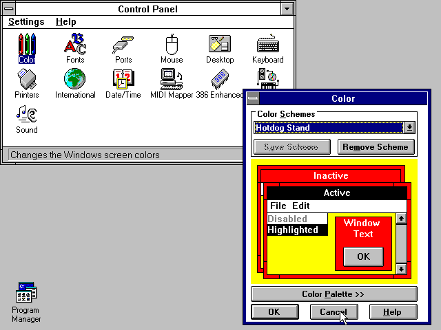
The first screen shot shows another important feature Microsoft deleted from Windows: the color-scheme editor.
Just as people started to realize how dumb inverse color schemes are, and started adopting “dark” ones, Microsoft REMOVED the ability to make one.
I’d say Windows has regressed, but that would be wrong because it was NEVER the steaming pile of dogshit that it is today.
MIDI Mapper was most advanced in Windows 3.1, as well.
In Windows 95 it was nolonger possible to change instruments per MIDI channel.
Windows 3.1 was peak in terms of individualism.
To be fair, Windows 98 and XP had offered themes and visual styles, though.
I can’t say I totally agree with this article. To say that all modern designs are the same it simply not true. Modern gnome does not look anything like the WIndows setting panel. Likewise, Mac OS does not look like gnome. I do not really see the resemblance. I get that many people are nostalgic for the 90’s but these days we have better UIs. I would argue that gnome actually does a really good job at making a modern user friendly UI. Sometimes Microsoft and Apple could use to learn something from foss UI designers. Admittedly foss doesn’t always have a good UI and the are plenty of examples off awful designs.
I also think that control panel is from a very different era of Windows. Historically it was for power users who wanted maximum control. However, it is now more “cloud” oriented and users are not support to think about how things work. You are expected to use the cloud apps and they are slowly turning the OS into a “web” experience with ads and web apps that work from the “cloud.” I think the loss of control panel is minor in reality as the people who are screaming are the ones who have used it for a long period of time. The settings app can do most of that the control panel can do. I think it was a mistake to include control panel in Windows 11. Instead of doing that annoying redirect they could of just scrapped it. It would of been better to pull off the band aid than to slowly peel it off. For that matter, they should kill all the old Windows components that create the inconsistent UI you see in Windows.
If you are like me and want to continue playing with the old Windows, I would recommend React OS. It has a slow development cycle and is Alpha quality. However, it can run some software and works very much like Windows XP. You can create a new React OS install in a virtual machine.
AI front-end: Computer, computer? Hello, computer. Keyboard, how quaint.
I’m not so sure. Almost every modern UI has moved to a flat appearance. Making it harder to distinguish what is interactable. The same with automatically hidden scroll bars. I makes it non obvious there is more to be seen. I don’t even want to rant on about the hamburger menu and gear symbol.
OMG. Just OMG.
As a sys admin, I really really hope things don’t go your way.
The settings app i total crap.
We need control panel.
Ill just repeat, I hope things don’t go your way.
You call it design, but it is NOT design. It is just a bunch of text on your screen and hidden scroll bars. Hideous, totally counter intuitive and bad in any way possible.
Removal of control panel is going to make my job much harder.
I hope they don’t actually remove it.
To all other readers, I wish you a nice day.
Mmm… For mouse based use UI peaked with Windows 98.
Even the best Linux desktop managers just emulate that.
I’m not saying time should have frozen there… some adjustments should be made for touch and/or small screens. But a large percentage of the newer stuff is just crap.
Gnome is a UI with all the most incredibly annoying options chosen by default and the configuration to change them hidden in a Windows like registry. Yuck!
When it comes to Windows configuration… the control panel peaked with Windows 98 too. That was a place where you could tell the OS what to do. XP’s wasn’t terrible but it was starting to veer into the territory of having to ‘ask’ the OS to do what you want, with the potential for it to say no. After that they have just been removing function and adding fluff with every release.
The smartphone was the worst thing to happen to user interfaces in the history of personal computing.
Yes, I am considering Microsoft Bob. Though, to be fair, if that had actually caught on, it would have been worse.
They shouldn’t have invented the mouse either, everyone should use VIM ehj?
snark xkeynav
But seriously if you use linux and don’t have a mouse, xkeynav is fantastic. The screen is divided into 4 quadrants, with a directional selection you are now down to half a screen which is again divided into for quadrants, another selection and you are at half of a half etc.
Once you get where you want to be hit the click or double click key.
The mouse wasn’t that important, the principle of the digitizer was.
The lightpen and the trackball existed, as well.
Then there were drawing tablets.. CAD and CAM had used it.
Architects, as well. History is more rich than we may think.
I think same. In Japan, the old desktop-oriented internet still exists.
Apple and Google have dumbed down western internet.
It hurts so much. Invention of the smartphone was worst in my opinion.
I was so happy with PDAs before, which used a styles and had desktop-based internet browsers.
I love to see all the “Linux is better” vs “Windows is better” discussion here. As a 25-year Linux user at home (but daily Windows user at work, which means if anything is broken I don’t even bother trying for myself, I just walk to the IT desk and say “broken”) I think there is more variation within the Linux world than between Lin and Win. When I started using Linux I preferred Gnome as KDE looked old-fashioned, but I swithched over to K-side because I prefer it’s uniformity between apps, and over time. While both have changed, I think KDE less (and in a good way) than Gnome. KDE also had had many “innovations” that I absolutely loathe and disable as soon as possible, so it’s not all roses.
To me, there is no real winner between Win and Lin: Some things are impossible to do on Windows unless you either pay $$$ or download a very much untrusted program from the Internet Archive off a Geocities website (true story), yet are a 30-character command line away on linux. Other tasks are two weeks of installing software on linux and on windows it’s literally plug, wait 10 second for a showr “installing software” popup, and play.
One pet peeve of mine is the Ctrl-S behaviour in The Gimp. It used to be “Save in any file format you select”. However that changed to “Save as XCF” and any other format needed Ctrl-E (Export) — A stupid difference to make (imho) and also one that should be toggleable in a setting somewhere. But no! It was the day I stopped using GIMP regularly.
P.S. To Maya Posch, could you stop appending ?skin=vector to your Wikipedia links? It forces me to use Wikipedia in your preferred skin… Which kinda aligna with what the subject of this article :-p
Fresh out of the box, assuming the rest of the software stack a user wants is available for both platforms (so I’m not talking to Photoshop users) I don’t see how there is much of a difference between the two OSs for “normal” users.
Except that you paid for Windows (even if it was just rolled into the hardware cost).
And Windows is far more likely to force you to throw your computer on the e-waste pile and charge up your credit card buying a new one earlier while Linux is more likely to keep running on old hardware just as good as it ever did.
If that were the case, then of course you would be right.
But it isn’t. It’s not just Photoshop users. It’s all the small things like, where’s my audio manager? On Windows I have a little app that lets me select if I want to mute my speakers when I plug in my headphones – on Linux, nope, nowhere to be found. Can’t do it.
Replying to @Dude.
I’m pretty sure that little app was installed along with the sound chip’s driver suite and does not actually come with Windows. I say this because I had to hunt for that on the Windows 11 Dell box I have to use at work. But sure.. that’s something someone is apt to want.
I don’t know of a small, simple Linux app to do what you describe. It may be a thing. I just don’t know about it. But I found I want more than that anyway though. When working from home during Covid for example we used MS Teams which at the time had a nice Linux app. We wanted to all watch a movie together at lunch time. No one could get Windows to send the video player’s audio out through Teams.
Other times I wanted to do things like play music during long meetings with the music coming out my speakers and the meeting in my headphones… stuff like that.
For me Pipewire + Carla works great! I can route any audio from any input or software to any output or software. I can mix it, split it, etc…
Several of us tried to find ways to do this in Windows when we got back to the office. There were lots of unmaintained apps that used to do it before Windows update such and such… it seems Microsoft just doesn’t want users to have such capabilities.
Just free yourself from the Windows world and go the Linux route. Pick the DE that suits you and you are off and running. Not having one forced on you. This as worked for me for many years now and haven’t looked back….
That’s propaganda, I think. Linux isn’t the answer, I’m using it for years on a secondary computer.
As soon as you leave the hobby corner, Linux starts to cause trouble.
Simple things like standard text fonts or printer, scanner and webcam drivers cause headaches.
Things that you need in a workplace environment. Special hardware, such as lab hardware or diagnostic devices don’t have Linux support.
You need to run a 32-Bit Windows 98 or XP system, to get the traditional drivers going.
Even current things like EPROM programmers may have 32-Bit drivers only, so you have to use an VM.
Really, I can’t hear the Linux argument anymore. Linux is fine for people who are undemanding, without much intellect. IMHO.
All computers will hit trouble somewhere, from time to time – some more obnoxious than others. The only reason you won’t want to rage quit on Window’s many foibles is they are so familiar to you, and the work around you likely already know – most of us grew up with it and didn’t have any alternatives at all. Or you long ago forgot you wanted to get the computer to do x that it should be able to do so haven’t even tried in years… So I’d have to agree with rclark – pick the DE you like and stick with it – it will give you a much more predictable and stable user experience than M$ does with their constant moving stuff around in general. The only example I can think of where the DE really shifted as it modernized is the Gnome desktop, but as old style Gnome was and still is very popular you didn’t really have to switch, its just your desktop isn’t the ‘Gnome’ desktop anymore.
About the only reason you might find Linux trickier than Windows if/when you do run into trouble is if you decide to run on a less popular distro and don’t have any unixy understanding to take what you can find (likely on Archwiki these days – seems to be by far the best resource for most things) as the starting point for your troubleshooting. However the advantages of being FOSS also means when you hit trouble you don’t end up needing to find a M$ insider, or hardware vendor’s software team member to have any hope of a fix and the error messages are generally much more specific and descriptive so its easier to search for the right information in the first place.
You are also much more likely to have a printer just work on Linux than Windows now, same with Webcams too actually as between MS actively burying and deliberately denying function to the older, less capable hardware/drivers and the printer companies moving shittier business models actually getting a printer to work at all can be a minor miracle.
And your old and special hardware where you need old 16bit (etc) Windows functionality is at least theoretically possible to get working on modern hardware with Linux, and not at all possible on modern Windows (unless the linux system they have sneaked into modern windows is complete enough – not something I’ve looked at really) – WINE is great at pretending to be older versions of windows and still actively works on the latest hardware with the oldest programs I’ve got to test against. So while the serial port may pose a challenge, with how very rare they are on modern hardware being perhaps the biggest one Linux actually can at least in theory just work with most of this stuff without a VM (though of course you can also use a VM if you like).
“You are also much more likely to have a printer just work on Linux than Windows now, same with Webcams too actually as between MS actively burying and deliberately denying function to the older, less capable hardware/drivers and the printer companies moving shittier business models actually getting a printer to work at all can be a minor miracle.”
I’m not sure if I can agree on this.
For example, CUPS on Linux is outdated and even Mac OS had stoppedusing it.
And webcams are an issue on Linux. I recommend you to tryout about 15 different models, like I did, then we can speak again.
Out of 15, merely 3 had been supported by Linux.
The rest used image compression or sensor types Linux had no modules for.
I’ve found the hard way during the Corona pandemic a few years ago. That’s when I tried to get some working for video chat.
‘Outdated’ is only revelevent when its no longer functional, if it works fine it works fine. With a great example being my local toolstore chain – they use a POS and Inventory management system that is largely older than I am, but it works flawlessly still so why change it? (Obviously some modernization to handle modern payment methods)
And I didn’t say webcams were not an issue at all – just that Windows actively refuses to work with plenty of perfectly functional webcams because they are not ‘good enough’ to be worthy, the driver isn’t acceptable anymore etc. Which creates a whole pile of e-waste you can’t do anything about easily. Where on Linux generally you can get any of them to work if you know what you are doing – maybe you end up having to play directly V4L2 to create the stream off the camera etc, but its usually possible if you care enough to try, and in many cases it will just work effortlessly with a camera Windows refuses to… Neither is perfect, but that is largely the point anyway – computers have become such complex stacks of abstraction that is very often the case and you will always hit trouble eventually.
Also if you are trying about 15 ‘different’ models that are all rebadges of one or two designs that happen to not to just work you can have exactly the same experience on any OS – and you will find that same problem often enough as finding information on the chipset involved in the marketing spiel…
That’s not Windows’s fault, that’s the OEMs refusing to provide official drivers.
When Windows transitioned to signing drivers and distributing them through Microsoft to stop OEMs shipping crappy drivers that would crash the system and cause security issues, many OEMs took the opportunity to depreciate their older hardware and refused to provide new signed versions to be distributed.
“As soon as you leave the hobby corner, Linux starts to cause trouble.”
Really??? Ever been in a bio-medical lab in the triangle.
“As soon as you leave the hobby corner, Linux starts to cause trouble.
Simple things like standard text fonts or printer, scanner and webcam drivers cause headaches.”
Strange office you work in.
I find good office printers are more likely to have good native Linux support and if they don’t will support some sort of standard like PostScript, HPGL or PDF. I can’t remember the last time I saw anyone use a scanner but the office ones I am familiar with just scan to a NAS or email, no computer required. Home stuff however… yah.. kinda sucks.
EPROM progammers? That’s kind of specific. But if you have to run your tools in a Win32 VM then who cares if the host is Windows or Linux?
We now use Brother printers at home. A B/W laser, a recent color laser (we really like this one), and one Tank inkjet printer. When I did a new Linux install a couple years back, the printers worked without having to install any drivers…. They just showed up ready to use! That was a pleasant surprise as normally you had to install a ‘driver’. Linux has come a long way now with printer support (I am using KUbuntu LTS BTW on my file server, desktops and laptops). The scanner on the Tank printer worked the last time I tried it. We don’t use the scanner to often though, but is handy when you need it.
Yeah, they “work”, but with the default drivers you can’t change any settings or do much else. No paper options, no DPI settings, no color profiles, no borderless printing…
If all you need is just for some text to appear on paper and that’s it, then I guess it’s fine?
OMG, all these years and I never tried the hotdog stand setting!!! I’m such a failure…
I absolutely hate the windoze settings crap. I have always felt the “reach the task within as few clicks as possible,” design was the best policy. Now it’s become how far can we bury this crap shop they use the search feature we built instead. That’s why M$ has tried to tie the search bar into the internet as well because then they get more data which makes them more money in the l long run.
Even the switch they made in the start menus has been app pain to me. I have used open shell since I had to switch to 10 and will not use 11. Thankfully it seems like I will finally be able to make the full switch to linux with proton solving tons of issues I have had in the past.
The search feature is the best thing about it.
Long time users may not remember how things were to start with, but the control panel icons are actually quite confusing. Yes they split up the options into a few categories, but they too obscure where any individual setting actually is, so you ended up trying a few and going down rabbit holes until you finally found what you were looking for. Over time it just became muscle memory to reach for the correct applet, typically by the shortcuts provided elsewhere.
Many also don’t realize that there’s a third “control panel” – the Device Manager – where you can click individual devices to pull up their driver configuration. OEMs didn’t pick this feature up either, instead opting for providing their own configuration apps for the devices. Yet, Windows has always had this feature where you have one single spot to put all your hardware related configurations: the device tree.
Putting a search function in a control panel is the ultimate admission of failure.
No it isn’t. It should have been there in the first place, because in the end there are so many settings under so many categories that you can’t order them sensibly without obscuring information and getting lost somewhere, or developing the doom scroll issue, or both.
I daresay that the new design of the Settings control necessitated the search function, because it would be extremely frustrating to use otherwise.
I fall in the middle here – the use of the setting panel absolutely 100% requiring a search is the ultimate admission of failure (and I’d say windoze is there). However search absolutely should always have been there, as it is always going to be the most direct route if you know exactly what the setting you want is called, or close enough for the search to be useful.
But as you frequently won’t know the right word to search the settings need logical grouping and good naming in the GUI so can work your way towards the setting you need without knowing its name. Which for many would be the case every single time they need a setting tweak, as most folks are not that interested on that side of tech – they just want it to work and expect the cables that came in the box to do work fine when plugged into right shaped receptacle.
Take for instance a hypothetical case where EDID doesn’t work right for some reason leaving you with aberrant behavior in your display if it even works at all – a problem I’ve seen many times for various reasons, which seems to be the case very very often if you introduce the high quality external audio over HDMI type stuff into the mix or have a HDMI switch or KVM and is often made worse when one of the devices is older than the rest – especially on the KVM/Switch front – I think they will often pass the EDID of the display unmodified even through they can’t actually handle the throughput for the highest resolution and refresh rate (but I’ve never actually looked that deeply into it).
Now the serious techie might know to search for EDID or generational changes in HDMI related stuff. SO they will then try searching EDID and actually get a workable solution either presented directly by the search or from the web search. But to the normal user its just – my new monitor won’t turn on type problems – so maybe they know enough to search HDMI settings but they are never searching for right words to find the right setting (assuming modern windows even allows you to force an EDID without an M$ insiders help knowing exactly which bit of the obscure registry to poke at).
It does. Most GPU providers have utilities to force a monitor profile and there appears to be a third party utility called CRU that lets you apply custom profiles.
The Microsoft Basic Display Adapter driver doesn’t support custom modes, so you have to “cheat” and create your own monitor profile .inf file to replace the system default one. This also works if the manufacturer provided GPU drivers don’t have the function or doesn’t have all the correct modes by default.
I remember having a “special” monitor back in the windows XP days, with three BNC plugs instead of a VGA cable, so I had to do this to get the native resolution and scanning frequency. I also had the same monitor under Ubuntu, where I had to make the configuration in the X.org configuration files – with the effect of booting up to a black screen.
https://learn.microsoft.com/en-us/windows-hardware/drivers/display/overriding-monitor-edids
Long story short: once you have the correct .inf file, you just load it up – in safe mode if you have no display output – then all the correct display modes will appear in the monitor config.
Here’s the thing: if you don’t know what you’re looking for, the search suggestions are more helpful than blindly pecking away at the categories until you find it.
Of course the settings should be available without searching as well, but having cute icons and a deeply nested tree of categories and sub-sub categories doesn’t really bring anything to it. For one, the icons aren’t helpful because they need interpreting as well, so you end up reading the text descriptions under the icons to get around anyhow.
A couple general categories with flat lists are faster to skim through. When you have some idea what you’re looking for, the search with suggestions becomes more useful, because it shows all the options you have related to e.g. “display”.
The Device Manager used to be in the control panel along with everything else.
I distinctly remember learning to navigate the Control Panel in Windows 98. Yes I had to memorize it. At least it’s memorable! The icons have color. The menu is a layered hierarchy. The windows stack and build upon one another. I agree with the article – a layered menu has been replaced with a web. The UI has no physical shape, it’s all flat unmemorable grey.
You have no idea how badly I want colored icons, and a UI that has layers stack upon one another instead of shimmying left/right. My brain wants to physically navigate.
I hate the search. It doesn’t even bring me to the right location half the time. “microphone” first result goes to Time & Language – Speech for the speech recognition. I don’t even learn the navigation (Android’s settings search tells me what sub-menu before I click). If I search and click a search result and discover it’s not the right menu, click back button …it goes to the last menu, not my search results, type it again
@Dude said: “The search feature is the best thing about it (Windows 11 Settings).”
Search in Windows Settings is the ONLY WAY remaining to actually find something anymore! Microsoft always does this: Once something works good, it immediately forms a team of MBAs to enshittify and break it, all while making it shove millions of ads down your eyeballs. I only have one Windows machine left, it was the only machine I had that met the hardware requirements for Windows 11, and it will likely be the last Windows machine I will ever own. All my other machines are running either some flavor of Linux or xBSD Unix. The next thing on the horizon from Micro$oft is Windows as a Service (WaaS) – you will have to pay for windows updates with a never ending ball-and-chain subscription contract. By the time that happens I will likely be long gone as far as Micro$oft is concerned.
All I hear is “Something changed, my muscle memory isn’t valid anymore, I’m angry.”
The way you navigate the old panel is by reading the text under the icons to figure out what the category is, then iterate until you find the correct setting, then memorize through repetition.
The new way: you have a text list of categories, which is searchable with suggestions of available options in case you don’t directly know or see what you need. It ditches the icons because they were basically irrelevant to begin with. Instead of developing a muscle memory to click a particular icon or button, now you memorize the category or option by name, and get there faster. It’s also easier to explain to someone else. Instead of “Click the icon that looks like…” you say “Search for such and so”.
There’s a subtle paradigm shift here: it’s no longer about “the computer is a kitchen appliance” model that tries to emulate outmoded ways of thinking and refer back to old concepts that are no longer valid – like the diskette icon for saving a file. Instead, you state what you want the computer to do, and it delivers, without the “guess what this icon is supposed to be” charades.
Ironically, it’s the same model as tab complete is for the Linux command line – if the Linux commands were named descriptively and categorized and tagged for easy searching and discovery.
For example, as much as I hate the new Start menu being a useless mess, I still find it more convenient to type “calc” than hunt for the icon from a tree of menus and would have much preferred to do so with the old one.
all the icons in Control Panel have a name attached to them
They don’t want you easily changing your settings. “Their default settings are perfect and nobody deserves to mess with perfection.”
Jokes aside, limited access to settings is a goal and they are making slow changes to get people to adapt without losing their minds. You wouldn’t jump in a boiling pot, but if you were in it they could really turn up the heat before getting out.
Yeah with recall, ads and telemetry as well as who knows what else…They don’t want you turning em off.
Or possibly this is the first step into the nightmarish world of pervasive SaaS, where you run everything off a remote server, including the operating system that “will be always updated and perfectly set up to the highest standards without the user intervention”. All that crap will of course be sold to the technically illiterate masses as a cure for technical problems, viruses and malware, obsolescence, ease of use, and of course personal data safety.
The trend is to move everything away from user intervention and ownership, therefore I’m 100% sure the OS will follow as well. That day we’ll be back to the prehistoric mainframe era: a bunch of stupid terminals that can do nothing by themselves, whose user is forced to depend on remote services and surrender their personal data, and/or paying money also to do stuff that was once free and doable offline.
SaaS has the same issue as subscribing to all the streaming video services at once: too expensive, can’t afford it. The market will kill itself by overpricing and losing customers to the traditional model – it just takes some time for the competition to rise up.
If they try to lock out locally run programs, people will switch operating systems – even for Linux – because a bad user experience is better than having nothing.
They can bury me with my Windows 7.
I never had a virus on it, despite update was never enabled.
Never updated your virus scanner either I guess?
This comment made me wish for a like feature on Hackaday’s comments for the first time
Somewhere between Win7 and 10 I stopped using the start menu to navigate to apps and just use search for everything instead. So much easier to hit the Win/Super key and just start typing instead of scrolling through a long list. Changes to the Control Panel have been mostly moderately annoying, but manageable, and now I just search for that stuff too. Even more annoying to me was the Ribbon menu bar for MSOffice and eventually Explorer. Can’t stand that crap. To be noted: Linux has been my daily driver since the early 00’s, I only use Windows (in a VM) because I have to support it, but as little as possible.
At work (Windoze centric), I too use the search for most everything anymore. It is faster to get around. Applies to to Linux as well… At least KDE. Just start typing on the desktop and you are given ‘choices’ to pick.
Apologists often cite searching as an excuse for the piss-poor mess that is the current Start menu.
But searching is not a complete solution, because you may not know the name of the application you’re looking for. If I installed an SD-card-file-recovery utility four years ago and used it once, I sure as shit don’t remember the name of it. Likewise for all sorts of tools and utils.
You used to be able to organize your programs into logical groups; such as “graphics apps,” “dev tools,” “audio apps.” But NOOOO, says Microsoft. Why?
You can create shortcuts for all your programs and organize those shortcuts however you want, such as graphics, dev, audio, etc. I don’t see the problem.
That’s why search suggestions exist. If I type “display”, I get things related to display such as “device manager”, because they’re also tagged by category. Applications are also categorized. If I type “picture”, I get “Paint” and “Photos”. If I type “ca” I get “Calculator, camera, calendar…”. etc.
I don’t have to know the exact wording for the thing I’m looking for, but it sure helps that I know what programs I have installed on my own machine.
In Win10 it seems the search function only shows you what Windows wants to show you – despite having applications installed it will steadfastly refuse to open them unless I type the full name properly and instead offer to whisk me away to a Wikipedia entry in Bing.
Since it’s harder to write a search function that is so deliberately cussed I can only assume malice/marketing.
I agree. But the things I normally need to look for (occasionally) do pull up like local security, environment variables, local group policy, etc. Other wise, as above, I use desktop shortcuts to the ‘most’ used applications for quick access. Same on Linux.
It is sneaky. It refuses to show Firefox as an installed app when you type in “browser” – only a reference to the install folder, but it will show Edge. It knows that Firefox is a browser.
So much of this article is about how ‘pretty’ the designs are, which really isn’t important, at least compared to the actual functionality!
It doesn’t matter all that much if the design language shifts between normal use and admin/config/power user type tasks as long as it is still comprehensible and actually functions! Which Windon’t has been failing at ever since the Control Panel ceased to be the only place these settings/config type tasks would be found. I’m all for Windows putting in a touchscreen friendly skin over the common control panel tasks with a ‘settings’ button as they did in 8 – that just makes sense as new user input devices become more prevalent you want to support them, but making it an actual separate thing that lacks so much functionality and simultaneously fracturing where you can actually find the right config option between the two…
All interfaces need to look like CDE.
Control panel was never the only place.
Control panel was for “user related” settings, like printers and network.
Device Manager was for hardware related settings
Group policy editor had basically every OS level option
Computer Management…
Etc.
Individual hardware vendors also refused to put their settings and configuration options where Windows had them, and instead opted for making their own applets for controlling them, which broke the system even more and forced you to load up little tray applets like an “audio manager” to help you switch between speaker options (e.g. headphones vs. surround speakers).
The only good thing about it was the fact that there was some place you could click to change almost any option. In the end, very few important ones went completely missing. “Power users” and Linux nerds simply didn’t have the patience to figure it out it and went stabbing at the registry instead.
That individual hardware vendors don’t play nice doesn’t change anything much about Windoze experience though – that is on the vendor and could just as easily apply to Apple or Unixy OS (though it may equally be M$ not playing nice enough to allow them to function in the usual way as well so they have to get creative).
And you really are just agreeing with my point, sure compmgmt.msc is the one ‘playground’ in Windows I’ve had to use any time recently, but it is not a place 99.99% of folks will ever go. But for your normal user everything used to be in Control panel (outside strange edge cases), and now its fragmented or outright missing – which is just an unforgivable failure…
It’s more about having a sales team that demands them to add a pretty applet that doesn’t respect the operating system UI/UX paradigms or themes. Otherwise, how would the customers know they’re getting something special?
Though the system becomes fragmented, the user doesn’t know enough to complain, and you get to display your company logo and advertisements instead of the boring standard menu. While everyone was doing this anyways, there was little point in spending any money developing a unified control panel. The Computer Management was left as it was 25 years ago, for better and worse.
Touchscreen computers failed, for good and predictable reasons. There is no excuse for continuing to trowel out the piss-poor UI that is today’s Windows.
Don’t get me wrong I love a good keyboard interface, and don’t much like touchscreens as a general rule. However touchscreens absolutely have their place in computing – they are absolutely the best or at least exceptionally good for some tasks, and can be good enough for many others. You just won’t get me using one to type anything etc.
“So much of this article is about how ‘pretty’ the designs are, which really isn’t important, at least compared to the actual functionality!”
This statement may sound wise and smart at first, but it’s relative.
If you’re forced to work with a specific piece of software on a daily basis, for months or years, then the interface does matter.
It will affect your mood, your effiency, your health, the way of your workflow.
Windows has terrible UX, but this isn’t the hill I’d choose to die on. Constant focus-stealing popups are my main bugbear. Stupid sh*t like “XXX is up to date” or “no threats are detected”. It reminds me why I switched to Linux-only on my personal computers around 15 years ago and didn’t look back.
That’s something I hate about Linux – it actively refuses to tell me what’s going on.
Recent example: my SD card reader was failing and disconnecting from the system. I heard the USB disconnect sound repeatedly. OK, so I opened up device manager and lo the SD card reader was popping in and out of existence. On Linux if the same thing happened, it would just silently fail and I would not be any wiser until I actually tried to use it.
oh you could find it, just type in some archaic command written back in the late 70’s from that one unix distro and pipe it to the console
And the command shall be named “hyz” because commands should be extremely short to be efficient to type, non-descriptive, yet require a whole line of flags, paths and regular expressions to actually do anything.
When you press “enter”, they should also not echo back any indication that they’re doing something, and if they fail the error messages should silently go to the system log or some other file, for you to find among myriad other messages, or vanish into thin air because you forgot to add the “verbose” option (of which there are three or four levels and only the last one is helpful).
The “man” pages should also be missing from the system, or never written, and any help flag shall only return a (partial) list of options without adequate explanations or instructions to use them. The option flag syntax shall also be different from command to command.
“And the command shall be named “hyz” because commands should be extremely short to be efficient to type, non-descriptive, yet require a whole line of flags, paths and regular expressions to actually do anything.”
+1
And it should use a lot of Z and Y letters, in both upper and lowercase, so that users of QWERTZ keyboards have fun with it early on (Y/Z are switched, up until the keyboard setting was configured).
Most distro do have a notification type spot that will mark your drive connecting again and again and again, with GUI popup and selection menu in many cases – as it is oh so helpful to be able to mount and open that folder without navigating to it yourself when its connected (just a little sarcastic there, as to me that seems such a pointless feature that saves no meaningful time when you do want open the folder, while actively getting in the way whenever you are putting the drive in to take the output of some other program – for instance in my case often the 3d printers SD card that will be written too straight from the slicer).
It really wouldn’t be a silent failure unless you are running the sort of distro not at all aimed at desktop use, that probably didn’t ship with a desktop at all, so it is on you to add all the features to the desktop environment you selected – the default desktop aimed distro’s generally do a better job of that sort of user experience stuff than Windows does now (though there are so many distro’s and desktop environments if you don’t want to do some research you may not get everything exactly as you wished to it be)
Or you could simply shock of shocks look at the logs if anything ever seems weird, as they are actually informative and helpful on nearly all occasions…
which one of 100,000 in what folder using which command? that’s a bit of a problem
Which sometimes works, sometimes doesn’t, depending on what notifications are actually implemented and which piece of software is compatible/using that particular distro’s implementation of it.
Making it vastly superior but similar in experience to windon’t then, where notifications are entirely wild and random and you have no ability to control the ones you actually want to see at all (for the OS elements of it anyway). Sure the default on a distro may not show everything you wanted it to, but if you really want to add a new notification its usually about as easy as can be unless the software you want to issue notifications has no concept of notifications…
Windows hit a new low for me when I kept getting notification to renew my game pass. Putting that salses pictch in the same stream as things like software not up to date is very very lame on them.
But re linux I try it every few years but it’s always not too long till I get stuck and need to to use windows for some specific thing. Half of the time that thing is a game.
With how much work Valve has put into Proton actually finding a game that won’t just work is pretty rare now. Other than the games with anti-cheat that actively chooses to not work, but as those anticheats also end up blocking windows users at times as well and are often a terrible terrible idea to have on your system anyway… So for me not playing those games is the right choice.
Also if gaming is the only reason you want to stay windows you might be better off just passing through a GPU to a windows VM to game on, so none of the bloat windows keeps adding matters to your normal non-gaming computer use – I used to do that, especially for the VR stuff in the really early days and it does work great. About the only gotcha to be aware of is you would need two GPU of some sort as you can’t passthrough the GPU your host system is using and as far as I know the Virgl virtual GPU doesn’t have a driver for windows still. The Passthrough is a bit of work to setup, but it works great.
Though you won’t get any judgement from me for putting up with Windows just so you can game – only so much downtime folks have, and while being HAD reader the learning required to set up the GPU passthrough might well be fun for you it isn’t gaming, and when you want to game…
Microsoft’s strategy is a cruel, absolutely cynical joke. The 2d windowed interfaces worked and is probably an apex solution for current technologies until 3dVR interfaces become viable.
Here is a novel idea: Microsoft, how about finally using all the processing power available to us and letting the user decide how they want windows to look? We might be experienced enough to know what works for us.
If I could use Linux at work I would. I do at home but I still need a windows machine for some programs. Microsoft is just playing the long game and building a nice repository of features to include in future builds… Money for old rope.
(posting again b/c hackaday doesn’t like links in comments)
This same philosophy effected prusa slicer lately. They updated their tab menu system to look all ‘modern’ which just means talking up more space, wasting half of it on whitespace, and increasing the number of clicks to get places, and removing some functionality of the old system without replacing it.
At this point i’m kinda convinced this is just a fad that everyone is following everyone else on. To the detriment of the users.
https://github.com/prusa3d/PrusaSlicer/issues/12943
https://www.reddit.com/r/prusa3d/comments/1dwpxza/prusaslicer_280_menu_feels_like_a_step_backward/
https://www.reddit.com/r/prusa3d/comments/1elfiup/cannot_change_prusaslicer_menu/
Had a quick go on the home edition a laptop ago, advertising in the start menu?!?! Trying to trick me into not having a local login? I don’t *#%king well think so!
I still have a laptop with pro 11 partition for emergencies, but haven’t had to use it yet, and fingers crossed I won’t have to…. and I used to be an MCSE, lol.
I simply wiped my laptop drives and loaded Linux over the top. No way was I going to setup an account just to test the laptop hardware before loading a proper Linux OS…. So crossed fingers and installed. All worked. No need to hold on to ‘Windows’. Can’t think of anything that can’t be handled by Linux in an ’emergency’. Yesterday I upgraded from 22.04 to 24.04 on both my laptops and all is well. Went smooth. Have one more desktop to upgrade to latest LTS at some point and then good for another few years.
This.
I have so many ubuntu machines around my house that me and my family use and I have never had a successful upgrade without issues.
I always am so hopeful when a release comes out but I get bit every time with the upgrade.
Been using Linux since I was 12. I am 37 now and still daily driving unless I have to develop for something else. Kids use it and wife who has never even owned a computer.
Rarely do webcams not work and I suspect Nvidia putting time and money into Linux will have a positive effect on driver compatibility from other companies.
Dudes complaints are valid but small especially since now you can just ask an LLM.
Just run a debloater on Win11, and again after every update.
And I use a YUMI thumb drive/USB SATA drive. It automatically disabled the requirement for a network account (you still have to click ‘I do jot have network’). I never use a net connected account on any computer.
Regarding the new control panel. It sucks. The update window doesn’t properly keep up with the progress of the updates. And if I want to do any other settings, like change resolution, display scaling, networks, background. It closes the updates screen. I don’t know what committee picked the settings that are available. But they have been removing useful settings for years, some were still in the control panel, others disappeared forever. And now all the settings in the old control panel will be gone. Useless.
ADA should apply right from the start as well as not fostering ADDADHD tendencies in children. Text only! Have a way in any OS to force this mode, no pretty pictures at all just a list in plain text which can even interface with blind talkers. I have to turn off with every view all this junk and click details on each view whilst exploring files. No tiles anywhere! I don’t read comic books anymore, that format really did ruin things for sure. That set of headers with different sizes and functions on 4 strips is unacceptable in file viewing. I’d rather scroll down a list (boring on purpose) of word-descriptions and not have to play someone’s ever changing videogame. Most of my files I list by date not alpha and that makes another struggle to keep that order everywhere without it changing back to alpha.
hmm… the biggest problem I have is that buttons no longer look like buttons. Slider bars are hidden, and you need to hover over a region exactly one pixel wide to make it appear and then you can slide, that’s not progress… and which user did they ask and which user said that it was a good idea, sometimes I wonder if they even ask users. The programs menu for instance, users went crazy when it was changed, they could have know in advance, if they only asked…
If you’d ask me, windows XP looked fine, handled fine, stable enough and when you were about to close the system it slowly turned into a greyscale screen. I may be getting old, but buttons should look like buttons, I hate guessing where you need to press next to make something appear.
The problem we have to today is this ‘idea’ that it doesn’t look ‘modern’. Silly word, but seems to be the mantra of the day. Goes with languages as well. Shouldn’t use c/c++ because it isn’t modern. Use Rust for example. I prefer to stay with what ‘works’. But no, gotta change it up to appeal to the ‘modern’ generation. Modern modern modern…. All you hear. I really think looking back, Win-7 was the last best UI in the Windows world. But that is just me. You hear it all the time in the Linux world, “Doesn’t look modern enough” :rolleyes: .
True. Which is kinda paradox, though, if we think about it.
How can a bland white surface look more sophisticated, look more modern than an acrylic one?
Both the beauitiful Aero design of Windows (Vista/7) and the Aqua design of Mac OS X (10.0 to 10.4) are so more advanced than what minimalism has to offer.
Minimalism is lack of design, it’s anti-design. Absence of imagination. Death. It’s as beautiful as a landscape of dead trees.
All information can be conveyed by words it may not be elegant but it works. Morse code works when all else fails. Art & Design is all in one course and YMMV depending your state of mind while driving on one of these trippy colorful “worlds”.
It’s a spectrum like autism from textbook, to magazine format, to comic book anime graffiti “text”.
As Marshal McLuhan said the medium is the message. He’d never imagine where we are.
Sometimes we have to do things like ruling PRNDL instead of leaving such things to desigh-ners. The best cassette decks all had a similar logical sequence of buttons like on your shifter but now even Audacity can’t get it right.
“Morse code works when all else fails. ”
Morse telegraphy is an art form, though.
And a good “fist” does matter in morse code. It’s the equivalent to good handwriting.
So elegance does matter, even for radio telegraphy!
The obscured UI certainly doesn’t help. Aside from it all being grey squares, it’s extremely odd having multi-purpose or stacked buttons. Sound output, for example. It’s a radio selector AND each radio button is a navigation to another page. Stacking clickable elements is bad, MS should know this.
Not a single comment about God Mode?
Is it also getting removed?
No guarantees, but unlikely that this underpinning capability for ‘god mode’ will be removed:
https://learn.microsoft.com/en-us/windows/win32/shell/appids
First reaction: “Oh, they’ve finally decided to clean up the user settings system in a single coherent structure.”
“Yet bizarrely, much of the Control Panel functionality doesn’t exist yet in the Settings app…”
facepalm
https://xkcd.com/927/
For me, Windows 7 with Aero is still the best UI design hands down.
Hope future versions of Windows return to it somehow.
It’s good practice not to go near any settings on a windows based PC through the UI, it’s like playing dress up with a Call of Duty character, you can design your character any way you like as long as you use the pre-set skins provided. It’s a complete waste of time, User interfaces are orientated toward beginner and intermediate users, you know the type, the college kid that know everything. ;D
I love to see all the “Linux is better” vs “Windows is better” discussion here. As a 25-year Linux user at home (but daily Windows user at work, which means if anything is broken I don’t even bother trying for myself, I just walk to the IT desk and say “broken”) I think there is more variation within the Linux world than between Lin and Win. When I started using Linux I preferred Gnome as KDE looked old-fashioned, but I swithched over to K-side because I prefer it’s uniformity between apps, and over time. While both have changed, I think KDE less (and in a good way) than Gnome. KDE also had had many “innovations” that I absolutely loathe and disable as soon as possible, so it’s not all roses.
To me, there is no real winner between Win and Lin: Some things are impossible to do on Windows unless you either pay $$$ or download a very much untrusted program from the Internet Archive off a Geocities website (true story), yet are a 30-character command line away on linux. Other tasks are two weeks of installing software on linux and on windows it’s literally plug, wait 10 second for a showr “installing software” popup, and play.
One pet peeve of mine is the Ctrl-S behaviour in The Gimp. It used to be “Save in any file format you select”. However that changed to “Save as XCF” and any other format needed Ctrl-E (Export) — A stupid difference to make (imho) and also one that should be toggleable in a setting somewhere. But no! It was the day I stopped using GIMP regularly.
P.S. To Maya Posch, could you stop appending ?skin=vector to your Wikipedia links? It forces me to use Wikipedia in your preferred skin… Which kinda aligna with what the subject of this article :-p
“I love to see all the “Linux is better” vs “Windows is better” discussion here. ”
It’s happening because the Linux fans constantly try to brag about Linux.
They’re like vegetarians who appear out of nowhere and then tell you they’re vegetarians and how healthy they are. ;)
Situation is similar to how the Amiga fans used to worship their platform without being attacked, even.
Personally, I just think it’s annoying that Linux fans do try to sell Linux to people they don’t even know.
They assume these people are undemanding and are good with some minimalistic Linux distro.
In reality, though, a Macintosh is a better alternative! Ok, just kidding. But who knows?
People who’re unhappy with Windows can also move over to BSD, Minix 3, AROS or Haiku or any other OS. Linux is not the only alternative there is.
“I just think it’s annoying that Linux fans do try to sell Linux to people they don’t even know.”
Like a baptist ? LOL or many other religions??
Linux is a cult (and I am a member) :)
I like Linux myself, but I think you should be a little masochistic to endure it at times. I would not advise Linux except to those who I know are already using it.
I removed Windows and went to Linux on my dad’s laptop a few years ago. He loves it (he’s now 84). And I rarely have to deal with ‘problems’. Before it seemed I was always helping him with ‘something’ on Windows. Nothing missing for his use. So maintenance has went to almost 0 percent of my time on his laptop. Love it.
This works as mong as you will never upgrade.
Linux is bad at upgrading an existing Installation, it rather requires re-installation each time.
Secondly, a bad habbit of Linux programmers is to constantly change things over night.
In next release, an GUI item moves to a completely different spot without a warning.
Books, written manuals, are also affected here. Since Linux has no proper releases model, written books can barely catch up with progress in development.
These are issues that plague Linux for +25 years already. Linux has no consistency.
If you look at a Windows 95 or NT 4 book, you can apply lessons learnt to Windows Vista, still.
Unfortunatelly, nerds don’t see this issue. They think Linux is fine, which it might – to nerds.
Ordinary people want an OS which lends a helping hand. Linux and *nix doesn’t, it’s hostile.
Just look at the man pages in *nix, it requires a manual itself to use man pages. It’s sort of a sick joke.
[Joshua]
I agree.
My two Linux Mint installations are several years old and would require a fresh install to update.
When I do plan to update, I want to try Devuan.
@Joshua @~Ren
I’d have to disagree on the upgrading, at least a bit. It can take forever occasionally you’ll find a hiccup you need to sort from time to time as things change but its generally fine, especially on the more noob friendly distro’s like MInt that provide an easier upgrade tool – I’ve got a machine that has never been reinstalled and is running the current version of Mint having started I think a decade ago now, certainly on many versions old version of Mint..
A fresh install is certainly quicker, can be easier, and if you keep the home folder/partition the same its probably rather seamless transition even with a giant transition in software stack underneath – so certainly would be the way I suggest you upgrade most of time. Now a good idea as if you don’t want to learn how to set up Pipewire but do want to move with the crowd and use Pipewire for audio…
There I sort of agree, the Man pages are great, accurate, dense, and informative once you learn how to reach and search through them quickly. So well worth reading for the right people. But you really don’t need to read a man page as a general computer user…
Only downside of “?useskin=vector” is there’s no native dark-mode support.
If it had that, then it’d be like how wikipedia should’ve been the whole time.
Does HaD have a resident ggraphics designer who designs these thumbnails or are there a set number of predefined ones?
He’s listed in the “about” section.
“Despite the lack of any significant criticism from users and with many generations having grown up with its familiar dialogs, it has over the past years been gradually phased out by the monolithic Universal Windows Platform (UWP) based Settings app.”
This is somewhat an cosmological constant among companies. You may moan as much as you want about something and they will refuse to fix it. But let there be a feature grown up feature you like and are quiet about – here they are with fixing plan. Lenovo/IBM had the best laptop keyboard. So they change it. Laptops used to have mat screens with narrow angles so in public it was hard to look on your screen – here came glare matrix and wide angles. Nice semi 3d UI that looks clean – make it flat. Easily customizable UI to make your job easier – cut it.
And it’s not MS only. Iphone icons can’t be arranged in two groups separated by row of no icons. I stopped customizing my Ubuntu around 2012 – all necessare options were unavailable. 2 years ago I installed ubuntu on my ild laptop and discovered that power management options were reduced from “basic but enough” to “one option only” – is it only on my laptop? I can’t believe no one else noticed.
In windows there was something that i found concerning. I work with laboratory machines that need to keep connected at all time. Stuff like USB Selective Suspend tends to cause a lot trouble as somehow Windows might decide to do so just cause the machine is idle for a split second. Disabling this was just a setting under power-plan editing.
W11 got installed and the setting was removed. Its still there, but they decided to purposefully hide it leaving no way to disable it. All USB devices are to be powered off by the whims of the OS.
To fix this. I had to either make a registry entry in a obscure location, or go to CMD and use the Powercfg utility using the relevant obscure GUID to switch. They somehow made it WORSE than changing a setting on linux!!! I didn’t think that was possible, but somehow they did exactly that!! Ended up having to make a .reg and a .bat file to deal with this BS. Without them every new system to be configured would turn into a pain.
The whole point behind Windows was to never have to truly deal with a CLI, but with these changes it seems people will need to start learning cmd/powershell-fu. May aswell start learning Linux-fu in earnest i guess :/
I haven’t read through all the comments, so my thought here may have been mentioned.
If this isn’t already the case, I suspect in the future power users and administrators will not use the Windows Settings UI for configuring Windows. Rather these operations will be performed at the command line using PowerShell commands or similar. This then leaves the simplistic Settings app for simple operations (such as changing background wallpaper) that typical users will perform.
And this might be the best option IMO.
terima kasih infonya menarik bgt