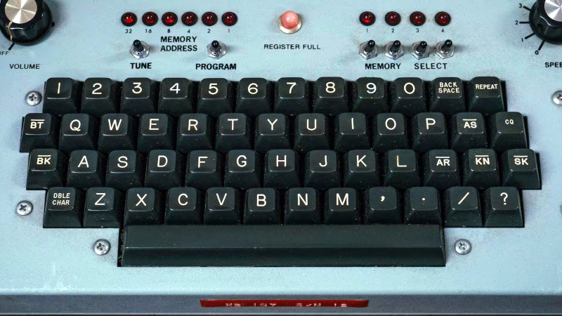
Typography enthusiasts reach a point at which they can recognise a font after seeing only a few letters in the wild, and usually identify its close family if not the font itself. It’s unusual then for a font to leave them completely stumped, but that’s where [Marcin Wichary] found himself. He noticed a font which many of you will also have seen, on typewriter and older terminal keys. It has a few unusual features that run contrary to normal font design such as slightly odd-shaped letters and a constant width line, and once he started looking, it appeared everywhere. Finding its origin led back well over a century, and led him to places as diverse as New York street furniture and NASA elevators.
The font in question is called Gorton, and it came from the Gorton Machine Co, a Wisconsin manufacturer. It’s a font designed for a mechanical router, which is why it appears on so much custom signage and utilitarian components such as keyboard keys. Surprisingly its history leads back into the 19th century, predating many of the much more well-know sans serif fonts. So keep an eye out for it on your retro tech, and you’ll find that you’ve seen a lot more of it than you ever knew. If you are a fellow font-head, you might also know the Hershey Font, and we just ran a piece on the magnetic check fonts last week.
Thanks [Martina] for the tip!


Unfortunately the company where Marcin works as Design Director, Figma, is going full-on ‘ai’ nonsense. So keep that in mind when you read his stuff.
Well, I know Gorton and Hershey. I probably need to get out more.
Was this font used on Commodore PETs or am I see (not seeing) things?
The PET used a much more angular font — Microgramma, according to r/identifythisfont.
It was not used on the Apple ][ keyboard either – but at least the keys are molded !
I don’t recognize it because in my country first we only had chinese famiclone keyboard “computers” (like GLK-2001) and then we jumped straight into equally shitty A4tech and Manta keyboards used with x86 PCs brought from German e-waste dealers.
Wow, these keyboard famiclones are now collectibles! 😯
Sorry about the poor keyboards, never heard of Manta but A4tech rings a bell.
In the 90s, Cherry keyboards were quite popular in my country.
Speaking of, I hope these x86 PCs still had German software on it, at least.
So you guys had the chance to learn a language from a developed country. ;)
(Just kidding, please don’t take it too seriously.)
This font will probably work pretty well for 3D printing too. I will have to try it out next time I need to print something with text on it.
Nah- these fonts and the knob dials came as part of Letraset!
This is really interesting to me because I’ve been thinking about exactly this for the last few days. In my mind I call it the “bakelite look”. That font, that exact black plastic and the profiles of the parts having that geometric curve look. Nowadays things are all extruded rectangles with fillets and sometimes rounded corners. Ie. The “CAD look”.
Ugh this comment system that tends to put your comment as a reply somewhere random despite your knowing best efforts and quadruple checking.
If you read the full story, Letraset came much later, but is part of the lineage.
It’s gorgeous! But that’s nostalgia speaking, not typographic expertise :-D
I can’t thank you enough for linking that article. I have been looking for “that font” for ages, now I finally know why it always escaped my digital searches. It’s nature is mechanical.
The list of digital recreations listed by [Marcin Wichary] should be enough to satisfy my lettering needs for the time being.
I dislike anything other than sans serif fonts. Have you noticed how the fonts used on many no-name Chinese devices with LCD displays use ugly serif fonts? I’ve wondered if their apparent preference for those ugly fonts is because their written language is nothing but serifs. It can’t be copyright related because they typically don’t honor those and, anyway, there are plenty of license free sans serif fonts to chose from.
It’s all a matter of personal taste.
I personally find sans serif fonts ugly. They don’t distinguish well between l and I and other things.
Serifs make printed letters clearer.
I expect my preference for serif fonts comes from having read literally thousands of books and magazines.
Books are a completely different story, and they were obviously not meant here ;-)
I can only agree with Winston – I’m also familiar with those small LCDs on some cheap devices that communicate their messages using serif fonts. Due to the low resolution, they’re usually completely pixelated and have odd proportions. I don’t see the point either – just a clear lack of aesthetics on the part of the developers. Call that personal taste ;-)
Arial. 😺
If it’s downloadable, you should link it!
https://www.ffonts.net/Gorton-Digital-Regular.font
I’m not sure if it’s public domain (if it isn’t by now, that is a crime) but here’s an open-source version:
https://github.com/dakotafelder/open-gorton
But is there a set of stroke paths available for using in a CNC mill? Something like the Hershey font.