It’s often said that what’s inside matters more than one’s looks, but it’s hard to argue that a product’s looks and its physical user experience are what makes it instantly recognizable. When you think of something like a Walkman, an iPod music player, a desktop computer, a car or a TV, the first thing that comes to mind is the way that it looks along with its user interface. This is the domain of industrial design, where circuit boards, mechanisms, displays and buttons are put into a shell that ultimately defines what users see and experience.
Thus industrial design is perhaps the most important aspect of product development as far as the user is concerned, right along with the feature list. It’s also no secret that marketing departments love to lean into the styling and ergonomics of a product. In light of this it is very disconcerting that the past years industrial design for consumer electronics in particular seems to have wilted and is now practically on the verge of death.
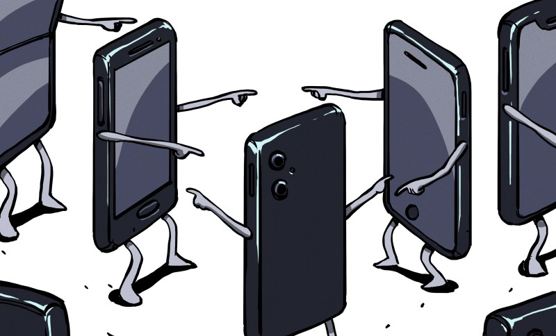
Devices like cellphones and TVs are now mostly flat plastic-and-glass rectangles with no distinguishing features. Laptops and PCs are identified either by being flat, small, having RGB lighting, or a combination of these. At the same time buttons and other physical user interface elements are vanishing along with prominent styling, leaving us in a world of basic geometric shapes and flat, evenly colored surfaces. Exactly how did we get to this point, and what does this mean for our own hardware projects?
Bold And Colorful Shapes

Industrial design is less of a science and more of an art, limited only by the available materials, the constraints of the product’s internals and the goal of creating a positive user experience. Although design has always played a role with many products over the millennia, these were generally quite limited due to material and tooling constraints. As both plastics and electronics began their stratospheric rise during the 20th century, suddenly it felt like many of these constraints had been removed.
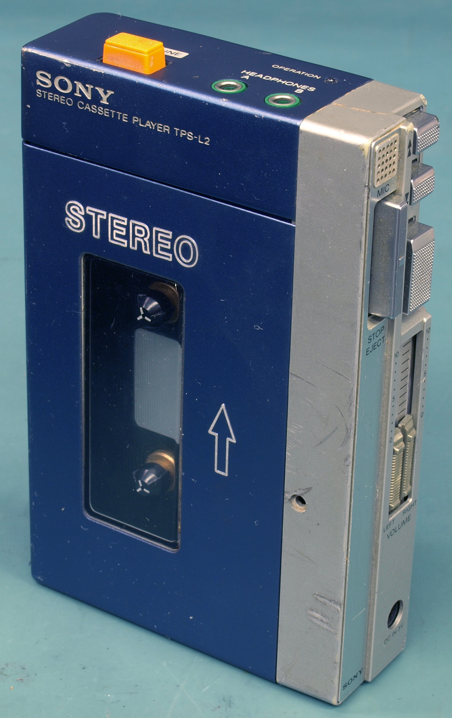
No longer was one limited to basic materials like stone, metal, wood and paint, while internals got ever smaller and more flexible in terms of placement. Enclosures now could take on any shape, while buttons, knobs and dials could be shaped and placed to one’s heart’s content. This change is clearly visible in consumer devices, with the sixties and subsequent decades seeing a veritable explosion in stylish transistorized radios, home computers and portable entertainment devices, with industrial designers getting the hang of all these new materials and options.
The peak here was arguably achieved during the 1990s and early 2000s, as electronic miniaturization and manufacturing chops led to device manufacturers basically just showing off. Personal Hi-Fi systems and portable devices along with computer systems and laptops grew curved, translucent and transparent plastic along with a dazzling array of colors.
These days we refer to this era as the ‘Y2K Aesthetic‘, which was followed around the mid-2000s to early 2010s by the sweetly named ‘Frutiger Aero‘ era. During this time both hardware and software underwent a transition from mostly utilitarian looks into something that can be defined as tasteful to over the top, depending on your perspective, but above all it embraced the technologies and materials in its industrial design. Futurism and literal transparency were the rule, as a comfortable, colorful and stylish companion in daily life.
From Brick To Slab

Ask someone to visualize a Nokia 3310 and even if they’re born after 2000, there’s a good chance that they will be able to tell you what it is, what it does and what it looks like. Then ask that same person to describe any modern cellphone, and while the feature list should be quite easy, asking them to draw what differentiates, say, an iPhone 16 from a Samsung Galaxy S25 is effectively impossible unless they have memorized the layout of the cameras on the back and perhaps the side button placement.


Over the decades, cellphones have seen their displays grow larger and larger. With voracious appetite, these displays have consumed bezels, front speakers, keyboards and home buttons.
Along with the demise of these features, front facing cameras were only preserved by literally punching a hole in the display, but notification LEDs vanished right along with headphone jacks, IR blaster LEDs, swappable covers, removable batteries, etc.
The current scuttlebutt is that Apple will be the first to drop any and all connectors from its iPhone cellphones, with the iPhone 17 reportedly nearly becoming the first to do so. Along with eSIMs, this would leave smartphones as glued-together slabs of plastic-and-glass with only a screen, some cameras and a couple of buttons.
In marketing shots smartphones are always shown with a lock- or home screen open on the screen, because otherwise there would be just a lifeless black slab of glass to look at from the front. From the side you can see the same slab, which easily wobbles on its ever-growing camera hump that’s sticking out of the razor-thin case like a bad case of optical melanoma. At this point in time, the most exciting thing about cellphones is whether it can flip or not, followed by whatever subdued color is applied to the slippery glass back that you want to cover up with something concealing and grippy as soon as possible anyway.
Naturally, it’s not just phones either, but also computers, with the iMac’s evolution showing a clear ‘evolution’ from colorful and bold designs to geometric slabs:

Whether you call it ‘modern’ or ‘clean’ design, the trend is quite clear. Curves are removed, colors are purged or at the very least muted and the overall design reduced to the level of excitement experienced while being stuck at an Ikea showroom during a busy weekend with the family.
Lifeless Slabs

There was a time when televisions had a recognizable look to them, with a stylish bezel, a real power button, as well as a couple of front input connectors and buttons to adjust basic settings like volume and the current channel, which could also be hidden behind a small flap. This is now all gone, and TVs have become as visually striking from the front as modern smartphones, with the speakers fully nerfed since there’s no space on the front any more.
All inputs and any remaining controls are now hidden on the back where reaching them is borderline impossible after installation, never mind if you mounted it on a wall. You’re not supposed to find the TV visually appealing, or marvel at the easy user interface, just consume whatever content is displayed on the bezel-less screen.
The rest of any home entertainment setup has undergone the same process, with the HiFi stacks and mid-sized sets of yesteryear replaced by the same smartphones and TVs, along with a bit of plastic that you can stick into a slab TV to stream content with from some internet-based service.

Rather than a stereo – or better – HiFi setup, most people will have a bunch of usually mono Bluetooth speakers scattered around, each of which possessing the visual appeal of a radar dome. If you’re lucky there are still a couple of touch buttons to fondle, but virtually all of your interactions with such devices will go via an app on your slab phone.
Touch controls are also all that you will get these days, as physical buttons, dials, sliders and switches are almost completely faux pas in modern-day product design. Everything has to be smooth, stealthy, invisibly present and yet always there when you crave that entertainment fix.
This design language isn’t just afflicting home electronics either, as over the past years car interiors have seen physical user controls vanish in favor of one or more touch screens, with cars like those from Tesla being the most extreme example with just a single large touch screen on the center console as the sole user interface. Users are however pushing back against this change, with a number of studies also showing that touch-only controls are less effective and less safe than fumbling around on a big screen while driving to adjust something like the climate controls or radio station.
There Is An App For That
Want to set up your new formless slab of plastic or fabric? Please download this special mobile app to do anything with it. Got a new pair of headphones? Better pray that the mobile app works well on your slab phone or you’ll be stuck with whatever preset defaults it came with, as physical controls on the device are for dummies.
Whether we like it or not, the human user interface part of industrial design has been mostly taken out back and replaced with software running on a slab phone. Whatever vestigial controls still remain on the device itself will only be a small subset of what its electronics and firmware are capable of. The slab phone has thus become the user interface, with that part of industrial design often outsourced to some third-party mobile app developer.
This has massively backfired for some companies already, with Sonos in 2024 releasing a ‘new and improved’ version of its slab phone app that was so buggy and plagued with issues that it rendered the Sonos speaker hardware effectively useless. While physical user interfaces have their issues, sinking an entire company due to a badly arranged set of knobs is not as easy as with a slab phone app or equivalent, not to mention the potential to retroactively brick the user interface of devices that people have already purchased.
Yearning For That Human Touch
Here we can see parallels with computer user interfaces, where much like with industrial design there’s a big push to reduce shapes to the most basic geometric forms, remove or reduce color and remove any ‘superfluous’ styling including skeuomorphism. These parallels are perhaps not that surprising, as companies like Google, Apple and Microsoft produce both consumer hardware and software.
Google, for example, has heavily invested in its Material Design design language, which can be summarized as having flat color backgrounds with the most simplistic UI elements suspended in said void. UI elements like the ‘hamburger’ icon are used to hide menus not just on phones, but also on desktop systems, where a form of extreme minimalism is being pushed to its ultimate extremes.
In the case of consumer electronics that means devices that lack any distinguishable features, as minimalism is a poor way to distinguish one product from another. The removal of visually pleasing and physically practical elements also means a dull, stimulation-free experience.
There are no pleasing elements to rest your eyes on, no curves or colors that invoke an emotional response, no buttons to press, or any kind of auditory or physical response. Just lifeless touch controls on slabs of plastic and glass with maybe a sad beep as confirmation of a touch control having been triggered.
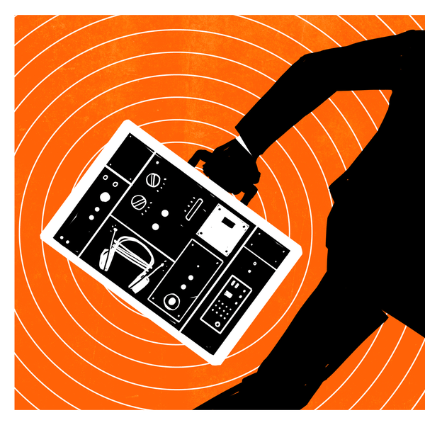
In this context, what is often called the revival of physical media can be interpreted as not just a yearning for a more visceral audio-visual experience, but would together with so-called retro-computing be a way to experience personal electronics in a way that stimulates and invigorates. Where physical buttons are pressed, sliders slid, dials turned and things go click and whirr as one’s fingers touch and manipulate the very real user interface elements.
We know that chronic boredom can be extremely harmful to non-human animals, with enrichment toys and activities prescribed to make them happier and more content. With modern day consumer electronics having become incredibly dull due to the death of industrial design, it would seem that us human mammals are seeking out our own enrichment activities, modern design sensibilities be damned. If this means repeating the sins of early 2000s or 1990s industrial design in our personal hobbyist projects, it’s a price worth to pay for keeping ourselves and our fellow humans happy and enriched.


I completely understand the desire for our artifacts to be beautiful, but when it comes to some of them like my phone, I want them to disappear. I want the aesthetics to be in the “world” that lives inside the device. I sometimes think the discussions about phones being boring doesn’t really consider the idea that what most of us care about is the inside not the outside
virtual is the new real
Apes smoothly touching a slick rectangle?
https://storage.googleapis.com/thehundreds/media/2018/09/giphy-1.gif
Nah–that’d never happen….cought
The cheapest smart phone
https://tvtropes.org/pmwiki/pmwiki.php/Main/TheMonolith
it’s like worrying what colour the outside of a telescope is painted :-D All the good stuff happens on the inside.
I love this analogy!
Thanks, they’re mainly used in the dark too, so even less of a worry about the tube colour.
And yet, telescopes DO often have distinctively finished tubes. The tube’s appearance is what you’re left with during the day, when the (astronomical) telescope has no purpose and just takes up space. A telescope’s tube is like a phone, tablet, or laptop’s background or screen saver.
Still, usually white. In the day they don’t get as hot, at night you don’t bump into them.
Still this is the main point of discussion among amateur astronomers (besides the fights to death between lens-lovers and mirror-lovers) Ask me ho I know it :)
Using a Victorian era steampunk looking telescope is a pure work of art.
But if it wasn’t functional I wouldn’t enjoy using it.
Tho, I do prefer to put modern Televue eyepeices in the century-old scope. :)
Remember the Questar tabletop Maksutov, a 3.5-inch scope priced like a 12″, with the start chart printed on the tube?
Like right to repair. More insides than one can shake a stick at.
Nah I want keyboard phones brought back. Miss my N900
YES! Id much rather a compact qwerty slider over a minitablet pretending its a phone.
This is why I’m always watching what Unihertz is doing with their phones, because they’re actually trying to build phones that fall through the cracks of modernity. I’ve backed the Titan II on Kickstarter specifically because it’s a modern-enough Android phone with a form factor reminiscent of the Palm Treo or the full-keyboard Blackberries.
I would love to see a modern phone using the old HTC Dream (aka T-Mobile G1) form factor, though, or the Danger Hiptop (T-Mobile Sidekick).
When design meant something
https://www.smithgroup.com/projects/general-motors-design-dome
https://www.hemmings.com/stories/the-art-and-colour-of-gm/
That’s a feature and not an artistic design element though.
It’s the same as asking for a headphone jack or removable battery, great things but features not ‘design’.
Either a keyboard or controller inputs like the Xperia Play. I prefer devices with a gimmick, personally. But when we get those, Planet Phones comes to mind, they’re so expensive now. :(
Size isn’t an issue for me, because I have a purse I can toss it into.
I was (and to an extent, am) such a keyboard bigot that I even purchased an LG Mach specifically because it was the LAST phone Sprint ever sold that had a slide-out keyboard.
But you know what ended the life of that phone? The ribbon cable connecting the keyboard to the rest of the body flexed itself in half after too many slides.
EVERY phone I ever had with moving parts, those parts ended up setting the i limit on its lifespan. My flip phone? Hinges cracked. (Also happened to two of my laptops.)
Meanwhile, the phone I’m writing this on is a Samsung A53 that I bought 2.5 years ago, and I have no plans to replace it any time soon because it’s still in practically-new condition. I will most likely use it until the battery fails, and then I’ll have to decide between replacing the battery and getting a new phone.
As much as I hate to admit it, moving parts and physical interfaces are points of failure for personal electronics, especially portables.
If you are willing to change a battery not meant to be user removable you should be willing to replace a worn flex for the keyboard etc. All these glued shut battery powered devices have a limited lifespan likely better measured in months over years anyway (but of course your usage will make that better or worse) so having some moving parts that might wear out enough to matter in roughly similar time (again usage dependant) isn’t a big deal. Epically if the thing is built to be maintained..
“All these glued shut battery powered devices have a limited lifespan likely better measured in months over years anyway”
Well, that’s absolute nonsense, what are you basing that on?
“If you are willing to change a battery not meant to be user removable you should be willing to replace a worn flex for the keyboard etc.”
It wasn’t a matter of willing, I’m willing to do a lot of things when I have to. But the thing was like 2″ wide and carried about 50 needle-thin wires. Where would you even get a replacement for what was clearly a custom part? And assuming you could find a replacement, what are the odds you’d be able to install it correctly without breaking either it, or some other part of the device? Maybe for you, they’re incredible. For me, they were poor at best. I know my limitations.
Replacing a battery, past the ungluing, is usually a matter of pulling out one 2-wire connector. It’s not even in the same LEAGUE as repairing a side-slider’s main bus connection between the two halves.
I feel like that fails to account for a great deal, while being pretty accurate. As your use of phones might make that entirely true for you, but between the desire for nice HID options for a specific though perhaps more niche task that keeps the phones with keyboards (etc) in production. Or the folks that want extreme minimal zero distraction pure communication only devices. Or the really small very pocket or perhaps soon wrist mounting friendly full featured devices that for lack of screen real estate must get more creative as you can’t consume 1/2 the screen to bring up the contextual HID the way you can on a larger slab. Not to mention some folks are trying to use them like a real computer so the folding screen devices grab them etc.
There is plenty of room for more interesting design choices in the mobile phone world, especially IMO with the new generations of folding phone, as that gives you the option to have almost anything on the outside clamshell closed mode with the ‘disappearing’ device that just lets you at the world inside being available when you open it. So I’d love to see a much more 2000’s buttons you can operate by feel approach on the outside for instance.
I’m not interested in allowing companies to sell those features back to me on a device I already own. I don’t care how it looks. I just want it to be functional and more so than the last version, not less.
I want the smartphone to disappear. So unimaginitive.
A black pocket mirror with almost no physical buttons.
It’s not design, it’s anti-design. Lack of any design. Minimalism at its worst.
The wheel of the original iPod was at least being inspiried by the Braun SK2 radio, which had a bit of elegance, still.
The smartphone did more harm than good, imho.
More than often it has become an addiction and stops people from thinking of their own or make them lift their heads.
It turned people into Smartphone Zombies (Smombies)..
I think I fully understand this comnent and that is why I am extremely worried.
Just because what people are willing to accept from a phone. No more user control but limitless walled garden opportunities and gaslighting + cutting attention span for profit when all the control is given to external entity wanting to earn bit more than last year.
Imho it is telling that social media companies are definitely not using their own products but focus on all the mundane real world stuff if they want to get most from their employees.
“While physical user interfaces have their issues, sinking an entire company due to a badly arranged set of knobs is not as easy”
Not as easy, but it is possible. Consider the Coleco Adam, a home computer system so poorly designed it was a major factor in the company’s failure.
Mind you, they had to make some EPICALLY bad choices to pull that off. Like putting the power transformer for the entire system inside the PRINTER, so you couldn’t use any of it without the printer attached.
And this wasn’t supposed to be a reply to Jock.
Apple seemed to do ok with some dubious purser supply decisions.
I think the phone was a bad example. I understand why it was chosen (ubiquity), but phones were not being designed to be ornate. From the beginning, the industrial design of phones was all about making them less cumbersome, as they are a thing you have to handle frequently and carry in a small bag of even in your pocket.
A better approach to this discussion would be examine industrial design from a broader perspective, looking at the homogenization of interior decorating, architecture and cultural artifacts. It is demonstrably true that our world is becoming blander and blander as time goes by.
Ask any repair tech: if there’s a button to push or a knob to twist, someone will do that enough to need repair. Try that on a new IPhone. No buttons and reset boot generally returns default options.
Umm… there are still buttons on the iPhone, even the latest one. https://macreports.com/how-to-locate-your-iphones-buttons-and-what-they-do-when-they-are-used/
That’s why they should be easily replaceable. Getting rid of them just makes for bad user experience.
Yeah, things are usually a bit easier if they are completely featureless and bland and homogenous
No, just no. I’ve repaired my fair share of electronics, and basic use of buttons has never been the cause of failure. Foreign objects, liquid, corrosion, and abuse.
The finger print reader on my wife’s iPhone went tango uniform last year, and since that was also the home button and the only way to turn it on, it effectively made it completely useless. So no, having no buttons does not result in longevity.
A lot of this is driven by a single consideration: Is form following function? Slab phones don’t look the way they do because people want them to look that way, they look that way because any departure from the basic form will make them bigger, slower, or more awkward. The millennial explosion in cool design happened largely because miniaturization was ahead of the needed functionality curve, so designers had room to play. This was not true for example in the 1980’s, when if you wanted to market a computer that could be used at all (especially a portable one) you didn’t have a lot of options to play with if you wanted it to work at all. And barring some new leap in technology, like the transition from CRT’s to flat displays, we’re probably stuck with how things will look now for the foreseeable future.
That’s kind of Maya’s thesis: form has followed function down a dark alley, and gotten it’s lunch money taken.
Indeed, by taking the ‘larger display is better and bezels are evil incarnate’ concepts as gospel, there is no form left to play with. The only form left is a display with some camera modules glued to the back and one poking out through the display. There’s no ‘design’ happening any more from that premise.
There’s no form to play with because there’s no function that requires a bezel or nubs or hidden space. I think this is a good thing! I want my phone or monitor or tv to disappear except for what I need it for.
Exactly, “make the screens as big as possible” and “remove everything that isn’t screen” are two separate concepts. I’d be perfectly happy with a 4″ to 5″ screen instead of the giant 6″+ displays that every smartphone has these days, but I wouldn’t want that size to be replaced with bezel and buttons, no matter how snazzy the design; I want the overall product to be smaller to fit in my pocket. Beautiful industrial design is great but only so far as it doesn’t interfere with the experience of using the product.
I bought an older model phone solely because I could not find a new model that didn’t have a camera hole in the display. A featureless expanse of infinitely variable pixels is all I require of a screen. A screen is like a sheet of paper, and anything that never goes away is a blemish.
There are Android phones with 3-4 inch high resolution screens available. The issue is that they only carry half the battery, so they barely last a whole day of use even when new.
And why is that a bad thing or something that we should be waxing nostalgic for?
If we want unique designs and interesting to look at devices then them being as stripped down and uniform as possible makes it super easy to customize them with cases, stickers, 3D printed doohickeys or anything else.
Devices used to be unique but they were also much much worse for it.
And here form follows a very particular function. I found notification leds very useful to know what is going on without even needing to light up the screen. Bezels are protective, and really, not that much of a bother. Front camera notches are an abomination that makes a slightly larger screen, but in a way that it is significantly worse, right where you are expanding it.
Kind of ironic how the bezel-hating crowd are effectively BUYING a bezel for their phone every time they buy a protective case.
Remove the bezels, then charge separately for them, and everybody is falling for it…. Genius!
Yes, because you can choose to have it or not, and you can replace it when it gets broken. I personally only use an extra glass and nothing else. I don’t care if the back cover gets dinged up.
If the bezel was built-in, you’d have to cover it with yet another bezel to keep it from scuffing up, and then your phone would be double plus big.
I turn off the notification LEDs because they’re going to be burning battery and mostly flashing when I’m not looking at the phone while it’s in my pocket, so 99.9% of their action goes against my purposes. When I am looking at the phone, I don’t need a flashing LED to notice the notifications.
Yet every time there’s a system update, they turn the bloody thing back on.
Nah, it´s just convergent evolution.
I was scrolling down to see if anyone mentioned “form following function”, especially after seeing the Razr phone above. I frequently drive a tractor and am often outside doing dangerous enough stuff in the countryside, on my own. My monster Samsung phone of course slid out of my pocket and I ran over it with the tractor, did not survive, banana shaped.
So I sought and found a phone whose function satisfied my needs – to withstand being run over (on grass, mud I hasten to add) dropping into rivers etc, but basically to be there if i need sudden help.
Cat Flip 22. Cut down android, smart phone – is a wee bit heavy, I’ll admit. FFF is still out there.
Nobody is preventing you from using CRT, just be prepared to pay five times as much for energy. There are even companies in Russia remanufacturing old CRTs into new units with warranty.
This isn’t about CRTs. There were many LCD and Plasma TVs that featured a similar front IO and speaker arrangement.
Front IO was useful when people needed to plug in their VHS camcorder or nomadic game console, they would be almost completely vestigial today.
TV speakers have always only needed to be ‘good enough’ for regular viewing and backfire speakers work well while letting the TV be narrower and easier to fit wherever you might like. The death of side speakers, allows for people to place their own nearer or have more space for artwork in the room.
Front IO is never going to be vestigial, though often these days you have to fake it with extension cables as the manufacturers think it is… It is just too convenient even if you don’t need it every day in this age of ‘smart’ screens and expensive streaming services! I wish I had some front IO on my monitor, as then I’d not need the HDMI splitter that thanks to all the EDID ‘smarts’ is always going wonky. I’d be able to just plug in all those lesser used devices and the stuff being worked on my desk into the front IO (if there was enough of it) only while I was using that device…
And the death of good integrated speakers as an option on TV’s isn’t to make the TV easier to put anywhere, it is so they can sell you a soundbar to get adequate sound…
Don’t get me wrong speaker less or troubleshooting/backup only rubbish speakers in a screen is a fine thing to have as an option – It is what I’d pick for myself as I already have a decent Surround Sound audio system to hook it up to. But at the same time those old screens that came with darn nearly if not actually Hi-Fi quality speaker are a great option for space and budget constrained folks – no need for the another boxy amp, the speakers etc when this very slightly chunkier TV can manage to fit a really good sound system inside.
Good integrated speakers need depth to work properly. They’re not easy to design or manufacture in a TV that you’re supposed to be able to hang on a wall.
And the external speakers/soundbars aren’t actually all that good either. They’re actually kinda rubbish for the most part. THAT is intentional, to make you buy one, and then buy a proper set of active speakers.
@Dude I did say adequate, not good sound… Adequate isn’t all that hard to get in a small space, especially if you do the sane thing of pointing the speakers at the viewers rather than the floor/wall behind the TV. But doing that does require some bezel…
Though I have seen some impressive reviews of some of the more recent high end beam forming, room mapping soundbars with separate subwoofer that might just best at least some of the older dedicated SS amps and speakers (if only because simulated though the rear channels will be none of the source audio has been compressed as used to be true given much lower bandwidth).
My TV points the speakers down, and the stand is shaped like a compound curve to radiate and reflect the higher frequency sounds evenly around the room, instead of just straight ahead with constructive and destructive interference creating “dead” spots – as is usual for tiny point-like sources.
That sounds rather like pointing the speakers at the viewers to me still – just a somewhat novel construction of the speaker, and one that is a bit fragile with how many folks want to mount their TV to the wall, or at least raise/lower and rotate it around etc. But still way more effort put in to create decent enough sound than most TV do these days now they have focused so much on thin and bezel reduction.
Yes, but in a way which doesn’t require a bezel, and which is better than just having two speaker grilles next to the screen pointing at the viewer.
Of course it fails somewhat when you hang the TV up on a wall, but it still works adequately because now it’s bouncing the sound off the wall just under the TV which isn’t blocked by the screen like with regular rear-facing speakers.
And why would the type of TV that you’re using cause your price per KwH to go up?? Sure, energy consumption may increase, but you’re not going to pay “more” for that energy….
Many utilities charge more per kWh beyond a certain threshold. My family house is treated like a duplex, but the utility charges us as a single household – so our ‘family’ of 5 with two kitchens, electric water pump, and electric heat is often in the top bracket of households and charged the max per kWh.
i’m amazed there’s still so much variety in laptops. i haven’t looked inside a high-end laptop in a long time but i have the impression the bottom half of every laptop is the same…a hollow plastic case, a rectangular prism about 9″x13″x0.5″, give or take. but every vendor has a different game they play with the edges and corners. symmetrically rounded like a half-cylinder parallel to the edge like my wife’s hp, or coming to almost a knife’s edge like a classic macbook air, or (mine) asymmetrically rounded almost like the bottom sheet is a shallow bowl, or crisp right angles like a thinkpad or pixel chromebook. almost irrelevant because all that’s inside is like a 3″x4″ SBC, a little cooling solution, and a custom-sized pile of prismatic lipo cells. but the tiny details of the shape still make a powerful first impression.
Well Lenovo is slightly different, it’s a magnesium case, and the styling changes very slowly, like an 80s or 90s BMW (I have a hunch the buyers of one would also be shopping for the other). And the X or P line-up could be likened to a V12 model.
So your saying a X or P Lenovo is an unmaintainable money pit garage ornament?
Well there’s the “butterfly keyboard”.
Some of those early 2000s / Y2K designs were truly awful though. Buttons that were all different sizes, which collected dirt in them and got stuck. Plastic cases with the cheapest plastic and the cheapest matte silver paint, or else that gummy rubber coating that liquified within 2 years. And everything is a clamshell!
Peak phone was probably around 2015, whenever they started to make beveled glass edges you couldn’t hold without touching and got rid of the SD card slots and headphone jacks. At least USB-C turned out OK (at least as a phone charging cable. It’s other features are questionable.)
Its (possessive). scnr. Always a eye sore when native speakers trash this one.
Everyone makes mistake’s, friend.
Goe bak two reddit.
I think you are right. The only people that look at those old designs and think, they were so much more unique and fun, are people who are wearing rose tinted glasses. They were awful.
The beveled glass edges I’ll give you as a design concern but everything else are just features that I think we could still have with our current ‘designs’ but they just striped away to make things easier and cheaper for themselves. I’d be happy to have a glass brick with an SD card slot and headphone jack.
“All generalizations are false”
Cars are kind of the same, now. Mini-SUVs all look the same except for things like the shape of the lights; all the sedans and coupes are the same; the minivans and pickups and full-size SUVs …
I miss the mid-70’s Monte Carlo, everything from the 50’s and 60’s, all the ordinary cars with style.
Sure, I understand that the function now includes stricter requirements on efficiency and safety, and all the interesting details have been ground away in that interest.
I’m not even really a car guy, but I miss interesting cars.
Yep… The variety of shape is mostly gone. All there was a time when you could lean against or stand on a vehicle without denting it.
2 things:
If the vehicle doesn’t crumple, it is just passing whatever forces from what you hit (or what hits you) into your body.
Secondly: using more material than is necessary to maintain the shape against the wind is actually wasteful. You will have to spend more for the vehicle, both in materials, and the tooling needed to stamp thicker metal, and the fuel or energy needed to accelerate it. I only lean on cars along folded edges or corners where the metal is better supported, but you could in theory bond a support behind a large ‘flat’ metal panel and keep a light weight and the ability to lean on your car*.
*You might note that Pontiac/Saturn/Corvette had quite a few models with entirely ABS(?) panels that simply popped back into shape, as they didn’t carry any of the chassis loads.
The idea that crumpling is a necessary feature of vehicle design is misguided bollock pushed by never-satisfied menagers of automotive companies in Korea and Japan. The notion that a car must absorb impact energy through crumpling is simply rooted in their failure to produce thicker steel at affordable prices. Seriously. It’s not easy when you’re an island nation without natural resources (unlike the USA). What if we designed vehicles to be inherently strong, resilient and capable of withstanding impacts without compromising the integrity of the passenger compartment? A vehicle that doesn’t crumple can be engineered to instead dissipate energy by destroying obstacle it was passing through. It’s not 1980s anymore where we can choose between Ford, BMW or paper-thin Mazdas. By utilizing advanced nano-materials and structural decisions it should be possible to enhance vehicle safety without sacrificing performance.
and if the other object is another car? and the whole point of crumble zones is to keep the passenger compartment intact and use everything else to slow down slow enough to not make the passengers mush
Woof ok lot to unpack here.
Weirdly racist start to all of this. Crumple zones were neither invented nor popularized by Japanese or Korean automakers.
This supposed failure in steel production and cost-effectiveness is pretty hard to believe given that Nippon Steel owns US Steel now
How exactly do you think a car destroys a bridge abutment, or a building, or heck even a decently-sized tree in a 30mph collision? Where’s the energy going in those cases?
If all cars are made of magical super-nano-steel, how does a collision between two of them work? Do they both annihilate each other like a matter-antimatter collision? That may be a concern for bystanders, considering that a collision between 4000 pounds of matter and 4000 pounds of antimatter releases 78 gigatons of energy
How is magical super-nano-steel cheaper to use than it is to just replace cars after accidents?
How do you defend the morality of choosing to destroy whatever arbitrary object you collided with, in the interests of saving on repair costs? What happens if you t-bone a school bus? How about if you drive into bollards separating pedestrians from cars?
And what happens when you crash that battle tank into another one or any practically indisputable immoveable object at high speed? If the car can’t crumple even a little bit you are going to feel the entire collision as a single large impulse that almost certainly breaks bones if it doesn’t outright kill you. Where just spreading that out over a few fractions of a second and you could well walk away uninjured at all – the passenger compartment is typically made to be as crumple resistance as practical so you won’t be having your legs mashed but the peak forces are reduced meaningfully by the crumple.
Ah, motivated reasoning in action. What a beauty.
Going through obstacles works… until it doesn’t. All SUV/pickup “safety through size” bullshit relies on you forgetting that even in an Hummer EV you remain a very small and light thing on the road. A semi is multiple tens of your weight, and structured to deal with forces generated by 50 tons of cargo on a continuous basis, with generous reserves. You will not go through that, you will not stop it. If you are lucky, you will be light enough and be hit in just the right angle to bounce off it.
Physics does not care for your barely concealed racism.
“If that pedestrian didn’t want to be killed, they shouldn’t have been in my way!” as you drive over the footpath while looking at your phone as you snapchat your mistress.
This is also why there wasn’t a revolution in automotive safety brought about by crumple-zone design. And why they haven’t made guard rails and barriers that crumple in precisely engineered ways. And…
It’s not the 1970s anymore. Cars are lighter, safer, and more performant now.
I own this car!
1960 Chrysler Saratoga.
Was very popular in demolition derby, until they were banned as indestructible.
Not many made in first place.
Jetsons design…’Forward Look’ IIRC
Hence rare AF.
Impossible daily driver, drum brakes suck, 6 MPG.
Idiots wreck while looking at it, trying to figure ‘WTF is that?’, forget to drive.
Has tiny ding on rear bumper, modern car was obviously totaled, doors sprung.
Except lighter. Modern hybrids and EVs are heavier.
I’ve driven older cars without crumple zones built into the chassis. They were called bumpers then. The idea was that you’d be able to replace the bumper and the mounting point that would compress or tear off in a minor crash, so you didn’t total the entire car. You could fix the thing instead of throw it away, and even if the chassis was bent it wasn’t made of such exotic metals that you couldn’t twist it back into shape and weld it up.
All I can say is, it worked. I drove it in the ditch, the car flipped up and dropped back down, and then I drove it home without the front bumper. No injuries to anybody. Any modern car would be written off as a total loss.
The ugly truth is that the crumple zones don’t help much at higher speed collisions because the impact energy quickly grows past their ability to absorb it. At highway speeds, if you have a head-on collision with anything, you’re pretty likely to die anyways.
https://www.researchgate.net/figure/Wramborgs-model-for-fatality-probability-vs-vehicle-collision-speeds-Source-based-on_fig1_304529995
At lower speeds, seatbelts and airbags work quite well as long as the cabin stays in shape. So, it’s not unjustified to claim that “crumple zones” are more designed to make cars junk themselves in minor fender-benders.
For example of good, robust vehicle design see KIA (sic!) KLTV
yeh, now cars might as well be a dishwasher, it does what it is supposed to but no one is going be excited about it or be particularly invested in what brand name is on it
My thought as well.
Cars seem to be defined by some type of construction constraint. The side panels must be joined with the roof, 10% in, all cars have that same two roof seams, at least for the last 15 years.
Only thing that seem to change are headlights, bumpers and decals.
They tried something different with the Cybertruck and everyone hated it!
process ‘troll’ has exited with code 0
Not really lots of folks do love the Cybertruck design (I personally wasn’t one of them, but neither did I hate it). Or at least they did till it under delivered on its promises with lots of little problems reported and is from the company headed by Musk who has gone from polarising but tolerated by most, to largely hated…
That says more about you and your associates than Musk.
It says nothing about me at all, as my opinion on Musk is not in that statement at all. What is in it is the widely reported on response to the faux pas contained in his not quite tweets on his shouting platform and the DOGE chaos he headed which means he has gone to rather more actively hated rather than just polarising personality that almost nobody really really cares about. With further evidence in the case of a sudden influx of bumper stickers saying ‘I bought this before I knew he was crazy’ or trying to rebadge and hide that they are driving a Tesla…
All information about you.
You can’t see it from your confirmation bias.
Cybertruck made me chuckle, reminded me immediately of 80’s Tron. An ultra low polygon model.
It went that way because of Musk’s insistence on making it from stainless steel. A decision that had certain historical precedents that did not predict great outcomes.
Properly stainless steel is tough to cut, hard to bend, difficult to weld, easy to crack etc. so they had to make the folds very simple in order to make it work at all. However, they still had to make compromises on how stainless the steel was in order to make it workable, which then resulted in corrosion issues.
“a number of studies also showing that touch-only controls are less effective and less safe than fumbling around on a big screen while driving to adjust something like the climate controls or radio station.”
There is something wrong with this statement, it does not say what it’s trying to say.
Sorry, my previous comment wasn’t supposed to be a reply to you, Dude.
The Delorean is also stainless steel, and yet somehow managed to still look stylish as all hell (even though it’s incredibly unreliable, something else it shares with the Cybertruck)
Is it stylish because it appeared in a movie and it’s now part of nostalgia?
For the point of it, the DeLorean was more rounded and conventionally shaped than the Cybertruck. Hence, in part because of the stainless steel panels, in other part because they were using cheap non-unionized labor to make it, they had problems with manufacturing quality control and getting the panels to fit – just like with the Cybertruck.
The DeLorean was also the wrong car for the market it was aimed at, just like the Cybertruck.
I still like the compact flip phone. Nice small simple screen and buttons to dial/text. Tis the height of phone design. Then went downhill after that…
I had the Moto Razr v3. It was the best phone i’ve ever owned. Had 3 of them and rebuilt 1 from parts of the 3. It was my personal phone and the work phone was a Samsung s3. The s3 was a flat emotionless slab. Phones have only gotten bigger and more slabby since. Written on my Samsung a35.
Still using a V3i Today ;)
Appearance is important and I agree with your points. But I can’t get past function. I have all these frickin PROGRAMMABLE devices with crappy user interfaces and I can’t change them. Just need to change a few behaviors but there’s no user modifyable controls. Phone. Computer. Car.
Then there’s email that actually lets you set up rules for handling and ignores them. Yes, I’m looking at you, Outlook. Frustrates me to no end.
finally i’m in an time where i don’t feel ashamed for the design choices based on cocain abuse. it’s not dead, it finally come to a point it should’ve been 200 years ago!
I dunno, I think that the mobile phones of the 1820s had some serious design deficiencies.
They were wireless! (but not stringless or tin can-less)
Design does not exist for designs sake. We’d just call that art.
The design of a smart phone has been distilled down to its bare essentials, while still being ergonomic, easily carried and extremely functional.
Successful design could be the disappearance of anything unnecessary while still achieving usability goals. Successful design could be a bright pink phone that weighs 50lbs. Doubt it’ll be popular however.
TLDR: Some thoughts of mine about why the Internet as a public knowledge base is dying.
We probably mean different things in most points but still
A) Ergonomic? They are big slabs of glass with no border to hold it & no usability without looking at the screen (practically no usable buttons).
B) Easily carried?! Most are such large slabs of glass it’s pretty much impossible to comfortably carry them in any trouser pocket.
C) extremely functional…. Okay, stop trying to kill me by laughing my ass off.
Today’s SPhones are super computers compared to “old” actual computers but thanks to their complete lack of good functional and efficient I/O interfaces they (and their users) are one reason for the death of “the Internet”.
C1) How many comments on any platform reference/mention something without actually linking to what they reference? Why? Well, I’m pretty sure one reason is that SPhones are terrible (in their usability) at multitasking, clipboarding ;-) and many other “processes” easily done on anything with at least a proper keyboard (eg. Alt+Tab, Ctrl+C/X/V, Win+”notepad”+Enter)
C2) Copying the content of an error message? Nope, forget it – today’s SPhoners rather take a PHOTO of raw digital text data (eg. an error displayed in a (cmd)shell) instead of just copying the text or at least typing it down, thus making the actual error unsearchable.
C3) Not so sure about this’s connection to “functionality of SPhones” but even today’s help requests on non-forums like Reddit often boil down to this example: “My game crashes and I have mods but I’m not gonna tell you which ones & if I did it would be a screenshot of the FGW$%GW$%H& ModManager instead of any searchable data”
Which is equivalent to telling your doctor you have a stomach ache without telling them anything about your diet etc.
I think I could listen to this sermon on proper design decisions for a while longer, so do please carry on…
IMO a modern traditional smartphone is actually just about the worst design it could possible be, with perhaps a small exception here and there for the ones that are more than a slab with bugger all buttons – for instance the Samsung’s with the Pen interface have some great functionality.
The only thing the standard slab is ‘good’ at is being so painfully generic they are equally terrible/good at all things the impressive silicon inside is capable of – they make awful gaming devices compared to something with a even as primitive controls as a D pad and a few well placed physical buttons, are terrible and usually slower at text input compared to even the number pad multiple button presses per letter or wonky predictive text phones of the 90’s, terrible media players as you just can’t control them easily or without actively looking (other than the greater quality of screen, storage and processing to allow for high quality audio and video where the old portables with great ergonomic controls you can use blindfolded probably 480p video if they did video at all), and they even make worse telephones than many of the older mobiles too – harder to answer than a flip phone, more likely to end up with spurious input on the screen from finger or ear messing with your call before it even begins as with no bezel the touch inputs while your Grandparent tries to bring it to their head can do wild things, and generally now rather too large and slab like to actually put the microphone and earpiece in the right ballpark as well, so much more reliant of signal processing…
yeah, I kinda went of track with my comment
absolutely agree with your points (some of which are kinda identical but better explained/exampled).
since you asked – I had a little more I forgot in my previous comment. ;-) here you go
… Today’s SPhones are a retarded compromise between wanting to be able to do anything a proper computer/laptop can do (eg. large screen and whatnot) while offering no good input interface (eg. mouse+keyboard).
Ooops, forgot something here: My first SPhone was the “Samsung Galaxy 5” (not “S5”) form ~15 years ago.
https://www.gsmarena.com/samsung_i5500_galaxy_5-3371.php
It has 9 buttons and a D-Pad – I can control Winamp while the phone is in my pocket and locked (Winamp had a control interface on or instead of the lock screen).
It’s kinda egg shaped and easily fit in any pocket (for what it’s worth it still works fine today with Cyanogen mod).
(had that ^^ typed up in a reply to my own comment but then decided against actually posting it)
My favorite phone was a Samsung Glide..I think 2004…it was nigh indestructible! Dropped it on the floor at a concert, the battery flew out into a puddle of beer. Dried it off put it back in..worked fine. And it had a kb that slid out under the bottom. It was small, and the screen was small..but I could text 1 handed due to the size and ease of the device. Even in my pocket without looking.
You’re simply being a contrarian.
My iPhone fits just fine in my pocket, a perfectly normal pocket.
So here’s the thing.
Design a smart phone; just the outside, just the shell.
It would be better than the 1Hz contest. (Which I appreciate, but in a very specific way).
The use of touchscreen and lack of buttons requires human vision, though. Very inefficient.
An 1980s cell phone can be operated while being blind, by contrast.
– Sure, you cheat by arguing that modern smartphones have speech recognizion. But that’s not thanks to the physical shape.
iPhone and iOS support input devices for the blind quite well. I’ve actually sat it in on a presentation entirely run by someone who was both deaf and blind.
Your ignorance isn’t my problem.
“Your ignorance isn’t my problem.”
I see, if we run out of good arguments we’re getting personal.
Put the phone under my thumb and pinky finger nails.
Remove the ‘phone’ requirement from ‘smartphone’.
Make it just a portable computer, text device/camera and let them evolve.
I expect it all to be in the AR/sunglass frame in 20 years.
Be honest, it’s not a ‘perfectly normal pocket’, it’s a phone pocket on the side of the pants that has grown over the years with the phones.
I keep my Galaxy s22 ultra in the perfectly normal front right pocket of my jeans, though as I type this I realize that the front right pocket of vintage girbaud brand X jeans (the only jeans I wear) is certainly more suited to a smartphone than those of levis or skinny pants. Hmm maybe “sagging” is about getting tight jean pockets low enough that phones dont crunch when the homies sit down.
In other words, it’s primitive.
your first paragraph: “Design does not exist for designs sake. We’d just call that art.” is such a great example of the fact that ‘just’ doesn’t usually belong, and in fact often implicitly negates the truth.
try instead: Design exists for design’s sake. We call that art.
Your comment: “is such a great example of the fact that” is such a great example that “the fact that” doesn’t usually belong.
Design that exists for design sake is called art.
Not all design is art for arts sake.
Design for the sake of design is at best pseudo-art or ornamentation.
Art is expression and intent, not just execution.
Also see the naming. A “Galaxy S(x) Ultra” is actually a Note, it was rebranded. Also see ThinkPad L and E which look from the outside very similar to the actual ThinkPad, the T class. Trying to trade on the quality of the carbon and magnesium reinforced easy to maintain models, while inside they are built like a ‘disposible’ box store spec HP Chromebook.
Cell phones peaked around 8-10 years ago with the S8 or S9 class, the size was decent, the cameras amazing, only problem being the ‘curved edge’ display meant it was difficult to use. Glass screen protectors sold out almost immediately and nobody wanted to sell protectors, probably because they were too expensive to make. Now the “base” model doesn’t get good cameras, and the next model up is firmly in ‘Phablet’ territory.
Instead if getting 5-6mm wider screens we got 10-20mm taller screens. I have yet to find a benefit, except possibly being able to see some of your content around the simultaneously playing ads all over the apps and internet.
I love the top illustration.
Someone once posted an image of about 20 different models of SUV. All damn near indistinguishable.
Just to be the devil’s advocate: airliners converged on two designs decades ago, and for very functional reasons.
Only for certain scales of aircraft – still lots of variety in the design at the varied scales all the way down to propeller aircraft still being in use for many things. And that is something you do still see in car and even ‘SUV’ designs to some extent as not every users needs are identical.
But we pretty much don’t have in smartphone design. As for years now ever larger screens and thinner bezels and devices in total have been the darn nearly universal trend, and that is actively awful for a great many folks. There is plenty of folks out there that really would like smaller phones, phones with keyboards etc, but you can’t vote with your wallet when basically nobody makes ’em and they all raced to cease making them at much the same time.
I would love to be able to purchase a product that has design money spent on functionality…
For example. Look how many parts on a typical automobile do not serve any functional purpose. A lot of styling, which I guess is intended to sell a car, but it all has to be designed, tooled, and ultimately paid for by the customer.
A virtual interface doesn’t ensure any functionality either. My iphone doesn’t have volume controls for it’s sounds that you can adjust when they are not making sounds, so I get ear splitting message tones when I’m connected to Carplay because the tiny phone speaker needs to be turned up. A fairly simple problem to solve in software, but again, it costs money and time to do the engineering work (but it’s a nice looking phone).
Exactly.
The author is partially or even completely right! But the system logic of gadget operation is changing and industrial design requires a different approach.
This is the reason slapping LEDs inside your gaming tower is so lame. Your gaming tower (I don’t game, so maybe I’m missing something) is what it does, not the light pollution it incidentally generates.
While I don’t care for RGB everywhere madness myself there is no reason you computer can’t also be your Lava lamp. It is only light pollution if it is glowing where and when you don’t want it to, otherwise it is simply ‘nice’ decorative lighting.
Please can I have a phone with buttons on the top rather than the side, so I don’t press them by accident. Please can I have a phone that is not slippery like a bar of soap (or is that the idea – you drop it and have to buy a new one). And please can I have a laptop keyboard that does not have half-height arrow keys so my fat fingers can use them without pressing anything else.
I second those wishes!!!
Me too…. and while we’re wishing, I also want removable batteries, memory cards and headphone jacks. Hell, I’d love a phone with a proper keyboard again. An updated Nokia N900 would be ideal.
Design and aesthetics are too different things. One is more-or-less related to function, the other – related to art. In some (rather rare) examples the Venn diagram of the two intersect somewhat, however, the degree of the intersect varies from unit to unit, and at some point the economies of scale (ie, what’s the cheapest to mass produce and mass sell) simply drowns them both. Cell phone and sedan cars (or SUVs) are the two prime examples, but not the only ones, residential housing (in the US), that closely follows its even uglier twin, commercial properties.
I am a big fan of the 1980s electronics design, which grew out of the somewhat turbulent 1970s electronics designs, that were busy shaking off the whackly 1960s designs (googie architecture anyone?), that were mostly continuation/branches of the 1950s designs. However, starting with the 1990s, the recycling of the 1980s designs mostly run out of the material by the early 2000 and largely continued its downward spell ever since. The form that follows the function today is about as different as it was in the 1990s, not really; on a contrary, the last 30 years were mostly spent regurgitating the same things that were learned in the 1980s and late 1970s. GUI-bui, the SAME elements had been around for almost ever and ever, pushbuttons, dials, knobs, etc, with the only noticeable invention since then being the scrollbar (that replaced “paging”). I am talking about the concepts, not the actual implementations that vary and mimic each other (for example, the scrollbar morphed into the computer mouse scrollwheel that also doubles as a middle click).
As far as the cell phones go, they are not built for humans any more – no buttons or dials or knobs, and rather vague idea that humans have more than one finger on each hand, and more than one hand with one finger. Human hands are also shaped as squares, with stubby fingers protruding on both sides (or one side), all being the same length, spaced equally. As far as the rest of humans go, they don’t seem to have eyes or legs, are stationary creatures and sport one unblinking eye that wanders around the cell phone screen. Same “designers” seem to be moonshining designing average sedan car – the backseats are for the short stubby humans with their legs cut just below their knees (thankfully, not ALL sedans; surprisingly, compact Nissan Versa’s back seats can accommodate statistically average US adult). As far as I can tell it is still “design”, just not for the humans per se, but for the whimsical “users” who are not aware of aesthetics.
I decided on living in the past loooong ago. I use stuff that is older than me as daily drivers (my radio cassette alarm clock from 1977 for example). Sure, not everything was better back then, but I decide what parts of the past I live in.
You can kinda see the UIs plunge from Windows 7* to Windows 8 – we went from “UI that looks so awesome you need a GPU for it” to “This would easily render on a machine that ran Windows 1” – and this seems to be the new normal now. As are cars that come in silver, black, white and now an “exciting new” shade of dark gray that was last “popular” in the 1950s. Colorful cars appear to be merely tolerated, but frowned upon (ok I’m making this up). Or everything needing a SPhone app. That also tracks your behavior, sells your data and instantly stops working if the manufacturing company goes bankrupt, gets gobbled up or just feels like it.
*) I know there were Linux GUIs that looked a lot like what Vista, but years before Vista hit the market. Since I’m always running on e-waste, I’m running Gnome. Simple, easy on the resources, makes a 15 year old notebook still be snappy.
Now if you excuse me, I have to fix my VCR so I can tape that movie that’s on TV later… now get off my lawn!
+1
Sounds rational to me.
I recommend those dual VHS/DVD Recorders.
And a CRT video monitor such as Commodore 1702 or 1084.
That gives best visuals when playing back SD material,
because that’s what Composite video was made for.
But please don’t forget to stay up-to-date mentally, at least.
It’s not required to follow the latests fads, but being aware of them is a good thing.
Got both the Commodore 1701 (which is better than the 1702 – it has a monitor tube in it. The 1702 afaik has a TV tube in it. The monitor tube has much narrower shadow mask and can thus create a sharper image) and the 1084 (one of the early massively overbuilt Philips units, also with a monitor tube).
Sorry, I let it lapse mentally already. And now I can’t even read the simplest Java code my colleague writes. (however he can’t read my old school code either, and he’s doing way too much with ChatGPT, if you ask me). I prefer C or even Assembly, ideally on simple devices doing simple tasks.
Although last time I used ChatGPT, it taught me how to restore the partition structure of a hard drive whose MBR got wiped. One of the partitions was CP/M (which tells you a little about the age of the machine, but it’s much newer than you’d expect – 1990).
(the drive was working very unreliably and I could gather some information about what’s on it before disaster struck and the MBR got wiped so the CP/M partition is definitely not an AI hallucination)
The bottom line is that artistic people often get a “feeling” associated with designs and colors that are interesting. To us the current landscape is boring as hell.
Mandatory reminder, to be considered whenever the topic of touchscreen-only interfaces is mentioned: The US NAVY CRASHED A WARSHIP BECAUSE OF A TOUCHSCREEN, USS John S McCain, DDG-51 class destroyer, August 2017, near Singapore
Most of users didn
t like bezels or speakers. The TV is a display. I only miss the LEDs and usable keyboards from laptops, because these were useful.“The removal of visually pleasing and physically practical elements also means a dull, stimulation-free experience.”
Most of users are not enjoying electrical equipment, only using it. They don’t think about the design. They don’t want the speaker as the part of the living room, but it is a necessary something which is needed but better invisible. Companies know this :(
What about the wooden radios of the 1920s with their ornaments or TVs of the 1950s that looked like furniture?
I bet the owners did care about visually pleasing electronic equipment at the time.
The slate is the “Winning Design” of the smart phone. So many thing where tried, but in the end they did not win in the Market. Color and customization where tried, users liked it. But at the end of the day they bought the black phone anyway. Flips and Keyboards where offered, but at the end of the day users always wanted the bigger screen.
Users like choice, but don’t exercise them.
Blackberries and phones with keyboards were extremely popular until the iPhone showed that you can do 80% of that with no physical keys and 20% the manufacturing complexity, which translated to cost savings. The fact that it was also novel meant that you could sell a toy phone for 2000 dollars, albeit in small installments, but people still wanted them for the status symbolism.
Nowadays the screen sizes are a result of having to fit in bigger batteries to feed less optimized electronics and software, to save cost on development. They’re not a user preference.
Big screens have become a negative selling point because people can’t reach the UI elements and many are having a hard time just holding the phone. Phones have also become heavy. Premium phones are usually much smaller and actually designed to fit the user’s hand, but people can’t afford them.
None of this is about user satisfaction but selling the minimum product for the maximum price.
From the touch screen phone era I really enjoyed the initial iPhone design, abandoned with the iPhone 4:
– Well-rounded corners, edges, and curved back.
– Non-ridiculous screen size meant easy one-handed operation. Eat your breakfast and run through news, mail, whatever, with full screen reach without over-extending fingers? Yes plz!
– Size & shape also made it easy to slip into generally any pocket, resting in there fine without digging into your leg or whatever.
– If the software can present what I need in an accessible manner on a given display, why on earth would I care about bezels unless I’m building a display wall?
I get the want of a stylus. Personally I preferred the fast, less precise access of multi-touch, but stylus seems such a cool interface for the pocket computer / pda device class. I do not agree that the two need to compete directly in the same class.
I also realise that none of the above appears to match general customer preferences today, so I’ll never get a revival of that small-enough & rounded design. Can still share my fondness for it though :)
As someone who used an iPhone 4 for a few years I totally agree. Even that iPhone still has a pleasant to look at aluminium body, of course, with the distinct toggle switch to turn notifications on/off and very solid ergonomics. Plus you could drop the thing without everything on it shattering, except maybe the display if you hit just the wrong angle.
Used a Xiaomi Mi 5 after that, which honestly wasn’t bad either. All phones after that, though… yeah, no. They drop features like crazy and ergonomics are gone. Bezels are also nice to prevent you from constantly triggering the touch screen by accident when you’re just trying to hold the bleedin’ thing.
There are still ‘werido’ catering companies out there making what the big brands won’t – Unihertz is one that springs to mind, I’ve been hands on with the Jelly series and found it very well done and useable even with my giant hands (bought one to play with thinking a really small phone would be handy for something and had it stolen by my sister who really loved it). They also do a Titan series with keyboard in that traditional blackberry layout that is supposed to be good, and something I’ve been tempted by for ages but I just keep on keeping my ancient Samsung alive instead (I don’t actually need a mobile telephone very much, and I do like the pen input option)…
No doubt a few others out there making oddities as well, if you go looking for your dream device.
As I said in another comment, look for “iPhone SE”:
Pros:
– It has a reasonable size and physical mute switch
– The haptic feedback of the home button is excelent
Cons:
– It is a still an iPhone
I think the “industrial design” of modern cellphones is basically stuck on stupid.
Let’s take a device that’s hideously expensive and fragile, yet purposefully make it as non-ergonomic as possible–a thin, slick, featureless, rectangle, difficult to hold onto under good conditions (nearly impossible to hang on to if your hands are wet), so thin that if you put it in a back pocket and sit on a park bench you’ll break it in half, with camera lenses that protrude like bubble-fish eyeballs, whose delicate optics–by intent and design— come into direct contact with any abrasive surface you might set the phone on.
Lest I forget… we then take the one component of the phone that will predictably wear out (and far sooner than any other component)–the battery–and we glue it inside so as to prevent easy replacement.
Like I said, the modern phone makes for a great prop in a commercial or sci-fi movie, but the “design” seems to be driven by anything but considerations beneficial to the end user.
I see NO reason (and no benefit) for my phone to be 2 mm thick… in fact the first thing I do with any phone I own is drop it in an Otter case. If the bumpers and additional thickness were intrinsic features of the phone itself, I wouldn’t need the case, it would be at least twice as rugged, and a lot less likely to be dropped in the first place.
An intrinsic Otter-case-thick phone design would also easily allow for externally replaceable battery cards or modules. Spare me the “we glue the battery in to make it watertight” BS. Back in the day, I had a brand-new LG flip with removable battery slip off the stupid belt clip and plunge into the 8-ft section of a swimming pool. I fished it out, removed the battery, let it air dry, and used that same phone for another 5 or six years.
strange,
its almost like companies that sell you $1000+ devices they reiterate annually have no concern for the durability and longevity of those devices.
“we glue the battery in to make it watertight” BS”
My 2016 S5neo had replaceable battery, audio jack, IP64 rating and was slim enough. Not to mention whole line of early Galaxy XCover.
IP64 is not watertight. It’s “splash proof”.
I recently purchased my kid a 9 year old Android phone off eBay for $50 – an LG V20. It has every feature you’ll find on a 2025 phone and a bunch of nice stuff we were all told we had to give up so that phones could move forward.
3200mAh Removable battery (the phone is thinner than my 2025 Samsung, I thought they had to do away with user replaceable batteries so our phones could get thinner)
Dual SIM support
a MicroSD slot (expandable storage up to 4TB, more than any modern phone and much, much cheaper)
3.5mm headphone jack (I thought those had to go also)
A built-in IR emitter and remote control app (also IR sensor to allow cloning your existing remotes)
a built-in FM tuner
“Modern” phone features it also had back in 2016:
Fingerprint sensor
Three 16MP cameras with laser autofocus and 2X optical zoom
Dual LED flash
Dual SIM support
Quad core Snapdragon processor
4k/60fps video recording
2560×1440 display
USB-C with QC 3.0
Bluetooth LE
NFC (file send and tap to pay)
GLONASS, GPS
Dual band WiFi (a/b/g/n/ac)
Hi-Fi Quad DAC headphone amplifier
Oh, and it’s running Android 14
Phones truely have not changed in the past decade. They’ve honestly gotten worse.
“every feature you’ll find on a 2025 phone”
Except 5g service.
Or security
“LG V20’s last official software update was to Android 8.0 Oreo.”
“Android 8.0 Oreo: Latest security patch date October 2021”
There are page upon pages of unpatched and disclosed vulnerabilities, starting from Feb 21:
https://source.android.com/docs/security/bulletin/2021-02-01
Month after the last patch starts with:
CVE-2021-0325 Media Framework, Remote Code Execution. (critical) – h264 video decoder exploitable.
4G is fast enough, especially LTE Advanced. 5G is already at the point of diminishing returns, not to mention 6G (if it even materializes, hopefully not).
People that think a product’s appearance doesn’t matter compared to its functionality have never had to get dropped off in front of the school with your friend in his mom’s AMC Pacer.
It got you there reliably, but you wish it had broken down or exploded on the way.
In the case of my friend’s mom’s AMC Pacer, it unfortunately caught fire right out in front of school.
You were lucky if your parents car was more embarrassing than your parents.
We don’t have much space to play with design but I’m sure we could fix ergonomics? I would really like to have more options of reasonable sized smartphones. And grip should not be inspired by oversized wet soap. Buttons are not bad idea (mute switch is really useful).
Look for “iPhone SE”, which has a reasonable size AND a physical mute switch.
I think that the way some people leave all the feature advertising stickers on the edge of TV’s and on laptops could possibly be a need for more decoration.
As for phones: there is a wide range of phone case designs available. Although – the most sold ones are the straight and simple ones the average local stores carry I expect.
And of course the UI design is the look of modern devices, TV’s have their interface and phones have their interface styling, and in both cases they cover most of the device.
Cars are weird though. people massively buy drab grey or white cars over here, with the reasoning being that they retain their resale value I’m told. But I’m not entirely convinced that is the complete real reason.
You see the same trend with audio equipment, with lots of lookalike AVRs from Denon, Marantz, Sony, Harman-Kardon… all having 2 big knobs and a dull text screen at the front. What happened to Vu-Meters? Yes, you can have them in the multi-thousand bucks, stereo only, top-of-the-line units, like McIntosh, but still…
And don’t get me started on the looks of beauties like Tascam, Teac or Akai open-reel deck units.
Even cassette decks from the ’90s with their fluorescent level meters are better looking that any current Blu-Ray player.
Don’t get me wrong: the sound is better today, but the equipment looks is dull.
The answer is that Vu-meters and VFDs are much more expensive than an LCD or LED panel. More buttons for controlling specific things are also more expensive than just having a simple microcontroller that can do the same with just a few buttons and a screen displaying a menu that you can navigate. Or even a bluetooth connection + some bullshit app they made.
In fact, I’d bet just the plastic of the buttons are cheaper than the microcontroller required to implement those features. Which I guess is also why cars have more and more started getting rid of buttons and replaced them with an unreliable touchscreen and some cheap CPU capable of running Android for their “infotainment” systems. Despite how absolutely dangerous and awful a touchscreen is to use in a moving vehicle. Oh well.
But yeah, I do agree modern equipment in general looks kinda dull. Not that there weren’t truly awful designs from the past too, or that there aren’t any cool designs today. I guess they ran the math and decided it wasn’t worth it.
I get that Vu-meters and VFDs are more expensive than a cheap LCD panel. But get me a virtual Vu-meter in that LCD panel. Modern car dashboards are fully electronic now. No mechanical neddles on a scale. BUT the LCD panel have: virtual “neddle on a scale” real-time RPM indicator, virtual real-time speed indicator, virtual fuel gauge indicator, and so on.
How difficult is to draw a virtual real-time analog Vu-meter on a LCD panel? They can even give the user choices, like: blue background needle vu-meter, white style straight-scale analog vu-meter, yellow backlight round-scale analog vu-meter, green-yellow-red rectangular LED digital vu-meter, blue VFD vu-meter, and so on. And, for people who like minimalism, have the option to display no meter at all. But let us choose.
For those, companies really cutting cost on programming and programmers behind those features and streamlining the overall functionality of the unit—less things to go wrong.
However! That is a good idea you had, I like that very much. With commercial grade equipment, some of these things can be programmed in by a decent installer.
Distractions in the eyeline of the driver is a bad idea.
They deliberately keep that off the main dash display.
They are right about that.
I was trying to make a point: the fact that you have LCDs instead of analog neddles does not mean that you cannot reproduce them in software.
I meant that for the audio industry, citing the removal of VU-meters from modern equipment and the proliferation of digital front panels.
The modern car dashboards mimicking analog neddles by drawing them in a digital LCD screen is proof that it can be done, and I mentioned it as an example.
I am not suggesting placing moving VU-meters on a car dashboard.
This is not about form vs function.
These modern designs are neither functional nor aesthetic!
Thinner bezels means more screen per device, but at a certain point you will start to get less screen!
Rounded corners and camera holes means you cannot see a rectangular photo or video full screen.
I want square screen corners and thick bezels to hold speakers and front facing cameras.
What’s worse is that YouTube now adds rounded corners to videos playing on desktop PCs too (there is a plugin that disables it). I don’t want deleted pixels!
A brick is hard to hold. Thinner is easier to hold. But at some point the phone is too thin. It can slide out of your pocket (happened to me in a car seat). Not comfortable to hold. The thinner the phone the thicker the covers people use, so what’s the point? Thinner also means a smaller battery.
Manufacturers are good at coming up with excuses. Removing the 3.5mm audio jack and gluing the phone shut preventing battery replacement was supposed to be to make the phone water proof. I never got my phone wet because I also use a cover. The real reason is so you buy a new phone when the battery wears out or you buy their expensive wireless headphones or earbuds.
TL;DR want a thicc phone with 3.5mm audio jack and a back that can be popped off with my fingers
re 3.5mm jack. Made me look.
There are earbuds that come with USBC connector instead of 3.5mm jack. Not quite as cheap (2 for $8) as the 3.5mm jack ones, but better than one of these annoying adapters.
The worst part is, they were already pretty darn thin while having that 3.5mm jack, and other goodies. If anything they’ve moved in reverse since “better cameras” mean bigger modules = a flippin’ tumor on the back killing off any semblance of balance.
Worse is how all the hipster go “but dongles / USB-C/ BT options exist.”
The point was OPTIONS! Older flagships weren’t exactly chonkers (the Xperias aren’t fatter than the lates iPhones nor Samsungs, but “good enough” flys for the masses who aren’t really using them clearly. And as such we’re all entitled to just be along for the ride)
I never understood the removal of 3,5mm headset jack.
If it’s a space issue, why not use 2,5mm jack instead?
There are cheap adapter cables to 3,5mm and its better than replying on USB-C any time.
They are not only removing a jack. They are also removing digital-to-analog converters, analog signal amplifiers, plug detectors, FM antenna and radios, and so on.
If the phone has speakers it already has a DAC. It just needs a headphone amplifier to drive the headphones. Those can be tiny.
+1
On a side note, I think it would be neat if smartphones had analog FM radio functionality worldwide.
But not just for reception, but also for transmit (very low power, stereo signal).
That way, there wouldn’t be bluetooth speaker required all the time.
Any vintage car radio, kitchen radio or cheap pocket radio could act as a speaker.
An other smartphone, too, of course. That would be so conveniant.
The analog radio used to be the heritage of modern technology, it would be almost a philosophical decission.
Industrial designer here (don’t work in electronics though thank god), the reasons for things being this way at least in regards to phones and tvs are pretty simple. Consumer demand and economics. People don’t want an interesting looking phone or tv, they don’t care, they care what’s on the screen, everything else being invisible literally is the point. It doesn’t help that while id is a small and competitive field, a very good industrial designer is likely to get paid significantly less a shitty ux/ui designer. Tells you a bit about where priorities are at.
I rather think that “consumers” have no choice anymore and that they assume that nothing else can be available other than the dull pocket mirror design.
After 15+ years of stand still in cellphone development,
there now is a whole generation of young people who don’t even
remember the days when phones used to look different before.
About consumer demand and economics.:
I think both US and China are the culprit and their extreme forms of
capitalistic thinking.
Other places on earth weren’t so much into that.
Japan, for example, had developed a tradition for flip phones.
They’re gratefully not entirely thinking in terms of money all the time, despite them very business oriented, as well.
Exactly. the phone I would choose to buy is not available for any price. From reading the comments here I am not the only one. It’s a pretty simple list, and it was easy to find a decade ago.
Removable storage.
Replaceable battery.
Headphone socket.
Real buttons.
I love my Nokia 2720. If the interface wasn’t so laggy (especially the T9 text input) I wouldn’t even be complaining here… but there is nothing serious to replace it when it eventually dies.
Everything will be a bland, lifeless, stealth shape. AND YOU WILL LIKE IT! LIVE IT! LoVe It OR ELSE!!!
AND we will remove all the utilitarian features and options because who needs those when we have clouds (that seem to be under attack and legit going down every few months as of late…)
But we all want it, because the MASSES screamed and approved (not I recall being asked to try any of these products in their test phases. And that IF any of these companies even asked as opposed to imposing their none-design and gimping on everything)
Industrial design is very much alive since it involves more than just slab phones, flat panel monitors and electronics. Consider appliances, sports equipment, construction tools, medical devices, luggage,any of the millions of mass produced consumer items. Seems the most prevalently used products like mobile devices evolve more quickly through the minimalist aesthetic, to the most no frills essentials.
One thing I’d like to have back is a phone with tact buttons for more than volume and power (and Bixby – bleh). I used to listen on my Palm Tungsten T with it in my pocket and being able to play, pause, skip forward and reverse, all without taking it out of my pocket. I know some earbuds do this, but figuring out whether it’s double tap, long press + tap, or triple tap and on which side… unintuitive at the least.
I understand people saying what’s on the inside of a device counts, but this trend seems to be happening in music too. You used to be able to buy equipment with jacks for quarter inch, eighth-inch, full 5-pin MIDI jacks – now you’re lucky if you get a MIDI dongle. They are ALSO outsourcing their industrial design to apps on synthesizers and electronic instruments, which as you can tell from the people who use them, are off-putting.
Honestly I think the death of the 5-pin MIDI jack is more about the rise of USB-MIDI. Even most of the people who ARE using MIDI on a device won’t use MIDI cables, they’ll connect via USB. And the few who want real 5-pin can attach a dongle. Manufacturers don’t like attaching ports to a device that less than 5% of buyers will ever use.
This was a good article, and I really know it as an audiovisual system designer. I try to make things very tactile for end users out there in the world and try to influence the design team to not make everything slab-dependent or slab-infested. It just takes only one person to fat finger a touchscreen control panel.
When it comes to electronics, it sure would be nice to have all those graphic designers, illustrators, and industrial designers back on the job; there used to be beautiful and highly informative manuals as well. Now we get a few sentences and a single-view labeled printout from Solidworks, a series of confusing tech support chats, and eventually a return label on the box.
To their credit, GUIs have come a long way and are generally pretty straightforward these days. As long as we’re aware and provide good feedback, maybe we’ll have more nice things down the line.
I miss those times.
If you brought Newton back to life, he might complain about how fast cars move today. He’d likely be more comfortable with horses and carriages. Technology and our needs for convenience and comfort evolve over time, so we simply adapt.
Phones these days are utilitarian. They’re no longer the stuff of nerds, and many people who use them don’t even like them, and if they use it a lot, it’s either because they feel addicted or because they’re forced to do so because their work, education, and personal life demands it.
Even as some who misses the era when phones looked like… gadgets, the front face of a phone is almost all screen for a reason. Consider that we often speak of using a digital device as separate from real life. I think folks want to get lost not in the real life object in their hands and its functions, but on the virtual interfaces the object displays. It’s the same reason why TVs, monitors, and laptop display panels don’t really have bezels for the most part anymore. We want to look at the screen and semi-voluntarily tune out everything else around it.
Apps are everything. Apple has evidently loosened their standards on the app store, and so, so many apps do not use the iOS’ default “design language.” They use different fonts, different button layouts, etc. YouTube on an iPhone looks more like YouTube on an Android phone than Apple’s old YouTube app.
At this point, other than a few perks like iMessage or GarageBand (Who is that for? Most people aren’t into music production, and those who are would go for something better than GarageBand for iPhone!)…
“Brand loyalty” in smartphones isn’t a big deal. Even if you really like your phone (I’m more of a desktop computer person), does being an iPhone vs Android user say much about you? Are iPhones for stylish geeks, and Android phones for rebellious trendsetters? Or are Androids for the underprivileged, despite the most expensive ones being more expensive than the most expensive iPhones?
It honestly is beginning to sound like the question of why someone would buy a given brand of laundry detergent. Why would someone buy Gain over Tide, Persil Free and Sensitive, Arm and Hammer, or Seventh Generation? Is it their sensitivities? Did they fall for any marketing, and is there a kernel of truth to it? Would they just pour vinegar in the washer and chew up the rubber gaskets? If their favorite brand was out, would they switch? Would they date someone who smells of scented Persil, or be so unfamiliar with it that they think it’s a perfume? Who knows?
They are pretty awful for utilitarian really, at least those default slabs, as they just don’t have good HID for anything you’d want to use them for, and phones also never used to be the ‘stuff of nerds’ at least once they became affordable enough most folks could afford a Nokia brick etc they where just for everyone… And if you really don’t like them it rather says they are not doing it right then – the basics of your daily life shouldn’t have such a negative connotation, you should at worse only notice when its missing for some reason as you take it so for granted, not actively dislike it…
Also having a bezel around your display really has no bearing on being able to tune it out, if anything the bezel probably helps you tune out as there is that larger blank clean space rather than your room clutter right next next to the display. Really the only thing thin bezel on a display does for you in those large room furniture sized screens is perhaps let you get a larger display area into your space (though often you won’t as the bezels are generally not that large and screens generally only come in rather large steps between sizes) and allow you stack multiple displays near each other, which these days you probably don’t need the same way as you did not that long ago either as you can just get the larger ultra wide single display quite affordably that will be better for most folks than separate monitors (though multi monitor definitively still has a place for some as well).
It is not just cell phones. I recently visited a friend (with too much money) after he had done a complete interior makeover of his home. He often had trouble keeping the washer and dryer apart as their fronts were exactly the same, and his kitchen had one black glass rectangle built into a wall, which were three doors, but when he asked me to put something in the steamer oven, I really had no way to tell which one was the regular oven, steamer oven or microwave. Funnily enough, the times on their displays were all one minute apart.
Well, I think you just cracked the secret to figuring out which is which! Just have to learn the system. I’d think the microwave would have the earliest time because it cooks so fast, then the regular oven, then the steamer. Or maybe swap those last two?
I miss the times of a Palm III, HP Jornada or Sony Clié..
These early devices had same form factor as a current smartphone but had character.
I will say, when it comes to gaming I’ll take something with buttons over a touch screen any day.
I had a few Razors. What a miserable fragile piece of dog turd. They would keep breaking. Horrible ugly uncomfortable in your pocket thing,
Aside from the obvious , the biggest thing the iPhone did was give ownership of the phone experience back to the user instead of of the carrier . Every carrier had its own stupid interface. Sure the razor had buttons, but the UI was awful.
I wonder what Raymond Loewy and his design studio could have turned out.
Musical instruments would be one of the exceptions. Hardware and controllers have undergone incredible evolution in the last 20 years.