The Most Personalized Font Is Your Own Handwriting

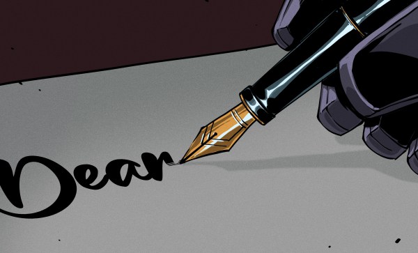
When making a personal website, one will naturally include a personal touch. What could be more personal than creating a font from your own handwriting? That’s what [Chris Smith] has done, and it looks great on his blog, which also has a post summarizing the process.

Like most of us [Chris] tried to use open-source toolkits first, but the workflow (and thus the result) was a bit wanting. Still, he details what it takes to create a font in Inkscape or Font Forge if anyone else wants to give it a try. Instead he ended up using a web app called Calligraphr designed for this exact use case.

Above is hand written; below is the font. Aside from the lighting the difference isn’t obvious.

Fair warning: the tool is closed-source and he needed to pay to get all the features he wanted — specifically ligatures, glyphs made from two joined letters. By adding ligatures his personalized font gets a little bit of variation, as the ‘l’ in an ‘lf’ ligature (for example) need not be identical to the stand-alone ‘l’. In a case of “you get what you pay for” the process worked great and to the credit of the folks at Calligraphr, while it is Software-As-Service they offer a one-time payment for one month’s use of the “pro” features. While nobody likes SaS, that’s a much more user-friendly way to do it — or perhaps “least-user-hostile”.

All [Chris] had to do was write out and scan a few sheets that you can see above, while the software handled most of the hard work automagically. [Chris] only had to apply a few tweaks to get the result you see here. Aside from websites, we could see a personalized font like this being a nice touch to laser cut, CNC or even 3D printed projects. If you don’t want a personalized touch, the “Gorton” lettering of retro machinery might be more to your liking.

Immersive Cursive: Growing Up Loopy

Growing up, ours was a family of handwritten notes for every occasion. The majority were left on the kitchen counter next to the sink, or in a particular spot on the all-purpose table in the breakfast nook. Whether one was professing their familial love and devotion on the back of a Valpak coupon, or simply communicating an intent to be home before dinnertime, the words were generally immortalized in BiC on whatever paper was available, and timestamped for the reader’s information. You may have learned cursive in school, but I was born in it — molded by it. The ascenders and descenders betray you because they belong to me.

Both of my parents always seemed to be incapable of printing in anything other than all caps, so I actually preferred to see their cursive most of the time. As a result, I could copy read it quite easily from an early age. Well, I don’t think I ever had any hope of imitating Dad’s signature. But Mom’s on the other hand — like I said in the first installment, it was important for my signature to be distinct from hers, given that we have the same name — first, middle, and last. But I could probably still bust out her signature if it came down to something going on my permanent record.

While my handwriting was sort of naturally headed towards Mom’s, I was more interested in Dad’s style and that of my older brother. He had small caps handwriting down to an art, and my attempts to copy it have always looked angry and stilted by comparison. In addition, my brother’s cursive is lovely and quick, while still being legible.

Continue reading “Immersive Cursive: Growing Up Loopy”