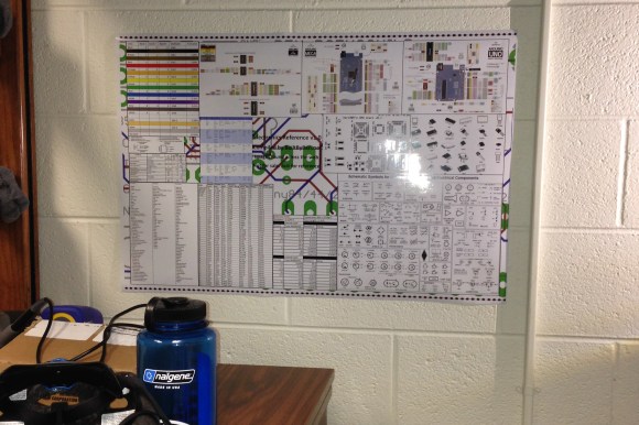
[Ben] just sent us this great reference sheet. It’s a poster he compiled of datasheets and various electronic references. He made it after spending too much of his time sifting through datasheets while working on projects. It also helped that he realized his school, Georgia Tech, had a poster printing service!
It contains the basics from resistor color codes, typical pinouts of various chips, current capacity of wire gauges, Arduino pinout diagrams, schematic symbols, trace widths for current capacity, and even typical coding functions!
The full image is 9,000 x 6,000 pixels and will print nicely at 30 by 20 inches, just shy of the ANSI D paper size. It’s 6.1MB so only click here if you want it!
Maybe if we ask nicely he’ll share the original MS Publisher file so we can tailor it to our individual needs! Some of the text in the images is a bit blurry, but everything is basically still readable.


Great project but the current capacity of your wire sizes is way off.
This is where I got my data
http://www.powerstream.com/Wire_Size.htm
Let me know if you know of a better site.
Eh – say what? “It’s 6.1MB so only….” That is roughly whats transferred to your computer everytime you open a Facebook page. Every snapshot by a decent camera is as big as that as well.
Unless the image is hosted on a smartphone connected by gprs that should not be a problem. :-)
Even 10mp cameras at full resolution are only like 2 to 4mb large.
Heh…. I hope his electrical skills is better than his choice of image format. Wtf? Even my pointy-haired boss knows that a jpg is not suitable for saving images with text and sharp edges.
You know that’s an interesting statement. I don’t know a lot about the JPG format. But I do know when making images for our articles I save as PNG whenever I can. I always wonder why the quality is so much better but never made the time to actually look it up.
JPG is not too bad when it’s used for what it’s made for – photos. In a simply put JPG compressed a image by removing information in a photo that the eye will not see anyways. The algorithm is made for normal photos of stuff, but if it is used to compress/save, for instance, a screenshot where there a lot of sharp edges and high contrast between pixels the JPG algorithm compressed that as a normal image with soft/smooth edges. This results in a lot of artifacts like fussy edges, blocky edges, color fringes and other nasty things.
The newer PNG is a much better allround algorithm that doesn’t remove info from the image while compressing it.
JPG is to PNG as MP3 is to Flac.
Jpg is a lossy format that causes artifacts around edges. For photos it’s not usually a problem but for anything with really sharp edges and smooth shading the artifacting is really, really obvious.
Png is lossless, so there’s precisely zero artifacting, with the downside that file size balloons the more colors are in the image. Funny thing is that for images with relatively few colors the file size can actually be smaller with a png than a jpg.
Hopefully the person who made it still has the original photoshop (or whatever) file and not just the jpg version.
If you have a camera saves only in the .jpg format when taking pictures, you have no choice in the matter.
I hate the fact that I cannot edit my posts when I see a typo.
It should read:
If you have a camera that saves only in the .jpg format when taking pictures, you have no choice in the matter.
You can edit your posts as many times as you wish when you see a typo, it just has to be before you click the “Post Comment” button. To be able to edit otherwise would require all of us to create accounts, log in sometimes, have a large host user database, etc, etc….
You certainly do not understand how these websites work do you.
1. You already have to login to post a comment.
Whether that be through wordpress, twitter or facebook,
you are still logging in for the purpose of posting a comment.
2. There is already a large host user database. If there was not,
you could not go to any given hackaday page, on any given day,
and read the comments that users have posted in response to
the hackaday article. There would be no history of articles to
search and read.
3. The only thing missing is the code that allows one to edit his or her
previously posted comment.
>>>
You can edit your posts as many times as you wish when you see a typo, it just has to be before you click the “Post Comment” button.
>>>
That is not editing a post. That is editing a pre-post.
What’s the difference?
A post has already been submitted and is viewable on the page by the community of viewers of the page. While a pre-post exists within the text box alone and is not viewable on the page by anyone other than the author typing the text.
Those who have vision issues such as dyslexia and aging eye syndrome find it harder and harder to catch pre-post typos. I actually did not see the previous typo until after I posted the comment. Which is very annoying for someone who has a compulsion to be perfect. Which I might add; is a condition just as annoying as posting typos.
>>>
You certainly do not understand how these websites work do you.
>>>
Uuuugh! Punctuation, it’s a question not a statement.
Why do I always make that mistake?
@SATovey,
It’s because you don’t understand the post that you were referring to.
If you spent a little more time proof reading before pressing submit then there wouldn’t be any reason to follow up with a correction comment.
At the end of the day you wish the code would change because you’re too lazy to read what you have written before pressing submit.
Only a proven liar thinks people are so perfect that they can catch every little minor mistake if they were just not so lazy. I’m a compulsive perfectionist, and even I know better than to expect that from people.
Despite my compulsion to do things in the most perfect manner possible, I still miss things. I have learned over the years that as my eye sight deteriorates, I catch fewer and fewer mistakes no matter how many times I read, re-read, and read again just before I post. Sometimes it’s out right dyslexia that causes the mistakes. And if I was not using Firefox’s spell check functionality, you would be able to see just how many mistakes I make that don’t get posted.
That said, if a lifelong perfectionist understands that one cannot expect people to never make a mistake, what the blood curdling scream is your problem?
@SATovey
Sorry, but you are not actually “logging in” to post a comment /here/ (Meaning hackaday.com), and probably any other site that uses WordPress. When you post a comment here, you ARE asked for an e-mail {never made public} and a name. You are also asked for a website, but that is optional. I could, in theory, post as Kaleb Kraft (not that I would EVER do that, I respect our dear former leader too much for that). I could even use whatever website he uses in his posts. I could also post using whatever e-mail he uses (if I knew it).
I am sure any that any post I (or anyone else) made in such a manner would eventually be removed by the moderators, but it might not be noticed immediately, particularly if the post wasn’t out-of-character for the “supposed” poster.
What we have is anonomous, tagged posts. You do NOT log in (OK, I suppose you /CAN/ log into an account, if you REALLY want), and you post using essentially an “honor system”. It is provable too.
Brian
@Brian Dale Neeley
Then why am I asked to login to either a wordpress account, face book account or a twitter account?
If I don’t use one of those accounts, I am unable to post, and anytime I provide my email address the page acts as though it is trying to log me into something.
There is definitely a login process here somewhere.
OH wait, I know what’s going on, Homeland security hacked the site and added there own little hack to track the hack.
Yeah, yeah that’s it.
It isn’t nice to expect anyone to be even remotely knowledgeable on everything. Even my grandmother knows that.
Where did he get the current carrying capacities? Those seem insanely low — they’re much lower than the NEC values for aluminum conductors, let alone copper.
From the American Wire Gauge standard, which is meant to be a general rule of thumb guide for single bare copper wire. It doesn’t take into account heat, multiple wires, or insulator type and is based on the formula of 1 amp/ 700 Circular mils.
This is my understanding of the AWG standard, if I missed something, then someone please correct me.
Pretty awesome for the tools he had available – though someone should introduce him to Inkscape…
Tell me about it. If I weren’t on vacation for the next week, I’d fire up Adobe Illustrator and vectorize it myself.
Vacation is where I do most of my “doesn’t really need to be done” type of projects. I once spent an entire Christmas at the in-laws laying out a circuit board. It was TV time on the couch (Big Brother, American Pickers, shows that you don’t really need to pay attention to).
I have posted the publisher file and original photos. If I had access to Illustrator/Photoshop I would use them. It will be neat to see it remade with more professional software.
https://docs.google.com/file/d/0B10bwEhSnfbacXVDR1JjcVNuWTg/edit?usp=sharing
There is always GImp… very powerful and free.
Would it be possible to get a Pdf version?
Everything is fine except quality (some images have poor resolution) and typography.
Feel free to improve it. This poster is meant to be improved and adapted to everyone’s needs.
https://docs.google.com/file/d/0B10bwEhSnfbacXVDR1JjcVNuWTg/edit?usp=sharing
Open source is a wonderful thing. If only more people lived by the real hacker motto: Instead of complaining, make it better!
Anyway, five stars on the project, sharing it, and those 25 files.
No vectorial, no party.
Poster? So Old School.
A webpage with links is better.
Call me a luddite, but I’d much prefer a poster to a website. On a poster, I can see everything laid out at a glance – no clicking links to find stuff.
Ditto with datasheets. I bought a cheap Android tablet last year, specifically for keeping datasheets on for “easy” viewing. Result? I still print out bits from the datasheets and pin them to things!
Great to hear. Please feel free to adapt it to your own needs or create a completely different one.
https://docs.google.com/file/d/0B10bwEhSnfbacXVDR1JjcVNuWTg/edit?usp=sharing
Even if you don’t USE the poster often, a poster is /still/ useful. If you have the luxury of a dedicated shop, this wouldn’t be a bad thing if you have free wall space.
Big posters are nice. If you don’t believe me, ask Andy Dufresne…
Brian Dale Neeley
A windows toolbar is quicker, easier, zero maintenance as you make ONE FOLDER containing all other folders named as needed and filled with anything. 74xx, RTC, Weather Radar & Maps, Diodes, PNP, NPN, Recipes, Antennas, Owners Manuals, Service Manuals, Recipes, literally anything including web shortcuts. ALL your reference materials just a couple clicks away. VERY easy to backup and move to another computer. Doubles how much one can get done because time searching for the info is cut to near zero and still there even if the internet is down. I can pull up a drill and tap chart in 30 seconds, and 30 seconds later AWG wire sizes and current capacity, then quick check the house wiring diagram to see if that network run to the entertainment center is old Cat5 or Cat5e, then pop over to the spreadsheet of all the router’s DHCP IP by mac assignments and config, then see what maintenance is coming due on the motorcycles and which fishing spots are getting hot right now.
It has been astoundingly quick and convenient and plus zero time to maintain. No need to stop and update a webpage.
Possibly the most useful thing ever posted on HAD.
One of the few things I have on my “wall” at work was a E96 resistor
values table. It was useful to figure out the closest 1% resistor values
(or ratio) for analog circuit. The only other “chart” I have are the
different package sizes of passives and semiconductors as it is helpful
to get a sense of scale while staring at a PCB layout. Posters are just
not scalable for projects that have more than a handful of parts.
One thing that was useful is a schematic page of the usual passives
parts. It is very handy especially if multiple people are working on a
project to try to share a common pool of components.
The rest are just a matter of dealing with information overload. Once
your average datasheet are 100+ pages each, it becomes a pain to print
all of that out. Pin outs are less of an issue once you get that into a
schematic.
Apologies if I’m hijacking this, but here’s a resistor chart I like to use:
http://imajeenyus.com/electronics/20120315_resistor_colour_code/index.shtml
Found a blurry version out on the web a while back, and re-did it in Illustrator so the PDF can be scaled to any size. Without the title text, it’ll print nicely on a 5″ square photo, so I got a pile done at an online photo service and I’ve pinned them up around the house. Yep, sad, innit ;-)
I guess different layouts work for different people.
Nice compendium… good job. Left out some formulae, though…
Would have been nice to see some RF stuff like filter references… air inductor…. voltage division… maybe even a metric prefix reference
Everything !!!
Even the internet is not enough to get everything in electronics
You’d better call this beginner cheat sheet
I think this is an excellent project. To all you trolls out there, stop hating on this project just because you’re so jealous you didn’t think of it. Stop sippin’ on that hate-o-rade, folks.
I have access to a plotter through the university…. hmmm. I might add some RF stuff and make a few more edits then post it on the wall in the Amateur Radio club-room. Thanks for the pub file.
If you do, please share it back here… having RF on the chart would be great!
Unfortunately, ANY reasonably comprehensive poster would soon grow beyond any standard paper size. And any reasonably comprehensive poster would likely have information that would be superflous to someone. Passive components, basic digital, PCB (chip footprints, data on trace width, etc), Arduino, RF, connectors, RF allocations, wire sizes, et. al could ALL be huge charts, and still not be comprehensive. Unless you make your poster(s) yourself, you can find something that isn’t to your personal taste.
[Ben] has done everything possible (ie: posted his files to an open site, encouraged people to adapt and improve them, etc) to make his poster useful to everyone, and I appaulad him for that. I mentioned eight different items that could EASILY fill up a huge poster, and that is with about a minute of light thinkiing. I am certain that list could be much larger, and it wouldn’t cover everthing that might be useful to the hackaday audience (I would personally like a large poster listing temperature, colors, and melting points of common metals).
So, in other words, find the stuff you want on YOUR poster, put it together, and take it to Kinko’s (or your local print shop), and BOOM, ya gots yerself a poster.
Brian
https://dl.dropboxusercontent.com/u/10372688/breadboardpostit.jpg I made a simple sheet for when your breadboarding and need to take notes or create some sort of reference. https://dl.dropboxusercontent.com/u/10372688/breadboardpostit.pdf Theres a pdf version also.
great, but missing TTL and CMOS in the middle
for the arduino pins? Yeah I tried to keep it as bare and simple as possible. One thing about this is that I imagined that people would colour the pins for the arduino along with the pin on the breadboard. Also that people would actually place this over the breadboard before you start prototyping.