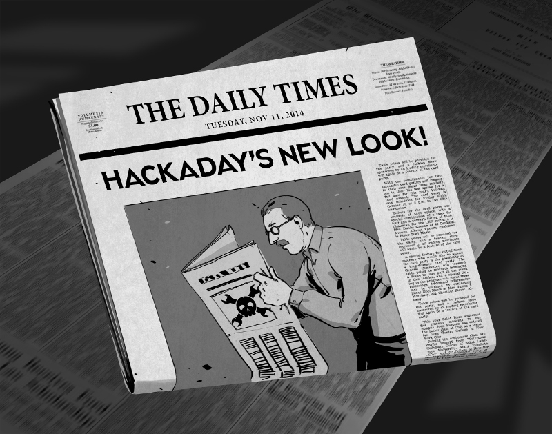
There comes a time when your movable type becomes so over-used that you no longer get a legible print off of the printing press. For months now we’ve been at work on a new site design that maintains the essence of Hackaday while ejecting the 10-year-old dregs of the site. With each small success we’ve actually ruined ourselves on viewing the old design. It is with great relief that we unveil a site design built specifically for Hackaday’s needs.
The most notable change is in the content of our landing page. For ten years, loading Hackaday.com resulted in the most recent blog posts. The blog concept is proven, but provides little opportunity to highlight quality original content and information about upcoming events. We have tried the use of “sticky” posts but honestly I find them somewhat annoying. The solution to this is not immediately apparent, but I feel we have found the most efficient solution to our complex set of needs..
We have a lot of community members who participate in Hackaday in numerous ways. Changes found in this design are driven by that fact. The landing page will, from this point forward, be a somewhat more persistent collection of notable content from the blog, our community site (hackaday.io), as well as news regarding live events, store features, contest highlights, and more. Those hard-core fans — a label I also assign to myself — will find the same reading experience as always on the new blog URL: hackaday.com/blog.
Aesthetically, we hope that all will agree the new design far supersedes the old. There was a lot to fix, and the work of the Hackaday crew who designed and implemented this new interface is truly amazing. I hope you will take the time to leave a positive comment about their work. As with any major transition, there will be some bumps in the road. Right now most of our sidebar widgets have not been migrated but that and any other problems will be fixed soon.
In this design we strived to highlight the title and image of each post to immediately convey the core concepts of the projects shown here. The author by-line and comment count remain core to the presentation of the articles, and our link style continues to be immediately apparent in the body of each article. I think we have far surpassed the readability of the comments section, in addition to the content itself. We knew we could rebuilt it… we have the technology… long live articles worth reading.
UPDATE: We are working very hard to fix all the parts that don’t look quite right. Thanks for your patience!
UPDATE 2: Infinite scrolling isn’t a feature, it’s a regression. On our test server all the blog listings were paginated just like always. When our host, WordPress VIP, pushed live the infinite scrolling manifested itself. We’ve filed a ticket with them and are hoping for a solution shortly.
UPDATE 3: Infinite scrolling has now been fixed and the blog layout now paginates. The mouse-over zoom effect has been removed. Slideshow speed has been adjusted and if you hover you mouse over a feature it will pause the scrolling.


Yiiieerrrkkkkssss…….mainstream layout…. how boring. One can smell commercial aspects.
The “oldschool”-design was a superb unique feature of hackaday!!
Even my girlfriend (you know, the other human species) knows it.
Now, it´s designed like a standard shitty blog…..just one out of a billion pages…..
The special character is lost and with it the special feeling during reading is too.
Even all my friends, although they are absolutely not affected knew from far away: “uh, do not disturb, he´s reading hackaday!!”.
I don´t like the new design, please change back.
–> KISS
I wouldn’t call it a mainstream layout. It’s not several implementations of parallax written in 8k lines of Javascript.
Well, you´re right, I´m only talking for myself, my friends and my girlfriend. With “mainstream” I really just mean the visual experience….it´s just not that unique anymore
Walks like a duck, swims like a duck and quacks like a duck, it may have a parallax interpreter hidden somewhere inside?
well, looks like a continuation fo HAD’s attempts to mess with what was working. The old design was a great look because it was old looking. It had this feel that you were stumbling into one of the older corners of the internet, from the days of projects being hosted in a somewhat sketchy free host or on a university’s servers. Now it looks like a bad imitation of a magazine website, which, last I checked, is not what HAD was all about.
Time to go looking for styling hacks to get me the old design back, as I’m not spending the time/effort to figure out why the current mess isn’t rendering correctly on my screen (no self respecting web designer would believe that this is how it is supposed to look).
The 16×9 aspect ratio images on the blog page cut off too much context and don’t work well for people. Adafruit’s new layout is similar and leads to poorly cropped images, such as these cosplay examples: https://www.flickr.com/photos/osr/13947599069/
Well you were a good way to waste time HAD, I removed you from my bookmark list when the buyout happened, and now that your intentions are clear (pilfer the readerbase and join the ranks of make, instructables, etc) its probably time to stop visiting altogether.
http://hackaday.com/blog/ as the homepage gets rid of the slideshow , I can live with that, someone mentioned infiniscroll, thank god it appears to be normal.. so far. :/ need to check it on a computer, other than that seems fairly palletable.
I was mildly startled when i saw the new frontpage, i’ve updated my bookmarks to point to http://hackaday.com/blog/ for now, this way HaD looks like it just got a new paintjob.
I’m sure everyone will get used to the new theme eventually, keep up the good work!
THANK YOU!
How long until someone makes a greasemonkey script to revert the layout back? See http://hackaday.com/2012/02/25/hacking-hack-a-day-with-greasemonkey/
here goes… this is version 0.1 . i’ve written this in 30 minutes or so and it currently only works on http://hackaday.com/blog/
// ==UserScript==
// @name Hackaday blog fixed
// @namespace http*://*hackaday.com/*
// @include http*://*hackaday.com/*
// @version 0.1
// @grant GM_addStyle
// ==/UserScript==
// fix page background color
GM_addStyle(‘body { background: black !important; } ‘);
// fix text logo style
GM_addStyle(‘.site-branding .site-title a { font-size: 70px; font-weight: 700; !important; } ‘);
// fix nav menu items text size
GM_addStyle(‘.main-navigation a { font-size: 14px; !important; } ‘);
// fix nav bar size
GM_addStyle(‘.main-navigation { border-bottom: 0px; margin-bottom: 0px; padding: 0px; !important; } ‘);
// fix nav search field height
GM_addStyle(‘.main-navigation .search-field { padding: 0px; !important; } ‘);
// fix posts header text style
GM_addStyle(‘.blog .entry-header h1 a { font-size: 28px; font-family: Oswald,arial,serif; text-decoration: none; font-weight:300; color: #00C100; text-transform: none; !important; } ‘);
// fix posts text
GM_addStyle(‘.p { font-size: 14px; font-family: DroidSansRegular,Arial,Helvetica,Tahoma,sans-serif; !important; } ‘);
I think the picture not being above the article is throwing me off the most. besides the color change its essentially the same layout.
My cat found an easter egg in the HTML!!!! view-source:http://hackaday.io/?from=had&utm_source=hackaday&utm_medium=menu&utm_campaign=blog , scoll down to see the egg.
My $0.02, mostly copying what others said.
Fresh look – great!
Big fonts – bad.
Zoomy-in-mouse-hover-image-thing – bad.
On the blog page, it seems like there’s a lot of text from the actual post appearing on the blog page. E.g. the recent one with the Tesla battery hacker guy, there’s over a dozen paragraphs there. Better just to have a few paragraphs, and people click on the article for the full story?
Very nice!!!
hmmm…
I noticed a little while ago as I was browsing.
I’m very pleased that the “older posts” button appeared ,for a short time it looked like it was going to be one of those annoying bottomless pages.
Brown replacing green was a bit of a shock at first, but, I have to say “I kinda like it” it makes it look a little less anx ridden teenager.
I like that the comment boxes have a slightly larger margin – this makes it much easier to see what replies are to!
I can’t see how the slideshow is an improvement over a sticky post. it seems that the featured posts are the ones that get up there, which means that you;re only a few tags away from taking your news you want to shout about from front and center to not featured.
The link to the forums is missing now. – will they get a similar style update? or are they being quietly wound down?
For those experiencing blurred vision, headaches, eye strain and eyes keep jumping.
I believe it’s because of this; http://en.wikipedia.org/wiki/Grid_illusion.
Grid illusion due to font, font size and font contrast.
What do you think?
I am not really against change, but I hate wasted space. I wasn’t happy when firefox decided to update and use another 30 vertical pixels for a blue stripe, and I still don’t like it two years later.
Seems it would be nice if all articles and comments had the same size body text, and that all headlines were the same size. The text may look better if everything was a P3 phosphor shade, but that isn’t my biggest peeve.
In the process of moving the picture to the side, they got smaller, and squeezed the text between that extra column and the growing sidebar.
So it seems that there is a decrease in useful space by 40% or more, but I don’t have the old page to back that number up.
Once the font sizes get fixed (~80% of current size) I think I’ll like the changes. The black background on the blog page looks pretty weird, but I assume that’s not intentional. The home page isn’t my cup of tea, but I’m happy I can go directly to the blog. Once the kinks get ironed out I think it will be a good set of changes. Good job.
New layout sucks and is confusing.
So, people would rather have this?
http://i.imgur.com/0YkzW11.png
If it came to the false dichotomy you’re pushing, yes. Ugly and familiar beats ugly and new any day.
All the guff on the side needed cleaning up, and maybe green-on-black is passe, but nobody asked for animated crap all over the place, and sure as hell nobody asked for the frontpage to stop being on the front page. I can’t even save these stupid pulsing images as files.
The site is unrecognizable and its usability has suffered terribly. Don’t get snarky about it like we’re picking nits.
Yes!
I’d love to have that back vs. the new look. Can you put a link to how you fixed it?
Yeah, that´s how it has to be !!
In addition….”the hack of the day” should be accessible directly on the home site, without further klicking or heavy scrolling.
In work, sometimes every second counts…the old layout was possible to fullfill my daily-work-some-seconds-left-HAD-lookup habit….
Most definitely YES!
YES
Yes! I dont come to HaD to shop. I come here to flip thru articles, pick a few I’d enjoy and follow the ‘after the break’. The old HaD (to me) seemed like an old dive bar that reeked of cigarette smoke and booze but felt at home. Now I feel like Im walking into a sterile starbucks.
-1
Yes
Yes, 100%.
yes
Yes.
I couldn’t scroll away from that slideshow fast enough. One word: obnoxious.
I’ll stick with the /blog page from now on (until they decide to take it down & force the main page on us, and they will, or sabotage it to force us away).
Hackers aren’t into slideshow flash, they want straight into the meat.
“End-users” are into that sh!t, soccer moms, and people who buy arduinos, upload software they don’t understand, hook up a battery, stand back and say “I am l33t, look what I did”.
Another post coined it like this: I liked coming here because it felt like some forgotten corner of the internet.
I – LIKED -THAT !!!
Like Cameron’s office in the basement (HALT! & catch fire).
But clearly, I know how many people are here, farrrr from a corner, nor forgotten.
Now, it’s like when the boss comes into your work space and wants to turn on ALL the friggin’ lights, “that’s better !!”.
I can ask anyone who is seriously into electronics and USES a solding iron, they all can relate about projects they’ve seen here.
I guess the problem became, this started as something someone did, it got discovered, and now it’s not about paying for bandwidth, it’s about egos and getting rich off other people’s engineering skills (article submitters). Anyone whose ego solely hinges on what their web page’s layout is about is a deuce.
Bottom line: You’re not right when we say your not, and this is NOT what WE want to keep us here !!!
OK, yes I remember the shitstorm that came last time HaD went through an upgrade. I may have missed out on this one, but wasn’t there a, like, beta test first?? This…. needs some work. Comment boxes, text size, mobile view is a disaster… Interview posts are broken? Testing, guys.
Wait, I have to click on “blog” to actually get to the blog part?! Looks like it’s time to dig up my RSS reader…. :(
The new design looks awesome! I always like the minimal designs. I can see you guys know how how to design a page with the right colors with a minimal pallet and the right fonts. Something like this should be the standard.
Minimal design? I hardly find animated images and slideshows minimal. Or useful.
What the deuce, I had no problem reading Hackaday before this (but then my PC is as old as the site…). No idea why you changed it, just because it was old/not-new ? Well, it’s less-bad than some other site upgrades I’ve seen lately, but I have to ask, why fix what wasn’t broke? Do I really need a Hackaday Skull & Spanners the size of my whole screen, at the bottom of the page? No, I do not. Again, what the deuce…
A swing and a miss – Web Design 101 is pitching them hard and fast today and HaD just can’t get a piece of it.
You know there’s people out in the world that does Web Design for a living right? You don’t have to hack everything together yourself, some things actually take skills that must be learned from other experts (like teachers) and not done by flipping thru a “Web Design for Dummies” book.
Still no comment edit – really? Surely with all the NASA cutbacks there must be a Rocket Scientist out of work that could help you add such a feature.
And why does so much of the text content butt right up against the left edge of the window? That’s tres annoying…
Starting with the good: I like the cleanliness of the new design. It hearkens back to the days when Hackaday would manually turn every project thumbnail to grayscale and add little tape marks to the corners, a touch that I actually rather miss. While I liked the green, the amber reference to phosphor displays is classy.
Now the bad. Two main points that I’m surprised haven’t come up more:
1) I come here to read about hacks. Not to read about Hackaday. I know the Evil Overlords require their pound of flesh, but surely I don’t have to have the entire page taken up by Hackaday Prize news every time I visit, and need to scroll down to see what the actual Hacks of the Day are.
2) Again, I come here to read about hacks. With tiny images and shortened blurbs, now I’ll have to click through to read in any detail about the hacks. Previously, the images and descriptions were large enough that I could only click through when I found the hacks to be really worth my time. What’s the purpose of these tiny entries? More ad impressions when we click through to read? More focus on the Hackaday news at the top rather than the hacks? Both, neither?
Thanks to the non-Evil Overlords (looking at you, Brian) for being patient with us grumbly old fogies.
I agree. I left Makezine when in became all about the makers, how to be one, and all the feel-good stuff and less about the projects. I come here for the “out of the box” ideas
You do understand who owns hack a day now, it’s not a media company now. It’s owned by supply frame they make tools for developers helping them choose the right parts for the job, less out the box, more intelligently designed.
In a lot of ways that can serve to make this place a lot better, cool stuff made the “right way”, still cool project ideas, but in a way that could be more accessible to a wider audience, on the other hand that does kinda take some of the soul out of the place.
There is one thing though, it’s probably fair to say that supply frame didn’t buy hackaday for a laugh. This site is a part of a corporate portfolio. It’s not unexpected that it might start to look like it.
Infinite scrolling is the devil and images that change on mouseover are also the devil. Keep the bland non-colors and ultrabold headlines if you must, but bring back sensible pagination and ditch the distracting JS nonsense.
Example use-case problem: I’ve been catching up with HAD on my phone. I want to go 26 pages back on my desktop. To do that, I have to scroll down and click a button twenty-six friggin’ times. That’s tedious nonsense. Let me go to /page/26 without this Tumblr cruft.
Yeah we are working on the infinite scrolling, wasn’t intentional, something that got added by our host automatically.
Thanks for working on this, It’s the only real usability problem I’ve found.
When I’ve loaded the older posts, clicked on one, and want to go back I’ve lost my place and have to re-click the older posts button n times to find my place again.
Otherwise, the update looks 85% good.
Don’t let the hyperbolic rants get to you.
The big font did hurt my eyes, but like it was suggested, I just CTRL scroll wheel and made it smaller. Much better now. Good jorb, overlords.
Only request: please don’t use text-transform: uppercase.
And if possible, please allow NoScript users to see more than just the most recent page on the blog
It really hurts my eyes. Too much contrast in textcolour, a little too low between posts and background.
And after all – why are the headlines that big?
BTW those zoom effects awful.
annoying.
I have been lurking around on Hackaday for the past seven years. I love the content of this place but my god I am not digging this new layout.
What the fuck have you done to my beloved HaD?!?!
PUT IT BACK! PUT IT ALL BACK!
So here’s a piece of free use case research for you.
I have a view sites I check at least once a day, and HAD is one of them.
So I know what cool projects are going on. I don’t need you to tell me what I already know, so I’ll ditch the homepage and from now on will just read the blog, witch is fine by me. But I would like to have an good overview of the added articles. a title, a picture and a bit of text to get my blood warm(or not). The way it is now I have to scroll a lot more, and I get only one article on my screen on the blog page(1280×720) soooo please fix that.
Also I’ll use my opera feature to change the yellow back to green… you can’t change everything.
Grey background with white font is super hard on the eyes. It looks sexy, but you have to concentrate to read it. Also I’m not a fan of the shift to orange as the link color, but that’s just personal preference. I hope the font thing gets fixed and this isn’t the final revision.
I second this.
It get blocked at work.
I like change. Change is good. I’m sure once you get the kinks worked out it’ll be awesome.
Personally, I’d love a white background version, but that is too much of a leap for most of the commenters here.
Another unrelated thing. Your site is blocked at the hotel I go to for work because of hacking. You should totally buy modifydaily.com so I can read your site there too.
What’s the reason for making the images so small on the front page? The Image is the first thing that catches the eye, but now it is to small to recognise any details.
If there is no reason please make the images as wide as the text column again.
Thanks!
I HATE IT!!!!!!!!!!!!!!!!!!!!!!!!!!!!!!!!!!!!!!!!!!!!!!!!!!!!!!!!!!!!!!!!!!!!!!!!!!!!!!!!!!!!!!!!!!!!!!!!!!!!!!!!!!!!!!!!!!!!!!!!!!!!!!!!!!!!!!!!!!!!!!!!!!!!!!!!!!!!!!!!
Hey, your exclamation points are leaving the comment box! Please keep all punctuation inside the designated area. Thank you, and have a nice day.
Is this a blog or a website? I think it’s a blog, and therefore: Remove the slider! It’s really annoying that I have to go beyond that slider everytime I want to read the new posts.
You have to do too much scrolling now all the text is bigger and spaced far apart, especially in the comments which is one of the biggest parts of this site, only being able to see a few comments at once is not nice at all, even on this 17″ 1600×900 screen I’m finding the site tough to use now.
On my mobile the front page, well look: http://www.haku.co.uk/pics/HaDNewFrontPageMobile.jpg
How exactly is that an improvement?!
And orange? Bring back the green.
Oh did I mention TOO MUCH SCROLLING NEEDED NOW? Because I hate sites that make me scroll and scroll and scroll because the designer was trying too hard to make the site look good for them rather than make it functional for the users, eBay is lousy for pulling that shit on its users, scrolling through badly formatted information trying to find a needle in a haystack is not my idea of fun.
I hated the last change, I despise and detest this new one.
As long as you don’t turn into space.com, I won’t complain.
That indeed was a clusterf**k redesign
IT’S NOT GREEN!!!!
Urghhh
Is this some sort of early april fools joke that was released early?
Angry thoughts:
* New format feels too forced and over crowded.
* Why fix something that wasn’t broken?
* The old layout is much more user friendly and simple.
* Just because you can change the layout doesn’t mean you should.
* New format and layout is almost like Hackaday was taken over by Facebook and they wanted to make it more hipster.
* After further exploration, New layout now reminds me of the many trendy poorly designed layouts you can simply download from wordpress….
* when you click the top navigation bar links, it is almost like the image sizes and layout changes in strange ways
* zoom in on images in the featured section makes the whole page feel tacky. If you have good solid articles you don’t need special effects on everything. KEEP IT SIMPLE STUPID
Oh I know lets add more features like a calculator, farm simulator, friend message system, grandma sized fonts, scrolling marque text and a midi file that you cant stop.
Nice straw man fallacy you got there…
I visit this site daily on a few different devices depending on where I am, it looks awful on all of them now.
“Fresh” look – Sure fine whatever. What I see is the mimicry of every other “hip” site out there. This isn’t hacker culture any more, this is mainstream culture. We aren’t “makers”, for crying out loud. Trying to be mainstream (and frankly not being that good at it) offends those of us that challenge that culture.
Big fonts – All Caps – Why are you screaming at me? Is it a style choice? If so, where is the “style”? You have a logo, why aren’t you using it.
What is the name? – Is it hackaday, Hackaday, Hack a Day, Hack-a-Day, HackaDay, or HACKADAY? Pick one. Stay with it. Personally, Hackaday or Hack A Day. What is with the all uppercase nonsense.
Zoomy-in-mouse-hover-image-thing – WTF? Why would you ever want that?
Yellow (“amber”) vs. Green fonts – You say that it is supposed to harken to amber screens. That’s not what I see, I see washed out yellow fonts with no relation to amber CRTs. Green at least popped.
Flipping articles at the top – why? Isn’t that the “In case you missed it” section? Get rid of one of them.
From the store – Really? Six images + text for tshirts and bus pirates? Shrink that to three smaller items, or put it on the side bar. I mean for crying out loud guys, you only have 15 products there, if you’re gonna display 40% of them on the front page, put’em all there.
The term Blog – Really? I didn’t think the collection of submissions was a blog?
Our Columns – “More from this category” ? How about “More Hack a Day Columns”
Featured Projects – How about “Featured Hackaday.io User Projects? Focus on the user.
Missing link to the forum.
Dates inconsistently displayed for articles both on blog & front page
But probably the most important thing here – what is the point of going to hackaday.com instead of hackaday.com/blog?
As others have said, I come here to read about hacks. Not to read about Hackaday. It seems that you’ve forgotten where your content is coming from, where your value is coming from. You want to generate your own, I get it. More able to control what is going on, you’re actually adding “value” (but that’s debatable) and not dependent on the fickle and inconsistent generation of user content. Focus less on the list aggregator aspect, focus more on the fostering the hacker cultre thing. Sure.
But at the end of the day, the reason I went to Hack a Day was that it was an aggregator of links. Over the years you’ve added features that I agree with, the forum, Hackaday.io, etc. and these foster and support a community surrounding the topic, but ultimately, at the end of the day, its about the content creators, not Hack A Day.
+1
Your comments very succintly put and I agree with them all.
My initial posts here were immediate reactions to the new layout without taking a step back and looking at it in more detail (actually taking a step back means I can still read it with the granny-sized fonts now employed!), but I still stand by those comments and my followup one with more detail of why I hate this change.
I laugh at all these people who supposedly are not looking for and are not hating this “fashion concious” site who want the black background and green terminal text. all edgy and matrix and hacker like.
if you didn’t care about fashion you;d want times new roman, size 12 on a white page.
what these whines about the place looking fashionable or mainstream are really about is that your little exclusive playground is starting to seem less exclusive, or more inviting, the way the place looks has got nothign to do with the content.
“if you didn’t care about fashion you;d want times new roman, size 12 on a white page.”
That’s it, exactly what I’m after. Look at my own site.
In fact the retro HackADay with new posts would be my dream, even with ads as well.
Actually I decided yesterday that when I’ve got a chance, I’ll look into making a Linux Bash script to convert the latest pages from HackADay into something like that.
Perhaps if I do, someone who isn’t afraid of Supply Frame’s lawyers could hoast the improved pages.
I hate this, go back start over.
If you won’t go back.
Bring back old color scheme.
Bring back old font size.
Give us the ability to make the blog our default page.
https://www.youtube.com/watch?v=28GLa9T2CtI
I like the new look, a lot. Don’t give in too much to all the whiny crybabies that probably got here via an RSS feed in the first place.
I seem to see the majority of commentors being unhappy with the change, I should note, that this site rejuv’ seems to have made everything HUGE, unlike other sites rejuv’s that made everything small, within seas of whitespace. I am annoyed that (very) that you’re making me do more work when I want to read what’s going on in makerland. I thought previous HaD was pretty much “good enough”.
I really like it thanks.
Needs space before text at left margin as the text for the story is right up agains the edge of my screen.. Default “type” is too big. These two issues make it ugly on a 21″ 4:3 TFT at 1600×1200. Otherwise it seems OK and works fast enough.
What would be most useful would be:
1 A function to re-size font to accomodate different screen sizes and resolutions.
2. A sort function to allow for different sort orders for comments.
NO!
if you leave it looking like this i cant stay
fuck “the new HaD”, ill only drink “HaD Classic”
So where the hell has the archive gone? I was a few hundred pages behind “reality”, and that’s a few hundred pages worth of advertising opportunity that you’ve now lost.