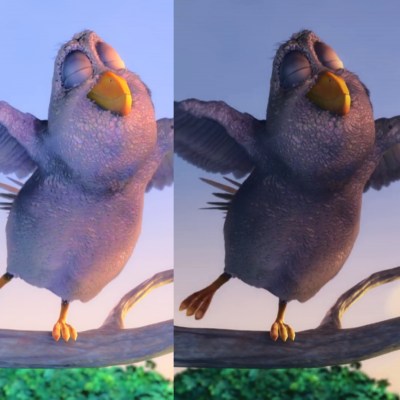
Last year a team of researchers published a paper detailing a method of boosting visual contrast and image quality in stereoscopic displays. The method is called Dichoptic Contrast Enhancement (DiCE) and works by showing each eye a slightly different version of an image, tricking the brain into fusing the two views together in a way that boosts perceived image quality. This only works on stereoscopic displays like VR headsets, but it’s computationally simple and easily implemented. This trick could be used to offset some of the limitations of displays used in headsets, for example making them appear capable of deeper contrast levels than they can physically deliver. This is good, because higher contrasts are generally perceived as being more realistic and three-dimensional; important factors in VR headsets and other stereoscopic displays.
Stereoscopic vision works by having the brain fuse together what both eyes see, and this process is called binocular fusion. The small differences between what each eye sees mostly conveys a sense of depth to us, but DiCE uses some of the quirks of binocular fusion to trick the brain into perceiving enhanced contrast in the visuals. This perceived higher contrast in turn leads to a stronger sense of depth and overall image quality.

To pull off this trick, DiCE displays a different contrast level to both eyes in a way designed to encourage the brain to fuse them together in a positive way. In short, using a separate and different dynamic contrast range for each eye yields an overall greater perceived contrast range in the fused image. That’s simple in theory, but in practice there were a number of problems to solve. Chief among them was the fact that if the difference between what each eyes sees is too great, the result is discomfort due to binocular rivalry. The hard scientific work behind DiCE came from experimentally determining sweet spots, and pre-computing filters independent of viewer and content so that it could be applied in real-time for a consistent result.
Things like this are reminders that we experience the world only through the filter of our senses, and our perception of reality has quirks that can be demonstrated by things like this project and other “sensory fusion” edge cases like the Thermal Grill Illusion, which we saw used as the basis for a replica of the Pain Box from Dune.
A short video overview of the method is embedded below, and a PDF of the publication can be downloaded for further reading. Want a more hands-on approach? The team even made a DiCE plugin (freely) available from the Unity asset store.
[via Road to VR]


Human HDR. Wonder if viewer fatigue goes up all from the background processing happening in your head?
>The result is greater perceived contrast and image quality
The contrast is greater, but the image quality isn’t. I get the same shimmering effect as when you use the cross-eye effect in spot the difference games – except now it’s on the entire image. It basically looks like a glossy magazine image that reflects ambient lights.
https://en.wikipedia.org/wiki/Binocular_rivalry
>When one image is presented to one eye and a very different image is presented to the other (also known as dichoptic presentation), instead of the two images being seen superimposed, one image is seen for a few moments,[2] then the other, then the first, and so on, randomly for as long as one cares to look.
>When the images presented to the eyes differ only in their lightnesses, a form of rivalry called binocular lustre may be seen.
Is that when only one eye is very stoned?
Due to being born with a crossed eye and having it corrected surgically, my brain basically does that anyway when I’m tired. Maybe this HDR trick will work better for me than the average viewer?
Wonder if optical illusions can be used to overcome any other VR limitations?
The trouble with any form of optical trickery that relies on human perception is the variety of humans – astigmatisms for example hugely mess with binocular depth perception. To the point that only one eye is ever in use at a time (potentially) and all depth perception seems to be based on relative dimensions (I don’t suffer from the problem but know some that do).
So while this sort of ‘magic’ might work for some I would be astonished if it worked for more than 9/10 folks as described at all. That said any clever magic that improves performance for some people is well worth looking into, I just don’t think VR’s limitations will really be solved by them.
Although with where the best headsets are now it seems most of the limitations are probably not optical at all but practical issues of running at high fps, weight, hygiene, and interactions with the real world (yes better images could be made – but its not like even the first generation of consumer VR was bad – much like how many people have actually moved on from 1080P to 2/4K monitors (for gaming at least) vs how many jumped in a similar time from the 640×480 CRT? I’d say from experience the first generation of VR is very much a 720P type image – good enough it doesn’t scream bad for moving images, but when really studying a fine detail like text you will notice.)
>much like how many people have actually moved on from 1080P to 2/4K monitors
If you could find very high resolution monitors in anything taller than 16:9 aspect ratio, that would be swell. What’s good for movies is terrible for desktop and productivity use, and the monitors can no longer be tilted on the side because then they’re just ridiculously tall and way too narrow.
1920×1200 seems to be the last useful resolution for desktop, and going any higher means going up in monitor size to compensate for the fact that it’s the wrong shape – but then you lose pixel density and the point of high resolution on a monitor is lost again.
You can get 2 and 4K (or at least the non-widescreen equivalents) if you like, usually rather over priced comparatively but they do exist.
But as VR is most like movie/gaming and steam hardware survey shows almost everyone is still 1080P. For good reason 1080P in normal monitor sizes creates pixels too small to be differentiated at normal viewing distances. While a static side by side comparison will show it to be inferior a moving image is far more effective at concealing the slightly larger pixel size and its corresponding fuzzier edges. It is also of course much easier to drive at really high fps having orders of magnitude less pixels. Which is for most games the key to a good experience.
For productivity I agree excessively shallow monitors are a crap idea but for visual showcasing wide and shallow aspect ratios work well. I don’t however see the problem with turning them on their sides.. Get the right size 16:9 monitor as you end up with great views for documentation and web reading. As long as the monitor isn’t too large you end up with a view that can render all of a page neatly while being a comfortable size to scroll your eyes across reading.
> now it seems most of the limitations are probably not optical at all but practical issues of running at high fps, weight, hygiene, and interactions
To the contrary, I think the main limitations of current VR headsets are mostly optical.
First the resolution is way too low compared to Human visual acuity. The Oculus Rift for example only provides 13.6 pixels/degree, which is way below normal visual acuity (60 pixels/degree) or average visual acuity (85 pixels/degree). It corresponds roughly to a 300p resolution on a 16:9 display viewed at the THX recommended viewing angle for HDTV (40°). It’s a little bit better for more recent headsets, but not by much.
Second, VR headsets don’t support all the depth cues that we can use in real life and make the world “real”, it misses accommodation which is an important cue for distances lower than 10 meters and which also provokes the vergence-accommodation conflict. It also misses defocus blur and curvilinear perspective cues.
And third, the field of view is currently very limited. It’s ~170°x135° monocular and ~210°x135° binocular for most Humans, but the Rift for example only provides 80°x90° monocular and 88°x90° binocular. It’s marginally better for more recent headsets, but still much lower than the Human field of view.
High FPS requirement is certainly a problem, especially since you need to maintain a constant 90 FPS in VR headsets, but there are already many optimization solutions that exist and that allow to render scenes not far from what you can see in current console games.
Weight is a faux problem, heasets are designed to concentrate the weight on the top of the head where it’s not a problem at all. Hygiene is also a largely resolved problem, there are many VR venues that deal with this daily.
Interaction is obviously limited, but more at the software level than at the hardware one. And anyway it won’t be completely resolved any time soon, it will always limit the kind of interactions that you can expect in VR. But still, you can manipulate objects with your fingers or even play table tennis like you would in real life.
A more serious problem for which there is no solution in sight is locomotion, which creates virtual reality sickness for a majority of people and that requires alternative locomotion schemes (reduction of FOV while moving, teleportation instead of smooth locomotion, etc.).
Not overcome, but if you want to see one that really makes VR development more frustrating look up chromostereopsis
Dont give a @$!# about visual vr. I want tactile vr.
There’s also another 3D trick where you wear shades over one eye only while watching a film clip with parallax movement. The eyes compensate for the difference in brightness so you stop noticing it after a moment, but the eye responds slower when it has less light, so the parallax movement causes the image to be perceived at a different time in each eye, which makes the parallax motion pop out as difference in depth.
This trick causes the same effect. The darker image appears later, so the 3D illusion is messed up the more difference there is between the images.
Also notice that when you’re viewing the two images on a single display, or two identical displays, it’s not possible to have a greater dynamic range than that of the display – so the same image could be shown with exactly the same dynamic range as the composite view – and in fact the individual images are simply compressed into a narrower dynamic range than the displays can actually manage to make the point.
The eye adjusts to the brightness of the image, so if one picture was simply made dimmer, it wouldn’t make any difference. Both eyes need to receive the same range of values for the brain to be fooled, but if both displays are equally bright, then they’re limited to the exact same dynamic range and you haven’t actually solved the problem. Instead of faffing abouty, you could just use the whole dynamic range of the display.
It appears you did not actually watch the video, because they explain this quite clearly. They’re not changing the brightness of one image – they’re changing the tone-mapping curve to increase local contrast in the highlights on one image and the shadows in the other. Doing that in only one image sacrifices detail in the other half of the range, but when two inversely mapped images are fused in the brain it provides the extra detail in both ranges. Our brains work on local contrast not global, so the original dynamic range of the image *doesn’t matter*.
It’s supersampling, in other words.
>”Example of DiCE-processed images, showing each eye a different dynamic contrast range.”
Sorry, you’ve not understood that sentence correctly. It’s the contrast curve which is different from eye to eye. Both eyes get an image using the full dynamic range of the display.
I’ve got a pair of EOS-Ms with adapted FD28mm’s attached in a stereo rig. It looks like I could try this out just by exposing one image with a faster shutter than the other.
Jokes on you guys, I only have one functioning eye…so…yeah, not gonna help
I do see how some could interpret that as “percieved improvement” but to me, definitely not, my combined-image flickers gradually between darker and lighter and makes me somewhat dizzy (I’m very used to looking at stereo images cross-eyes, so it’s not that).
I wonder if this would also be a trigger for epilepsy in those with that disposition, since it does wreak some havoc with your visual system.
In all the examples provided in the video, the image is better with the standard way.
The intensity difference is too high for good fuse, and it looks a bit like badly done glossy material.