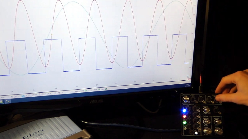
For hackers on a tight budget or with limited bench space, a USB oscilloscope can be a compelling alternative to a dedicated piece of hardware. For plenty of hobbyists, it’s a perfectly valid option. But while the larger discussion about the pros and cons of these devices is better left for another day, there’s one thing you’ll definitely miss when the interface for your scope is a piece of software: the feel of physical buttons and knobs.
But what if it doesn’t have to be that way? The ScopeKeypad by [Paul Withers] looks to recreate the feel of a nice bench oscilloscope when using a virtual interface. Is such a device actually necessary? No, of course not. Although one could argue that there’s a certain advantage to the feedback you get when spinning through the detents on a rotary encoder versus dragging a slider on the screen. Think of it like a button box for a flight simulator: sure you can fly the plane with just the keyboard and mouse, but you’re going to have a better time with a more elaborate interface.
The comparison with a flight simulator panel actually goes a bit deeper, since that’s essentially what the ScopeKeypad is. With an STM32 “Blue Pill” microcontroller doing its best impression of a USB Human Interface Device, the panel bangs out the prescribed virtual key presses when the appropriate encoder is spun or button pressed. The project is designed with PicoScope in mind, and even includes a handy key map file you can load right into the program, but it can certainly be used with other software packages. Should you feel so inclined, it could even double as a controller for your virtual spaceship in Kerbal Space Program.
Affordable USB oscilloscopes have come a long way over the years, and these days, using one is hardly the mark of shame it once was. But the look and feel of the classic bench scope is about as timeless as it gets, so we can certainly see the appeal of a project that tries to combine the best of both worlds.


I don’t know if I’d consider a Picoscope to be a “budget oscilloscope”…
I particularly like their range of automotive scopes. Hardened against physical (and overvoltage) abuse.
I agree
Who said it was? USB scopes are often low cost compared to bench, but doesn’t mean they all are.
If you compare the really costly components (leaving the display and frills aside) you will sooner or later find out that the bench models do have the same or better price-performance ratio.
It’s fair, that there’s a sweet spot with bench scopes wrt price/performance. That being said, unless you need really good analog performance or just absolute screaming speed, a USB scope is a really good option.
I work as an EE and I have a $25K scope sitting on my bench.
I also have a $200 USB mixed signal toy scope at home if I’m just bashing around with microcontrollers and don’t feel like dragging ass to work to do it on my bench.
I’m very pleased with the two Picoscopes I have. They are well worh the money.
Nice. Slightly off-topic, but I really wish that more pieces of equipment and software would implement and document reasonable “remote” interfaces, to make these sorts of hacks easier (or even possible!), potentially more robust, and with fewer UI/UX glitches.
For example, I have a relatively inexpensive microscope video camera that has an on-screen, mouse based UI. I would love to have something along these lines to control it. It’s probably possible, but I suspect using it would cause the UI to appear, however briefly. I also have a Sony FDXR3000 video camera that I also wish I could control remotely via USB, in that case I am not even sure if what I want is even possible.
The typical test equipment you find for sale nowadays is entirely controllable over LAN using LXI type interfaces. You can controll it via something complex like LabView or something basic like a python script talking to a socket. One helpful part is that a lot of the equipment has a common language (SCPI for example). You can swap out an oscilloscope for example and replace it with a totally different vendor but still capture the same data using the same commands.
looks like there is a terrible latency ? is that normal behaviour of the picoscope software ?
There was a problem with the switches being too bouncy, so I added more switch debounce and it sorted it. I presume that is what you saw (The auto button takes a long time, but that is understandable). The software doesn’t seem very laggy.
This looks to be a very good idea!
I must have a play with it later.
Thank you :)
Nothing compares with the ergonomics of a Tek 400 series scope. No thinking. No need to read the manual. No help files. You didn’t stare at the front panel and puzzle out how to make it do what you need. You just fly it. Switches properly clicky.
Spacing and grouping good. No other manufacturer really got it right. Copy the layout and features of a Tek and maybe you have something.
I was going to complain about the horizontal scale and position controls being laid out identically to the vertical scale and position controls just in a different place on the panel and I see that the TDS460 at least makes the same blunder. If they were differently arranged such as the position knob being to the right of the scale knob for the horizontal controls or differently colored then I might not have to read the labels every single time I go to use one or the other.
Tek dropped the ball when they started going digital. Maybe the ergonomics guy retired. None of my digital scopes are intuitive. Work through the menus repeatedly to figure out how to do something. Are you getting work done or spending a couple minutes every time you try to do something? Are you looking at what you think you’re looking at? The old analog scopes are tools. You don’t need a manual to use a hammer. But, takes a lot of effort to make something simple.
We liked Agilent windows based scopes with Mouse + knob over Tek’s clunky JAVA UI and dizzying LCD color shutters.
Don’t get me started! My Agilent scope (MSO6052) has six menu buttons under the screen, you hit one and then adjust the parameter with a knob — that’s off to the upper-right of the screen.
So for the most common commands, you have to press a mode button on one side of the box, select a menu item from under the screen on the other side, and then go back up to the middle of the thing to dial its value. When you compare this with just turning a knob on an older scope, it’s pretty damn frustrating.
I’ve wanted to make my own interface for it for years.
Some touch screen POS terminals are that bad too, screen, buttons, screen, buttons, aaargh, it was easier without the damn touch screen. Made worse by those big “cone of shame” privacy guards around the keypad.
I have recently seen some discussion on Twitter about using MIDI devices as input in some programs. There are a few examples in this thread: https://twitter.com/whitequark/status/1353578371716960256
It could be useful for things like this because otherwise the program needs focus in order to receive the keyboard input.