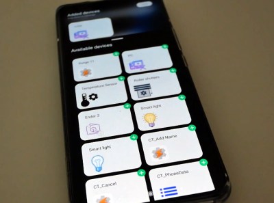
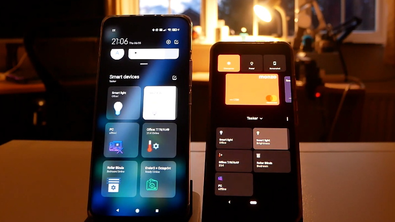
Introduced in Android 11, the power menu is a way to quickly interact with smart home gadgets without having to open their corresponding applications. Just hold the power button for a beat, and you’ll be presented with an array of interactive tiles for all the gadgets you own. Well that’s the idea, anyway.
[Mat] of “NotEnoughTech” wasn’t exactly thrilled with how this system worked out of the box, so he decided to figure out how he could create his own power menu tiles. His method naturally requires quite a bit more manual work than Google’s automatic solution, but it also offers some compelling advantages. For one thing, you can make tiles for your own DIY devices that wouldn’t be supported otherwise. It also allows you to sidestep the cloud infrastructure normally required by commercial home automation products. After all, does some server halfway across the planet really need to be consulted every time you want to turn on the kitchen light?

The first piece of the puzzle is Tasker, a popular automation framework for Android. It allows you to create custom tiles that will show up on Android’s power menu, complete with their own icons and brief descriptions. If you just wanted to perform tasks on the local device itself, this would be the end of the story. But assuming that you want to control devices on your network, Tasker can be configured to fire off a command to a Node-RED instance when you interact with the tiles.
In his post, [Mat] gives a few examples of how this combination can be used to control smart devices and retrieve sensor data, but the exact implementation will depend on what you’re trying to do. If you need a bit of help getting started, our own [Mike Szczys] put together a Node-RED primer last year that can help you put this flow-based visual programming tool to work for you.


> After all, does some server halfway across the planet really need to be consulted every time you want to turn on the kitchen light?
It is not just that, does that server really need to permanently log the time and date of the event and then commercialise the surveillance.
That’s what he meant by “consulting”
>After all, does some server halfway across the planet really need to be consulted every time you want to turn on the kitchen light?
How else will they pay for the app they’ve just “given” you? The larger problem crops up when layer after layer of “convenience” and “subscription benefits” are made unavoidable and the central functionality becomes anything but functional . This may make the focus groups intending to actualize their synergies from the 40,000 foot view look like they’re being creative, but the results are dismal (looking at you, latest Chromecast widgets).
Now you have that single command from a half dozen layers of an outsourced app ping-ponging all over the planet via un-integrated servers and trying to get it back through your dismal broadband “service” in order to not fall down the stairway in the dark sometime before the next eclipse.
Little wonder that the “Flashlight” app/utility in phones remains so wildly popular.
Perhaps an unpopular opinion, but I liked the previous power button menu much better. It was simple, clean and did precisely what I needed it to do. Now it’s just an ugly mess, and the extra functionality is of no use to me. I’m curious what other people think.
Home assistant supports this menu too. It’s really handy, I use it a lot.
Only issue with HA is that it can only display action buttons (like toggling devices/lights or triggering automations). It can’t display sensors there.
Nevertheless it’s great to have this.
Windows Phone imitation …
Thanks for reminding me of this feature.