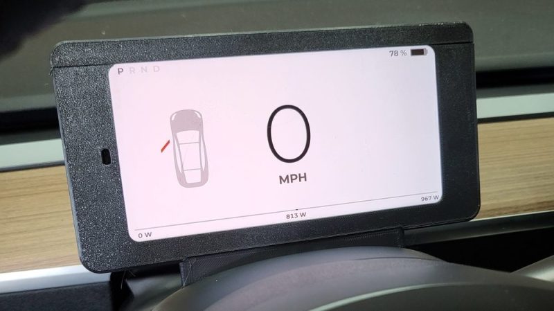
The Tesla Model 3 and Model Y are popular electric vehicles that dispense with some of the usual provisions you’d expect in a typical car. Namely, there’s no dash cluster in front of the driver; instead, all information is solely displayed on the center console screen. [Nick Nguyen] wasn’t a fan of this setup, and decided to hack together a dash cluster of his own.
The CANdash works in a simple fashion, snooping the Tesla’s CAN bus for all the information relevant to the vehicle’s operation. It’s capable of displaying everything from speed to the remaining range in the battery, while also allowing the user to keep an eye on things like coolant temperatures and whether the Tesla Autopilot system is currently available.
The build relies on a CANserver, an ESP32-based device specifically built for hooking up to the CAN bus on Tesla vehicles and sharing the data externally. The data can then be piped wirelessly to an Android phone running CANdash to display all the desired information. With the help of an aftermarket dash clip or a 3D printed custom mount, the phone can then be placed behind the steering wheel to display data in the usual location.
It’s a simple, straightforward hack that gives Tesla owners a useful feature that they’re otherwise missing from the factory. The US automakers cars are proving to be fertile ground for hackers and DIYers, with one man recently saving thousands on a battery swap with a simple mod. Video after the break.


At least it doesn’t freezes like the original does :D
And then there are those of us that actually OWN THE CAR, can discuss the topic with first hand knowledge and have zero issues with the center display.
In fact, I prefer it to the other 20 cars I have owned, save for those with HUD’s, like the C5 Corvette. I’ll take a HUD over any other type of display.
My house mate with his model 3 has the screen go black on a weekly basis while he drives. Tesla said they can’t find the issue that’s causing it and suggested trading it in for a different one…
I’ve got an IX3, I really like being able to open the glovebox by….. pressing the catch on the glovebox, same goes for seat heater setting etc. I think that Tesla have gone for principle over function, I completely get the big screen thing, but some stuff should be controlled in a conventional way, if for no other reason than driver attention on the road.
Ok. I don’t get this ‘need’ for the glovebox button? How many people are opening their glovebox WHILE driving? On top of that, you can simply use voice command and say, “Open Glovebox” and guess what? The glovebox opens. Like magic. But hey, not everyone has a smart car, I get it. Some people prefer dumb cars, with buttons everywhere, that “require you to take your eyes off the road” to push! OMG, BUTTONS ARE SO DANGEROUS!!! Like my sarcasm?
As for seat heaters, this button is one that pops up right away, when you tap the temp. But again, not needed. Simply tell the car to turn on the seat heaters or the AC or to increase fan speed… Are you seeing a trend here? The Tesla can do anything you want WITHOUT ever taking your eyes off the road, UNLIKE with your car. This makes Tesla the safest car on the road. Welcome to the 21st century.
Voice activation probably works if you are American, or maybe British. If you have a less common accent (Scottish? New Zealand?) it’s a joke, especially if you add in a bit of road noise. Do these Teslas have a head-up-display? That would solve the output, but not the driver input. If I ever buy a Tesla (and I might, I find the performance and range quite appealing) a “conventional” dash and some shortcut buttons would my first modifications.
“that dispense with some of the usual provisions you’d expect in a typical car. Namely, there’s no dash cluster in front of the driver; instead, all information is solely displayed on the center console screen.”
What an absolutely idiotic idea.
You need things where you can see them while watching the road.
” Turn your head and search for the middle console” is just no way to keep important things in view.
Cool project, but it shouldn’t have been necessary.
Tesla dropped the ball big time.
I think the problem is bigger. The authority checking the road worthiness is to blame. Same with the headlights. They completely spiralled out of control and about eighty percent of all new cars blind you during the day as well during the night.
And don’t get me starting about the xmas lights disguised ad turn signals…
Soon we won’t even own the cars.
https://investmentu.com/taas-transportation-as-a-service/
A certain kind of investor won’t be satisfied until they charge us for every breath we take.
yawn,
model 3 is a great car
this is a cool hack
have a nice day
I once had a Toyota car with a center mounted gauge cluster. It wasn’t terrible once I got used to it, but it sure as heck wasn’t an improvement! Of course, it was also a conventional cluster instead of some distracting and useless touch screen, so there is that…
Clearly you’ve never drove this car. It’s absolutely fine where it is. You don’t have to turn your head like they are exaggerating. All the information you want to see is always easily visible. This project has a huge idiotic idea they didn’t want to mention. They just covered the vent in front of the driver.
Yes I test drove the car. No I did not like the center dash. It was not what I consider just fine.
I think a heads up display is the ideal solution for adding a dash display.
BTW also not offering XM Radio on the 3 is dumb as a box of rock. “You can use you cell phone…” Only if you you always have coverage which I do not.
Paying for XM radio is as dumb as a box of rocks. It does have integrated Tidal, Spotify and others. I know that at least with Tidal, you can download songs straight to an attached USB and never have to worry about not having a signal. If your using XM for news radio, you should really seek help. News radio in a car being a must sounds like an addiction.
The problem I can see is how tesla has everything in the center yet the car likes yelling at you to pay attention at the sane time.
It’s sorta like hay pay attention to your speed but your not allow to look at your speed
Which comes in handy with roads with 25mph speed limits. So you don’t get pulled over
Tesla is a piece of overcharged junk belonging at the tivoli.
For that kind of money it should look like a car.
No kidding. And those gas burners? For that kind of money they should look like proper horseless carriages.
I mean, I made this thing, it’s very far from the vents and tilts with the wheel, and I like it better than it was before, which I thought was kind of the point of hackaday. Your car does not have this display, and there is no danger of me adding it to your car while you’re asleep, so you can rest soundly. It attenuates airflow somewhat if you like air blowing through the wheel, but otherwise it is unaffected when used like most people do, in split vent mode. There’s also way more data that I have in my display that isn’t of interest to everyone but certainly nice for me to have.
Yes mini did the same thing – not a fan. A better idea would be a HUD. put what is needed on the windscreen
HUDs done right are hard to do, OEM huds have a diopter lens and a collector to make the HUD float in the focal plane ahead of your hood. I am not doing a mirrored view for people to put a phone on their dash because that is junky, but it’s open source so you are free to implement any idea you want. The mini cluster is also an awful blend of a tiny LCD and analog gauges cheaply modified to look like part of a digital cockpit. A Pixel 2XL, which is what I use, updates at 60 hz, has practically infinite contrast at night, and is more powerful than the MCU in the Tesla while having a 500 ppi display that has higher effective resolution than print. Implementation matters, and taking advantage of cheap used hardware that is more advanced than anything an OEM would use is a feature, not a bug.
You’ll see VW did something similar in the ID but the execution (IMO) is worse.
You clearly haven’t driven one. It’s really not an issue.
By keeping “important things in view”, I presume you mainly mean the road and cars around you.
And speed limit like roads with 25mph only or 30. Too fast then you will get pulled over.
It’s not fun getting pulled over going 35 in a 25mph since it’s so slow..
Why look at the speed? Just pull down the right stalk and enjoy not worrying.
You have no idea what you are talking about. I was apprehensive at first, but it took about 10 minutes to get used to where the speed is displayed. The center console is NOT an issue, and anyone who drives a Model 3 knows this. Sure, this might be kinda nice, but it’s far from necessary. You don’t “turn you head” and there is no “searching the screen” for information.
You are grossly ignorant and misinformed- but cool that you joined the conversation. :-/
Nah it sucks. Center console IS an issue. Its stupid and should not be allowed by regulation
Imagine paying that much for a ‘state of the art’ car, then needing to 3D print essential features. What a nonsense!
Imagine never having driven the car, and commenting about whether or not a display is needed behind the wheel.
Been driving my Model 3 since 2018, it takes literally the same amount of time and effort to shift my eyes to the right and see the speed I am traveling as it does to look down and see the normal speedometer on my 1996 Vovlo 850 wagon I still have. People are afraid of change and make a huge fuss over nothing.
No it doesn’t. Its longer and harder to look right then a bit down. It sucks and is very bad design.
cool hack. good job accessing the CAN bus directly to access speed and other parameters. CANbus is meant for this :)
having the center console display speed allows multiple regions with same display hardware, honestly it seems rather efficient to me.
having had experience with that specific device, not having a cluster centerline has benefits. introspectively comprehending speed is a skill that is valuable to cultivate.
again, cool hack! great display choice
It’s not like Tesla was first with center mounted Dashboard. Toyota Yaris and Citroen C4 had something similar.
Also, the original & modern Mini Coopers.
Although, they did give you the option of the cockpit Chrono package to move it back over the steering wheel.
Also the ford Model A
Also the Saturn Ion
The big difference here (I made the CANdash with my wife) is that most OEMs put a center mounted screen much closer to the windshield and therefore in line of sight. The Tesla UI puts it in the corner of a display that is much closer to you. Does it work well enough? Yes. Do I like it better now? Also yes. The new v11 UI which migrates the speed ever closer to the edge of the screen seems to suggest that people would prefer an easier to see speed display. Speed isn’t the big issue for me but when using AP as you’re supposed to, looking ahead at the road, it is easy to miss the blue pulsing of the main display reminding you to waggle the wheel. My hands are on the wheel when this happens but the system isn’t sensitive enough to detect this unless I really put some force on it.
I’d suggest having your sensor checked then. When I am on AP, I keep my left hand resting around 7 or 8 oclock on the wheel, and that amount of torque is enough to have the blue flash rarely every happen for me. Took me a little bit to get the general idea of how much torque was needed to not have it (I used to do the waggle thing every little bit too) but once you get the right positioning and torque, it’s a non-issue.
You don’t need to put any force into the steering wheel at all. In fact, you don’t even have to have your hands on the wheel to get the blue pulsing to stop.
Simply touch one of the wheel buttons (scroll up or down) and that will stop the blue pulsing and give you another 45 seconds (if at freeway speeds) or 12 seconds (if on back roads.)
Toyota Prius. (At least the new style – not sure about the previous gen.)
This is a pretty cool project. Having spent a lot of time with a Model 3, I think the most valuable part of it is bringing the proximity sensors into a location where you will more likely notice them being triggered. There’s also the total geek value of being able to see things like wheel torque which is neat but not necessarily useful – like so much else on Hackaday :)
The next progression to this sort of thing is to add hardware buttons for functions like turning on the seat heaters, should the user prefer hardware. This means sending over the CAN bus, which has a different level of complexity than just listening because you can’t just shout louder than the actual controls. Should be easy enough to emulate a button push without causing other problems as long as that message doesn’t also contain highly volatile info.
Indeed. Someone should market a kit for this.
I have 10k in my Model Y at this point and the center console has had zero problems. If I’m driving with my hands at 9 and 3, the speed indicator on the screen is just beyond the knuckles of my right hand. Glancing at it (without turning one’s head) takes a 10th of a second at best, and the road is still in my peripheral vision. It’s less far to look than any of your mirrors, which you should also be scanning with regularity to maintain situational awareness, yet no one’s complaining about the dangers of checking their mirrors.
I’d be willing to bet that many people opining critically on Tesla’s setup (and not having driven one) also have their side mirrors set incorrectly, so much so that they physically turn their heads (and maybe bodies to some extent) 90 degrees or more to check their self-inflicted blind spot during lane changes at highway speeds, taking their eyes off the road ahead for significantly longer than glancing at the well-placed screen of a Tesla.
Cool, now add a proper analogue speeometer….
… and real Radio and HVAC knobs…
FYI, they have real radio knobs on the steering wheel. Prev/next/volume/pause.
I actually find digital numerical speedos to be preferable. It’s where you need precision but not rate of change. Perfect use for an exact readout. Something like a tach, you’re more interested in rate of change so a sweeping analog needle makes more sense.
Jumping from cars with a digital speedo to ones with analog dials, I do notice a difference in mental processing time. But if you want to add sweeping needles triggered off CAN, I did a project like that a while ago that was mentioned on Hackaday. It’s not terribly difficult to implement.
Tesla dashes look stone aged compared to the one in my 1960 Chrysler.
Seriously, it’s right out of the Jetsons. Just haven’t found the ‘fold up car’ button yet. Bet it’s near the gear shift buttons.
Put me down for analog gauges. Because you don’t have to ‘read’ them per say, just a glance gives you a ballpark.
Also turn the tach to the red line is straight up.
Sure, bud. Sure. You might want to see an optometrist for your annual eye exam.
I have at least two cars where the tach is set with a vertical redline – there’s something about horizontals and verticals that our eyes register easily.
A glance to get near the ballpark is great for information where you need trends and general information. Speed is not one of those, that one you need exact information if you’re worried about speed limits. If you’re not, well, speed isn’t that important a datum. So a digital speedo and an analog tach is a good combo.
20k on a 3 here, and I agree that the speed indicator is quite easy to view. If you are 100% happy with the UI of your Y, then this project is not for you. Just don’t take an interesting project as an attack on your vehicle of choice – it can be hard to get out of that mindset with Teslas because public opinion tends to be very polarized.
What this does is allow you to prioritize things that you feel are more important than the Tesla UI designers did. For example, making the proximity detectors more prominent will help with situational awareness even if you are following driver’s ed best practices, because your eyeballs only point in one direction at a time. Or maybe you want more emphasis on the energy deploy/regen graph. Or maybe you’re some kind of nerd with an interest in propulsion and want to see how the torque is deployed across both axles in real time. Take this open source project and run with it. Do something interesting instead of telling us why it’s pointless.
Sorry, I was expecting separate displays similar to an older car, not an LCD hovering in front of the dash like in a police cruiser. I mean, that’s ok if it’s what you want just not what the article seemed to be leading up to.
If you want separate motor-driven analog gauges reading CAN, I built one of those last year. Didn’t put it in a Tesla but you could. This project will get you a head start on doing it yourself if that’s what you want.
Speed on the top corner of the center display is perfectly find on the Model 3. But tesla leaves out a ton of other useful information. You have a one pixel power graph that is impossible to see in periphery, and no way to see battery temperature which defines a number of powertrain and charging limits. I took on these projects to place data that I’m interested in right in front of me…I like to see power and torque graphically, and power and temperature numerically. Others like to see efficiency information, blind spot indications, or whatever they desire. Tesla provides almost none of that, and every year they scramble up the UI and hide useful things anyway. That’s why I started this ecosystem, so users can decide what they want to see where. Thanks for posting about it.
You are correct. I wish the UI on the 3 and Y was more like the X and S. On the later, you can place windows on the left or right. With the 3/Y, the car info is permanently fixed to the left side and you can’t make the window larger or smaller.
If Tesla would let us create our own customizable GUI, for putting various data windows where we want, say speed in the top left, tire pressures in a small window below that, and then battery info in a window below that, with maps on the right, that would make life a lot better.
Maybe that’s the plan in version 17, but for now, we are stuck with version 11 and all of the issues they created with it. I prefer version 10, personally.
Looks a bit janky to me, however, it’s disappointing to see Tesla trying to re-invent what doesn’t need to be reinvented and the owners having to deal with it themselves. May i suggest an idea for Tesla? Remove all the screens and buttons completely, that will make the car even better! While at it, why do you even need a vehicle, just buy the badge! That is going to be the next iteration of Teslas.
Actually, that is the plan. Elon wants to remove the steering wheel completely and move all vehicles to full self drive. (Won’t happen for at least a decade, but that is his goal.)
Tesla’s cars are _now_ already Fully Self Driving! At least if you’re willing to ignore the words “fully” and “self”.
They do drive, and quite well. Teslas are very nice, if expensive, electric cars with a good level 2 automation setup. An Elon is a rich showman.
I will believe “no steering wheel” from them when I see it. Their competitors are much closer. Waymo or GM Cruise or Mercedes will beat them. Ford is breathing down their necks — a Volvo is almost as “fully self driving” as a Tesla is. Toyota won’t be far behind.
But Tesla and competitors have completely different approaches to self driving. Teslas are built to react to their surroundings and learn as they go. The others are usually pre-mapped terrain, so there’s less to respond to and decide in the moment. The downside is they’ll never be able to completely map EVERYTHING, and they’ll have to remap every area that has new or altered construction.
This isn’t true. Waymo and the rest have to geo-fence every area that they want to “self-drive” in. This requires pain-stacking pre-mapping per city. Large cities like LA they can’t even do. They have to piece meal the city into small sections. They do utilize an AI for things like emergency vehicles, Lane closures, etc, but they also have a real person to take over, as needed, just in case. There are plenty of YouTube videos that describe this fully.
Tesla, on the other hand, are using a neural net approach, so no geo-fencing or cost-prohibitive / timely 3D mapping required. Rural and sub-urban areas and the entire world are open to any Tesla vehicles self-drive abilities.
This is apples to oranges comparison. Tesla is in a whole ‘nother league. The technologies of both are pretty amazing. I highly recommend watching YouTube videos on them. Fascinating stuff!
I think it’s awesome that you customized it and learned so much about building an Android app in the process. Maybe Tesla can roll with this idea to make better in-dash instrumentation or an HUD. Nice job!
Compare the Model 3 dash to the dash of a 1948 Hudson. Sweeping curve. Fake woodgrain. Chrome strip. All instrumentation smack in the middle.
Tesla’s are S3XY and they know it… Nice pre-planned order of the model releases.