What’s the most important keyboard macro you know? Honestly, it’s probably Ctrl-S. But do you use that one often enough? Chances are, you do not. What you need is a giant, dedicated Save keyboard that looks like a floppy disk.
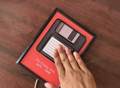
Just like you’d expect, pressing the floppy icon triggers Ctrl-S when connected over USB-C. Internally, it’s a Seeeduino Xiao, a push button, and some wires.
The floppy disk itself is made of foam board, and everything is encased in a picture frame. If you want to make one for yourself, [Makestreme] has some great instructions over on IO.
Folding Keyboard Working After Five Hours of Debugging
Wishing for something compact and foldable, [sushiiiiiiiiiiiiii] created this seemingly nameless wonder that sort of resembles a concertina. The initial idea was to have both halves separate and make the thumb cluster unfold, but the making the linkage work correctly turned out to be a nightmare.
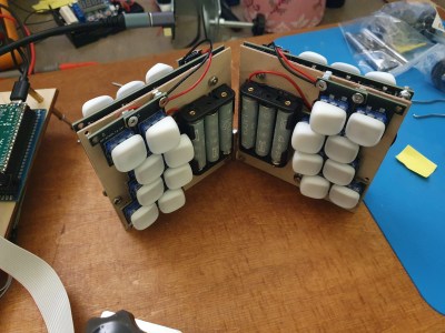
They are topped with beautiful KLP Lamé keycaps I’d really like to touch that [sushiiiiiiiiiiiiii] had printed through JLC. It runs on six IKEA LADDA Ni-MH AAA cells [sushiiiiiiiiiiiiii] had laying around that the integrated Li-ion charger “shouldn’t explode” based on research.
Programming was a different kind of nightmare. [sushiiiiiiiiiiiiii] went through the ZMK setup, but the thing just would not show up on any Bluetooth device. After several hours of checking absolutely everything, [sushiiiiiiiiiiiiii] went back to the guide and discovered the programmer’s bane — an errant space after a comma that screwed everything up. The next version will have a reworked hinge and be less wobbly.
The Centerfold: A Little Comic Relief
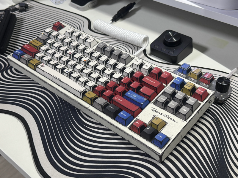
Do you rock a sweet set of peripherals on a screamin’ desk pad? Send me a picture along with your handle and all the gory details, and you could be featured here!
Historical Clackers: Defi-ing Typical Typewriter Prices
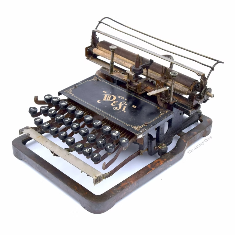
First and foremost: although it looks nice, the reason why this Defi is screwed to a metal base is unknown. This typewriter came standard with a wood base and cost a mere $25 in the early 1900s, whereas most machines were more like $60-$100. A metal base would probably have made it cost more.
The Defi was built with a three-row, 84-character keyboard bearing two Shifts, presumably one for upper case, and the other for figures and symbols. From here, it looks as though every key has a second function, which gives it a really nice balance between usability and portability.
One of the most interesting bits to me is the semi-circular type element, which looks like one of those old rocking desk ink blotter things. Speaking of ink, the Defi used a ribbon spool. The whole thing was only a foot square and five inches tall, weighing about nine pounds total, presumably with the wood base.
ICYMI: the Lancaster ASCII keyboard Clacks Again
If you want a cool keyboard in 2024, you’re probably gonna have to build it yourself. And if you wanted a cool keyboard fifty years ago, you definitely had to build it yourself.
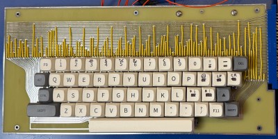
[Artem Kalinchuk] wanted to recreate this famous keyboard, and he did, twice. One PCB is true to the original key switches, and the other, more practical version is made for the MX footprint. Both are up on GitHub if you’re interested.
While the board itself is nice, you would also need the ASCII encoder board, which is fairly simple with a few ICs, diodes, and a couple of transistors. I really love the look of this keyboard, and although far more practical, it would be a shame to cover up all that beautiful wiring. Perhaps clear acrylic is in order?
Got a hot tip that has like, anything to do with keyboards? Help me out by sending in a link or two. Don’t want all the Hackaday scribes to see it? Feel free to email me directly.








When using any browser, use Alt+F4 to save any important data on the server ;-)
You may also use Ctrl+w.
For best results, use the button that looks like so: ⏻
The button that looks like a generic-character-rectangle with “23” in the top half and “FB” in the bottom half? That’s how my web browser renders it.
A quick copy-and-paste to word processor gave the big reveal. Maybe the “23/FB rectangle” is my web browser’s version of a molly-guard.
Molly-guard. I was trying to remember that the other day.
In reference to the “WTF were they thinking” Apple II reset switch right next to the “Return” key.
Apple ll ???
Is that an unauthorized clone of the Apple ][ ?
No, the clones didn’t have that “feature”
The molly-guard for that was to put an O-ring around the reset key stem. If you wanted to press it, you had to really mean it.
When editing a table in MS Word, you select the whole table with Alt+Numpad 5.
Once you move to a TKL or smaller layout, this needs to be a cutom macro anyway.
Damn it, posted in wrong spot.
What’s with the whole keyboard shtick?
CTRL+S and CTRL+Q, in that order.
CTRL+Z then bg
I was looking at the image of the Defi and couldn’t identify the mentioned type element, and started to wonder if I was seeing an AI image. It turns out the shown typewriter is incomplete. A complete one with the type element can be viewed here: http://www.typewriterstory.com/defi-typewriter/
I also couldn’t figure out the platen. Turns out it strikes the paper from behind to print the characters onto the paper.
that looks an awful lot like the way my Varityper 1010 works. although that one is way bigger and heavier due to the whole proportional typing thing and justification system.
The “unknown-to-me make and model” headache-inducing keyboard looks identical (less the visual enhancements) to my cheap-but-entirely-adequate off-brand mechanical from Amazon. Mine branded “REDRAGON K552”. Excellent, once I gave it a LEDectomy and a few dozen o-rings to quiet it down a bit and soften the bottom-out feel.
[Kristina],
I couldn’t help but wonder if you added an extra “i” every time you inserted [sushiiiiiiiii] into the text.
B^)
The save-icon keyboard is brilliant!
I’m pretty sure I use Ctrl-Z, Ctrl-C and Ctrl-V more than Ctrl-S. Also Win-Shift-S, maybe. Do I rely on autosave too much?
You want the vintage ASCII serial keyboard to work with your modern Linux workstation? Checkout Serkey https://github.com/racerxr650r/SerKey