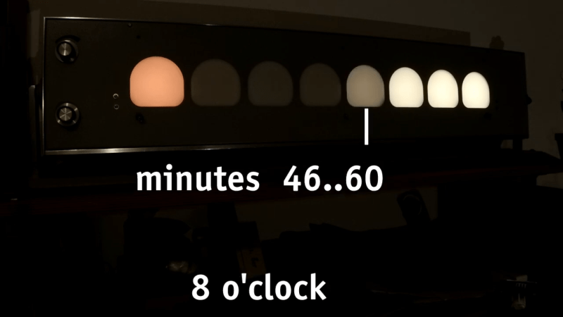
Creative clocks are a dime a dozen, even clocks that use binary have been created in nearly every format. [typo] promises a clever adaptation to the binary format, and it promises a more usable display. Using a combination of both traditional binary and digital gradients creates a usable and yet still nerdy fun clock.
[typo]’s clock fits the traditional binary counting method with the hours on the left side of its face. On the other hand, its right side presents a lighting gradient depending on the completion of the hour. While this is simple in principle, [typo] chose to correct what many don’t consider when deploying visual gradients. The human eye doesn’t see everything exactly as it is, which creates a rough logarithmic curve that gets corrected for in the binary/digital hybrid clock.
If you want something more mobile and still have that smidge of difficult time telling you, check out this minimalist wrist watch!


I did something like this once. Had a fun project that I wanted to have a numerical display. But I didn’t want to buy an LCD and all that. So I wired up some LEDs and output the number in binary. It worked but wasn’t a very nice user experience as I’m sure you’d all imagine
I was on a business trip to Stuttgart Germany, staying in a Hilton Garden Inn. The breakfast area had a square on the wall with blinking red dots. I fairly quickly figured out that it was a binary clock, each column from left to right represented a digit. I was fairly surprised to find something like that in a generic business hotel.
Bonus, it was in the shadow of the soccer stadium (literally) and just down the street from Mercedes HQ.
I admire the author’s insight to focus on the completion of the hour, which brings this much closer to what real needs usually are. Creative clocks maybe dime a dozen, but usable ones are a rare find, indeed.
There has been numerous concepts claiming “upgrading” the round clock dial with hands, however, it all boils down to whether they are intuitive enough to be nearly self-explaining, and my impression was “almost none (that I’ve seen) were”. My rule of thumb is simple, can a kindergarten kid figure out how to use the clock without explanation/hints? Because that’s about the age when one needs to start using one independently.
7-segment LED/LCD clocks were quite an improvement in that sense, though, they lacked another thing – point of reference, ie, one had to mentally place current time in relation to midnight (or noon). In this sense combined digi-analog clocks, ie, round dial with hands and complementary 7-segment numbers were addressing both quite well (though, in the usual corner-cutting manner cheap clocks have two separate circuits driving the two, hence, they quickly go out of sync, IMHO, partially defeating the purpose of combining the two).
I’d say it is really 50/50, half of the times we need to know the count of hours/minutes starting from some reference point in the past, for example, when cooking, while the other half of the times we need to know the remainder before some reference point in the future, ie, the timer. Round clock with hands excels in both, since both can easily seen at once in relation to the clock hands’ positions. Humans in general are not terribly good at multi-tasking, so two hands (and four quadrants – two remainders and two counts, since it is two hards) is about the maximum; third hand makes it look decidedly busy.
I’ve dabbled with re-designing the clock for a different reason – for me an hour should be broken into three segments 20 minutes each, and it makes more sense to go with the same idea the author has – show the reminder as gradient, ie, lit segments vs unlit, given all segments are easily seen. Binary or not, the idea there is to show both the count and the reminder at once.
I’ve also looked into logical colors for various hours of the day/night, and, interestingly enough, arrived at no good/unversal solution, for example deep blue is not a good nightcolor, since blue light in general tends to do the opposite of calming the brain down, just historically it seem to be linked with twilight (and basically Rayleigh Scattering, results of which become most obvious at daybreak and twilight).
My original idea was matching the outside natural light with LED coloring (well, virtually – I had tiny TFT), but eventually that proved to be just too complicated/confusing. It was no better than assigning random colors, so eventually I just went with the classical spectrum and its complementary/matching colors for each daylight hour, and settled on gradient dark shades of purple gradually changing to blue for the night hours.
Why 20-minute hour segments instead of the 15-minute ones loved by HRs? Personal observations, I can productively work, ie sustain uninterrupted high-concentration attention on one task for about that long, after which I start to gradually space out. Two 20-minute segments, ie 40 minutes is about the absolute maximum for my ADHD, after which I have to take a break to cool off. I’ve also seen similar timespans for others, and what’s interesting that pushing the 40-minute limit tends to be counterproductive, I start making mistakes that mostly could have been avoided during the first 20 minutes of intense mental focus. Obviously, this only applies to mental tasks, and not really things like woodworking, but you kind of see how this can be applied in about similar way, ie, breaking time down into mentally identifiable segments.
I made a desk clock out of an LED matrix and an ESP32, as one does. I added a bar along the bottom that marches an LED from left to right to show the hourly progression. It’s neat, I like it, but I don’t find my self guided by it as I thought I would. That dial is just too good, as you point out.
The one I made for the bedside table does offer some guidance via brightness. I have it dim down around 10PM because that’s my usual bedtime and it’s just too bright to sleep next to. At 6AM it goes back to full brightness. I’ve found that dim/bright switch actually conveys some useful information about where I am in my day without really having to look at it directly. Weird.
Excellent observation, and I haven’t really paid attention to brightness, but now it makes even more sense.
What’s wrong with just using a standard 24 hour clock? That is what we use at work. No ambiguity. My cell phone, bedside clock, computers is all set to use a 24 hour clock.
Digital clocks in most of the world (that I personally visited) have 24-hr “zulu/military” time, yes, and I grew up using that. IMHO, you have to train yourself to constantly compare current hour with 12: less than 12 – it’s morning, larger than 12 – afternoon. In this sense dial clocks make more sense, but then the vast majority of them is usually 12 hr kind, that’s why I mentioned analog-digital kinds, a glimpse of the numbers (given they are 24 hr zulu time) resolves that ambiguity. In the US it is almost always 12-hr digital, with AM/PM marking morning/afternoon.
For some reasons 12-hr dial clocks are more prevalent (and more widespread). I always found it strange, since the 24-hr dial removes ambiguity AND has rather nice visual sun-day (unrelated to the weekday) representation of part of the day, right side of the dial is morning, left – afternoon.
One of my ideas was rotating the 24-hr dial clock 180 degrees, so midnight would be at the bottom, noon at top, and that would match up the sun’s position at the sky. I also thought that the dial should be proportionally gradient-colored, from light color at the top to some kind of dark blue at the bottom.
I actually programmed one of my TFT round display clocks with that (ongoing project, not much to share; yet;) to see how it would look, and that actually makes sense (more details – I picked one of those 1980s themes with gradients starting with bright orange/yellow at the top and down to deep purple at the bottom … definitely impressive and position of the hour hand clearly points to the sun-day quadrant : – ] ).
As far as usability goes, there is more stuffs that’s needed still. I always wished there was some kind of easily recognizable information relaying the length of the light-day, maybe moving the said TFT round clock gradients slightly up/down at midnight to reflect longer/shorter day length … something like that. I haven’t tried it yet, but I’d also probably want the civil daybreak/twilight timing as well. Somehow. Somewhere : -] Work in progress.