
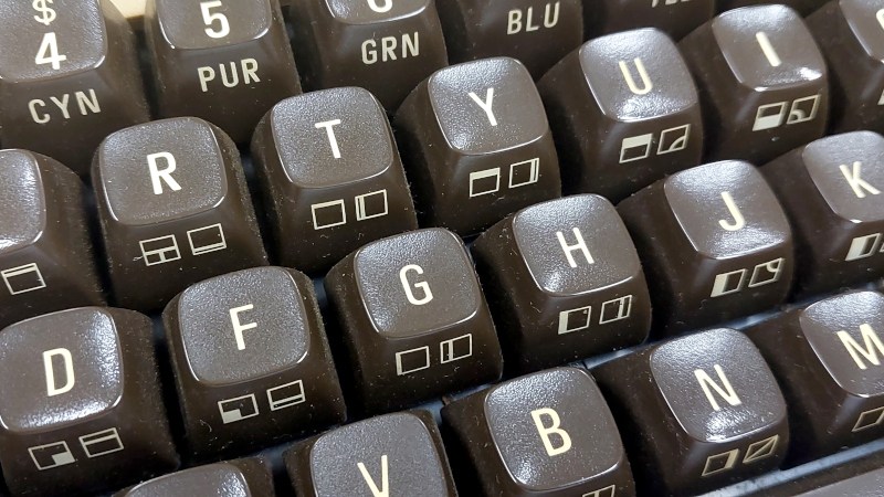
There are some classic fonts which appeared in one place and became almost iconic, yet never made it into the digital age. The font on the Commodore 64 keyboard for example, with its its slightly narrow letters. If you’ve been yearning to see it again then help is at hand, because [Levente Szabadkai] has traced it from photographs and made it available as a vector font in a variety of formats on GitHub.
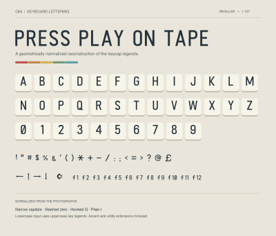 As you might expect, it’s an uppercase font only, as the hardware never sported lower case letters. But it doesn’t stop there, because it also contains the various punctuation and other marks, all the PETSCII glyphs, and the function keys. There’s even a Commodore logo for that key down in the left hand corner, but we’re guessing you’ll have to assemble CLR HOME yourself. We can’t help noticing the cursor arrows are solid in contrast to the outlined ones on our 64 here, but we’re guessing there may be some minor differences between models.
So download the font, and make all your stuff look like a 1980s home computer keyboard. And in case you are wondering why you find so many keyboard fonts familiar, we’ve talked about the Gorton font in the past.






Next step: create that “missing” lowercase font. A fair bit of effort needed; lowercase A, D, E, F, G, etc. require some creativity, but the upper loop of B and the upper right prong of H could simply be removed (and some rounding applied. C, I, O, V, W, X, and Z mostly require shrinkage. Drop J and add the dot; drop P and round it a bit, etc.
Perhaps refer to the lowercase font provided in word processors like Paperclip. I absolutely loved that program; even used it to write my dissertation. One of its most endearing features as a chemist was the ability to activate just one super- or subscript with one command, then automatically return to normal font without having to undo the function. For chemical formulas…neither WordPerfect nor Word offered that feature, and I never figured out how to create a macro that would do it for them. So it goes.
That is very much not the font on the Commodore keyboard. Look, for instance, at the G. On the keyboard, it has a slight angle at the bottom-right; the font shown has an all-round bottom part. The letters on the keyboard have a slight but very effective contrast (thick and thin lines); as far as I can tell, the one shown has no contrast (all strokes are the same width). There are other differences, such as how the arms of the K and the leg of the R are positioned, and the more complex curves on the bowls of the B on the keyboard. The midpoint of the M on the keyboard touches the baseline, but is well above it in the font. The angles of the N and the top of the 4 are elegantly wide on the keyboard, but geometrically drawn at the same width as the stroke in the font. Absolutely not the same font, not even close, and that’s based on the few letters I can see in the title photo.
This guy fonts.
I’m now curious why. The repo has some “normalization-comparison” which seems to be showing the process of pulling an owl on a globe. Why?..
“I read about fonts with ChatGPT and now I have decided to go for a nostalgia play so ppl will notice me. What gets the old nerds going? Oh yea! Commodore!”
That’s your why. Not shaming it tho. I’ve done worse in my youth trying to establish what I am. Not with fonts tho… Like trying to win at stamp collecting… I’m more into bit banging and game modding myself.
You’re right! That G looked okay until I went back and examined it. I think I like the originals as well. More style.
Doesn’t look the same. Look at R for example.
Yes. The R looks like the one from my current PC keyboard.
“As you might expect, it’s an uppercase font only, as the hardware never sported lower case letters.” – most keyboards only show uppercase on the keys.
What universe do you live in?
The vic-20 and C64 both supported lowercase letters, but it was based on the same byte codes as the symbols , so you could have one or the other but not both at the same time.
I’m convinced the legalization of marijuana will lead to the downfall of civilization.
I think you might have misread “sport” (to wear or be decorated with something) as “support”. “Sported” is a very journalistic way to avoid using the normal English word “had”, to sound fancier. So the meaning is presumably more like “The hardware never had lower case letters [on the keyboard]”.
So they mean that there’s no source for lower-case letters on the C64 keyboard, not that the C64 itself didn’t support lower-case characters on screen etc.
I do like your thing where you end a comment with a non-sequitur though.
I’m convinced building floors should always be numbered from “floor 0” for the ground floor, followed by “floor 1” etc., to avoid confusion over UK and US numbering, etc.
Indeed. I had a Sinclair ZX81, now that did have only upper case. But both machines had upper case keyboards.
To be clearer: you could have Uppercase, and shift gives you symbols, or lowercase, and shift gives you Uppercase. C= Shift toggled between the two modes.
I thought the same, but I think the author means hardware as in the keys themselves, not the hardware as in the machine, which obviously supported lower case!
They way the author phrased it is very confusing.
To avoid confusion, C64 can have either upper case and graphics or lower case and upper case. The default is upper case and graphic. Press shift key + C= key to switch mode.
C64 has 256 characters to display at once but it has 2 sets in the ROM. The second half of 256 characters are reverse field of the first 128 characters. A creative coder could change it all to have both upper and lower case and most of the graphics by repurposing the second half of the characters to get rid of reverse field version
You think Marijuana is causing people to have chatGPT develop fonts for them?
Since so many go quite hysterical over AI maybe some weed can help them climb down a bit.
What a lovely font. It is quite close to the font on the keycaps of a C64, but as already noted, there are a few differences – but the author does say on the font’s page that the letters are geometrically normalized. Perhaps this accounts for the variations.
What I find interesting is that the article mentions that the typeface is uppercase only because the hardware didn’t support lowercase, which isn’t true. The C64 could absolutely display lowercase letters without special software or ROM hacks. They are part of the normal PETSCII character set and are available by pressing the Commodore key + SHIFT. Perhaps the article’s author was momentarily confusing the C64 with the Apple II, which did not have lowercase letters in its original ROM.
Perhaps the font is uppercase only because the keycaps from which it is drawn are only in uppercase. But then that makes one wonder why the function key characters go to f12 when there are only characters up to f8 on the actual keyboard.
Many mysteries.
But, I still think it’s a cool undertaking and I am very glad it exists and that Hackaday decided to write about it.
Yeah, they took the retro-modern, very cool humanist sans and “geometrically normalized” it to something that looks like a technical lettering stencil. In fact, some of the letterforms look more like DIN 1451 than like the Commodore keyboard (check out the M, the R, and the G). Remember the well-intentioned Aragonese woman who “geometrically normalized” that 100-year-old frecso of Jesus?
Ive added the lowercase fonts and fixed some symbols. If you want it you can get it here: https://www.dropbox.com/scl/fi/qik1wm0v3o750bsb71bpe/C64Keyboard-Regular.ttf?rlkey=5kywgq0p6jtc1r8a8hwnqa9mx&st=gn3l816k&dl=0
Nice, where are those font coming from?
https://style64.org/c64-truetype
Posted 7 years ago and looks to be a more faithful rendition.
That’s a font that looks like the C64 font on screen.
The font in this article was supposed to be a recreation of the font used on the keyboard key caps.
Yes, this is the font that anyone interested in Commodore would actually want. Not the top-of-the-keys printing.
Surely it’s a typeface rather than a font?
A typeface, also known as a font family, is a design of letters, numbers, and other symbols, created with unified stylistic features. Since this is a single design, rather than a related family of them, it is a font.
Quick info, the character set used by PET/VIC-20/C64/C128 etc is called “PETSCII”.
That’s important in the context of old Commodore BBS systems and ASCII art.
https://en.wikipedia.org/wiki/PETSCII
It’s a word play on PET and ASCII. Other systems have similar sounding names.
For example, the character sets of the Sharp MZ 80K lineage are nicknamed “SharpSCII” (there are two; European/English and Japanese).
https://www.idealine.info/sharpmz/mz-700/codetable.htm
I love the cursor codes, most of the control characters seem to be randomized.
17 CURSOR DOWN
29 CURSOR RIGHT
145 CURSOR UP
157 CURSOR LEFT
How did it get there? People working in parallel, each claiming a control code as they needed it?
The codes for DOWN and RIGHT may be arbitrarily chosen, but UP and LEFT are the same as DOWN and RIGHT, respectively, with the high bit set (add 128).
Nice, thanks.
I had binary for breakfast, for years… missed it, doh.