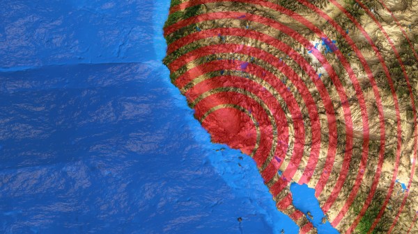
Let Your Pi Make A Pie Chart For Your Pie

March 14th is “Pi Day”, for reasons which should be obvious to our more mathematically inclined readers. As you are not reading this post on March 14th, that must mean we’re either fashionably late to Pi Day 2019, or exceptionally early for Pi Day 2020. But in either event, we’ve got a hack for you that celebrates the day using two things we have it on good authority most hackers overindulge in: food and needless complexity.

This project comes from [Mike MacHenry], and it’s just as straightforward as it looks. Put simply, he’s using a load cell connected to the Raspberry Pi to weigh an actual pie and monitor its change over time. As the pie is consumed by hungry hackers, a pie graph (what else?) is rendered on the attached screen to show you how much of the dessert is left.

One might say that this project takes a three dimensional pie and converts it to a two dimensional facsimile, but perhaps that’s over-analyzing it. In reality, it was a fun little hack [Mike] put together just because he thought it would be fun. Which is certainly enough of a motive for us. More practically though, if you’re looking for a good example for how to get a load cell talking to your non-edible Raspberry Pi, you could do worse than checking this out.

We’ve also got to give [Mike] extra credit for including the recipe and procedure for actually baking the apple pie used in the project. While we’re not 100% sure the MIT license [Mike] used is actually valid for foodstuffs, but believe it or not this isn’t the first time we’ve seen Git used in the production of baked goods.

Imaging The Neighborhood With Solar Panels

Like many people who have a solar power setup at home, [Jeroen Boeye] was curious to see just how much energy his panels were putting out. But unlike most people, it just so happens that he’s a data scientist with a deep passion for programming and a flair for visualizations. In his latest blog post, [Jeroen] details how his efforts to explain some anomalous data ended with the discovery that his solar array was effectively acting as an extremely low-resolution camera.

It all started when he noticed that in some months, the energy produced by his panels was not following the expected curve. Generally speaking, the energy output of stationary solar panels should follow a clear bell curve: increasing output until the sun is in the ideal position, and then decreasing output as the sun moves away. Naturally cloud cover can impact this, but cloud cover should come and go, not show up repeatedly in the data.

Expected versus actual power output.

[Jeroen] eventually came to realize that the dips in power generation were due to two large trees in his yard. This gave him the idea of seeing if he could turn his solar panels into a rudimentary camera. In theory, if he compared the actual versus expected output of his panels at any given time, the results could be used as “pixels” in an image.

He started by creating a model of the ideal energy output of his panels throughout the year, taking into account not only obvious variables such as the changing elevation of the sun, but also energy losses through atmospheric dispersion. This model was then compared with the actual power output of his solar panels, and periods of low efficiency were plotted as darker dots to represent an obstruction. Finally, the plotted data was placed over a panoramic image taken from the perspective of the solar panels. Sure enough, the periods of low panel efficiency lined up with the trees and buildings that are in view of the panels.

We’ve seen plenty of solar hacks, but this one has to be something of a first. Usually people are more worried about maximizing efficiency or tracking the sun with them.

3D Universe Theater

If you are an astronomy buff, there are plenty of star maps you can find in print or online (or even on your Smartphone). But if you are a science fiction fan (or writer), you probably find those maps frustrating because they are flat. Two stars next to each other on the map might be light years apart in the axis coming out of the page. A star 3.2 light years from Sol (our sun) looks the same on the map as a star 100 light years away.

The Gaia satellite (an ESA project) orbits beyond the moon and is carefully mapping the 3D position of every point of light it sees. [Charlie Hoey] took the data for about 2 million stars and used WebGL to give you a 3D view of the data in your web browser.

Continue reading “3D Universe Theater”