Yup, another clock project. But here, [Jan] builds something that would be more at home in a modern art museum than in the dark recesses of a hacker cave. It’s not hard to read the time at all, it’s accurate, and it’s beautiful. It’s a linear RGB LED wall clock.
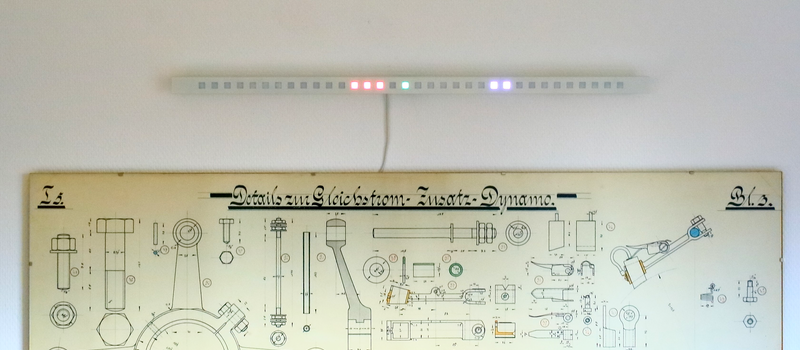
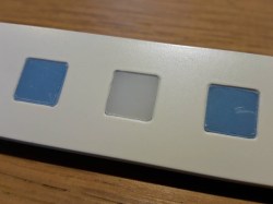 You won’t have to learn the resistor color codes or bizarre binary encodings to tell what time it is. There are no glitzy graphics here, or modified classic timepieces. This project is minimal, clean, and elegant. Twelve LEDs display the hours, six and nine LEDs take care of the minutes in add-em-up-coded decimal. (It’s 3:12 in the banner image.)
The technical details are straightforward: WS2812 LEDs, an Arduino, three buttons, and a RTC. You could figure that out by yourself. But go look through the log about building the nice diffusing plexi and a very clean wall-mounting solution. It’s the details that separate this build from what’s hanging on our office wall. Nice job, [Jan].






I am confused by the 12, 6, 9 configuration – shouldn’t this be 12, 5, 9?
Found it – groups of 3 with a “space” LED. it is more a 15, 6, 11 configuration – total of 34 LEDs (2 more “spaces”).
You’re right. Indeed there are 12, 5, 9 active LEDs, not 12, 6, 9 as written in the article!
The 5 LEDs for 10 Minutes each was the only way to keep the clock this short.
It’s not perfect but was a fun project to build.
It would be easier if the LEDs were arranged in a square, like the dots on a domino set, so you could easily identify patterns.
Easier still to read the write-up.
The write-up doesn’t look very good on the wall, though, and it doesn’t tell the time.
Like the one Destin (SmarterEveryDay on YouTube) has hanging on his world map? He explained how it works (pretty much like this one) on a recent video, but it was only up for a few days.
Duuuuuude, I literally searched the web for hours to make sure that system is in no way copyright protected or even in use somewhere. Thanks for the tip.
No problem. I especially like the feature of his where the lights for a given digit randomly shift around within their area. It’s cool, plus it (along with symmetry) helps justify having three LEDs for the tens of hours, even though you only need two, even for 24-hour time.
TL;DRTFM version: they are already arranged in groups of 3.
12:12 is shown like RRR RRR RRR RRR – G – BB
5:29 is like RR RRR – GG – BBB BBB BBB
It does indeed work exactly like this! The reason I chose to have all 34
plexi pixels in the front plate was, again, because of clean looks.
So there’s no distraction.
Awesome! Neat and original method for representing time.