Hawaiians started their weekend with quite a fright, waking up Saturday morning to a ballistic missile alert that turned out to be a false alarm. In between the public anger, profuse apologies from officials, and geopolitical commentary, it might be hard to find some information for the more technical-minded. For this audience, The Atlantic has compiled a brief history of infrastructure behind emergency alerts.
As a system intended to announce life-critical information when seconds count, all information on the system is prepared ahead of time for immediate delivery. As a large hodgepodge linking together multiple government IT systems, there’s no surprise it is unwieldy to use. These two aspects collided Saturday morning: there was no prepared “Sorry, false alarm” retraction message so one had to be built from scratch using specialized equipment, uploaded across systems, and broadcast 38 minutes after the initial false alarm. In the context of government bureaucracy, that was really fast and must have required hacking through red tape behind the scenes.
However, a single person’s mistake causing such chaos and requiring that much time to correct is unacceptable. This episode has already prompted a lot of questions whose answers will hopefully improve the alert system for everyone’s benefit. At the very least, a retraction is now part of the list of prepared messages. But we’ve also attracted attention of malicious hackers to this system with obvious problems in design, in implementation, and also has access to emergency broadcast channels. The system needs to be fixed before any more chaotic false alarms – either accidental or malicious – erode its credibility.
We’ve covered both the cold-war era CONELRAD and the more recent Emergency Broadcast System. We’ve also seen Dallas’ tornado siren warning system hacked. They weren’t the first, they won’t be the last.
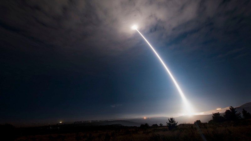
(Image: Test launch of an unarmed Minuteman III ICBM via US Air Force.)


Problem solved:
https://www.jnd.org/books/design-of-everyday-things-revised.html
I’ve reading this the past 2 days and it’s good. Here’s a critical excerpt:
“More and more often the blame is attributed to “human error.” The person involved can be fined, punished, or fired. Maybe training procedures are revised. The law rests comfortably. But in my experience, human error usually is a result of poor design: it should be called system error. Humans err continually; it is an intrinsic part of our nature. System design should take this into account. Pinning the blame on the person may be a comfortable way to proceed, but why was the system ever designed so that a single act by a single person could cause calamity? Worse, blaming the person without fixing the root, underlying cause does not fix the problem: the same error is likely to be repeated by someone else.”
A single persons mistake that had numerous options and stop gaps I think not.
Whilst the person who clicked the wrong menu option should be severely reprimanded, I think the real problem perhaps doesn’t lie with them, they are just the day-to-day operators.
Principally, the Business Analyst who did the Use Cases and mockup screens, the System Architect who figured out how it should all go together, and the programmer who built the alerts code should all now think very carefully before putting the words ‘Designed and implemented Hawaii Emergency Alert System’ on their CV.
Exactly this! Why on earth would a system capable of sending such a warning not have several layers of confirmation / validation!? Surely you’d set it up like this:
Employee: *Pushes Button*
System: “Are you sure?”
Employee: *Yes*
System: Hey Mr/Ms Manager – Employee Pushed “The Button” – you cool with that?
Manager: *Oh Hell No*
Manager: Fires Employee
I was thinking more like a ‘Fire Hydrant’ option in which you need to break a glass or something.
Clippy Jr.
Lol
Employee: *Pushes Button*
System: “Are you sure?”
Employee: *Yes*
That part all existed and happened…
The really scary thing is that photos of the “buttons” (links on a web page) look like they are on a page I might have created 20 years ago when checking out this HTML thing.
Hindsight is a beautiful thing, but it would just leave us wondering next time why on Earth such an important message was absent because the manager was on the toilet and couldn’t confirm the message. It would have saved 10 precious minutes and would have saved thousands of lives.
Yeah, like no-one’s ever clicked on a wrong menu option before. Such things should be expected and allowed for. User completely blameless in this case (unless they’d been told how to send the ‘whoops, sorry’ message and didn’t).
As I understand, they didn’t have a ‘false alarm’ template so it took them about 30 minutes to cancel the warning.
Without seeing the menu layout, I don’t have a final opinion, but from the descriptions I have read, it is a design issue, not operator. It appears that the options were both available on the same screen, and may have been adjacent, or nearby, choices. If it is a system with menus that are not fixed in form, content, and sequence (*cough* windows system and context pull downs *cough*), that is worse, as the wrong selection may be where the correct one was last week.
The options for “test” and “alert” should not be available at the same time, nor should it be easy to confuse which you are looking at (clear TEST mode vs ACTIVE mode indication. Also, there should be confirmation before an actual alert. Neither should EVER be in a pull down, as that is asking for a misread or finger twitch to select the wrong one.
I see somebody’s posted the menu layout in this thread – and you were exactly right. The menu option to click for “Missile on the way, everybody’s going to die” was directly below the “Test the system” option.
FF “History” menu. “Show all history” above “Clear recent history”. Ooops.
Report comment..
Thats all Im saying…
“The options for “test” and “alert” should not be available at the same time”
Like “format” and “eject” next to each other in the Windows right click menu :P
At least you get a follow up prompt :P
Report comment..
Thats all Im saying…
Ha! I did. Point made.
(Also, sorry!)
“Whilst the person who clicked the wrong menu option should be severely reprimanded,”
Wow. I hope you aren’t actually in charge of anyone. What a DB you would be as a manager! Have you never accidentally clicked the wrong thing? Maybe you should be strongly reprimanded the next time you do!
“and the programmer who built the alerts code”
Did that programmer make design decisions? Or was he/she tasked to implement exactly what the boss asked for? My guess is the latter, that is more in line with how a bureaucracy functions..
I don’t know the exact workflow and chain of command that resulted in this F’up. For all any of us know the ‘designers’ wanted to do something different to prevent this exact scenario but the pointy haired boss wouldn’t let them. Or… maybe not. Who knows? Unless you work there who the F are you to name job titles and point a finger?!?
While I agree with most of your points, some job title requires you not to ‘make a mistake’. What would you feel if a Doctor forgets to remove forceps inside your body and you have been feeling pain in your stomach for a month without you knowing what happened? In this case, the Doctor and assistants would need to undergo procedures, like count the tools before and after an operation, to ensure this doesn’t happen.
Sending false alarms would cause panic, which in some cases, leads to death. So a simple procedure where at least two people confirming the alarm would greatly reduce the chance of this happening.
Yes. A doctor has all sorts of procedures and also people looking over his/her shoulder to prevent this sort of thing. This employee only had a shitty list of links with no formatting, no confirmation screen and not even a clear label on the ‘incoming missile’ link.
With such a system it is a guarantee that a mistake will eventually be made. Even competent people are imperfect and occasionally screw up. This means that to accept the idea that one who makes this mistake should be reprimanded is to accept the idea that to hold this job is to inevitably one day be reprimanded. I think that is a problem!
This is why I think people should be punished more for the level of incompetency or negligence that is required to make the mistakes that they make rather than for the gravity of the mistake’s consequences.
Lampshaded in the Genesis video “Land of confusion” by Reagan pushing the “Big Red button” at the end.
Well, this person has been removed from this job, so that you tell you something. They did not fire him, just gave him another job…hopefully not the one that launches the intercept missiles.
There was a confirmation.
You describe perfectly how you turn a single mistake from a doctor into a design issue, or not, depending on how you approach the issue. People will inevitably make mistakes, even when they know it cannot happen and are trained like none other. Proper design will allow you to catch those mistakes before they turn into problems.
It’s a single button to crash most CNC machines. And yes, you get reprimanded for it.
Biff, the operators would have undergone training training TRAINING to use that system and be aware of the consequences. We’re not talking about a ‘Format disk?’ or ‘Buy Now’ confirmation dialog here, this is far more serious.
In the wake of the Deepwater Horizon incident for the last few years I worked on the design and implementation of systems to monitor oil rig (dril rig) operations for pressures, temps, drill feed rates and the like and present realtime visual/audio warning and alerts to the rig operators, so I feel I have some qualified input on this matter.
You’ve seen the design of the thing, and you think they bothered with training? They didn’t even design the system properly. It’s actually stunning how awful and amateurish it is. I don’t think professionals of any type were involved in any part of this.
Besides that, how much training do you need? “Here’s the missile warning link (no, no, under the one for lost dog, above the one for 5% off a milkshake when you buy a Big Mac). If you hear of any missiles coming, press the link”.
Who said that one person in particular was the “Business Analyst”?
Or that one person in particular was the “System Architect”?
Or that one programmer was responsible for the code?
It takes a committee to really screw things up!
I’m thinking they let the intern do it…
“just copy the code from here, create a new button here (next to the original), and make sure you point to the correct instance…”
“Done…”
A single person’s mistake? Nah.
It’s government department. There would be at least 20 consultants employed to select the correct shade of beige for desk the computer sat on.
Can they also set the Amber Alerts so they don’t do a screaming, wake everybody up message at any hour, day or night? I’ve turned those off on my phone after one went off in the early hours of the morning. A less obtrusive option will be less likely to get turned off outright.
That is interesting to know that there’s no option for keying in a custom message. They may have been keeping that a secret in case a would-be supervillain figured out there is no way to send a message out that a city is under attack by giant mechanical lobsters.
The entire Amber Alert system is an exercise in security theater. The vast, vast majority of Amber Alerts are for situations where a non-custodial parent has the child in question, which makes it almost a certainty that the child is in no actual danger of harm. Only in a vanishingly small number of cases is there any actual danger, and there has never been a case where such an alert actually resulted in a tip that actually directly rescued a child.
I strongly urge literally everyone to turn them off. In iOS it is a separate enable/disable option from government emergency alerts.
Is that a factual statement? Can’t speak for amber alerts, but I do know the silver alert (missing elderly, etc) has helped rescue several folks in my part of the country…
Since there are no numbers, yes. “Missing” children are most often found with a parent or relative.
FBI has statistics. However the statement is misleading. The highest percentage of rape is also from family, and close friends. Your chances of a stranger doing something bad to you is pretty slim.
But it’s beyond the problem of not having the option of a custom message. Having grown up in the hottest part of the Cold War, I had it drilled into me that in the case of an “air raid” alert, you go to a specified place and stay there until hearing the “ALL CLEAR” signal. As I understand it, Hawaii’s system HAD no “all clear” signal. What train of design thought could possibly have left that out?
I guess the assumption was that the system would no longer exist once the air had cleared.
Yeah, so?
An EE dropped yesterday a soldering iron, thus setting a paper sheet on fire. The sheet of paper was on fire for 38 seconds.
I don’t like to see this^ kind of articles on HaD. Seems like a trend lately. Please don’t dilute HaD content into just a daily journalism hype reporting.
:o(
Meh. We thought it was kinda interesting.
It was….
with more than 80 comment, it really is …
https://twitter.com/CivilBeat/status/953127542050795520
Good. Grief. That is so wrong in so many ways…
That is their solution?!?
So now everyone knows that their system is prone to false alarms and everyone knows that they have now ‘solved’ it by adding a retraction to their canned messages. So… when a missile really is coming everyone will stand still for several minutes waiting for the retraction. Great!
How about fixing the design to make this mistake less likely?
First.. Add a little bit of design. These are just bland looking links in a bland looking list. Look at this piece of sh1t! Does an incoming missile warning look any visually different from a road closure to you? No? Why not?!?! The big scary red button should actually be big, red and scary. It’s that way for a reason! You KNOW what you are doing when you hit it.
Maybe divide them into groups with a little whitespace between them. There can be a group for tests, a group for small warnings and a third group for the really bad situations. Then draw boxes around the groups. How about a green one for drills, yellow for alerts and red for “OMG we are all going to die” type stuff.
Second… How about all those abreviations? Hopefully to someone who works there “PACOM (CDW) State Only” is a clear message stating that missiles are on their way. But.. what if it’s not or what if the new guy doesn’t know all the abreviations. How about a clear label?
Third… Confirmation screen! If I can’t format my hard drive without clicking a confirmation box then nobody should be causing state-wide panic without one either! This screen can also serve to better explain the meaning of what was clicked and describe when it should be used or not.
“Look at this piece of sh1t! Does an incoming missile warning look any visually different from a road closure to you? No? Why not?!?! The big scary red button should actually be big, red and scary. It’s that way for a reason! You KNOW what you are doing when you hit it.”
FINALLY – a problem that can actually be solved with Unicode! Try out this layout.
Click here for BALLISTIC MISSILE DRILL
Click here for ROAD CLOSING ALERT
—
Click here for ACTUAL NUCLEAR MISSILE
I am so sad that the comment system ate my emoji decorations. Just imagine that it was hilarious.
Re: Third… There was a confirmation screen (or box/window/something) according to the Gov. Ige.
Not just that, but I would bet money that the “are you sure” dialog just said “confirm”, or “are you sure you want to do this?”, without saying what it is the operator is confirming.
I have a similar system, i can assure you, the same confirmation message pops up on the test message too. “We’re all special, that means no one is”
It looks like somebody’s ten-year-old kid’s “My First HTML” site. Why am I not surprised? Why hire a professional, when you can hire cheap? “We saved taxpayers $50,000, with the side effect that they’ll have to tolerate the occasional false doomsday notification.” Government procurement is so f’ed up.
This UI is appalling, I can’t even put it into words.
Looks a lot like this one
https://blog.codinghorror.com/content/images/uploads/2010/03/6a0120a85dcdae970b01310fd5f5e9970c-800wi.png
https://blog.codinghorror.com/the-opposite-of-fitts-law/
I don’t know what is worse: the bad design of this alert screen, or just the fact that someone was able to take a screenshot of it?
Not terribly convinced by HaD’s formatting at this point either… :)
It’s a photo, not a screenshot. So that narrows it down=)
I imagine in a test scenario it was really difficult for the folks involved to understand and then believe that this warning actually went out. In the simulation a lot of things would have appeared to go normally (because, well, they did).
In the future a good precaution would be to have a “safety” person who is out of the building, sitting at home, not talking to ANYONE, not on any conference calls, watching a bunch of TV and radio stations for the entire duration of the “test”. If that person calls the sim hotline, you know you have issues…immediately.
i was quite disappointed when i learned that world war 3 hadn’t started. sadface.gif
,,, in Hawaii.
Seems kind of pointless in the case of a nuclear strike. What they going to do? Swim for shore?
Duck and Cover. We practiced it at school when I was a kid. I think they must have done tests out at White Sands proving that ducking and covering under a wooden school desk could protect you from a 50 megaton blast as well as the associated radiation. I have no idea if everyone in Hawaii has access to a wooden school desk or not.
I’d rather be an oblivious shadow than surviving a nuclear war
As Stephen Colbert pointed out last night, they should not fire nor reassign the operator that clicked the wrong option–that’s the one person who absolutely, positively will not make that mistake again.
Similar to that IBM story (Urban Legend?) of a salesman that made a million dollar mistake.
He was expecting to be fired, but wasn’t because the boss said something similar.
Everybody’s focussing on what isn’t even really the biggest mistake here.
It takes a really, really special kind of stupid to type in “THIS IS NOT A DRILL” in a message that is part of a drill.
You would have a point if that was the message supposed to be sent out for the drill.
I have a point anyway. It doesn’t make the drill better practice for including it at all, and because of the mistake now that phrase will never be taken seriously again in Hawaii.
… or are you suggesting that the verbiage of the message was canned, which is why it included that?
If that’s true, then that is even dumber. The length of time it takes to write a specific message about the current emergency situation is more than made up for by the fact that the message will be specific and can include actual instructions and real information.
That, I think, was the worst part of this whole fiasco. Had it been real the only thing it would have achieved is inducing a panic.
No suggestion, stating as a matter of fact that the message was canned.
This is the user interface for that system:
https://static.mastodon.technology/media_attachments/files/000/584/849/original/cfb809282b597e4e.jpeg
Some people may feel that this story doesn’t belong here. I think it’s a lesson on writing good software. When I write code and something critical is about to happen, I always bring up a conformation dialog. It should not look like a normal dialog (I use a red background) and should clearly state what is about to happen. If it’s as important as this system then another dialog should ask “are you really sure?”
And if they click “No” on that dialog, it is replaced by another window that says, “I didn’t think so.”
B^)
Decades ago my (former) manager told me about a computer he was using that if a response wasn’t typed in within a certain amount of time, it printed out; “What did you do, go to lunch?”
Others have pointed out, about this fiasco, that with “are you sure” dialogues, people tend to automatically press “yes” without paying attention, often while muttering under their breath.
It’s “boy who cried wolf” syndrome. So many times we are needlessly asked that question, for whatever stupid reason somebody programmed it in. Maybe because it doesn’t cost anything to ask (except… it does!).
If it were me I’d have either a big image of a red button with some suitable “Pressing this will send a missile alert RIGHT NOW with no further confirmation”, or an actual red button. You could wire one up to the parallel port or a Teensy or something, plenty of people have done that project. The red button should be under a dramatic plastic cover. Nobody would ever press that by mistake, instead of sending the test message.
Interface design is a science as well as an art, and I’m AMAZED the people in charge of ACTUAL MISSILE WARNINGS got somebody’s 10 year old son to knock this one up in Notepad HTML. Missile warnings are fairly important. You’d think, y’know…
dont need to shut off alarm function, because nuke missles dont have remote shut off function
Not according to Dan Akroyd in “Spies Like Us.”
http://www.dailymail.co.uk/news/article-2614323/Americas-feared-nuclear-missile-facilities-controlled-computers-1960s-floppy-disks.html
Worst “OMG, undo, undo!!!” moment I saw was when the guy digging for a new utility pole pulled up the main fibre optic line crossing the state of Missouri. They had a little tent 24/7 for a week or so with the splicing/repair crew hard a work.
This is a hilarious recreation of how it would have happened if they were using my PC.
https://imgur.com/NRYdOSn
Exactly!! ha ha. Well done.
Considering the way some web pages jump while loading that could happen.
Oh, I have had that happen SO many times.
Hahahahaha
Really, why is it so hard to just format these things in a proper and logical way? In the menu system, you could easily format it like this, IMO:
[ALERT] AMBER Alert
{ALERT] Tsunami
[ALERT] Earthquake
[ALERT] Missile Warning
[CANCEL] AMBER Alert
[RETRACTION] Earthquake
[TEST] Missile Warning…
Etc…
A preface to each entry indicates what each one is, and they’re grouped together. A simple Yes/No box with an indicator of the message you are about to send, words to the effect of ACTUAL WARNING or TEST MESSAGE would pop up, and it’s done. If an actual warning, you could even create a third level if you so choose, but really, it’s into wasting precious seconds at that point.
You can’t create a layer for a second approver, just for the same reason, too many possibilities that you just don’t have time and someone could be unavailable, but at a minimum, you can introduce a hair’s worth of more certainty into it. Besides, if it’s a test, people will read more carefully, and they’re not rushed, reducing risks of errors.
And for the critical ones, like Tsunami, Earthquake, and for gods’ sake Missile alerts, the confirmation dialog should be on a RED background, while others are on a normal gray or white background.
…thought it was a disgruntled employee.
“Your fired”
“ok, bye”
You mean like the one who canceled Trump’s Twitter account?
Do people really not realize this was a test of panic by the government? I sure think so. Makes why more sense, and seems very likely considering.
Given the options of assuming malice or incompetence, there are two kinds of people: the first assumes malice, the second assumes incompetence. I’m one of the latter.
What is that saying?…
Don’t attribute to malice, that which can be explained by stupidity.