With everything from APIs to Raspberry Pis making it even easier for us to create and share objects shaped by personal whim, it’s high time that Don Norman’s sage design advice falls on not just the design student, but the hardware hacker and DIY enthusiast too. Grab yourself a coffee and a free weekend, and settle into the psychology of people-struggling-how-to-use-that-widget-they-just-purchased in The Design of Everyday Things: Revised and Expanded Edition.
Who’s to blame for a door that opens with a pull when everything about how it looks says it should open with a push? In Don Norman’s world, it’s not you; its the designer. Enter a world where blame is inverted and mistakes can be critically categorized. Norman takes us example by example showing us how common items in the world poorly serve the needs of their user, mainly because the designer simply ignores key aspects of our humanity. This book is a crisp, concise overview of human psychology when applied to engaging with things combined with a language of ideas to help us apply this psychology to better interactions. (And it reads like butter!)
Opening Up to the Language of Design
What’s an affordance, you might ask? Well, simply put, it’s a way that an object can be used by a human. How about a signifier? That’s a communication “signposting” scheme that object uses to suggest to you how it should be used. If that sounds a bit fluffy, just think about the last time you tried to push open a door that needed to be pulled. Something about that door was suggesting that you could push it open, but it couldn’t! It “fooled” you because all the object’s signifiers were telling you otherwise.
But Don Norman goes beyond a vocabulary that inverts our understanding of how we engage with objects and gives us another fresh perspective on how we make mistakes with out devices. Once again, these errors aren’t something to be ashamed of, but are categorizable interactions with our devices that, once understood, can be designed to accommodate or designed out altogether. Errors actually come in two large categories: mistakes and slips. Mistakes are, by and large, errors in planning, and slips are errors of action. Have you ever set your alarm for 7PM when you meant AM? That’s a slip. Or perhaps you forget some items on your grocery trip? That’s a mistake But there are actually multiple subcategories, each clearly explained with examples from real life, often accompanied by disastrous consequences that may have been preventable with different design choices. Norman’s language for understanding mistakes is precise. And with this precision, we too can unpack everyday “mistakes” into a systematic way that lets us understand why they happened and how to mitigate or prevent them.
Here lies the power of the book. It’s a grammar book, one that teaches us the language of designers. Armed with the grammar of design, we can start to see the choices of designers and start making some thoughtful design choices ourselves.
A Refreshing New Look
Once you read this book, I’ll warn you. Though you may be armed with a new language, be careful with your criticism when you re-enter the world beyond that comfy armchair and empty coffee cup. Yes, in a way, this new vocabulary feels like a clever way to point a finger at “bad design.” And sure; with these new words and clearly articulated descriptions, we can do that. But let Don Norman do the blaming for you. This book is already riddled with examples of bad design drawing from either history or Norman’s personal experience. Instead, let’s put it to good use. The Design of Everyday Things is an opportunity for us as creators to reflect on how we communicate, how we suggest experiences, to the people who use our creations. So let’s make sure those experiences are good ones.
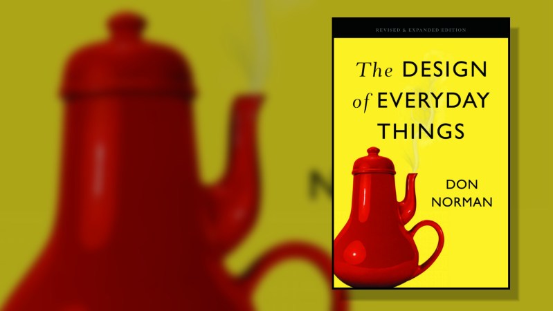
Side Note: the Revised and Expanded Edition of this book reads very differently from the original edition released way back in 1988. I strongly suggest finding the latest version if you can help it since so many of the examples have been brought up to speed with our times.


Yes, great book. Especially if you are involved in requirements setting or management – not just design.
I loved it from back when it was POET!
https://www.secondsale.com/i/psychology-of-everyday-things/9780465067091?gclid=EAIaIQobChMI3tvjlMvZ6QIVBIzICh3sfQcKEAQYAiABEgJNJfD_BwE
This is indeed an important and fabulous book. I reference my 1988 edition all of the time with customers and students. I wave it around during presentations but I never let it out of my sight for fear that someone should walk off with it. Many of the examples from the 1988 edition are less or no longer relevant but the principles are forever. And software GUI designers should be required to study this book or an analogous one specific to design of GUIs that someone else might have to use. (What a wild idea!)
Many of Norman’s principles are applied to manufacturing engineering in Shimbun’s Poka-Yoke: Improving Product Quality by Preventing Defects.
“but I never let it out of my sight for fear that someone should walk off with it.”
Well that’s a design flaw right there, should have a Kensington lock socket or a wrist strap.
This looks like a good book to put on the shelf next to my Tufte “The graphical display of quantitative information “. Another book that radically changed my perception of a subject.
My copy of “Design of Everyday Things” is tagged 620.82, and my Tuftes are 001.4226, so they’re nowhere near each other, but you make an excellent point: every library ought to have them. If Hackaday hasn’t yet profiled Edward Tufte, it certainly should. Victor Papanek deserves mention, too.
Well Arduino programming would be double oh something and Arduino circuits would be sixtwenty something. Dewey ain’t not very perfect.
Oh what did I find once, 3 books by same author, in same series, one was something like basic blacksmithing, in high 200s or 300s somewhere, then metal forging tech was in the 600s then Making Art Deco ironwork in the home shop or something like that was stuck in the Art/Antiques, 700s?? Don’t remember author or exact titles. I bet if he did blacksmithing through the ages that would be up in the 900s history too.
I know the feeling. It’s a very fine distinction, for example, between my 385s and my 629s. When my roommate started calculating Dewey numbers on my books to eight decimal places, I had no choice but to marry her.
Hacker planning of library space, “Ima need 10 shelves for 0-1.5, 1 shelf for 1.5 to 300, 3 shelves for 300-500, 4 shelves for 500-627. 20 shelves for 627-630…”
Ah that’s more like 620 to 630, public library has been closed for 2 months and I’m already forgetting where stuff is LOL
For anyone that’s interested, the book is also on audible. So if you’ve not tried it also, you can get a free month of audible and get the book for free to keep forever. I had a spare credit on audible, so just purchased the book. I’ll be listening to it over the next week or so while waiting in the queues to get into the stores during lock down.
I wonder what he says about flat design, and the implementations of it. I just don’t know what is clickable or not anymore, and if is so tiresome (physically and mentally fatiguing) to hover the mouse or press a finger to distinguish the interactive elements. Flat icons that look like nothing and my brain has to interpret them instead of recognizing them. Then even when I know an interface, I still tend to overshoot links or button elements that have been beautifully blended away, spending extra fractions of a second to anchor onto them. A simple example on this page is the Reply and Report comment links. Correctly implemented here, but so much design uses clickable text instead of styled (3D) buttons.
Thousands of these (stuttering interactions) over a day and I am knackered.
I hate flat design, endless scrolling, and monochrome UI. Early 2000s UI design was often better, but the actual tech behind it wasn’t as good so there was more manual fussing.
In the open source world it’s reversed, it’s great now but was usually just plain awful before recently.
I’m glad I’m not the only one who hates, or at least dislikes flat design. It’s definitely a step backwards. It’s amazing how terrible some of Google’s UIs are. Yet so few people see it.
Unfortunately, the book predates the computer screen as central input/output device in our lives.
You hear web designers bringing up ideas from “Everyday Things” all the time, but you hardly hear them ever taking it seriously. The essential problem with a screen is that it’s capabilities are displaying images/words, but that to be interactive, we require it to be an input device as well. So you get the pointer as metaphor for the point that the mouse is pointing to, or touch-screen keyboards.
If you think about the design of physical devices, there’s often a control section and a display section. The (computer/cellphone) screen has to do both. How do you style a button so that it’s both unobtrusive when you’re reading, but easily visible when you want to act?
Just bought it on LibGen, great book!
Electrical switches marked with 1 & 0 still foul my thought process even after many decades.
I always have to have to stop and think so as to override the reflex that sees the “1” as an unconnected wire and thinks of the “0” as a closed circuit symbol. arrgh!
For many years I often scraped off the offending markings and painted them in red and green.
Cheap fingernail polish works pretty well for this.
Red being the off or stop indication, green being on or run.
You mean Red doesn’t mean Stop! Danger! And Green means that the item is safe (powered down)?
B^)
Definitely not in China where red indicates good fortune.
And blue for cold, red for hot..
Been a while since I’ve seen it, but there was some stuff using an empty or white O for off, and a red spot or filled red O for on.
I’m with you on the 1/0 one. (I thought it was I and O!)
What does a fan blade look like when it’s spinning? When it’s stopped? What do my eyes look like when they’re open? When they’re closed? Etc. There are a million possible wrong ideas you could have about it, especially with the stylized typeface.
Red/green is great, except for folks who are red/green colorblind.
And to all the snarkers above: I’ve never in my life seen a green emergency stop button.
Ren, Too many years of “just pound the red one if things go poorly” x^D
(still haven’t sussed the comment linking issue of recent months and just enabling every bloody script is a non starter)
Yes, this is an excellent book, highly recommended. My favorite line is “The paradox is that automation can take over dull, dreary tasks, but fails with the complex ones” Amen
The book is available for free on archive.org, if any of you are looking for it.
One of my favorites too. Absolutely a must-read, IMO, because it will change the way you look at the (designed) world.
Something that I read that has always stuck with me is in Windows 95 you couldn’t click the Start menu if you moved your mouse to the extreme bottom left corner and clicked. They fixed that in later versions so you could throw your mouse south west for Start, or north east for close.