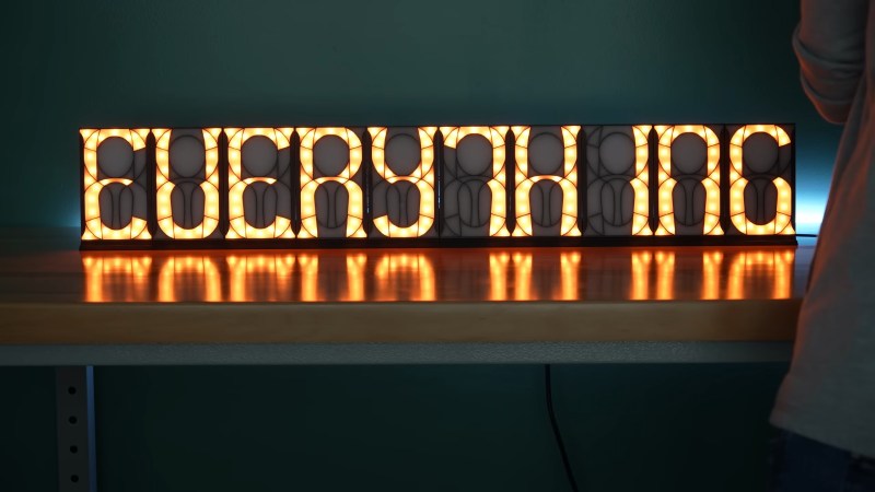
We all know and love the humble seven-segment display, right? And if you want to make characters as well as numbers, you can do an okay job with sixteen segments off the shelf. But if you want something more art-deco, you’ll probably want to roll your own. Or at least, [Ben] did, and you can find his designs up on GitHub.
Taking inspiration from [Posy]’s epic investigation of segmented displays, [Ben] sat down with a sketchpad and created his own 20-segment font that displays numbers and letters with some strange, but frankly lovely, segment shapes. There is no center line, so letters like “T” and numbers like “1” are a little skewed, but we think it’s charming.
We’ve seen about a bazillion takes on the seven-segment idea over the years here. Most recently, we fell in love with this 21-segment beauty, but honestly the original eight(!) segment patent version is charming as well. Anyway, picking a favorite segmented display at Hackaday is like picking your favorite child, if you have a few hundred children. We love them all.
Thanks [Aaron] for the tip!


But, kerning….
I think you mean kern ing. 😛
OMG, I totally did mean that!
I like the stained glass effect of his final product.
That includes the shading in the corners of the segments.
I like how he changed the colors of the segments with each new numeral (7 segment)
I didn’t like the some of alphabetic characters like “T”, and “V”.
totally, T and I really throw ya off, if he went a few segs more we could get a center vertical line for those letters. not sure what to do with V though.
Keming is much more frequent…
https://www.ironicsans.com/2008/02/idea_a_new_typography_term.html
I think you meant keming.
Need one more segment, that T looks awful.
If you meant to say that it looks great except for the T and I, I agree :). Note that in the hand-drawn sketch, there is a vertical middle segment in both the top and bottom half and it’s missing from the final design. So I guess he thought about it.
One thing though, I wonder if a white PCB would reflect light and help getting the segments more evenly lit.
It’s really just that one vertical, huh?
I do understand why he abandoned that idea, the two middle verticals would either have a somewhat ugly gap between them or the segment at the center would have to be split into three parts, which is difficult. Or he could have used the central segment as-is and get a crossed-out I and T, this could even be cool but maybe not what he had in mind.
I’m probably not the only one here who is used to solving problems in software, where everything is possible, and who gets frustrated when the physical world stubbornly refuses to allow for a clean solution :).
Yes, aside from that one segment it’s really great, it has an almost Victorian look. Shame he missed it out but I’m sure there were reasons.
These are gorgeous!
I also like the LED segment displays (10 segments?) on the Teenager Engineering EP-1320 Medieval drumachine/grooverbox/sampler.
I had heard of Teenage Engineering before, I just went to their website.
Holy Smokes their products are expensive!
Not as Audiophile expensive, but those must be some well-to-do teenagers!
They have a desk that cost $1599. The Field Desk is just a sheet of plywood with some modular square tubing. Just absolutely ridiculous stuff.
At the other end of the spectrum thy have little calculator shaped toy sequencers for $80-$100 (Pocket Operator). And the fairly capable EP-133 sampler-sequencer for $300, which is tough to beat in price versus features with anything else on the market.
I’d be interested in seeing someone mathematically figure out optimal segment displays. Even a more rough (since it’s an abstract task) algorithmic or AI approach would be interesting.
I mean in theory you only need 4 segments per digit, 5 per letter or 6 with both. But none of them would likely be easy to parse visually or look much like standard characters.
So it’d be cool to see at bare minimum someone run it through something like a genetic algorithm for character generation and an AI recognition system for checking clarity.
Another interesting one would be designing a new set of characters that would be easier to recognize at the minimum segment level.
You might enjoy this high quality video about segmented displays: https://www.youtube.com/watch?v=RTB5XhjbgZA
Thank you but I’ve already seen it. What I want is for someone to take that and go further.
Yea this is a solved problem 16 segment displays have existed before your grandfather was born and matrix displays were born the next day
I don’t think you understand, I know there are displays that can show more characters but what I’m curious about it how efficient it could be.
Taking your comment further, you could say this is a solved problem we’ve had high resolution LCD displays for a long time that can display loads of characters and in different fonts. That should highlight how far off that is.
Sorry. Dupe.