
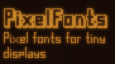
Small displays are affordable and easy to use, but their size can present a challenge. To help address this, [mcer12] created PixelFonts, a family of condensed fonts designed specifically for low-resolution displays, making sure every line holds as much text as it can fit.
PixelFonts works alongside either the AdafruitGFX or U8g2 libraries; one writes to the display using the common syntax of the chosen library, and the font itself comes from PixelFonts. Text can be displayed in regular and 3D shadowed versions, as well as in a wide variety of heights and weights. There’s support for accented letters, albeit only in lowercase due to space constraints. Want to make some changes? Every font comes with a BDF file to make alterations as widely accessible as possible.
Making the most of every pixel is important with small displays, but there’s more than one way to do so. For example, when it comes to color LCDs, subpixel rendering can improve legibility of small fonts; another way to get the most out of limited display sizes.






I don’t get it. Isn’t this what the unicode library is for?
This is for use with microcontrollers. Unicode takes up too much memory for that.
The d,f,l,t in the above example look too tall, could have moved the body of the characters up a pixel and that would allow descenders for the y and others. I’d give this font a B for effort.
I give it a e. It totally misses the goal.
As the author has published under the MIT license and “Glyph data in a simple txt form is included, so you can use AI to generate any bitmap / font format” then you could just adjust to whatever is desired and be less critical of the font designed to not look pretty but to provide a utility function on a small display.
IMHO, giving a grade implies one is an instructor and has the knowledge to consistently provide an A+ solution to any problem given to a learner, thus I will await your A+ solution on hackaday.io
You’ve rated things your whole life. An 8/10 here, a neutral-smiley face there. A positive tick here, a two-stars there. All without thinking ‘Am I an expert in this?’.
But in future, you’re welcome to follow your own advice – consider not rating anything unless you’re an instructor who has the knowledge.
And Mr Name Required – where exactly is your contribution? It’s a clever idea, well done IMO.
Well that is a bit harsh considering it is a very reasonable response to the topic. As the GitHub pages states: “The fonts are designed to be slender and condensed to fit as much text on a line as possible” you might assume that saving space does not go hand in hand with characters that could easily be 3 dots less in height. Simply because after 3 or four lines you are then able to squeeze in another line, which could actually improve readability as it allows for a more sensible layout of the text on your screen in general.
However… regarding readability, as some point in your life you just have to admit that you need to start using glasses, no font in the world would solve this and the fact that displays keep getting smaller and smaller doesn’t really help.
Thinking about that, 30 years ago we had a red LED that indicated that the battery was low, next to the LED stated in clear readable text “batt.”. Nowadays we needs some hieroglyphics on a fancy screen to indicate the same. A simple rectangle with a protrusion, depending on the state of the battery the rectangle is filled with one 2 or 3 dots. Unfortunately these hieroglyphics seem to change every decade. These days we live in an age where a menu is indicated by 3 tiny dots… 3 tiny dots? Sometimes a menu is indicates by 3 tiny bars (which are bars consisting of 3 tiny dots close together. Sometimes, you need to hold that symbol for a few seconds to initiate a different action. In some cases you can even delete important things without knowing if you happen to drag your finger slightly to the left of right too much. Now… where was I, oh, yeah, the comment of “Mr Name Required” seems pretty reasonable to me and let’s face it, a B is not bad at all. Many of my project related grades never got that high, so what is the problem here?
After Human Machine Interaction was split into UI and UX careers, the windows of hell were opened. The three horizontal bars are a hommage to the devil’s fork.
Anybody who has ever tried to do a small font has done better than this. It used 3 ‘dots’ for internal space in caps when the obvious solution is 2. So yeah it’s a font, is it easy to read ? Maybe. Does it achieve it’s goal to optimize vertical space ? Clearly no.
Patrick, I’ve had a project of mine published here on Hackaday a few years back, to good reception and inspiring others to take what I’d achieved further. I However I can’t see any implied connection that this is a requirement before providing critique on other projects.
Hey, author here. The font height is ultimately set by the capital letters. That’s the vertical space that needs to be accounted for. Now for the small letters it’s an artistic choice to make them taller or not, for English that is. For extended Latin glyphs you ideally want at least one pixel gap and three pixels height for the diacritics. Which is the 4 pixels you see here. Not that it would matter for readability but I also like taller small letters, so this particular font size was a compromise.
See my reply below, I replied out of the thread by mistake ;)
This reminds me of the tiny fonts of the bitmap-font era. I think there was an all-caps font that was 4×4 pixels or less. Even today, you sometimes see such uber-tiny fonts on copyright notices on the edge of pictures.
Given the screen resolutions of the time, they weren’t ‘uber-tiny’! A 5×7 font (smallest reasonable size) would still not get you an 80 column display.
Uhhhh… aren’t the X11 builtin fonts like 5×7 already a pretty optimal version of this? I’ve used those for a long time to get more text on a low-resolution screen. I’ve tried to better and failed
That depends. If you just want to show some text, it really doesn’t matter. The point of pixel fonts is to make a reasonably condensed font that also looks futuristic and nice. If you don’t care, you don’t care. if you do care, you’ll appreciate it I think.
Yeah, these
https://en.wikipedia.org/wiki/Fixed_(typeface)
https://github.com/Bloxmine/pixelfont
I created something like this too one time. 5×5 letters, and 5×3. Originally designed for a flipdot display, but also works fine on a led matrix
Ha, nice! I also made the font for a flip dot display originally.
For those limited to 3×3 grid there is Fakoo. It was created to be readable by both the blind and sighted people. Just look it up on the Omniglot site.
You could go all the way back to the WW2 British Army portable lightweight TELEWRITER teleprinter which had a 5×5 pixel dot matrix font in an 8×7 field (scroll down to char set):
https://web.archive.org/web/20240821185917/nonstopsystems.com/radio/hellschreiber-modes-other-mfrs-UK.htm
also a video about it
https://www.youtube.com/watch?v=_s9FffAntHM&t=946s
The creator of these fonts is pretty active in the vintage display technology…if you want to hack a plasma display (like what was used in pinball machines back in the 90s-00s) you should give his Github a look!
Back in the 80s we sometimes used 3×5 fonts (+1px spacing) on PCs and Amiga/Atari compters to get high amount of text on a 320×200 screen.