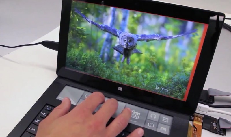
Tablet computers have come a long way, long way. It finally seems like they’ve found their niche in the market, and now maybe they can catch up to more traditional computers. The Microsoft Applied Sciences division came up with a cool prototype design for a new tablet, one with a secondary e-ink input display.
The tablet interface makes use of e-ink strip above the keyboard. While it might not seem like much, this frees up a bunch of screen real estate, allowing you to have various icons and shortcuts off screen. It makes a ton of sense for digital artists as they can draw on the screen, but also have their toolkit open right below them — almost like real painting/drawing.
One of the other great uses for something like this is a signature pad — with everything going digital, when is the last time you had to print, sign, and scan a document back to someone? They even developed a dedicated email app you can use solely on the e-ink screen, allowing you to maximize the use of your main screen for something like a video chat.
The demo is pretty cool, and we often wonder why there aren’t more phones with e-ink displays integrated into them — is this just the beginning?
The Applied Sciences Group from Microsoft is an R&D team working on the future of human-computer interaction — they’re the same ones who brought us the Hololens, but only time will tell if that product will actually materialize.
[via Engadget]


I like the concept, but would prefer a color display. I don’t see the need for e-ink in this scenario. Tablets (especially those with a physical keyboard) have plenty of battery power to handle a full color display.
Personal Preference.
To many, the trade-off would not be worth it, and considering the frequency that the bottom display would actually need to update, there is no need to use anything other than e-ink. (Perhaps the use of a color e-ink)
There is actually an old prototype video from ages ago https://youtu.be/ojusRO38Tdc
I don’t think that’s an actual keyboard, looks like an onscreen one on a touch-screen LCD.
Use “Memory In Pixel” display instead. Color, and ultra low power consumption.
eight percent!
^this
“…when is the last time you had to print, sign, and scan a document back to someone? ”
I always just photoshop my signature in.
I normallyuse a handwriting font as I don’t have a scanner these days
I knew it wasn’t genuine. I could tell by the pixels.
This seems so weird thing to do; I have never had to submit hand-drawn signatures electrically. If there is some electronic document to sign, typically it happens by bank account.
“This seems so weird thing to do; I have never had to submit hand-drawn signatures electrically. ”
Landlords always want signatures on rental applications., even if you’re out of state.
Not sure how it works in other fields, but in the medical records/ signature capture realm, the signature pads don’t just capture the image, but actually create an “encrypted, time-stamped file that is imported into the generated PDF” for the final archive. At least that’s what the sales guy told us.
That way, you couldn’t just copy a signature onto a form and say “see, they signed for consent…”
It seems like an interesting idea and it would be neat if some tablet-based games took advantage of the feature, but I doubt they will because the Surface has such small marketshare.
“be neat if some tablet-based games took advantage of the feature”
Nintendo’s basicaly been doing this for years. Lower screen on DS/3DS is almost always menus/inventory/options/map.
And since the lower one is a touch-screen, also for extra game controls. Context-sensitive buttons for games, etc. Sue ’em, Nintendo!
Actually I can’t think which software behemoth I dislike most.
Nice, I could see that being a nice feature on a future laptop purchase.
I have always steered away from using microsoft software, but I’ve been a fan of their hardware designs for quite a few years because it was good.
Hope this makes the jump into production kit and linux HID drivers come out for it :)
I always wanted to get an Optimus Maximus but they were so freaking expensive.
get yourself a biggus diskus; the price has swelled in the past, but its coming down, now.
lol
(‘and what have the romans done for *us*, lately?)
not only are they expensive, they are power hungry and too bright. someone should make a keyboard with individual epaper keys.
I lusted after the Maximus as well… until the concept for the Optimus Tactus came out and it still makes my tummy feel funny.
Hadn’t heard of the Tactus [Google…] Eurgh! So, it’s basically a big tablet. Only more expensive. Giant fail in the key department. Typing on a tablet is such a pain they’re still inventing new methods of doing it. I don’t reckon touch-typing would be efficient on it, no tactile feedback, no feel of keys.
From looking at Art Lebedev’s page, it looks like it might be useful as a second keyboard, if you had the money, might be nice for sliding icons about and things. But so would any tablet. There’s already tablets with LCD displays for artists, a bit of software to use it in general tasks would be good. Perhaps there already is.
The Maximus is definite geek-pr0n, with it’s OLED display on each key. Although once the novelty wears off, and it spends it’s life displaying a normal key layout, I might start to wish I’d spent the money on something else. They sell, or somebody does, small blocks of the same type of key, for a little programmable keypad for certain functions. But then Vi managed to perfect keyboard-fu 40 years ago or so.
I’m an engineer working on a similar solution, the Sonder keyboard. We’ll be shipping soonish.
IT does kind of look like a z88 doesn’t it?
http://www.sinclairzx.com/i/past/z88-lg.jpg
Looking at the past this simply means microsoft killed yet another possibly useful thing with a patent strike to the back of the head.
But hey, this is HaD so we can hack something ourselves I guess.
Although in windows10 MS might disable the hard and software as warned/agreed in the EULA.
Ah, if it’s useful China will come up with a copy.
Well, darn. I was going to do somthing like this with my desktop. :-/
Looking at that, I’m seeing some cross between a cheap wacom+led/lcd screen hack with a e-ink side screen. With just b&w e-ink, that would still be a much less messy way of doing “charcoal” sketches. Color e-ink and the wannabe painter in me is screaming “make that for us!”
If only I could figure out the USB protocol that my Ativ Tab uses on it’s 10 pin dock. I think it’s just two USB2, but it might be only one and a hub in the keyboard. Either way, a cheap screen to the side to keep the layers, samples, and clutter tabs out of the way . . .
Funny that the 1st gen Barnes and Noble Nook e-reader uses the exact opposite approach.
How about a row of general-purpose buttons below the screen? They could be incorporated along the top edge of the keyboard and have different “functions” depending on which application was running.
Yep, something like F1-F12 keys.
Well function keys are nice,. but let’s face it, it’s hard to remember across 20 programs what they do, apart from the F1-F3 maybe. So having some sort of display to indicate things is a bonus.
But maybe they could do a style guide at MS to do like the wacom tablet software does and have a information display hover over the screen for a moment with the current key assignments when you press a button. Or just add one dedicated button to do that.
In fact, you could probably hack something together using autohotkey or a similar scripting utility, and use that to detect the active program and blend in the function key assignments. Instead of printing out templates like they offer online for a few programs like Photoshop and Office and such..
Sodick used this concept in the 90’s on some of their machine tools amongst other manufacturers. They called them soft keys, theyre 10 mechanical keyswitches arranged underneath the crt and 8 up the side. The software changes the menu context depending on what screen you are on to use them. You can see them on this picture here although this has had a monitor lcd retrofit and now the buttons won’t line up with the menu options properly :-)
http://img03.olx.in/images_olxin/1233697_4_1000x700_sodick-edm-wirecut-machine-a-320-s-wire-cut-electronics-computers.jpg
So dick.
Hurr hurr.
That’s why I like Samsung phones. they don’t hog a chunk of the screen space with Home, Menu and Back buttons. I also like that those off screen buttons are always in the same place and don’t change function or move around at the whim of the current app or when the screen is rotated.
I’m in favor of any design that removes keys/options from the large touchscreen. Emulated keyboards alone piss me off. I hate how the market prefers single screen smartphones rather the flip designs, only for a large amount of screenspace to always be a virtual keyboard…..
Design matter a lot…