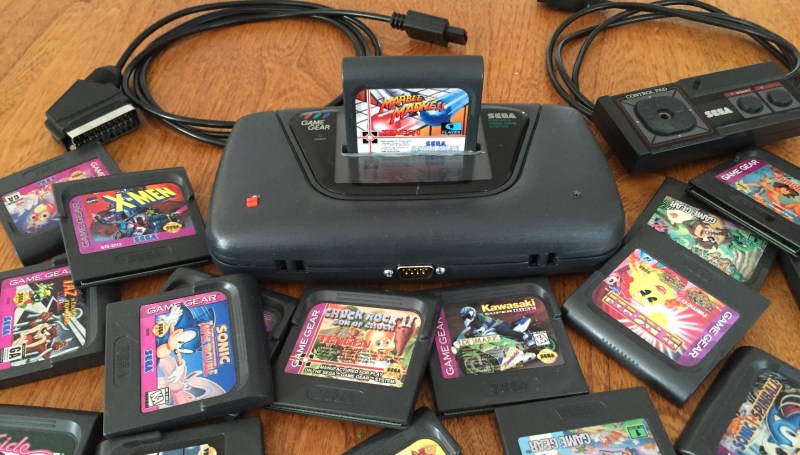
What if the Game Gear had been a console system? [Bentika] answered that question by building a consolized version of this classic handheld. For those not in the know when it comes to 1980s Sega consoles, the Game Gear is technically very similar to the Master System. In fact, the Game Gear can even play Master System games with a third-party adapter. However, the reverse isn’t the case as the screen aspect ratios were different and the Game Gear had a larger palette, which meant the Master System wasn’t compatible with Game Gear titles.
Sega’s decision to omit an AV connection meant that Game Gear games were forever locked into a tiny LCD screen. [EvilTim] changed that with his AV board, so [Bentika] decided to take things to their natural conclusion by building a proper console version of the Game Gear.
He started by ditching the screen and wiring in [EvilTim’s] video adapter board. The cartridge slot was then removed and reconnected atop the PCB. This turned the system into a top loader. [Bentika] then went to work on the case. He used Bondo to fill in the holes for the d-pad and buttons. After a spray paint finish failed, [Bentika] went back to the drawing board. He was able to get paint color matched to the original Game Gear gray at a household paint store. Careful priming, sanding, and painting resulted in a much nicer finish for this classic build. Check out [Bentika’s] video after the break!
We’ve already covered the Game gear video output board, but that’s not the only story for the handheld console we’ve featured. How about this flash cartridge, from 2010.


This guy took it a lot further a few years ago….. http://www.lcv.ne.jp/~mgs1987/sega/gg10.html
http://www.lcv.ne.jp/~mgs1987/sega/gg2281.jpg
Wow. That’s…WOW!
For all the work put into this, I feel like they could have gotten a better result by making a new PCB and case.
I I think the case is the right concept, you want to keep the GG look for sure. …maybe just rework the big chunk where the screen used to be. I think a paint job and smoothing of that whole section, including where the logos are and a redoing the logos to fill the space better may be the only needed aesthetics rework Possibly the controller port but this is pretty decent execution for sure.
Blasphemy! Well, nice work, but it’s still blasphemy. Well, except for the hole in the screen cover, which kinda looks crap. Also, if you’re putting that back on, I don’t see the point of moving the power LED away from the original location. If it’s symmetry you’re after, put the power switch on the right-hand side.
Most importantly though, blasphemy!
why blasphemy?
“What if the Game Gear had been a console system?”
There would be a few less cubic acres of AA batteries in the world’s dumps :-P
6AA at a time, man! I’m glad I finally saved up for the hip-clip-mounted battery pack for those extended car trips!
It’s a great build, and kudos to that! If I were going to be picky, I think that I’m part of that incredulous majority around here that’s complaining about the screen, though.
Emphasis here, though: That’s a cool build!