When I learned about colors in grade school everything started with red, yellow, and blue and getting fancier colors was easy. I mixed some blue into my yellow to get green, or into red to get purple, and so on. After painting enough terrifying “art” for my parents, this made intuitive sense. That is until my mind was blown by the revelation that this wasn’t always true!
To make the same colors with light instead of paint I had to use red, green, and blue, not yellow. It was until much later when trying harness banks of RGB LEDs that this knowledge became useful. I was struggling to make my rogue diodes look quite the way I wanted when I stumbled into the realization that maybe there was another approach. What did the numbers representing R G and B actually mean? Why those parameters? Could there be others? [Elliot Williams] has written about the importance of gamma correction and adjustment for human perception of color, but we can ask a more fundamental question. Why do we represent color this way at all?
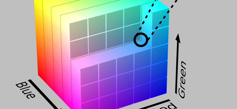
Let’s say you want to light an LED in a rich royal purple. The first step might be to search the web for a color picker to help visualize the color wheel or ask your OS to present one. Clicking around on it’s surface eventually you land at a pleasing point on the disk at the top. Now suppose you want to display this on a WS2812 LED connected to an Arduino. The software library may represents color as a composition of three 8 bit integers; Red, Green, and Blue. Tabbing over in the color picker you can see the RGB value of royal purple as reference and set the LED to show something like {86, 0, 197}. Simply, the red channel is set to 86 counts (in the range 0-255), green to 0 counts, and blue to 197 counts.
To be explicit the RGB values represent three wavelengths of light which our eyes are built to absorb and our brains interpret to create images out of visible light. So the physical outcome would be that three distinct diodes in the RGB LED turn on to the specified intensities. When the emitted light hits the wall above your workbench it reflects into your eyes (or photosensor as the case may be) and you see approximately the target color. If you wanted it to be brighter you would increase the energy being emitted by turning each channel up. As long as the ratios stayed the same so should the color. Great! Your first grade teacher would be proud of your scholastic accomplishments.
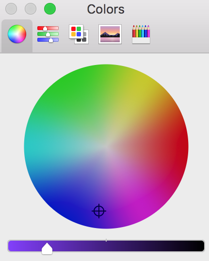
When I choose a color on my Mac I see the familiar color picker above by default. Switching back and forth between the first and second tab at the top it is clear the same color is represented two ways; the RGB values on tab two and the dot-and-slider on tab one. Sticking to tab one the disk is obviously the color, and the slider on the bottom represents its “brightness”. If I slide it to the right the disk becomes progressively darker until it turns fully black. If I slide it left the colors become more vibrant until the get as vibrant as the model allows. It’s possible to think of this in another way though. If the color wheel above is taken as a disk on a plane, you can imagine the slider at the bottom as the upward facing Z axis, giving you a cylinder. It would look something like the figure to the left.
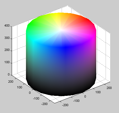
This color cylinder can represent exactly the same information as a three-integer RGB value can. Every visible color is somewhere on the surface (or inside!) the cylinder. If you took a cross section at the “brightness” level from the first figure you would be left with a disk containing our royal purple again. But in a cylinder it doesn’t really make sense to say royal purple is {86, 0, 197}, because that’s not how you represent coordinates in cylindrical space. (It is how you specify them in a different solid but we’ll get there in a minute). Cylinders can be addressed in, well, cylindrical coordinates by a less familiar 3-tuple of values. To represent any point in a cylindrical volume there is a radius, Z height, and angle. Radius selects a “distance” outward from the center (a radius). Z selects the vertical height. And φ (lowercase phi) selects the angle.
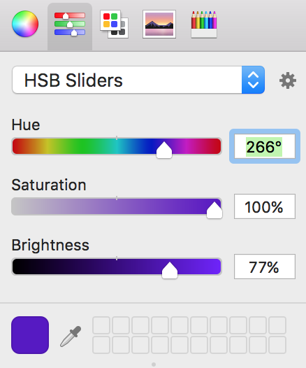
Switching back to the second tab in the macOS color picker we can actually force it to show us the chosen color in this coordinate system! macOS refers to it as “HSB” (Hue, Saturation, Brightness) but it’s a little confusing. The name correlates to the “HSL” (Hue, Saturation, Lightness) color space, but functionally the sliders match the “HSV” color space, for Hue, Saturation, and Value. Changing the spinner the interface alters to give us three different sliders with which to traverse our color cylinder. Keeping in mind our 3D cylinder these can be looked at as spatial coordinates. Brightness moves us up and down the cylinder (Z height), saturation moves in and out from the central axis (radius), and hue rotates about the center (φ).


You, astute reader, may have caught on that there must be yet more ways to represent colors. In printing CMYK (cyan, magenta, yellow, and key AKA black) is common, though it is not a different spatial projection of the same components. CMYK represents colors by the proportions of ink you might use when printing! Quite a neat trick to redefine the chosen units to better fit the task at hand instead of adapting something ill suited. Wikipedia has an unsurprisingly detailed list of color spaces and their uses if you’re interested in more theory than I can provide.
Knowledge of color theory isn’t something that is going to revolutionize your daily life (unless you buy lots of novelty mugs), and this can turn into a strangely deep hole if you really get into exactly what color gamut your new monitor can reproduce. But it turns out that being aware of the spatial nature of color representation makes certain blinkey-LED related tasks easier. At least it can if you know how to apply it. Want to play around with some of these concepts at home? We recommend the FastLED library.


A very colorful article.
Indeed.
Although, I wasn’t too happy with the smart-arse remark about my photosensors. Do have any idea how much a pair of Zeiss-Ikons cost?
what about optical illusions such as the dress colour issue ( http://www.bbc.co.uk/news/uk-scotland-highlands-islands-31656935 )
I don’t get it, said the colorblind man.
https://xkcd.com/1882/
Haha, I shouldn’t be surprised there’s a great XKCD should I?
Say I chose nice colors on a PC’s color picker, pick the triple-eight-bit RGB values and send them to a WS2812… Most colors come out differently.
The typical blue LED on the WS2812 is much more efficient than the green or the puny red.
So… long story short… who’s got a color correction formula for WS2812?
FastLED includes the option setCorrection, I believe
Oh it certainly does get complicated, the colours you see are not the colours that you perceive, as any skilled painter or neuropsychologist will tell you. Luminance in particular is relative, not just from scene to scene but from one part of your visual field to the other. There are also colours that you can “see” that do not really exist as a tuple with a single hue value.
Logarithmic scales are not intuitive for thinking, but they are built into our senses in order to handle so many orders of magnitude.
I mean this, https://en.wikipedia.org/wiki/Checker_shadow_illusion
There’s a typo. “macOS refers to it as “HSB” (Hue, Saturation, Brightness) but it’s also known as the “HSV” color space, for Hue, Saturation, and Lightness.” HSV is Hue, Saturation, and Value. Lightness belongs to HSL. Starting with a royal purple, the V slider in HSV will take you from black bright purple. In HSL, the Lightness slider will take you from black to bright purple and then to white.
It’s a little weird. Parameter wise they seem to correspond to HSV but the name translates to HSL. The words are wrong though. I’ll see if I can tweak it to make it more clear.
FastLED library link dead.
Fixed. Thanks!
“This color cylinder can represent exactly the same information as a three-integer RGB value can. Every visible color is somewhere on the surface (or inside!) the cylinder.”
Oh! If only this were true. None of the standard color spaces have a gamut that comers much more than half of the colors visible to a human with normal color perception. See https://en.wikipedia.org/wiki/RGB_color_space for the mappings of common RGB spaces to the CIE 1931 chromaticity space.
Minor nit… disc not disk.
The former is the geometric shape. The latter is short for diskette… a portmanteau of disc and casette, those now obsolete things that used to store between 180kB and 2.88MB of data.
The “disk” spelling was used long before computers and magnetic media were created.
I am always disappointed how eyes treat the light they receive. Our ears each get just a single point of sound and break it down into all the frequencies it contains. Our eyes take a single point of light with a complex set of frequencies and go “I’m going to call that blue” or some other single value. Arguably that value has 3 dimensions in most representations, but it is a poor substitute for the complete analysis our ears do. On the other hand our eyes (thankfully) collect information from way more points at once than our ears so our brains probably couldn’t deal with more information.
Also I think subtractive colours are more interesting than the author suggests. I would say paint mixing is less well understood than light.
>”Our ears each get just a single point of sound and break it down into all the frequencies it contains”
Technically, our ears break the sound down to a multitude of points, where on each point there’s a nerve receptor that says “I’m gonna call that 220 Hz”.
And our eyes do very little of the information processing – what the visual cortex and the rest of the brain manages to do with the relatively low-resolution image that comes from the retina, is amazing.
Here is a cool video by the Vsauce guys
it explains how we see yellow from a computer screen made up of red, green and blue pixels which can;t actually make yellow light
https://www.youtube.com/watch?v=R3unPcJDbCc
for the colors of paint; the “blue” required is actually cayan
WS LEDs can have RGB chips of varying efficiency ratios between the respective R or G or B
homo-sapiens do not see in RGB, they THINK in RGB but our eyes are a little more complicated. our brain has a (nearly?)dedicated area for conversion to RGB and our thoughts are stored as RGB
our eyes have 4 sensors.
1) red, not very sensitive, difficult to tell brightness, low res
2) yellow(ish), somewhat sensitive, low res
3) lumination / nightvision / cayan, wide-band, very sensitive, easy to tell brightness, high res
4) blue, somewhat sensitive, low res
this is why moonlight often appears cayan-ish instead of the white it should, because our nightvision’s color sensitivity-range coincides with the cayan colorspace inside our brain’s RGB conversion: our nightvision just does not detect red and thus we need a boat-load more of it to bathe in red light.
PS: red really DOES light up the room just like cayan, you (and your color-corrected camera) just dont see it.