If you’ve been tracking the spread of the COVID-19 pandemic around the world, as we have, you’ve doubtless seen a lot of statistics. The raw numbers look shocking, and in many cases they are, but as always it’s crucially important to ask yourself what the numbers mean.
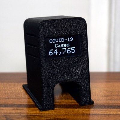
For instance, our own Tom Nardi put together a counter that displays the total number of COVID-19 cases in the US. It’s a cool project that puts together some web-scraping, a nice OLED screen, and a 3D-printed network display. When this is all over, it can be easily re-trained to show some other statistic of interest, and it’s a great introduction to a number of web APIs. However, it’s looking at the wrong number.
 Let me explain. Diseases spread exponentially: the more people who have it, the more people are spreading it. And exponential curves all look the same when you plot out their instantaneous values — the raw number of COVID-19 cases. Instead, what distinguishes one exponential from another is the growth parameter, and this is related to the number of new cases per day, or more correctly, to the day-to-day change in new cases.
If left unchecked, and especially in the early stages of spread, the number of new cases grows every day. But as control efforts, mainly social distancing, take effect, the rate at which the number of new cases can slow, or even go negative. That’s the plan, anyway.
As is very well explained by this video from 3 Blue, 1 Brown, if this were a naturally spreading epidemic, the point at which the new cases just starts to decline marks the halfway point in the course of the disease. Here, we’re hoping that particularly strict quarantining procedures will cut this run even shorter, but if you’re interested in how the disease is spreading, the point when daily new infections turns around is what you’re looking for.
Why not put the daily difference in new cases on your desktop, then? These numbers are noisy, and the difference jumps all around. To be serious, you would probably want to put a moving average on the new cases figure, and look at that difference. Or simply show the new cases instead and look for it to drop for a few days in a row.
 Still, this won’t be a perfect measure. For starters, COVID-19 seems to incubate for roughly a week without symptoms. This means that whatever numbers we have, they’re probably a week behind the actual situation. We won’t see the effects of social distancing for at least a week, and maybe more.
Further complicating things is the availability of tests, human factors like weekends when more people get tested but fewer government reporting offices are open, timezones, etc. (What happened on Feb. 13?)
I’m not going to go so far as to say that the COVID-19 stats that we see are useless — actually far from it. But if you’re going to armchair quarterback this pandemic, do it right. Plot out the daily new cases, maybe apply a little smoothing, at least in your head, and realize that whatever you’re seeing now probably represents what happened last week.
When you finally see the turning point, you may celebrate a little, because that means the halfway point was a week ago. We’ve seen it happen in China around Feb 2, and I’m looking forward to it happening here. I hope it happens wherever you are, and soon.
We will get through this. Stay safe, all. And keep yourself uninfected to keep others uninfected.


Can I also recommend the graphing method used here?
https://www.youtube.com/watch?v=54XLXg4fYsc
This video really clicked with me too.
I put together a basic couple of notebooks (R and Python3) to pull data and generate these charts here:
https://github.com/ali-raheem/COVID-19-Railway
Always glad to have feedback on my code (learning both R and the libraries I used with Python3).
thanks!
very good explainer.
Thank you so much! This is an amazing tool and a function I was missing in the John Hopkins map.
https://aatishb.com/covidtrends/
i see the usa is winning the race…
For any statistics to have relevance, you need to compare it to a baseline or at least other statistics. 7.8 billion people globally with 327.2 million of those people in the USA. Then you need to look at the age of those who have died along with their health status prior to contracting the virus. You also need to look at deaths from driving accidents, look at deaths from the flu, look at deaths from other illnesses, and so on in order to properly frame. In scientific experiments, this baseline is called a “control.” I don’t disagree there are people sick and people are dying, but death is collateral damage of life. Every day is a calculated risk so proceed with caution, but don’t walk around shuddering in fear. This is life and it will do what it does.
This is set to overtake daily deaths due to car accidents globally any day now.. (Maybe has already if driving is down everywhere)
Yes, the incremental increase in flu deaths of those already having compromised health (lung capacity, diabetes, voluntarily shoving carbohydrates in their overweight pie hole) should be balanced with baseline cause of death.
Article ends with, “And keep yourself uninfected to keep others uninfected.”
Alternatively, if generally healthy people would congregate, get it mildly and develop the antibodies, we could achieve “herd immunity” and it would stop spreading to the sick and dying.
The “herd immunity” theory is one possible outcome of ignoring current scientific advisories and allowing large numbers of young, healthy people to congregate. The other outcome is that this would exponentially increase the possibility that the virus, growing strong and learning to adapt inside unknowing people, would mutate, as viruses do, and evolve into a strain that will also be able to kill young healthy people. That is exactly what has happened in the past with some viruses in this family.
If you are interested in understanding the two current pathways of transmission (animal>human, human>human) of the evolution of this “novel” Coronavirus, please read these.
Nice summary for the general public here:
https://www.sciencedaily.com/releases/2020/03/200317175442.htm .
Some more heavy science here:
https://www.nature.com/articles/s41591-020-0820-9 .
I don’t mean to panic anyone, but many politicians have been advancing the idea that there is an immune group of people who will never be seriously hurt by this virus. It is just as likely that, if young healthy people do not also isolate as recommended, they will become the hosts and/or victims of the next version as the virus evolves.
There is a long, deep history of the study of this family of viruses. Here’s just one example which seems almost quaint given the situation we are in now: https://www.ncbi.nlm.nih.gov/pmc/articles/PMC3322807/ . That’s why we are calling it a “novel” or new Coronavirus. It is not the first and it will not be the last.
There is a major caveat here. Once health systems are overwhelmed as they were (probably are) in Italy people who would’t have died if they got sick at other times will begin dying en mass.
This is part of the reason during the explosion in Italy statistics were becoming so skewed that it looked like almost entirely elderly comorbid population issue.
Obviously if critical care are so busy they simply never review those over 60 or with any comorbidity because plenty of otherwise fit and well 50 year olds need review those older people will die in droves.
That’s a major source of bias. You will quickly be led to believe it’s hopeless for those over 60 when it truely isn’t.
I am guessing you are trying to simplify this for a non-scientific audience, but none of these would be “baselines” biostatisticians or epidemiologists or trained data scientists would use. These are things some politicians are citing, but no scientist is suggesting those groups would make a good baseline.
You can set up a comparator arm (control group) for a clinical trial or develop a reference group (cohort) using what we now call real-world evidence (large data structures with millions of cases and thousands of variables gathered over time) based on detailed patient histories or, more recently, simulated arms/cohorts based on extensive historical records. But flu-deaths or gun-deaths is not a part of that scientific study.
It is true that people are not paying attention to important factors and, simply put, using the wrong denominator. For example, reporting only cases and deaths in a country without referencing the population size and the number tested means you have a simple count floating in space. Even if we have to work at the general level (and not patient level), a decent model would include many things like population density by county (or area), age distribution in that area, distribution of top 20 diseases in that area, and much much more. Any model or report that does not include some reference to time, given the quickly progressing nature of this disease, should not be trusted. The important variable here is not the current (or cumulative sum), but the rate of change.
I could go on, but Hackaday is no place for a graduate level course in statistics. For beginners, now is a good time to read Alberto Cairo’s How Charts Lie. But here is something anyone can understand.
Right now, some politicians are advancing two lines of messaging designed to numb people to the emotional impact of this virus. You can say that they are trying to keep people from becoming hopeless or conversely that they are trying to hide their own incompetence; I don’t care which you think it is and it could be both. But people should consider carefully whether they want to help repeat this messaging.
The first is: This isn’t bad because we die of many diseases and other causes and we all die anyway.
The second is: It is patriotic for some people (older adults, health care workers) to sacrifice themselves for the good of others.
As for the first, we do all die, yes, but very few of us commit suicide and only cultists do it en masse. And the deaths we are talking about here are not instead of dying from the flu or a car wreck, but mostly (some random exceptions) in addition to deaths from those causes. I personally would not repeat that messaging.
As for the second, this is the kind of language that was used in the US in the Vietnam war era where parents were told their sons (and some daughters) had died for a noble cause while politicians knew it was an unwinnable war. The messaging you are hearing about patriotism is designed specifically to prepare you for what will be a very high “body count.” When people tell you that you or someone you know should be willing to die to be a patriot when, in fact, there was no need for you to make that “sacrifice,” that is a problem, especially when the people advancing this messaging know that they, themselves, and their families will not have to make that “sacrifice.” False promises from white knights willing to sacrifice themselves are just that: bloviating bs. I personally would not repeat that messaging.
But here is the reason I, myself, would not repeat that messaging. Just a bit of advice from an old man who was once young and full of abstract theories and hypothetical ethics.
I am very sorry to say that, in all likelihood, someone you know — maybe only a friend of a friend, someone else’s grandmother — is going to become very sick or die during this event and all of this hypothetical reasoning and rationalizing will pop into smoky dust like a cap soldered backwards. If you decide now to repeat this messaging, playing the part of volunteer propagandist, when this becomes real for you with real people you know, you will be overcome with a gut-punch of shame you will never forget.
For those of us not yet directly affected, this will get real for you and all of the rest of us very soon. Please plan accordingly.
Well put, thanks for effort in writing both comments Johnny Ramone spot on, my background minimal re food science post grad and analysis of norovirus re cruise ships and spread from passengers to ports etc but, importance of the math re infection patterns in general not lost on me and extremely pertinent for all to get a handle on that !
Fwiw: Iceland seems to have discovered 40 mutations of the initial covid-19 with the paradigm to mutations rather troubling since once there are mutations then more inevitably follow amplifying variation, so that by itself forms its own exponential path just as infections from just one form exponentially increase ie we are in for a wild ride indeed. The good side of this observation and analysis is the fortunate advance of technology especially computing resources to design & develop vaccines. Though more so for viruii in general across wider classes of differences, ie the potential for highly efficient sophisticated vaccines to target rayber more patterns of viruii rather than simpler changes to one virus type. There as a short SciFi story on this few decades ago which explored a super vaccine which killed All viruii with some odd consequences…
https://nypost.com/2020/03/24/iceland-scientists-found-40-mutations-of-the-coronavirus-report-says
For my associates on Australia, with some attention to graphing testing factors good missing from others
https://www.theguardian.com/australia-news/datablog/ng-interactive/2020/mar/28/coronavirus-australia-map-cases-numbers-stats-how-many-cases-of-covid-19-nsw-maps-victoria-live-data-qld-sa-wa-tas-latest-statistics
Timing interesting as this rather recent (2018) very good documentary on mapping infections in UK with benefit of a tracking app could well offer a good means of inspiration for mobile devices which might offer biochem instrumentation in the not too distant future… https://www.imdb.com/title/tt8219352/
In Australia this is free to watch from SBS on demand:-
https://www.sbs.com.au/guide/article/2020/03/23/contagion-reminds-us-knowledge-our-best-defence-against-pandemics
But.
a) Everything looks linear on a log-log plot. It brushes all the nuance under the rug. Hence, all countries’ trajectories look identical. Mar’s law. (https://spacecraft.ssl.umd.edu/akins_laws.html) or with humor replaced by scientific rigor here: https://arxiv.org/abs/0706.1062 That said, disease spread is exponential, so it should look linear. You just can’t draw the conclusion in the other direction. Everything looks linear.
b) Their main plot removes the time dimension, which is the whole point of slowing down contagion. Doubling times (the rate of spread) are a function of time. So some countries are doing a lot better (slower, still exponential, spread) and others doing worse (like wildfire) but that doesn’t show on the headline graph at all. Which is why all countries paths look the same. Because once you remove variation in the rate of infection, they are.
But we care _very much_ about the (time) rate of infection. It’s what overwhelms hospitals.
The total number of cases / mortalities (per capita?) is the right measure of suffering here, but if you want to predict anything about the near future, you want to be looking at the daily new cases (the first derivative in total cases).
Or in math. y = exp( x * t ). How can you get a measure of x? How would you tell if it’s big or small — when your containment policies are working? How can you tell if it’s negative? (OK, it’s x(t) in real life, but to first order…) How many of you have taken first derivatives wrto time?
So far with US style distancing the reinfection rate is still greater than 1. Meaning on average each person infects more than one other. The disease will expand until either a vaccination is available or the number of people who have been infected and thus carrying antibodies is a significant portion of the population. That is my humble two cents worth.
Spread will also stop when people keep enough distance, or take other precautions, such as wearing masks.
Your run of the mill masks are insufficient to filter the bacteria. Unless you are wearing one that has a micron filter sufficiently small enough to catch the bacteria. Even at that, most people don’t wear them properly, and there are air gaps around the edges.
covid-19 is a virus, which is even way smaller than bacteria.
My understanding is that you don’t have to filter the virus itself, I assume this would be impossible. You have to block the moisture which contains the virus, which may be more manageable.
This is an interesting read:
https://www.ncbi.nlm.nih.gov/books/NBK143281/
you are wrong, it is not “or take other measures”, it’s “and take other measures”
multiple infection vectors are not required, it only takes one and they all must be stopped
Masks aren’t a silver bullet and introduce infection risks as well. People are trained on proper mask usage, especially in a medical context, for a reason. It’s easy to slip up. Having people wear masks with no or basic instructions could do more harm than good.
I think the “Masks don’t stop it” tag like is like the clickbaity headline “Shingles* don’t keep your roof dry” with the body then explaining that you can’t just scatter them on your roof and expect them to work, you need to install them properly.
*or tiles or slates, depending on region.
It’s true anyhow. Shingles don’t keep your roof dry no matter how they are installed, because they are the roof.
But shingles is caused by a completely different virus?
Masks aren’t available in large enough quantities, and there are limits to how much distance people can maintain. People need to shop for food, supplies and other vital services. Store shelves providing said food and supplies need to be stocked by people, those items loaded on trucks from warehouses… by people. Mail delivery commingles potential sources of contamination with potentially many thousands of other pieces of mail, all to be hand delivered around the country.
I’m absolutely not discounting the value in distancing, but just offering that there are limits to it’s effectiveness in a modern, highly interdependent society. A perfect example of “easier said than done”.
The virus isn’t magic. Just looking at someone isn’t enough to transmit it. And very simple measures dramatically repoduction number.
Calculating R from the SIR model it’s proportional to N*beta/gamma. Where N is population “playing”, beta reflects contacts and gamma 1/infective period.
Since R0 has been esimtated to be about 3 (most estiamtes put it at 2.5 I think). Quartering the number of contacts you have per day drops this to 0.75. As a key worker in the UK I am stil working full time but I definitely have about 1/10 the amount of contact. So how hard can it be for people who have to stay at home to simply not cough in each others face?
That’s **easy**. Telling older people to stop all contact in effect takes them out of N.
Telling people to self isolate with even mild symptoms means people have less time to transmit.
There is a lot to doubt about China’s numbers, but without a doubt it would be achievable.
Virus’s aren’t myasma certainly not this one anyways. It has poor aerosol behaviour you really just need to cover your mouth when you cough and wash your hands and it’d be easy to stop (unlike say measels).
“The virus isn’t magic. Just looking at someone isn’t enough to transmit it.”
Well I’ll be darned, you’re right. People should just use their powers of telekinesis to stock shelves, deliver mail and shop all remotely from their homes.
I’m not saying distancing and isolation aren’t needed and helpful. I’m saying there’s a limit to the degree to which they’re possible. “Just distance more, just distance more” isn’t a helpful answer to the problem.
Personally, only one of our family members is doing all the shopping, the rest are staying home. But there are still many chains between us and the rest of society in which infection could happen.
Again, solutions that are easily said but difficult or impossible to achieve aren’t helpful.
If you’re dubious of the effect of social distancing, the first 5 minutes of this 3blue1Brown video (different from the above) https://www.youtube.com/watch?v=gxAaO2rsdIs
Covers just how dramatic a change small adjustments in these parameters can make.
So yes, just distance slightly very much is the answer. China and South Korea have proven that. Japan has proven that their lifestyle pretty much bakes in a good amount of social distancing (something surely we can all replicate for a few weeks??) and perhaps without being mean spriited Italy proves just how their touchy-touchy culture can make a big difference?
I think people are dubious (withoutputting words in your mouth) because of the lag time (2-3 weeks) in results. You think well heck we;ve been self isolating a week and the cases and deaths are rising! But that is because it takes about a 1week – 10 days for cases to be confirmed, and about 2-3 weeks for people to die of covid19.
China turned it around very quickly. So can the rest of us.
That depends on whether you trust the Chinese government to report accurately. For all we know, they’ve just stopped counting.
Luke, I don’t know that you can trust any government to be sincere and competent in reporting its numbers, or that how those numbers were measured are consistent with any other numbers we have. However, two things on China: 1) Their numbers are not anomalous – Japan and South Korea have also successfully pursued containment. 2) They have a vested interest in their customer markets not getting hit hard, so they shared their data. Which the U.S. largely ignored, to its detriment.
The link below has very good visual information about the spread of the virus. Scroll down past the state-by-state table to see how the disease is progressing.
https://www.worldometers.info/coronavirus/country/us/
Up until Mar 21 the curve was exponential with a doubling time of about 2 days. After Mar 21 the doubling time decreased significantly, and the curve almost turned linear for awhile. The doubling time is now three days, and this change started about 4 days after the US shut down all non-essential businesses and asked people to self-quarantine.
Given the number of infections as 100K, we can now calculate the number of doublings needed to cover the US population and how long this will take, and how many days this was delayed due to the quarantine.
Whether tanking the economy and pushing tens of thousands of businesses to the brink of bankruptcy was worth this delay is up for discussion. Also the loss of civil rights: some areas tried to ban gun sales during the emergency, gatherings of people are being arrested, and (as of today, in RI) the National Guard is conducting door-to-door house searches looking for people from NYC.
(And quarantines will be called for progressively less and less severe emergencies in the future.)
The original fatality rate was cited as 4% (by WHO), settled on 2.5% for a long time, and was gradually diminished until it now stands at about 1.5% – of symptomatic cases – with an unknown number of cases being unsymptomatic.
One has to wonder, the highest mortality rate is among people with other diseases. With people all packing into hospitals because of the hysteria that they might have the virus, but actually have other ailments, they’re primed to then catch the coronavirus there and join the death statistics because they’re fighting multiple infections.
It’s kinda like how a large cause for mortality back in the day was because doctors refused to wash their hands between patients.
(And quarantines will be called for progressively less and less severe emergencies in the future.)
It opens the door for climate change mandatory social restrictions. Bet on it.
It’s hard to tell if the turning point has really passed for china as 1) they are not back to normal yet in terms of people working, and 2) they keep changing how they count cases. They stopped counting mild cases at the beginning of Februrary, and that is exactly when they “flattened the curve”, and 3) they still have new serious cases and new deaths daily.
Distancing, lockdown, hand washing, testing and contact tracing etc may just be enough to allow the healthcare sector to treat all the seriously ill infected people – or it may not. If the healthcare sector becomes overloaded people will die due to lack of care, that is another “inflection point” where the problem changes from being epidemiology to being a political problem.
Good luck America and the rest of the world. I would actually be happier if Europe retained the “epicentre” title but I expect that the disease will spread around the world. What happens when it is all over will be instructive.
It has spread around the world (looking at maps like the one from Johns Hopkins). Main countries with no cases are those that aren’t testing.
I agree that tracking the growth rate is more important than just the raw number of infections. I setup a Twitter account at @us_c19_growth that shows the change in daily growth rates for US infections.
MinutePhysics also makes an excellent video https://www.youtube.com/watch?v=54XLXg4fYsc
Which plots on logirithmic scales, new cases against cumulative cases.
And it’s wonderful at showing when you break off exponential growth (although not much else). Check it out if you want to see why scientistics keep panic at a whiff of covid-19 we really are being dragged into the same curve no matter where we start.
I’ve been running simplified models of the progression in the US, where I think the statistics are clean enough to make reasonable extrapolations for at least the short term. As we all know, it’s still in the exponential growth phase in the US, and the number of new cases is growing daily.
As of this morning, the models show that even the inflection point won’t happen for another 17 days (mid-April). This is the point where the number of NEW cases will start to decrease: the number of infections will continue to increase for some time (many weeks) after that.
Though the model’s predictive power gets poor after two weeks or so — it’s pretty sensitive to assumptions about infection rate and accuracy of the input data — it looks like pretty close to one million cases in the US by mid-April.
At that point the Covid-19 virus will have killed about one quarter the number of people killed by guns in the USA last year.
“Sucess” if the numbers where 100% correct. Even in Italy the recent slowdown turned out be just delayed statistics from parts of the country. We already know the virus is most dangerous in combination with other medial issues. Which medical issue is elected as the main cause of death depends greatly on the procedures (and even politics) in each country. Selection procedures for testing, available tests and accurate tracking of test results also varies greatly by country. I do hope things improve soon, and that the precautions also have a positive effect on other diseases.
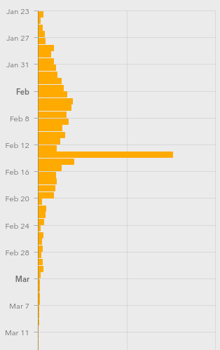
> What happened on Feb. 13?
China had a spike on the 13th, ~8x the cases on the 12th and ~4x the cases on 14th
dateRep,day,month,year,cases,deaths,countriesAndTerritories,geoId,countryterritoryCode,popData2018
17/02/2020,17,2,2020,2052,105,China,CN,CHN,1392730000
16/02/2020,16,2,2020,2007,142,China,CN,CHN,1392730000
15/02/2020,15,2,2020,2538,143,China,CN,CHN,1392730000
14/02/2020,14,2,2020,4156,13,China,CN,CHN,1392730000
13/02/2020,13,2,2020,15141,254,China,CN,CHN,1392730000
12/02/2020,12,2,2020,2028,97,China,CN,CHN,1392730000
11/02/2020,11,2,2020,2490,108,China,CN,CHN,1392730000
10/02/2020,10,2,2020,2974,97,China,CN,CHN,1392730000
09/02/2020,9,2,2020,2607,89,China,CN,CHN,1392730000
The actual question should be what happened about two weeks earlier in China that caused this spike.
Most likely the end of the Chinese New Year 24–30 Jan 2020, people were taking mass transport to get from home in the provinces back to work in cities.
Overnight 14’840 cases, including 13’332 clinically diagnosed cases were
reported from Hubei. This is the first time China has reported clinically
diagnosed cases in addition to laboratory-confirmed cases. For consistency,
we report here only the number of laboratory-confirmed cases. WHO has
formally requested additional information on the clinically diagnosed cases,
in particular when these have occurred in the course of the outbreak and
whether suspect cases were reclassified as clinically diagnosed cases.
From WHO Covid-19 report 13. February: https://www.google.com/url?sa=t&source=web&rct=j&url=https://www.who.int/docs/default-source/coronaviruse/situation-reports/20200213-sitrep-24-covid-19.pdf%3Fsfvrsn%3D9a7406a4_4&ved=2ahUKEwi127bO1L3oAhUDy6QKHS1lDwAQFjAAegQIBxAC&usg=AOvVaw1PBIz0ZQF0yvrohILevLf7
Could be a reporting thing. Were those really results from samples processed that day, or do they represent a change of definiton, or catch up on old data, or …
Real data doesn’t look like that. It must* be a reporting thing. My question was what.
*”must” in this case just means my statistical spider sense is tingling. But before you look into any other hypotheses, you’d have to make sure you can explain it by radical blips in data-collection methodology.
It was well publicised at the time that the jump in reported cases was the result of allowing clinically diagnosed cases, i.e. diagnosed with a CT chest, to be included in the confirmed cases, along with the lab confirmed cases.
A good site for global updates, though would be good to have an option to select the bottom rhs curve stats for individual regions or countries…
https://coronavirus.jhu.edu/map.html
Mike, just click on the country in the left panel. Bottom right graph changes to reflect that selected country.
Ah good stuff Paul,
Am on Lenovo tablet touch screen, not been totally happy with the android touch interface as it’s done a few odd things time to time, tried it once initially when finding the site no change but following your reply just now repeated the touch again after reload still needs two for me initially though it now works fine, thanks
I’m on a personally imposed trial reduced power consumption for domestic and lab, so sticking for the most part (ocd) to tablet with only rare and minimal use of a laptop/mouse – dropped my electron consumption from aud $212 per 2 month billing to approx $60 of course few other reductions, early morning exhaust fan vs aircon, turned off electric heater so cold showers too, even occasional use of headlight torches instead of 20W bedroom lights eek and getting used to walking in the dark with a pocket torch, suffice to say given covid anyway, no girl friends on horizon to stay over ;-)
For projection, this site is interesting.
https://covid19.healthdata.org/projections
US only, unfortunately. Models hospital, ICU beds and deaths, not cases.
For my weekly forecasts I am using the mean backward difference from the ECDC data tabulated here:
https://covid.ourworldindata.org/data/ecdc/full_data.csv
These two pages have a lot more information.
https://ourworldindata.org/coronavirus
https://ourworldindata.org/coronavirus-source-data
As of today’s data, the mean percentage increase in the US infections since 1 March is 23.3% per day.. The problem with exponentials is the numbers grow very rapidly which obscures what is actually going on. As a constant percentage increase *is* an exponential I consider it better suited to very noisy data. We’ve gone from almost no testing to drive through testing which is silly when you consider Bayes’ theorem.
We will know we are making progress when the daily percentage increases consistently go down over a period of several weeks.
A reasonable general predictor is current_count * 1.25**n_days. Divide today’s count by 4 and that’s how many new cases we’ll have tomorrow., give or take a bit.
US confirmed case data suggest a drop from 35%/day to 18%/day over the last week. I expect that spring break will dramatically reverse that trend over the course of the next 2 weeks.
A mask to prevent unconsciously touching your face and frequent hand cleaning are probably the 2 most effective measures if you must go out in public. But mind your light switches, door knobs, etc after you return.
I should like to call attention to this statement:
“SARS-CoV-2 RNA was identified on a variety of surfaces in cabins of
both symptomatic and asymptomatic infected passengers up to 17 days
after cabins were vacated on the Diamond Princess but before
disinfection procedures had been conducted (Takuya Yamagishi,
National Institute of Infectious Diseases, personal communication,
2020).”
From:
https://www.cdc.gov/mmwr/volumes/69/wr/mm6912e3.htm
This is considerably longer than the results of CDC Rocky Mountain Lab
tests reported here:
https://www.nejm.org/doi/full/10.1056/nejmc2004973
It’s important to note that detecting RNA is not the same as the RNA
being a viable infectious agent which was the focus of the CDC paper
in the NEJM. So we must wait for further details on the Diamond
Princess work.
Diamond Princess cruise ship showed many people got it with mild or even no symptoms. Those people now have the antibodies, so they won’t retransmit.
It also showed unsanitary food preparation (fecal matter) is a great way to spread this flu.
Hmm, I’m not so sure that antibodies guarantee no subsequent transmission such as if a person is a chimera and/or those with cyclical antibody rise and fall equilibria pattern with compromised immune functionality whilst pockets of viruii still operate “under the radar” of the immune system ?
Such as clamydia pneumonia can subsist in the brain’s CFS of multiple scelerosis patients continuing to output toxins which bind to myelin causing the immune system to over react to the toxin grabbing the myelin as well :-/
NPR is reporting now too, there are cases where people are now testing positive AFTER getting a negative test. This does not bode well. As people can be infectious even after they a.)cleared all symptoms b.)received a negative test after clearing symptoms. https://www.npr.org/sections/goatsandsoda/2020/03/27/822407626/mystery-in-wuhan-recovered-coronavirus-patients-test-negative-then-positive
That 3D printed display counter will overflow soon and run out of space.
We’re in full (not quite Wuhan style) lockdown in NZ with the govt. narrative now turning to a focus on stamping it out all together. Where that leaves us as a possibly virus free (in terms of community transmission) island nation is unclear. We’ve always been pretty hardcore on biosecurity from a hort and ag perspective but there’s still a tonne of debate in the business community around how that will work with humans. We quarantine animals coming in from nearly everywhere for weeks at a time. What will that look like for business travel? 2 weeks in a crate after each trip? Until there’s a vaccine we might be stuck here for a while :-/
Using Confirmed cases is now near pointless.
So many countries are either behind in testing or are restircting testing.
For example, the U.S. Confirmed rate does not show the Infection Rate, but the Detection Rate.
Look at Deaths.
Authorities can’t restirct deaths.
Althought some are not counting a death as Covid unless the person was Confirmed Covid prior to their death…
3 Blue 1 Brown has a new video:
https://m.youtube.com/watch?v=gxAaO2rsdIs
People in Wuhan who were infected, had symptoms, cleared symptoms, tested as negative are now testing positive again for presence of COVID-19, anti-bodies or not. https://www.npr.org/sections/goatsandsoda/2020/03/27/822407626/mystery-in-wuhan-recovered-coronavirus-patients-test-negative-then-positive
Yes,
Let’s pretend the tests are 100% accurate and that China’s magic new case count is real. Since we then trust all the data as it was supplied let’s use all kinds and fun and compelling looking graphs and heat maps to allow conclusions to be drawn.
The numbers will be tortured to make them confess any answer desired.
Now Newsweek is reporting it too. Two consecutive “negative” tests for Coronavirus does not mean you aren’t harboring Coronavirus. I don’t think there’s a really clear model of the epidemiology yet for the infection and what happens AFTER the symptoms clear. https://www.newsweek.com/covid-19-coronavirus-symptoms-infection-1494962
Here’s a better pullquote: “This warrants us to investigate the ‘shedding window’ after the clinical recovery of the patient,” they wrote.” But still sometimes the tests come back negative during that shedding window, at least that’s what NPR was reporting.
Had symptoms, lab-Confirmed, cleared symptoms, tested negative, released, later present again and lab-Confirmed; has been documented elsewhere much earlier, and not in China.
There was great concern that people had caught the disease again – that they didn’t have any acquired immunity.
It was determined that they had been lab-Confirmed, hospitalized, their symptoms had improved and were observed absent in hospital. They had negative tests, spaced. They were declared Recovered and released, only to later present again with symptoms. It was determined that the virus had been present all along, just that its levels had improved/reduced to undetectable levels. Hence when it got worse again, they re-present with the disease. One example given, was a woman in Japan. Re-presented a week or more after being released.
One earlier finding, that late in the course of the disease, viral loads in the intestinal tract were 20x to 50x that in the respiratory tract, had those authors considering if anal swabs would be a better determination of Recovered, as they would should positive when a respiratory sample would be below detectable and show negative. A later study confirmed that early in the disease, anal samples showed negative.
Another study noted that while RNA was detected and patients were being kept until test series were negative, there wasn’t a test that determined if the viruses the patient shed were live and infectious or were neutralized by anti-bodies. That thought was that patients may be being kept in hospital longer than necessary.
The feared asymptomatic SARS-CoV-2 carrier that would test as lab-Confirmed was determined to actually be presymptomatic (still in incubation) as the overwhelming majority later presented with the disease. Incubation was determined to typically be two days to 14 days, but the outlier range was as short as hours, through to 27 days, and at least one claim of 29 days.
It’s still rather early in knowledge of this virus and disease. People have to be prepared to relearn or completely throw out what they’ve already learnt regarding aspects of this. So many observations and findings that have to be reconciled.
And this just in from the South China Morning Post: https://www.scmp.com/news/china/society/article/3077753/china-include-symptom-free-coronavirus-carriers-national-figures
Any Public Health, BioStat, Epidemiologist attempting to use “reported” numbers from China is in for a big disappointment. Do NOT create curve-fitting, mathematical model. It’s far too early to do that, as China now has to change the way it was reporting it’s numbers. We may see their total positive tests go up as of Wednesday of this week.
I *love* how the video completely glosses over the fact that many places (like china) will simply brush numbers under the table and replace it with propaganda instead.
Also, this would be much more easily explained to regular humans, if it were analogous to a pyramid scheme sprinkled with a few animations about how 7 degrees of separation works. These are fundamental principles that are glossed over by every day humans and directly apply to how diseases spread.