Full Self-Driving, On A Budget

Self-driving is currently the Holy Grail in the automotive world, with a number of companies racing to build general-purpose autonomous vehicles that can get from point A to point B with no user input. While no one has brought one to market yet, at least one has promised this feature and had customers pay for it, but continually moved the goalposts for delivery due to how challenging this problem turns out to be. But it doesn’t need to be that hard or expensive to solve, at least in some situations.

The situation in question is driving on a single stretch of highway, and only focuses on steering, so it doesn’t handle the accelerator or brake pedal input. The highway is driven normally, using a webcam to take images of the route and an Arduino to capture data about the steering angle. The idea here is that with enough training the Arduino could eventually steer the car. But first some math needs to happen on the training data since the steering wheel is almost always not turning the car, so the Arduino knows that actual steering events aren’t just statistical anomalies. After the training, the system does a surprisingly good job at “driving” based on this data, and does it on a budget not much larger than laptop, microcontroller, and webcam.

Admittedly, this project was a proof-of-concept to investigate machine learning, neural networks, and other statistical algorithms used in these sorts of systems, and doesn’t actually drive any cars on any roadways. Even the creator says he wouldn’t trust it himself, but that he was pleasantly surprised by the results of such a simple system. It could also be expanded out to handle brake and accelerator pedals with separate neural networks as well. It’s not our first budget-friendly self-driving system, either. This one makes it happen with the enormous computing resources of a single Android smartphone.

Continue reading “Full Self-Driving, On A Budget”

Putting A Cheap Laser Rangefinder Through Its Paces

Sometimes a gizmo seems too cheap to be true. You know there’s just no way it’ll work as advertised — but sometimes it’s fun to find out. Thankfully, if that gadget happens to be a MILESEEY PF210 Hunting Laser Rangefinder, [Phil] has got you covered. He recently got his hands on one (for less than 100 euros, which is wild for a laser rangefinder) and decided to see just how useful it actually was.

The instrument in question measures distances via the time-of-flight method; it bounces a laser pulse off of some distant (or not-so-distant) object and measures how long the pulse takes to return. Using the speed of light, it can calculate the distance the pulse has traveled).

As it turns out, it worked surprisingly well. [Phil] decided to focus his analysis on accuracy and precision, arguably the most important features you’d look for while purchasing such an instrument. We won’t get into the statistical nitty-gritty here, but suffice it to say that [Phil] did his homework. To evaluate the instrument’s precision, he took ten measurements against each of ten different targets of various ranges between 2.9 m and 800 m. He found that it was incredibly precise (almost perfectly repeatable) at low distances, and still pretty darn good way out at 800 m (Ā±1 m repeatability).

To test the accuracy, he took a series of measurements and compared them against their known values (pretty straightforward, right?). He found that the instrument was accurate to within a maximum of 3% (but was usually even better than that).

While this may not be groundbreaking science, it’s really nice to be reminded that sometimes a cheap instrument will do the job, and we love that there are dedicated folks like [Phil] out there who are willing to put the time in to prove it.

Using Statistics Instead Of Sensors

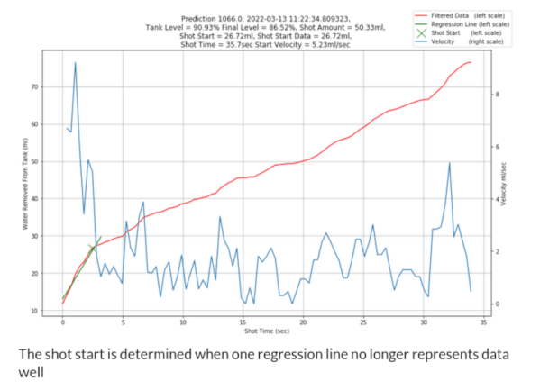
Statistics often gets a bad rap in mathematics circles for being less than concrete at best, and being downright misleading at worst. While these sentiments might ring true for things like political polling, it hides the fact that statistical methods can be put to good use in engineering systems with fantastic results. [Mark Smith], for example, has been working on an espresso machine which can make the perfect shot of coffee, and turned to one of the tools in the statistics toolbox in order to solve a problem rather than adding another sensor to his complex coffee-brewing machine.

To make espresso, steam is generated which is then forced through finely ground coffee. [Mark] found that his espresso machine was often pouring too much or too little coffee, and in order to improve his machine’s accuracy in this area he turned to the linear regression parameter R2, also known as the coefficient of determination. By using a machine learning algorithm tuned to this value, which assesses predictable variation in a data set, a computer can more easily tell when the coffee begins pouring out of the portafilter and into the espresso cup based on the pressure and water flow in the machine itself rather than using some other input such as the weight of the cup.

We have seen in the past how seriously [Mark] takes his coffee-making, and this is another step in a series of improvements he has made to his equipment. In this iteration, he has additionally produced a simulation in JupyterLab to better assist him in modeling the system and making even more accurate predictions. It’s quite a bit more effort than adding sensors, but since his espresso machine already included quite a bit of computing power it’s not too big a leap for him to make.

Hackers, Fingerprints, Laptops, And Stickers

A discussion ensued about our crazy hacker ways the other night. I jokingly suggested that with as many stickers as we each had on our trusty companion machines, they might literally be as unique as a fingerprint. Cut straight to nerds talking too much math.

First off, you could wonder about the chances of two random hackers having the same sticker on their laptop. Say, for argument’s sake, that globally there are 2,000 stickers per year that are cool enough to put on a laptop. (None of us will see them all.) If a laptop lasts five years, that’s a pool of 10,000 stickers to draw from. If you’ve only got one sticker per laptop, that’s pretty slim odds, even when the laptops are of the same vintage.

Real hackers have 20-50 stickers per laptop — at least in our sample of “real hackers”. Here, the Birthday Paradox kicks in and helps us out. Each additional sticker provides another shot at matching, and an extra shot at being matched. So while you and I are unlikely to have the same birthday, in a room full of 42 people, it’s 90% likely that someone will have their birthday matched. With eight of us in the room, that’s 240 stickers that could match each other. (9999 / 10000) ^ (240 * 210 / 2) = about an eight percent chance of no match, so a better than 90% chance that we’d have at least one matching sticker.

But that doesn’t answer the original question: are our be-stickered laptops unique, like fingerprints or snowflakes? There, you have to match each and every sticker on the laptop — a virtually impossible task, and while there were eight of us in the room, that’s just not enough to get any real juice from the Birthday Paradox. (1/10,000) ^ 30 = something with -120 in the exponent. More than all the atoms in the universe, much less hackers in a room, whether you take things to the eighth power or not.

I hear you mumbling “network effects”. We’ve all gone to the same conferences, and we have similar taste in stickers, and maybe we even trade with each other. Think six degrees of separation type stuff. Indeed, this was true in our room. A few of us had the same stickers because we gave them to each other. We had a lot more matches than you’d expect, even though we were all unique.

So while the math for these network effects is over my head, I think it says something deeper about our trusty boxen, their stickers, and their hackers. Each sticker also comes with a memory, and our collected memories make us unique like our laptops. But matching stickers are also more than pure Birthday Paradoxes, they represent the shared history of friends.

Wear your laptop stickers with pride!

What Really Goes Wrong With Your Tablet

We’ve all seen our share of consumer electronic devices that need repair. It’s inevitable that, however well-cared-for it will be, there’s always the unforseen that brings its life to an end. Many of us will be using devices we’ve repaired ourselves, because often other people’s useless broken electronics can be our free stuff when we know how to fix them and they don’t. This is the arena the Restart Project operate in, as through their Restart Parties they provide repair services to save unnecessary landfill. Over nearly a decade in operation they’ve fixed a huge number of faulty items, and now they’re releasing some data and have analysed common fault modes and barriers to repair for some categories.

We’re restricted to tablets, printers, and batteries, and while many of the problemsĀ  are the wear-and-tear such as tablet screens, power supplies, charging connectors, and paper feeds that most of us would expect, it’s the barriers to repair which the Restart Project are keen to draw attention to. Products that are near-impossible to open without damage, parts such as batteries which are difficult to remove, and unavailability of spares. It’s to become part of their campaigning for legal repairability standards across Europe.

Aside from their own analysis, the full data is all available for download should you have any extra insights. We’ve made our position on this matter very clear indeed.

COVID-19 Statistics: Reading The Tea Leaves

If you’ve been tracking the spread of the COVID-19 pandemic around the world, as we have, you’ve doubtless seen a lot of statistics. The raw numbers look shocking, and in many cases they are, but as always it’s crucially important to ask yourself what the numbers mean.

For instance, our own Tom Nardi put together a counter that displays the total number of COVID-19 cases in the US. It’s a cool project that puts together some web-scraping, a nice OLED screen, and a 3D-printed network display. When this is all over, it can be easily re-trained to show some other statistic of interest, and it’s a great introduction to a number of web APIs. However, it’s looking at the wrong number.

Let me explain. Diseases spread exponentially: the more people who have it, the more people are spreading it. And exponential curves all look the same when you plot out their instantaneous values — the raw number of COVID-19 cases. Instead, what distinguishes one exponential from another is the growth parameter, and this is related to the number of new cases per day, or more correctly, to the day-to-day change in new cases.

If left unchecked, and especially in the early stages of spread, the number of new cases grows every day. But as control efforts, mainly social distancing, take effect, the rate at which the number of new cases can slow, or even go negative. That’s the plan, anyway.

As is very well explained by this video from 3 Blue, 1 Brown, if this were a naturally spreading epidemic, the point at which the new cases just starts to decline marks the halfway point in the course of the disease. Here, we’re hoping that particularly strict quarantining procedures will cut this run even shorter, but if you’re interested in how the disease is spreading, the point when daily new infections turns around is what you’re looking for.

Why not put the daily difference in new cases on your desktop, then? These numbers are noisy, and the difference jumps all around. To be serious, you would probably want to put a moving average on the new cases figure, and look at that difference. Or simply show the new cases instead and look for it to drop for a few days in a row.

Still, this won’t be a perfect measure. For starters, COVID-19 seems to incubate for roughly a week without symptoms. This means that whatever numbers we have, they’re probably a week behind the actual situation. We won’t see the effects of social distancing for at least a week, and maybe more.

Further complicating things is the availability of tests, human factors like weekends when more people get tested but fewer government reporting offices are open, timezones, etc. (What happened on Feb. 13?)

I’m not going to go so far as to say that the COVID-19 stats that we see are useless — actually far from it. But if you’re going to armchair quarterback this pandemic, do it right. Plot out the daily new cases, maybe apply a little smoothing, at least in your head, and realize that whatever you’re seeing now probably represents what happened last week.

When you finally see the turning point, you may celebrate a little, because that means the halfway point was a week ago. We’ve seen it happen in China around Feb 2, and I’m looking forward to it happening here. I hope it happens wherever you are, and soon.

We will get through this. Stay safe, all. And keep yourself uninfected to keep others uninfected.

This article is part of the Hackaday.com newsletter, delivered every seven days for each of the last 212 weeks or so. It also includes our favorite articles from the last seven days that you can see on the web version of the newsletter.

Want this type of article to hit your inbox every Friday morning? You should sign up!

Florence Nightingale: The Lady With The Data

When you think of Florence Nightingale, you probably imagine a nurse with a lamp, comforting soldiers. Indeed, Florence is considered the mother of modern nursing. But she also made serious contributions in statistical data analysis, and used the diagram named after her, the Nightingale rose diagram, to convince the British Parliament to enact sanitation reforms that saved hundreds of thousands, if not millions, of lives.

During the Crimean war, Florence worked around the clock as head nurse in an overcrowded field hospital. But she also found time to create graphs to illustrate the terrible conditions of that field hospital to members of British Parliament. The sanitation reforms she led greatly improved the life of the soldiers in battle, and widespread adoption of her hygienic practices vastly reduced mortality rates of humanity in general.

Continue reading “Florence Nightingale: The Lady With The Data”