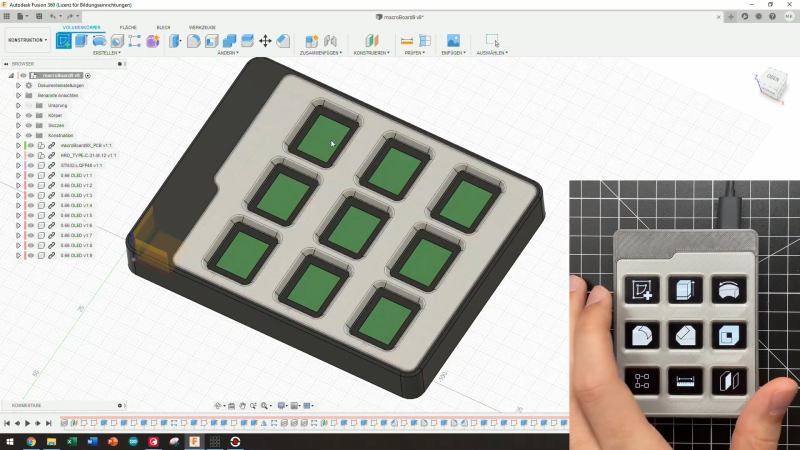
When we first laid eyes on Keybon, the adaptive macro keyboard, we sort of wondered what the big deal was. It honestly looked like any other USB macro keyboard, with big icons for various common tasks on the chunky keys. But looks can be deceiving, and [Max Kern] worked a couple of surprises into Keybon.
First of all, each one of Keybon’s buttons is actually a tiny OLED display, making the keycaps customizable through software. Each of the nine 0.66″ displays has a resolution of 64 x 48 pixels, which is plenty for all kinds of icons, and each is mounted over an SMD pushbutton switch. He had to deal with the problem of the keycaps just wobbling around atop the switch button without depressing it; this was solved with a 3D-printed cantilever frame that forced the keycaps to pivot only in one axis, resulting in clean, satisfyingly clicky keypresses.
The other trick that Keybon has is interactivity. By itself, it boots up with a standard set of icons and sends the corresponding keystrokes over USB. But when used with its companion Windows application, the entire macro set can be switched out to accommodate whatever application is being used. This gives the users access to custom macros for a web browser, EDA suite, CAD applications, or an IDE. The app supports up to eight macro sets and can be seen in action in the video below.
We love the look and the functionality [Max.K] has built into Keybon, but we wonder if e-ink displays would be a good choice for the keycaps too. They’re available for a song as decommissioned store shelf price tags now, and they might be nice since the icon would persist without power.








Reminds me of the Optimus Maximus. That was so impressive when it was first announced — and that was before every coder and gamer cared their choice of mechanical keyboard.
https://en.m.wikipedia.org/wiki/Optimus_Maximus_keyboard
Optimus Maximus was fancy-looking, awful to type on, and stupidly expensive.
This is why I’ve held out hope that when some of the e-Ink patents expire that it will become cheap enough that they will start making e-paper keycaps that have similar properties to normal keycaps. So there is hope… maybe in 10 years. :/
Really? Shocking!
I’ve thought of this, but the question of durability.
Commercial versions are available form a few different manufactures.
I have used these the LCD and OLED versions in products before:
https://www.nkkswitches.com/smartdisplay/
I could not determine from the video if the screens are the actual buttons or not. That flat flex cable of the oled screens are not designed to endure a lot from my experiences.
They seem to be on top, looking at the gallery in the project’s page.
They’re little screens sitting on top of tact-switches via a spring type frame. Press the screen down and the switch clicks. Let go and the screen pops back up because of the switch and springy frame. My guess is the flex cable will be fine for a long time since the actual movement is very small and doesn’t seem to put much stress on any one section of the cable.
Thinking of every time I only looked at OLED display wrongly or god forbid went for a dust speckle on it.. So many half-working M5Sticks :((
This is literally a homemade elgato stream deck. Nicer quality sure, but the stream deck has many, many integrations.
I’m pretty sure this could be integrated into anything you like. Also, it doesn’t cost $200.
First project log post of the project page on hackaday.io (first link in the article) literally says:
“The Elgato Stream Deck is a keyboard with a cleverly integrated LCD touch display behind transparent buttons. Each button can be configured to have different functions and icons depending on the application you are currently using. Considering the high cost of these devices I set myself the goal of creating a cheaper DIY alternative that is fully configurable. ”
So yes, Elgato Stream Deck was the reason Maximilian did this. And he’s done such a nice work!
Thinking about it, a touchscreen overlaid with a 3d printed, compartmentalized frame / grid plus haptic feedback in the form of a smartphone style vibration motor might be an simpler solution. You would sacrifice a few pixels I suppose.
You mean, like this post from a week ago?
https://hackaday.com/2020/12/10/the-macro-keyboard-is-on-deck/
Not quite, that’s more or less a conventional use of a touchscreen. Take that then put a windowed grid on top like the example above to get the appearance of sunken switches.
I do want this NOW! Great Project.
Any chance of getting the PCB? Would like to build one my own.
-h
PCB?… a link is in the very first line of the article. Dragging the .brd file over to oshpark tells me it’s $50 for three of them. And the displays are a couple of bucks each over at buydisplay.
btw: very nice work, and clever solution to the display mounting. The host side software is the clincher.
Ive been using JLCPCB and for any board more than a few square inches it is cheaper to use them over oshpark, even including shipping. Anything past about 4 square inches for me is where I switch suppliers. I actually get boards usually quicker from JLC too.
Exactly my strategy. I’ll favor OSHPark because, frankly, I want to support onshore manufacturing, and they’re just really great guys. Most of my “hobby” stuff goes to them. I’ll go to JLCPCB if I want more than three boards, if they’re big, or (especially) if I want to have them populate it. “Work” stuff tends to go to JLC because all three are usually true.
I mention OSHPark here because it’s so darned easy to drag&drop the .brd file on their site and get an instant preview & price.
Thx for the links to the PCB manufacturers. I will check these out.