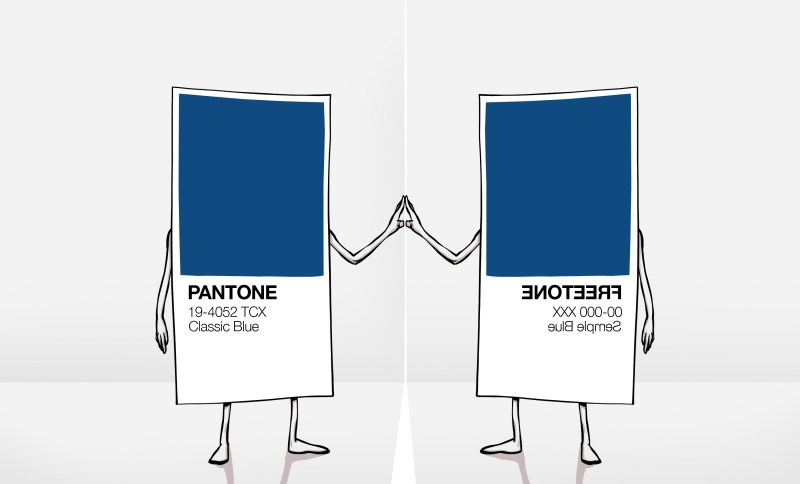
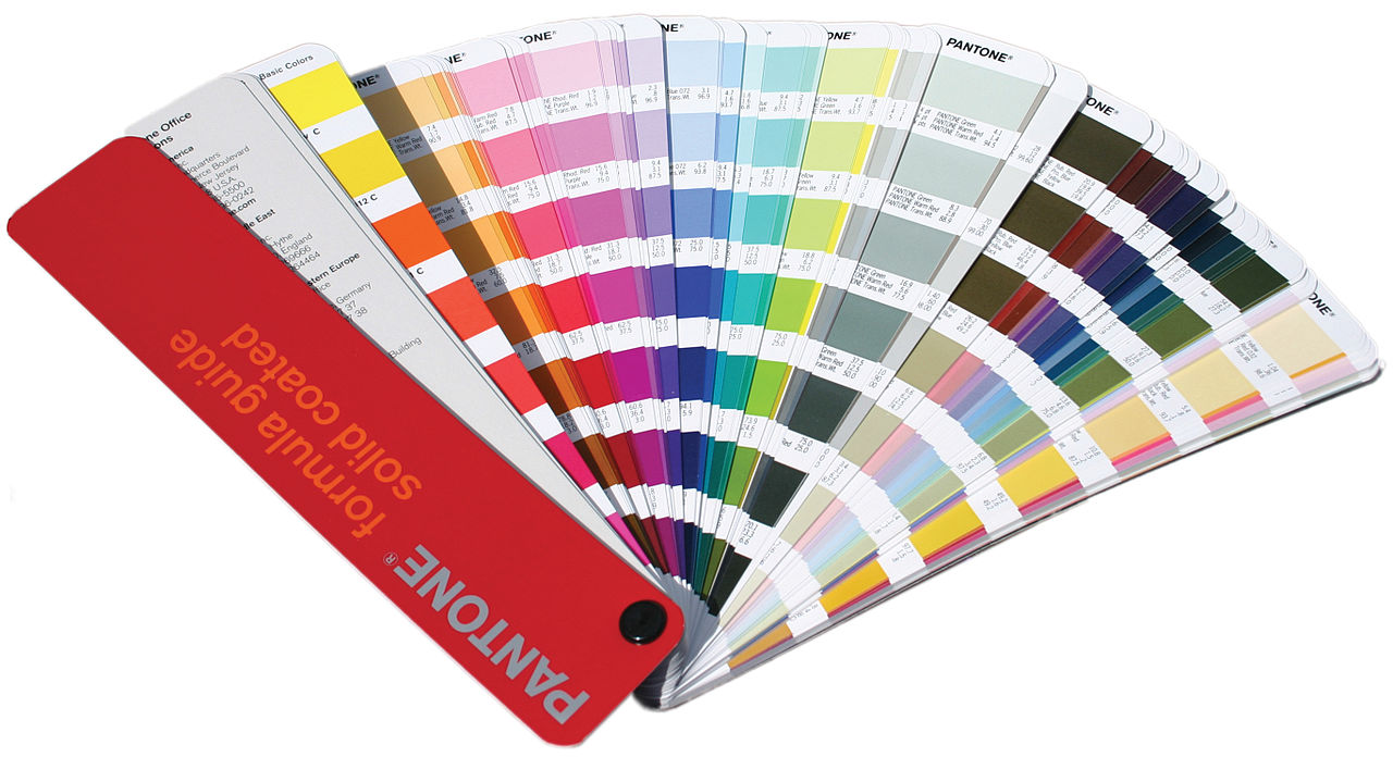
We recently covered the removal of Pantone colour support from the Adobe cloud products, with the two companies now expecting artists and designers to pay an extra subscription for a Pantone plugin or face losing their Pantone-coloured work to a sea of black blocks. Our coverage focused on our community, and on how the absurdity of a commercial entity attempting to assert ownership over colours would have no effect on us with our triple-byte RGB values.
Interview With An Artist And Pigment Activist
It’s fair to say though that in our focus on hardware hackers and open source enthusiasts, we missed its effect on artists and designers. To rectify this omission we needed to step outside our field and talk to an artist, and in that context there’s an obvious person to interview.
Stuart Semple is probably one of the more famous contemporary British artists, but in relation to this story it’s his activism over the issue of colours and intellectual property that makes him an authority. He’s drawn attention to the issue by releasing his own art materials in colours that directly challenge those which companies have tried to claim for themselves, and is perhaps best known in our community for challenging Anish Kapoor’s exclusive licence for VantaBlack, the so-called “world’s blackest pigment”.
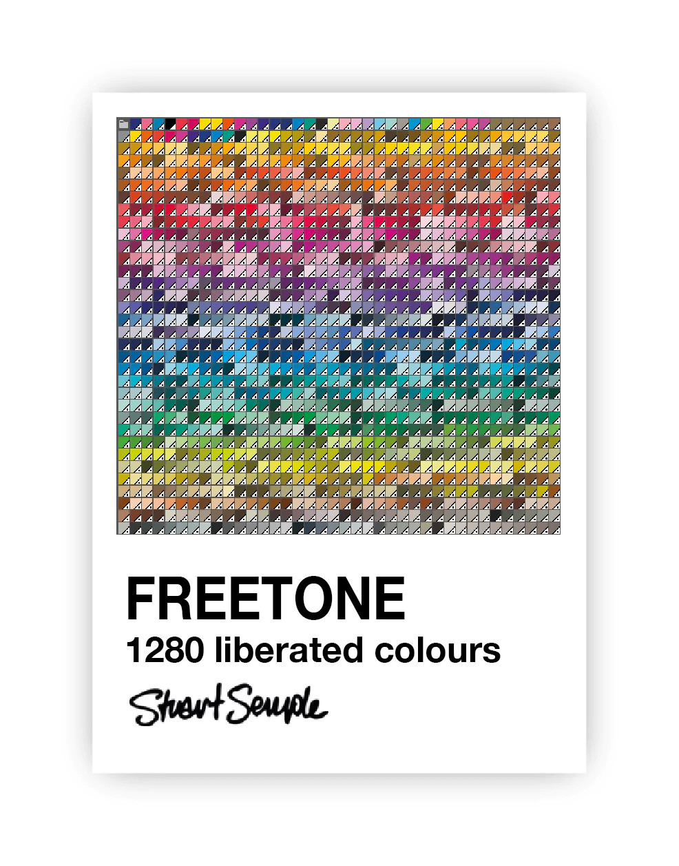
Most recently in response to the Adobe/Pantone controversy he’s released Freetone, a free plugin for the Adobe suite that in the words from its web page contains “1280 Liberated colours are extremely Pantoneish and reminiscent of those found in the most iconic colour book of all time. In fact it’s been argued that they are indistinguishable from those behind the Adobe paywall”. I had a phone conversation with him, in which he explained why Freetone had come into being.
Hackaday I understand Pantone is something used by designers, so I’ve worked for companies in the past where the designer would specify a Pantone index and it would appear on the screen, on the printed box, and on everything else identically. But why why do you as an artist use Pantone?
Stuart Well, I use it in lots of ways. So I make a lot of screen prints as part of my art. So you know, if I’m working with a screen printer, I want to know that the print that they make of my work is the colour that I want it to be, so Pantone’s really useful for me for that.
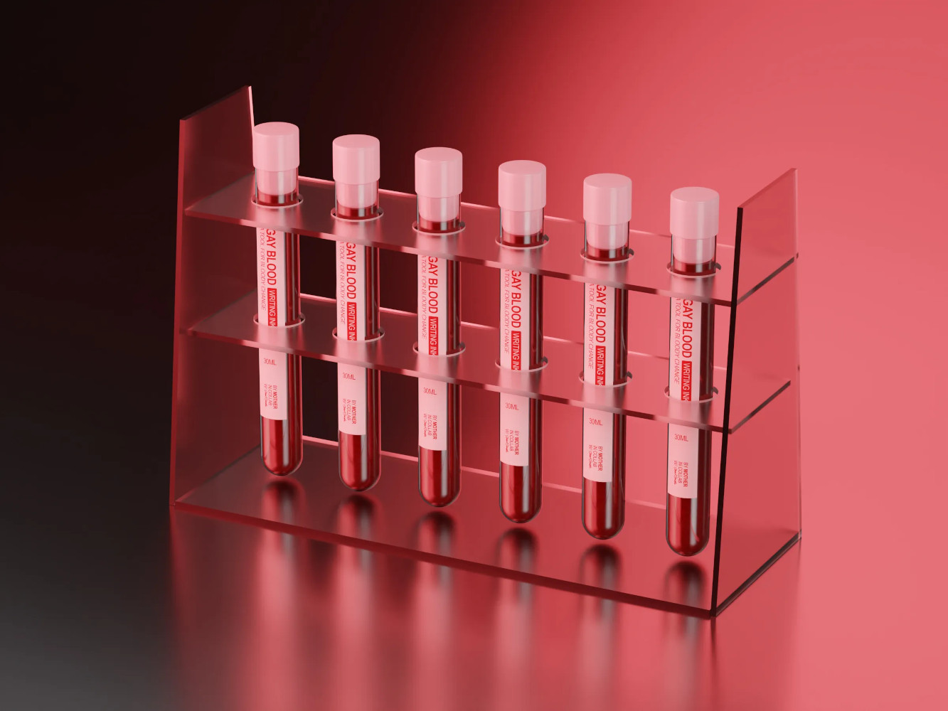
But also, even with within the paints, so I just did a thing where I made some paints, which actually uses the blood of gay men. It was really important to me that the colour of the paint matched the colour of actual blood. So I was working with a lot of people, we’ve been collaborating, and I was working with some friends in New York on it, and we needed a common language.
The red I was talking about was the red they were talking about, and Pantone is super useful for that. In fact, it’s the go-to for that. I just did a record cover for Placebo, the band, that was produced for me by someone that prints, so I had to tell them what spot colours I wanted. So I had to tell them Pantone references, it’s the language they understand.
Hackaday So my next question relates to Freetone. Obviously, as as you’ve distributed it, it’s a Adobe plugin. How does it solve the problem? Because obviously, I can specify a Freetone colour, and anybody else with Freetone can tell yes, that’s that colour. But how do I then go to a printer who buys his inks with Pantone specifications and map one to the other?
Stuart How it works is, if you download Freetone, you’ll find colours in there, and one of them will be called Sempletone 648C. Well, it’s exactly the same as Pantone 648C. If you do your work on the screen, use the Freetones, and then when you send it to the printer, it’s actually blatantly obvious to anyone that 648C is clearly apparent. If you’ve got the Pantone fan book and you look at the colours, it’s the same. 846C in mine is the same as 846C in the fan, in the Pantone book. I’d like to see them try and argue that they own it, but I don’t think they do in the name or the Pantone trademark, but these are Sempletones with a number. So I think it’s gonna be hard.
Hackaday My next question is probably getting more into the technology of it all. Do you think it will be possible to replace Pantone’s service completely? So if you took every Sempletone colour and threw it at a spectrometer and published the spectrum, would you then be able to say to an ink manufacturer or similar, here are the full technical details rather than just a colour, and does your paint correspond to this spectrum? I’m curious how far you could push open source in this line.
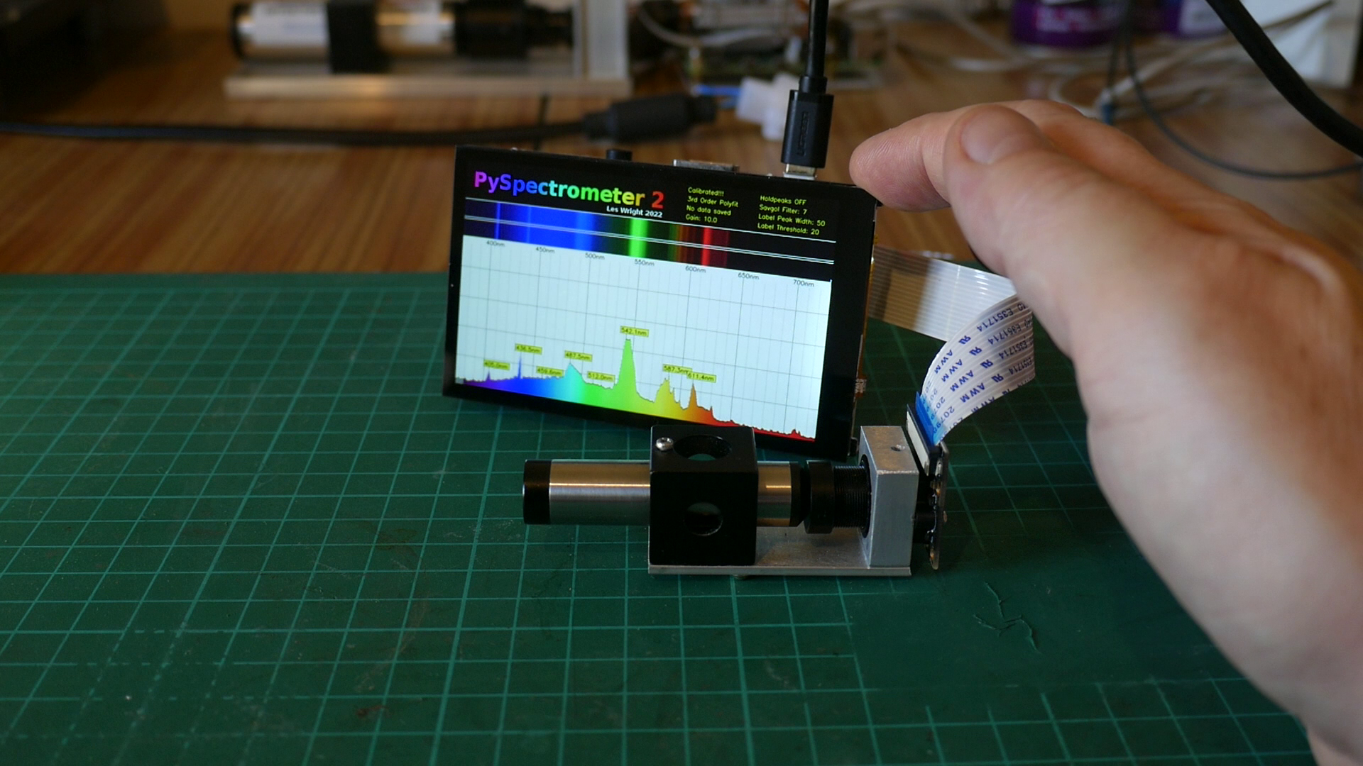
Stuart That’s really cool. I love it. Like, if you could just give them that spectral data, and if they’ve got a spectrometer they could measure it a their end. But there’s nothing that advanced at the moment, a lot of action is done by eye still. My answer is, I don’t see why not if there was a cool enough device. I don’t know if the spectrometer would be good enough to match it. I don’t see why not, I don’t see why you couldn’t publish the data. But it would have to be the whole spectral information and not just like an RGB value.
(At this point the interview digressed for a moment into a discussion of open-source spectrometers such as the Raspberry Pi project we featured recently, as Stuart’s lament was that a spectrometer can be an extremely expensive instrument. It isn’t the job of an interviewer to lead their interviewee so we’re skipping this part of the transcript, however I think we can all look forward to whatever uses Stuart makes of an affordable spectrometer. We’ll pick up the interview at the next question.)
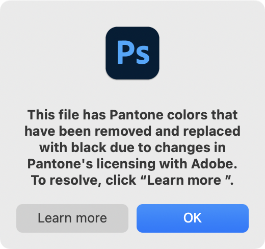
Hackaday One of the real problems with the whole Adobe suite, and this has happened in world as well with for instance the Autodesk CAD packages, is that they have gone into the cloud and become software as a subscription. So I understand completely, the frustration of artists at suddenly being told they have to pay an extra subscription to keep their Pantone support, and I’m particularly shocked to find that Photoshop isn’t just displaying black pixels over Pantone colours, I’m told it’s wiping out the Pantone information on saving. Do you think that anything in the open source software ecosystem comes close to replacing proprietary products like the Adobe suite for you as an artist?
Stuart Yes, 100%, there’s loads of stuff. I think open source is just the answer, I believe in freedom. And freedom means freedom to express yourself and freedom to own the thing and tweet the thing and change the thing and all the rest of it. So yeah, 100%. I think there’s actually better things than Photoshop, the problem we’ve got is that Adobe have the industry stranglehold. And if you want to work with someone, you have to be talking that language. And that’s still the problem. It’s like an operating system, but it’s got the monopoly.
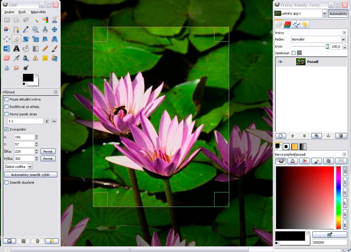
So there are other things, for instance, on a Mac, there’s something called Pixelmator, which is as good as Photoshop in my opinion, I use it every day. It’s not free, but you buy it once, and that’s it, free updates. Like software used to be. And there are other things, like GIMP is amazing. It’s awesome, but it doesn’t really replace Photoshop.
Hackaday Here at Hackaday we can make noises about how wouldn’t it be great if the developers of GIMP or other software could stick Freetone into their products, because they don’t have Pantone as it’s licensed?
Stuart Yeah, that’d be a dream, wouldn’t it? I mean, why not? I made it for everybody. As far as I’m concerned, it’s out there, use it, change it. incorporate it, the more people the better, I think.
A lot of people use GIMP, and it’s good. Really good open source stuff that always has been. We know the future is in the open source stuff, proprietary stuff just won’t last, it’s just not adaptable. It’s putting greed and profits above the user, it can’t work. There’s no freedom in it.
Hackaday To me the most egregious thing is that as I understand it they will delete the Pantone information from your PSD. This really shocked me.
Stuart They’re literally holding it hostage. It’s like 20 quid, or delete from your work, which is, wow. They’re not giving me anything, anyway. I’m renting the software, paying to use the software every month, it’s not free. And the licence fee is a lot. We’re already spending hundreds and hundreds a year on this software, probably about 800 quid a year. Another 20 quid, just to pen the work we make before. I mean, it’s our work! It’s pure corporate greed, isn’t it.
Hackaday Thank you very much for the interview.
As we wrapped up, I asked him about his Black 3.0 pigment, produced as a reaction to VantaBlack and Anish Kapoor. I was curious whether it might have a specially good infra-red response for headsinks or solar collectors, but sadly he informed me that it’s primarily a visual colour for artists. It’s very cool stuff, incredibly black, and I really want to get some to play with, but probably no better than a rattle can for heat purposes. Never mind, an engineer’s curiosity satisfied.
What’s Next, For Both Artists And Engineers?
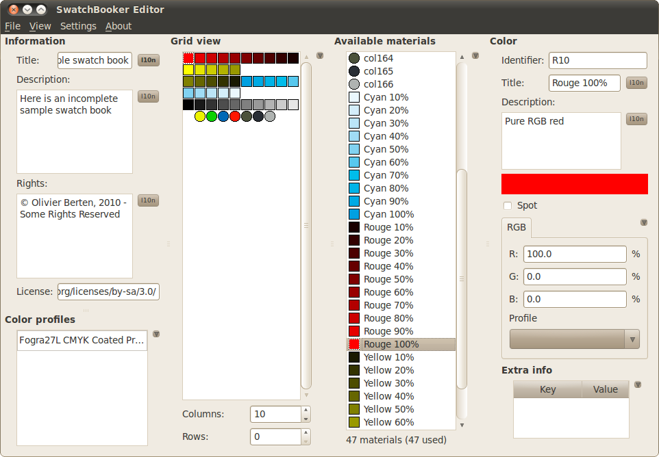
Following the interview, it’s worth looking at the Freetone project from our side of the table as well as his. If we as a community would like to ensure that colours do not become ever more proprietary, then it is probably on us to ensure that where appropriate it is supported within our sphere. GIMP support for instance would at a stroke make open source software an easier choice for millions of artists and designers, and could I think be done relatively easily through its existing palette support. There’s SwatchBooker which appears to perform the necessary interchange, and I found the ASE2GIMP project which imports Adobe palettes into GIMP, but sadly I couldn’t make it work here. If GIMP shipped with a Freetone palette built-in, would that be too much of a development task to contemplate?
From Stuart’s side, having sat down and played with Freetone, if there’s one thing I could ask him it would be to release it as more than just an Adobe plugin, and to give it an open source licence. As it stands it’s a binary available for no charge through his web shop, I think that releasing it as a straightforward list, perhaps even as simple as a CSV file, would make it so much more accessible to developers. And coupled with an open source licence that allowed them to include it within their software, I think it would be unstopable. We’re not open source licence nerds here at Hackaday, but I’m guessing something that does the same for a palette as a library licence such as the LGPL does for libraries would be appropriate.
In our world we’re wrapped up in electronics and code, and it’s sometimes easy to forget that the work we do reaches way beyond our workbenches. If you’ve spent enough time in a hackerspace you’ll know that art and engineering are almost the two sides of the same coin, so it’s pleasing to find such a moment of crossover. Let’s hope Freetone support can find its way into the open source movement, and together we can keep the tentacles of yet another IP land grab at bay.


Pirating adobe has always been a better user experience than buying it—excluding the expense factor. They make you pay to get screwed. Eventually they’ll merge with autodesk, that’ll be fun.
Yes, i have slowly been learning to replace all my software with open source alternatives.
Freecad is…difficult… to learn at best, especially when you are used to autodesk and solidworks. But free!
Gimp,inkscape and other pieces of free software are easier to learn since I had no experience with professional software before.
Freecad isn’t difficult to learn – it’s just difficult by design. The whole semantics and hierarchies are slightly “wrong” for what a CAD program is supposed to be doing.
FreeCAD has more of a feeling of being a playground for developers with no productive users in mind. I’ve learned to live with that, as there aren’t too much alternatives on Linux. But as long as FreeCAD is as crappy as it is in terms of ux, people will be attracted to non-free, limited, restricted, but real-world-productive software.
I am not a professional designer,. It I find freecad as easier to use than say fusion 360. Granted, there are things that Autodesk products do that freecad can’t. But I wonder how much of the “Autodesk is easier” comes from it being what people are trained on in schools.
With freecad, I feel that I learnt cad concepts, whereas with fusion, I did learn fusion rather than something entirely transferable.
Depends upon if “easier” is based upon sound principles other than familiarity. Things that could be applied to all software regardless of domain.
I am a dyslexic person, while I can function with Autodesk stuff, I find Freecad too obfuscated. However, this is not a ‘free’ feature, I have the same issue with Adobe products also.
>other pieces of free software are easier to learn
There’s two types of learning: learning a task, and learning a routine to accomplish the task. Programs like GIMP can accomplish the task, mostly, but you have to learn the routine because the program doesn’t work logically and isn’t built well.
If you don’t already know the task and you’re just approaching the matter like “I want to do X, how do I do that?”, then any convoluted way of accomplishing it becomes “easy” once you’ve learned the routine. It’s just a matter of reading a tutorial and doing it once, then remembering what you’ve done. That however doesn’t mean it’s a good way of doing it – just that you know how it’s done.
In a lot of UI/UX engineering, when you’re dealing with how things work “under the hood”, it’s easy to come up with difficult interfaces because you as the engineer know which bits are toggled by what button – you are used to interfacing directly with the machinery so the UI is obvious. You don’t necessarily need to label the buttons, or even have buttons – of course “you just press shift, it’s easy!” – provided you know exactly what it’s doing. The actual user however does not know, and does not care what’s happening under the hood, and can’t read the engineer’s mind over how they think the task should be accomplished. With Free software like GIMP, the people who design the interface are the same people who program the code, are the same people who end up using the software – they don’t really care what some Joan Doe thinks about it – or whether they’re even doing anything that makes sense in their context. They listen to the complaints though, and at times they go “Well, let’s make it better then!”, but even so they don’t actually bother to go out and ask – they just imagine what someone else might be thinking, which for the common “linux enthusiast” type doesn’t extend very far from what they themselves are thinking.
That’s where professional software like Photoshop are just better. When they came out, they went to the professionals and asked “What are you doing? How can we help?”, instead of just being a bunch of disparate people each writing small bits of the program for themselves. When you make a program for money, you have to please the users – whereas when you make a program “for community”, then you can just ignore and exclude whoever doesn’t fit your idea. “Don’t like it, fork it.”
Or to paraphrase John Gall: “Systems attract people who are suited for the pathologies of the system”, which is obvious.
A program like GIMP is driven by and attracts people who want to tinker with it, not people who want to do photo/art editing – who are instead met with hostility by the first whenever they suggest something should be made different.
Interesting take on it.
I use GIMP for photo editing. I have never “hacked” on GIMP. I’m a user, pure and simple.
I cannot use Photoshop. Every time I’ve come in contact with it, I’ve gone away baffled and frustrated. To my mind, Photoshop is “pathologic.” Nothing is where I can find it. Nothing works like I expect it to work.
It’s a matter of what you are used to. I never used a pirated copy of Photoshop like so many did back in the day. I used GIMP or other programs legally, so I never absorbed the Photoshop mentality. GIMP makes sense to me because I’ve used it for 25 years. Photoshop makes sense to many people because that’s all they know.
I’d have to disagree quite strongly on two points.
Gimp last time I used it and FreeCAD are both rather sanely and logically laid out. They are at least as consistent to themselves as their rivals are, at least now they are both reaching a more mature stable state, the earliest days of a FOSS project can be pretty wild on the UI, as getting all the desired functions tends to take priority – FreeCAD is only just about out of that phase IMO. What they are is just different enough so if you really learned ‘wrong’ you are going to find them hard to get started with.
And just because you could tinker with them doesn’t mean you will or will even want to – As they work! And for the most part they work really damn well. Are there features that don’t work, or work in ways you don’t like? Probably, but that is also true of any other software, at that point you can make a choice with the FOSS stuff that you can’t with the closed source – YOU CAN CHOOSE to tinker, or you can do what you would with the closed stuff and work around its annoyances as best you can and maybe file a bug report you know isn’t going to be dealt with..
The reason Pro’s like Photoshop has nothing to do with it being better, its entirely because super cheap licenses for all the university and collages means its the program everyone joining the workforce knows, and the program all the old timers have grow up with or been forced onto when the program they learnt first died in the industry… Plain and simple its the market dominance that makes working in anything else not a good thing for your employability…
Also 99% of the time I’d say the ‘pro’ or bespoke programs are sold by marketing people with no knowledge of what is actually plausible, then written in an excessive rush to meet the contract deadlines, so what you get is a really buggy shoddy product you and lots of other companies with different ideas paid lots of money for… And nobody will be happy, but they already paid all this money so lets throw some more at it till we get what we want…
The folks donating their time, or getting paid to work on their FOSS project actually know what the program does, how it can do it, what it needs to be – so what they are developing is actually done right, and done in a sensible extensible way so when the new features need to be added its not re-write all the kludges in even more awful ways… Neither is perfect product for everyone, but then nothing ever can be – in the same way something as simple as MS paint could be used to draw or edit your photos and is really really simple to operate, but its really quite awful as both a photo editor and art program – simple to use interface so its great for the folks that just needed to make something indicative of what they want, but no real substance to the program behind that UI making it really awful to use for the advanced user at their usual task..
> To my mind, Photoshop is “pathologic.” Nothing is where I can find it. Nothing works like I expect it to work.
Again, that is the difference between learning a task and learning a routine. You have learned to do things the “GIMP way”, which is to say, you know how to pull off certain particular tricks with GIMP and haven’t learned the equivalent routines for Photoshop.
It’s somewhat difficult to explain the difference, but some people also seem to operate that way in general. They can remember the steps to a complicated procedure very well, but don’t actually bother to understand the process they’re doing – only the steps required to complete the action. They then confuse the steps with the process.
Kinda like back in the day when your mother would get very confused because someone moved the IE logo from the left of the desktop to the right. She didn’t recognize the logo or the name of the program, just “click exactly here” – and when “there” wasn’t available anymore she was completely stumped. She had learned the motions, not the idea behind the action.
>Gimp last time I used it and FreeCAD are both rather sanely and logically laid out.
You say that because that’s how you’ve learned it.
>YOU CAN CHOOSE to tinker
Not really. You could, if you had the ability and the time on your hands, and not something else you’re trying to do instead. People who are not program developers or experienced hobbyist programmers do not “tinker” with such software to any real effect.
For the majority of the people, a program being open source is a moot point because they wouldn’t know where to start. That’s why the “community” around a program like GIMP is actually very insular – only a handful of people can do anything to it, and only a subset of those people are “permitted” to touch the actual works by the personal associations they keep. In this way, it’s really a good old boys’ club that doesn’t listen to the wider audience because nobody and nothing makes them. Either you like how they do it and learn it their way, or you go away.
It still amazes me that Photoshop took off the way it did. Granted, I am not a graphics professional in any way but who doesn’t ever want to create or edit an image?
I remember back in High School in the mid 90s I got my first computer that wasn’t limited to MSDOS, a Pentium 75MHz. Sure, that’s nothing by today’s standards but everyone I knew still had at best a 486. It was a decent computer for the day. I mention this because it becomes important later.
Anyway, I used a program called PaintShop Pro by a company called Jasc Software. Corel bought them out and Corel still develops a version of PaintShop Pro although I don’t know anyone who uses Corel stuff. It’s all Adobe, Adobe, Adobe!
This was, I think pre-Gimp but PSP was decent for the time. It worked well and made sense. It’s not like there wasn’t a good alternative to Photoshop.
Then someone told me PhotoShop was THE thing to have, that everyone was using it. Ok, whatever, I tried it out. This was… I don’t know.. 1995, 1996 maybe. The impression it left me with was so bad I still remember it!
It was SLOW. So so slow! By this time I think maybe Pentium 133s or so were out as opposed to my 75. So it shouldn’t have been that far behind. But this thing was hardly usable! What did they do, write it back then for today’s computers? And I think I remember it locking up a lot too.
It had a multi-window layout where the toolbox and image editor were separate, kind of like Gimp’s old default mode. But for the toolbox they didn’t use a square window, they had this roundish thing with buttons sticking out of the edges. Keep in mind back then having only one monitor was the norm, 800×600 was a good resolution and 1024×768 was almost bragging rights. This interface wasted so much space when there was so little to spare!
And the controls… the menus, how they were organized, what things were named. It might as well have been designed by aliens. Nothing made any sense!
After High School came college and not much time to play with that sort of thing. Then I graduated, got a job writing backend code for websites and when working with the front end designer found out… Adobe had taken over the world and Photoshop was everything! WTF?!? How? I guess it got better. It was too expensive for me to want to find out when Gimp does the job just fine. But how did it ever survive those early releases? It should have gone down in flames, it was garbage!
My then girlfriend, now wife insisted on getting Photoshop for her laptop as she was a photographer. I tried to talk her into Gimp. Talking with her the explanation seemed to be that there was a large community writing scripts for Photoshop and she wanted to be able to use those. Gimp is scriptable. Really? Why is an uber-expensive closed source product doing better at developing a scripting community than the premier opensource competitor? I searched for Gimp scripts but didn’t find much at the time.
Now, 20 years later I have searched again more recently and see Gimp is finally starting to grow a community. Maybe in another 20 years Photoshop and Adobe can finally die the death they so greatly deserve.
>its entirely because super cheap licenses for all the university and collages
They’re not cheap, and these days universities actually do offer GIMP by default. It’s just that nobody really wants to use it. Even back in the day, when I was learning the ropes, I didn’t start with Photoshop. I had Paint Shop Pro, Corel, etc., and while they all did some things well they were generally clunky and aimed at being more of a “bag of tricks” to impress the early “multimedia consumers”.
Photoshop was the first one that did things properly instead of just “eh, good enough”. Even today I see the same thing with GIMP where they’ve just copied some feature and went “eh, good enough”.
> But for the toolbox they didn’t use a square window, they had this roundish thing with buttons sticking out of the edges
That’s no version of Photoshop. Unless it was one of those “Photoshop for your Mom” -lite special consumer editions.
Btw. if you want a Photoshop that isn’t Photoshop and isn’t subscription based, and also does Pantone, see Affinity Photo 2.
GIMP and FreeCAD both follow UI guides for the OS’s they run on.
As opposed to Blender, who’s UI just makes things up as it goes along. Like some DOS program that won’t die.
Yes people that knew WP for DOS liked it and were productive with it. In 1992.
In the case of Blender it’s some variance on Stockholm syndrome. There is no reason to write your own, broken, open file dialog (just for example).
>>Gimp last time I used it and FreeCAD are both rather sanely and logically laid out.
>You say that because that’s how you’ve learned it.
No I say that because I have played with them all, and can find the logic to the UI. I started as most folks around my age would have done with Photoshop because it managed to saturate every space and become the defacto standard, even though its pretty damn awful at the time in oh so many ways at the time. The UI even now isn’t any more logical than GIMP, if anything despite it being where I started I’d say it never made as much sense in its layout! Familiar placement is not logical placement!! (Note I’m not saying its nonsensical and entirely crap either)
The transition to GIMP was of course bumpy for a while as you expect stuff to be where the other mob left it, but there is a logic to the layout and as you start to figure that out you find the features and functions you have never used before quickly as they are in places that actually make sense…
And as for CAD packages all the Solidworks folks hate the Autodesk experience to start with and visa versa as you say because its how they learned it. Doesn’t mean they are not both perfectly useful, or that FreeCAD being different again isn’t. But where CAD is concerned it is such a complex multidimensional thing, and it gets even more dimensional than it seems at a glance when you add in the CAM, the stress analysis, parametric methodologies etc. So its never going to be jump in and never look at the manual. When the core functionality requires so very much scope – so you have to learn the logic of the program you are using!!
>They’re not cheap, and these days universities actually do offer GIMP by default.
News to me but still a ‘Ooooh wow’ as sarcastically as possible moment. Now they own the entire market they have stopped pushing so damn hard to be the one and only program folks learn on, because to be employable Photoshop is the expected skill!
Um. No.
I know what I am doing in GIMP and what I would want to do in Photoshop. I’m not merely relying on muscle memory to do the same sequence of mouse clicks.
“Clean up a scan of a faded and yellowed 100 hundred year old user’s guide” is not “Click there, then there, then pull that slider.”
It is “Extract L from LAB components then adjust the color mapping curve to get clean white background and clear black text without destroying the grayscale drawings.”
That last is what goes through my head as I’m doing it – that’s a task I was working on last weekend.
I don’t know what menus to look at in Photoshop to do it. What I do know is that when I’ve had occasion to do things in Photoshop that I’d normally do in GIMP, it has been a struggle to discover just where Photoshop hides what I need. This is usually at work. The company has (or had) a licensed copy of Photoshop. Some coworker needs X done, and they come to me for help with Photoshop because they aren’t really graphic designers – I’m not either, but I am known to be able to do just about anything needed with graphics for ordinary office work. I’ll usually look at Photoshop for a couple of minutes, throw up my hands and say “put the file where I can get to it on the network” then sit down at my computer and do whatever needs done a just a few seconds with GIMP.
The problem isn’t figuring out what needs done in a technical way. The problem is figuring out how the Adobe programmers intended for you to do it. The structure of the user interface is different – it is organized for a particular way of thinking that is different from the GIMP way of thinking. GIMP’s organization makes sense to me because I’ve used it so long. Photoshop’s mentality is foreign to me.
Sup
Oh the comment itself?… nvm
My understanding is the whole situation affects SPOT COLORS or print. And that it’s about standardization rather than owning the whole color space.
https://www.shutterstock.com/blog/what-is-spot-color
It’s primarily about getting the color you want in a physical object, like a sign, or a vehicle wrap, or a fabric couch, or a printed book, etc. On-screen representation is useful but not required.
ie, the designer could use black and white crosshatch patterns in a photoshop document instead of colors and provide a key telling by name which Pantone color goes with which pattern.
Presumably that’s what they did back in the day when working on a Mac SE.
There is no intersection between technology and politics. We can use words like “red” and “black” and “green” to describe the colors on our screens and those words carry absolutely no political baggage of any kind. We also use the words “left” and “right” to describe the positions of objects on the screen and these words are also blissfully free of political baggage.
I love this idea of using the actual spectrogram to denote colors. Rather than using an existing code that has no real meaning other than standardization (Though I get that they’re used enough they are almost just names), why not encode the spectrogram in the code? Similar to how we have three bytes for RGB, encoded as six characters in base16, how about six bytes encoded as eight base64 characters? You could use that with six different spectral bins (basically RGB + CYM), or maybe something more like an ADSR (attack decay sustain release) curve: frequency, intensity, and fall-off profile of the peaks.
I wonder just many intensity values and wavelength capture points you would need to create a reliable to our eyes colour match…
That really is the technical challenge there, just how to do the encoding and how many bits do you need – if you go up in whole nanometer’s and have say 16bit intensity values for each nanometer change of wavelength for instance, which may well not be enough data it will still make each colour a rather long string… And where do you define the ‘0’ datum – is the epoc out of our visual range in the near IR or do you actually create the data structure such that its not always the whole string of the full visible spectrum but each wavelength gets its own ID number etc…
Looking forward to seeing how this plays out, as ultimately its not just a software problem but if cheap and good enough spectrometers become widely available Pantone as a concept can be allowed to die, nobody will miss it.
And then you will want to start dealing with other quantifications like angle of incidence intensity (a Bidirectional reflectance distribution function, BRDF). PBR shaders have simplified this down to a “metallic” parameter; Pantone adds different letters to the end for different series.
Indeed, but first problem first is defining just what bitrate is required in the x-y axis of the visible spectrum to match our eyes potential to detect colour match.
The effects you describe – effectively surface finish effects can be thought on once its proven to not need stupidly high quantities of data to just get a sufficient colour match – no point defining a standard this way if to define your colour sufficiently creates a file attachment ‘mycolour.raw’ way way too large to email… Only then you can get into defining methods to describe how axis of illumination vs viewing changes the colour shifts etc..
A common spectrometer measures intensities from ca. 380nm to ca. 730nm at 10nm. So 35 bytes are required to describe the spectrum of a given color.
Unfortunately, the color of an object is not entirely defined by the spectrum of light it reflects (under given conditions). For example, the difference between “brown” and “orange” cannot be explained in terms of spectra – in fact, whether there is a difference at all depends on what else you are seeing at the same time. For another example, two objects can have the exact same colorimetry, but if one is shiny and one is matt then their perceived color will not match (which is why Pantone colors come in both “coated” and “uncoated” books, and 648C has a different ink formula to 648U).
Pantone colors are not defined colorimetrically, but as a sparse vector of ~20 standardized inks (with additional sets for pastel, fluorescent and metallic colors), which are based on specific pigments in a specific medium. So if you specify a color from a Pantone book, your printer / paint supplier / etc. can give you something that matches that color regardless of lighting, texture or material, because they’re using (more or less) the same actual molecules as in your swatch book.
You /can/ specify the color of real-world objects completely analytically, as a set of spectra at various angles combined with measurements for dispersion, transmittivity, reflectance and so on, but it gets fiendishly complicated, and ultimately if you want to make an object with that color you still have to use physically existing pigments anyway. Pantone’s approach is a good solution; it’s the rent-seeking that’s the problem.
Worth mentioning, there are other systems available – RAL is much cruder but it’s cheap / free, I think because it’s run by DIN or some similar public agency. Also, lots of smaller ink manufacturers sell what are effectively Pantone Basic inks, just without using the name. So with these Sempletone palettes, you can pretty much use Pantone’s work without giving them money. Except for the swatch books, which cost hundreds of dollars, though to be fair they are expensive to print.
But Pantone is not a color standard. It is a pigment standard. It standardizes the absorption spectra and florescence spectra of a sample. The color of an object depends upon more than the absorption spectra florescence spectra of an object. It depends upon the spectra of lighting as well.
Hi, color professional here.
Spectrally, we do define colors by an international color consortium standard, L*a*b* (or Lab). Those are the Luminance values from 0 (black) to 100 (pure white). (Most commercial print paper tops out at 96-98 in the L value.) The “a” and “b” values are chromatic, going from red/yellow on one axis to blue/green on the other. (Higher values are more chromatically away from “gray.”)
Pantone is not claiming to own those.
What they’re claiming ownership of is the numerical chart and the *formula* of pigments (inks they sell) to derive specific Lab values.
You want a specific color? I’d you’re lucky, Pantone has an ink formula for getting pretty close. And the printer you’re working with can follow that formula and get a decent match.
Or, you could ask your printer to make a custom ink blend (we literally do this quite frequently). Maybe they get it right. Maybe they’re even able to duplicate it for subsequent printings. Maybe they’ll even do you a favor and give/sell the formula to the next printer when you’re doing reprints overseas.
Or you could use a Pantone color.
Thanks for this comment. It’s always good when people with specialist knowledge come into Hackaday comments.
If a jurisdiction allows that act of cataloguing to be copyrighted (or as IP if any kind) then simply using Pantones reference numbers are enough to be in violation.
Yes, 846C used in a workflow would likely violate Pantones rights. You don’t pursue the artist for the color, you pursue the printing company for the workflow to reproduce it in another medium.
There is case law defending the Dewey decimal system in the same manner. (And also ways that is subverted).
Agreed. Being pissed off and clever doesn’t change the law.
Not sure a “number” can be copyrighted though. Intel started the x86 processor series calling the first one the 8086, followed by the 8088, 80186 (rarely seen), 80286, 80386 and 80486.
Did they call the next one the 80586? No, they called it the Pentium™ because they could trademark it. Rival AMD couldn’t release an AmPentium and get away with it (they called theirs the K5). They couldn’t trademark 80586 as it’s just a number and not “distinctive” enough to warrant a trademark, so someone calling their processor an Am586 was fair game.
I like the idea others have floated by defining a colour system that quantifies the colour and expresses it in some easy-to-convey form: this gets away from the arbitrary alphabet soup a little bit by actually defining a “process” of measuring a real-world colour and mapping that to a code which describes it.
Maybe something based on the wavelength, brightness and saturation might work (i.e. HSL/HSV colour space)? That would side-step Pantone’s issues entirely.
I’ve often heard that Porsche wanted to call the 911 “901”, but couldn’t because Peugeot had a trademark about calling their cars with numbers following a specific pattern (three digits with a zero in the middle).
https://www.porsche.com/international/accessoriesandservice/classic/models/911-f/911-f-901/
That’s okay, a 911 is a “ten” to the Peugeot “zero” any day of the week!
B^)
>>>If a jurisdiction allows that act of cataloguing to be copyrighted (or as IP if any kind) then simply using Pantones reference numbers are enough to be in violation.
I wonder if simply adding 10 to the number contained in the Pantone colour – with a universally-known-but-not-officially-documented “conversion algorithm” of subtracting 10 – would be an effective end-run around Pantone squatting on colour rights.
That wouldn’t prevent legal action; I’m sure Pantone is going to be suing everyone it can over this. But it might prevent them from winning the suits. It might also give the courts justification for awarding costs, and perhaps even damages, to the defendants.
Probably better to make it easier/more explicit, like an offset of 1E7 for Sempletones, which people will naturally truncate in conversation.
That would not be possible, because these spot colors should be in LAB. Each color component has a limit. So adding 10 could cause issues when a color is near its min or max limit
We are trying to solve this problem of the “metric system for colour” at Nix. We actually started the company nixsensor.com in 2013 with the help of the community here. We have official Pantone licenses but you can also just grab Lab, RGB, values etc directly and bypass all together. If you still need physical QC we allow custom database creation on the higher end devices as well. Time to open up our SDK to you guys/gals I think…
That looks like an amazing product!
Love Stuart and his work for the open source community artists. I own some of his black 3.1 just to say I do lol
I run a filament business and when we were coming up with names for our colors I insisted on calling our black Semple Black!
the REALLY funny thing is that the spectrogram of Pantone #’s isn’t consistent across batches of their books either… so 186C isn’t guaranteed to be the same between say the 2005 book and the 2013 book.
That’s because the pigment degrades over time in ways that it’s impossible to foresee
This is what you get when you bend over before the God PANTONE (no affiliation):
* Pantone Cotton Swatch Library FHIC100A, 7 Piece, 4.4 out of 5 stars 14 ratings, $8,199.94
https://www.amazon.com/Pantone-Cotton-Swatch-Library-2020/dp/B084ZDB1SR
* Pantone P5D65840 5-Light Booth with D65, Fluorescent and Halogen Settings-Color Assessment Cabinet, Booth-P5D65840 5.0 out of 5 stars 6 ratings $2,646.79
https://www.amazon.com/PANTONE-P3D65840-3-Light-Booth/dp/B01700L47K
* Visit the Pantone Store
https://www.amazon.com/stores/Pantone/page/9ADC7BFB-9A0A-4F78-8975-4CAB217D6107
“But there’s nothing that’s advanced at the moment, a lot of action is done by eye still”
This may be true for technology-averse artists, but certainly not for industries e.g. automotive, packaging, cosmetics or color manufacturers.
To communicate colors objectively, you don’t need pantone or any other proprietary color code that is then only valid for certain substrates. A LAB value and the appropriate dE formula are sufficient in modern color communication. The only exception is fluorescent colors, as these cannot be detected correctly with a spectrometer. The cost of a spectrometer is high, that’s true. But there is e.g. a solution for the Iphone, Colorgrail, if I remember correctly. Not sure how good it is though. Apart from that, the cost of a spectrometer should only be a minor issue for professional users.
The complete spectrum doesn’t need to be published either, unless you need to recreate a specific color metamerism-free.
You think most designers have any knowledge of this… this already points out a major problem. Its becomes technically really fast, thats not what designers want. Its time consuming and he/she would need all kinds of tools and gear
And then you will want to start dealing with other quantifications like angle of incidence intensity (a Bidirectional reflectance distribution function, BRDF). PBR shaders have simplified this down to a “metallic” parameter; Pantone adds different letters to the end for different series.
The beauty of Pantone is that you may buy their book of colors, and your printer may buy their book, and the manufacturer of your clothing line or magazine can grab a book and all your projects will be close to the same color.
For design though you could specify HSV, or Lab, or cieLab, and use that as a reference to the nearest Pantone “Color” match. For most projects that would be good enough. If you need to do better than that then specify Lab and create six prints using the color ink you want and send those color patches to your printer and manufacturer. Also store them in your freezer so the dyes and pigments decay slower. And keep them dry.
The RGB on the screen doesn’t cover the whole Pantone Color Space anyway. And the color on the screen depends upon your viewing conditions just as the color of the print.
The article doesn’t say who is actually charging. Is it Adobe or Pantone?
The Pantone colour swatch used to be almost a pre-sales tool for their colour eco-system so that designers had a colour reference locking the printers into buying pantone inks. The ‘recipie book’ at the printer’s end told them exactly what pantone wet inks to mix in which quantities to produce the dry colour printed on the swatch.
The cost of the swatch then was more about covering the cost of producing the swatch than usage fee.
If Pantone are now penalising designers with high costs for using their colour information and driving them away they will ultimately hurt themselves by making the rest of their products irrelevant.
This is confusing a lot of people.
Pantones only really matter with vector graphics and manufacturing. So anyone talking about gimp or websites or whatever is missing the issue. (Sorry ♥️)
Regarding physical manufacturing:
What color you perceive on the screen is irrelevant. RGB pixels cannot replicate the full spectrum of possible colors. When you view a screen in a bright room the color will look different in a dark room. A tungsten light bulb will throw things off, light pollution outside, etc. On top of all that, every screen (even screens that are the same make and model) are different.
As you work with color you begin to understand that all perception is relative so you need a physically printed standard for manufacturing.
So as a designer, you buy a $300 pantone book and in that book it shows swatches of all the colors.
Your manufacturer also owns this book. They also own a recipe book to mix that color with whatever medium they are working in (injection molded plastic, screen printing, house paint, etc)
They make the thing, check the book, then adjust the chemical recipe until it’s perfect or passable.
What the color looks like on the screen does not matter because we both know what’s in the book.
It’s NICE that the pantone swatches exist in Adobe because I can do a 12 color screen print and ‘understand’ how it will look even if the color isn’t 100% on the screen. I have the book that shows me what each color will really look like.
When the manufacturer clicks on the vector shape and it says 7584C in the swatch panel they can look at their recipe book and generate that exact color with their medium, produce it, then send it to me.
The point is, I already paid $300 for a reference book. I’m not going to pay a subscription fee for a literal tooltip in Adobe, and it’s absolute bullshit that I have to go through and fix all my existing swatches.
Freetone solves the problem going forward because it’s all the same tooltips, but free.
I don’t want to disagree with or contradict your statement at all. But the deal with GIMP in this instance simply is, that many open source vector graphics programs (such as Inkscape) can’t import Adobe swatches in asl-format directly. Many can however handle GIMP swatches.
Thats not completely true. Pixel files can also hold spot colors and work with Pantone. This is done by using spot channel, its basically the same principle, but it works different. Its harder to work with compared with vector file. Print files in pixel file is done, probably not as much as with vector files
Also RGB Spectrum is way larger than the spectrum print can do. Your comment made it sound like RGB is actually smaller vs print spectrum.
But i agree. I have already backup everything. Also made scripts which fix broken files.
It’s not about size, it’s about overlap. And Adam’s statement is correct, there are *many* print colors that can’t be represented in the RGB color space — in part because, especially with spot colors, the process space isn’t simply about CMYK, or limited to parameters like hue, saturation, and lightness.
You can’t make a pixel on a screen light up, say, metallic orange. You can create an on-screen *simulation* of a metallic surface, in terms of realistically portraying how light in a scene both affects and is affected by the surface appearance, but the **pixels themselves** will never be reflective — you’ll never be able to look at your PC monitor and see your own orange-tinted face reflected back at you from a portion of the screen.
But in print processes, you absolutely can print the color “metallic orange” onto something, and have it come out both orange, and directly reflective. The total color universe for print applications is _vast_, and can include parameters like reflectivity, translucency, sheen, etc. that exist on axes completely orthogonal to, and entirely external to, the RGB color gamut.
Even ignoring all that, RGB kinda just sucks at certain hues — like the full variety of browns reality can offer us, for instance. (You can find a half-dozen different ideas for what RGB values represent, say, Burnt Umber… and not one of them is even CLOSE to what the actual color should be, because it exists nowhere in the RGB space.)
CMYK, OTOH, is notoriously miserable at reproducing anything in the vicinity of a heavy blue/purple hue. (Not cyan and not magenta, but _real_ navy blue, or a deep, royal purple. G’luck with that, if you have only C, M, Y, and K to work with!)
Like I said — not size, but overlap.
The recipie book at the printer’s end always used to be referencing Pantone inks so the swatches lock the printer into Pantone products.
The swatch was always a tool to lock the printer into the Pantone eco-system.
Ferrari was there first.
You can ship paint the exact same spectrum and with very similar formulation as ‘Ferrari red’, but use the F word without paying and you _will_ be sued. (Yes I know Ferrari red was changed when color TV was invented, this applies to both colors). Having the name on the paint can increases the price by a ridiculous amount, I believe it’s PPG for the genuine article.
Ferrari makes more money licensing it’s IP for sunglasses etc then they make selling insanely overpriced cars.
This was ground to death in European and American courts. You can use the color, just don’t use the name. Italian courts might be an exception, home team advantage and all.
When ‘Hot Rod’ magazine was most recently mocking Ferrari (by rebuilding the Ferrari that some talentless comedian totaled), they found a red anodized aluminum headlight washer that cost $5000.
$5000…one washer. Got to admire the Chutzpa.
The MystiChrome color ford used on the terminator cobras is the same way. Like $9k for the pigment, and you have to sign a document attesting that you’re using this to repair a vehicle originally painted with the color. I’ve heard that they required a Ford rep to be on hand, but that’s probably more rumor.
Yeah, but you have to have that washer to prevent all your headlight fluid leaking out! You can’t put a price on that.
Instead of using Pantone’s collection of some arbitrarily distributed pigment colours from the analogue days, you can switch to a better solution designed from scratch for the digital age:
https://www.freiefarbe.de/en/thema-farbe/hlc-colour-atlas/
Hue, lightness and chroma are L*a*b* polar coordinates than can express any colour measurable with a spectrometer. Our HLC Colour Atlas is a practical implementation of this colour system and is available complete with spectral data of every colour patch in the free PDF or the printed book that is manufactured to tighter dE2000 colour tolerances than Pantone’s fan decks. Moreover, the HLC Colour Atlas PDF or the gamutmap.org web tool make the same output colour (not the ink recipe that yields different results on different types of paper, but the target output colour that can be measured and confirmed in QC) interchangeable between different printing conditions, sRGB & hex values for web use and many more ICC colour-profiled processes, and you can constrain your colour selection to only those colours that are actually reproducible in a set of output conditions – say, on your web site and in offset printing on uncoated paper. The Lab values or spectral data can easily be used for custom ink formulation for your particular type of paper stock if such precision is needed. And we are working on a way to bridge between the standards for printing applications and other industries that use either 45°/0° measuring geometry and D50 lighting or d/8° and D65.
The standard HLC colour palette is already included in LibreOffice, and more will follow.
Kinda funny that first line “The new free colour HLC Colour Atlas XL with 13,283 colour swatches “… the book sells for €399
You can download the PDF version of the HLC Colour Atlas, its associated files (colour values, even spectral data), and DIN SPEC 16699 describing the HLC Colour System in detail all free of charge. Some manufacturers of high-end RIP/proofing/colour communication solutions have integrated the HLC Colour Atlas into their software (e.g. GMG, matchmycolor). The printed reference is optional, and as it is very labour-intensive to produce using costly, professional grade proofing materials and ink, you do not seriously expect to get that for free, too, do you?
Two points of note:
* inb4 pantone copyrights the RGB versions of their colors too (they probably already have)
* I’ve heard that in some cases, the deletion of the Pantone data happens on file LOAD (overwrites the missing palette with 0x000000, then immediately saves the file) and not on file save, so even if someone immediately pays up for the subscription, the damage to the file is already done (backups, people!)
I have three word for this:
Class-Action Lawsuit
I doubt it works like that. Ive tested what happens in a old version by removing the books folder. I got the same error and a black channel. Though im not sure if Photoshop really is saving immediately. Never read about this and this would also make no sense. Why would it need to do that. Adobe is not the one to blame here. Its Pantone or at least the main company behind Pantone which are doing this
“The main company behind Pantone” is Pantone. They’re _owned by_ X-Rite now, technically, but they’re still very much a wholly-owned but independently-operated subsidiary. They steer their own boat.
Always have. For the longest time, Pantone was its own business empire, beholden to no-one and built entirely out of jealously-guarded, litigiously-protected reference spot color values. Kind of impressive, I suppose, at least if you’re into capitalism schadenfreude.
They haven’t copyrighted the RGB versions of their colors. What they HAVE done is branch out into publishing (of-course-copyrighted) Pantone “Bridge Guide” swatch sets. Basically, they’ve decided that if designers will play ball, they’ll insert themselves into the process even if you’re NOT printing their exact colors using their exact process, because capitalism. You see, the Bridge Guides are translation tools for converting FROM Pantone spot colors into the “closest equivalent” RGB, CMYK, and HTML equivalents, for use in web design or standard four-color printing processes.
(I can’t decide if by “HTML” they mean the web color palette, or if they’re somehow pretending there’s a difference between RGB color and HTML hex color values — which are, of course, simply one particular representations of 8-bit RGB channel values. I assume, as it’s the more stupid option, the latter. Like, I bet the Bridge Guide makes a big deal out of translating pure white into BOTH “rgb(255, 255, 255)” and “#ffffff”, as if those aren’t *exactly* the same thing, just spelled slightly different.)
Naturally, because said Bridge Guides don’t help sell any Pantone inks, the swatches are the entire product and they’re priced accordingly: $450 for the full set, but hey you get a free mug with purchase. Great for holding your colored pencils.
“…with the two companies now expecting artists and designers to pay an extra subscription for a Pantone plugin…”
Holy shit what are company going to charge a subscription for next, specific sets of Bézier curve parameters?
[whispers agitatedly]Doooon’t giiiive them aaaany ideaaaaas![/wi]
This is free as in free beer, not really free, as it would be with a Creative Commons Zero (CC0) license like Wikipedia. Also:
All the colors are named with his surname, SEMPLETONE instead of FREETONE as with a truely free spirit.
Some colors are duplicated! 1495 C=715 C (#ff7621), 420 C=Cool Gray 3 C (#bdcdcb), 662 C=2747 C (#001589).