There’s a classic grade school science experiment that involves extracting juice from red cabbage leaves and using it as a pH indicator. It relies on anthocyanins, pigmented compounds that give the cabbage its vibrant color but can change depending on the acidity of the environment they’re in, from pink in acidic conditions to green at higher pH. And anthocyanins are exactly what power this unusual kinetic art piece.
Even before it goes into action, [Nathalie Gebert]’s Anthofluid is pretty cool to look at. The “canvas” of the piece is a thin chamber formed by plexiglass sheets, one of which is perforated by an array of electrodes. A quartet of peristaltic pumps fills the chamber with a solution of red cabbage juice from a large reservoir, itself a mesmerizing process as the purple fluid meanders between the walls of the chamber and snakes around and between the electrodes. Once the chamber is full, an X-Y gantry behind the rear wall moves to a random set of electrodes, deploying a pair of conductors to complete the circuit. When a current is applied, tendrils of green and red appear, not by a pH change but rather by the oxidation and reduction reactions occurring at the positive and negative electrodes. The colors gently waft up through the pale purple solution before fading away into nothingness. Check out the video below for the very cool results.
We find Anthofluid terribly creative, especially in the use of such an unusual medium as red cabbage juice. We also appreciate the collision of chemistry, electricity, and mechatronics to make a piece of art that’s so kinetic but also so relaxing at the same time. It’s the same feeling that [Nathalie]’s previous art piece gave us as it created images on screens of moving thread. Continue reading “Chemistry Meets Mechatronics In This Engaging Art Piece”→
A distinct blue pigment reminiscent of turquoise or a clear sky was used by the ancient Maya to paint pottery, sculptures, clothing, murals, jewelry, and even human sacrifices. What makes it so interesting is not only its rich palette — ranging from bright turquoise to a dark greenish blue — but also its remarkable durability. Only a small number of blue pigments were created by ancient civilizations, and even among those Maya blue is unique. The secret of its creation was thought to be lost, until ceramicist and artist [Luis May Ku] rediscovered it.
Maya blue is not just a dye, nor a ground-up mineral like lapis lazuli. It is an unusual and highly durable organic-inorganic hybrid; the result of a complex chemical process that involves two colorants. Here is how it is made: Indigotin is a dye extracted from ch’oj, the Mayan name for a specific indigenous indigo plant. That extract is combined with a very specific type of clay. Heating the mixture in an oven both stabilizes it produces a second colorant: dehydroindigo. Together, this creates Maya blue.
Luis May Ku posing with Maya blue.
The road to rediscovery was not a simple one. While the chemical makeup and particulars of Maya blue had been known for decades, the nuts and bolts of actually making it, not to mention sourcing the correct materials, and determining the correct techniques, was a long road. [May] made progress by piecing together invaluable ancestral knowledge and finally cracked the code after a lot of time and effort and experimentation. He remembers the moment of watching a batch shift in color from a soft blue to a vibrant turquoise, and knew he had finally done it.
Before synthetic blue pigments arrived on the scene after the industrial revolution, blue was rare and highly valuable in Europe. The Spanish exploitation of the New World included controlling Maya blue until synthetic blue colorants arrived on the scene, after which Maya blue faded from common knowledge. [May]’s rediscovered formula marks the first time the world has seen genuine Maya blue made using its original formula and methods in almost two hundred years.
Maya blue is a technological wonder of the ancient world, and its rediscovery demonstrates the resilience and scientific value of ancestral knowledge as well as the ingenuity of those dedicated to reviving lost arts.
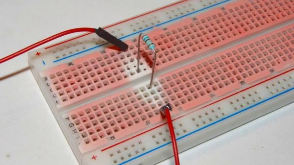
There’s a point in a component’s thermal regime that’s between normal operation and overloaded to the point of obvious failure. That’s a dangerous region, because the component isn’t quite hot enough to release the Magic Smoke, but hot enough to singe any finger you poke around with the see if everything’s running right. So if you’re looking to keep your fingerprints unmodified, but you don’t want to invest in a thermal camera, you might want to let this thermochromic breadboard point the way to overloaded components.
We’re not sure where this tip came from, but judging by the look of the website it was sometime in the late 90s. We’re also not sure who’s behind this little hack, so we’ll just credit [improwis]. The idea is pretty simple — white acrylic paint is mixed with thermochromic pigment, and the mixture is carefully painted onto the plastic surface of a standard-issue solderless breadboard. Care is taken to apply thin coats, lest the paint gets into the contacts and really muck things up. Once the paint is dry you’re ready to build your circuit. We have to admit we’re surprised at how sensitive the paint is; judging by the pictures, the heat coming off a 1/4-watt resistor dissipating 350 mW is plenty, even when the body of the resistor is well above the surface of the breadboard. We’d imagine the paint would point out not only hot components but probably the breadboard contacts too, if things got really toasty.
This seems like such a great application of thermochromism, one that’s a bit more useful than clocks and Pi Day celebrations. If you’re going to try this yourself, you’ll have to track down your own supply of thermochromic pigment, though — the link in the article is long dead. That’s not a problem, though, as Amazon sells scads of the stuff, seemingly aimed mainly at nail salons. The more you know.
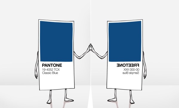
We recently covered the removal of Pantone colour support from the Adobe cloud products, with the two companies now expecting artists and designers to pay an extra subscription for a Pantone plugin or face losing their Pantone-coloured work to a sea of black blocks. Our coverage focused on our community, and on how the absurdity of a commercial entity attempting to assert ownership over colours would have no effect on us with our triple-byte RGB values.
Interview With An Artist And Pigment Activist
The palette that could start a revolution.
It’s fair to say though that in our focus on hardware hackers and open source enthusiasts, we missed its effect on artists and designers. To rectify this omission we needed to step outside our field and talk to an artist, and in that context there’s an obvious person to interview.
Stuart Semple is probably one of the more famous contemporary British artists, but in relation to this story it’s his activism over the issue of colours and intellectual property that makes him an authority. He’s drawn attention to the issue by releasing his own art materials in colours that directly challenge those which companies have tried to claim for themselves, and is perhaps best known in our community for challenging Anish Kapoor’s exclusive licence for VantaBlack, the so-called “world’s blackest pigment”.
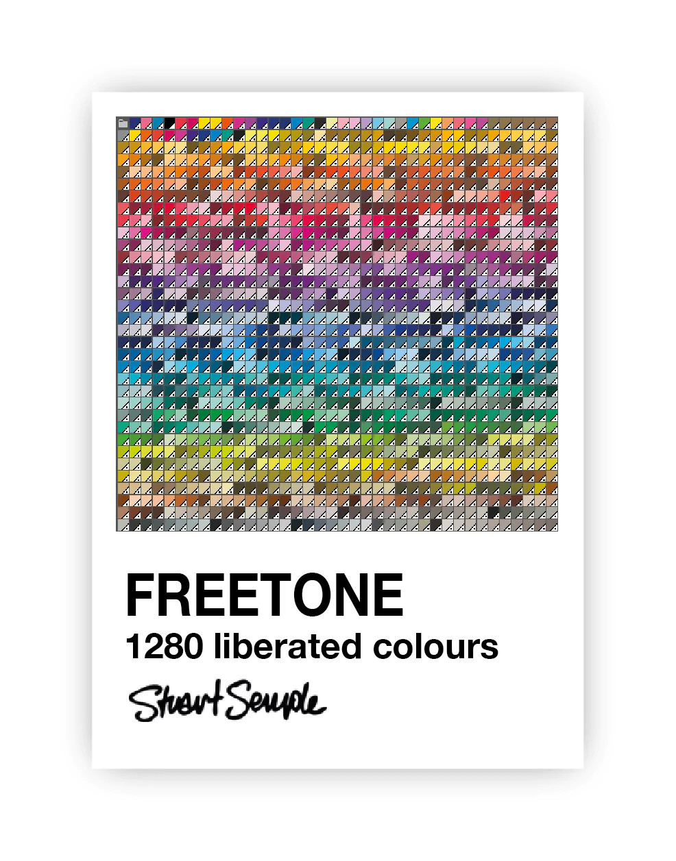
Most recently in response to the Adobe/Pantone controversy he’s released Freetone, a free plugin for the Adobe suite that in the words from its web page contains “1280 Liberated colours are extremely Pantoneish and reminiscent of those found in the most iconic colour book of all time. In fact it’s been argued that they are indistinguishable from those behind the Adobe paywall”. I had a phone conversation with him, in which he explained why Freetone had come into being.
Hackaday I understand Pantone is something used by designers, so I’ve worked for companies in the past where the designer would specify a Pantone index and it would appear on the screen, on the printed box, and on everything else identically. But why why do you as an artist use Pantone?
Art, activism, and a very red pigment.
Stuart Well, I use it in lots of ways. So I make a lot of screen prints as part of my art. So you know, if I’m working with a screen printer, I want to know that the print that they make of my work is the colour that I want it to be, so Pantone’s really useful for me for that.
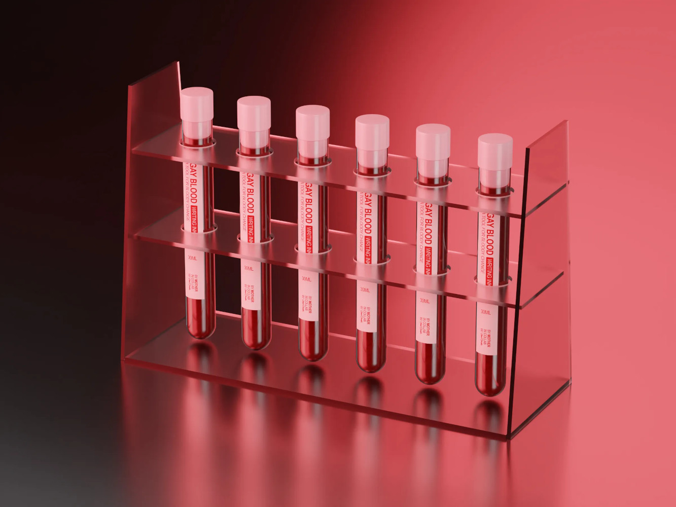
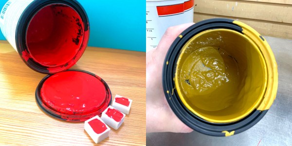
But also, even with within the paints, so I just did a thing where I made some paints, which actually uses the blood of gay men. It was really important to me that the colour of the paint matched the colour of actual blood. So I was working with a lot of people, we’ve been collaborating, and I was working with some friends in New York on it, and we needed a common language.
The red I was talking about was the red they were talking about, and Pantone is super useful for that. In fact, it’s the go-to for that. I just did a record cover for Placebo, the band, that was produced for me by someone that prints, so I had to tell them what spot colours I wanted. So I had to tell them Pantone references, it’s the language they understand.
Hackaday So my next question relates to Freetone. Obviously, as as you’ve distributed it, it’s a Adobe plugin. How does it solve the problem? Because obviously, I can specify a Freetone colour, and anybody else with Freetone can tell yes, that’s that colour. But how do I then go to a printer who buys his inks with Pantone specifications and map one to the other?
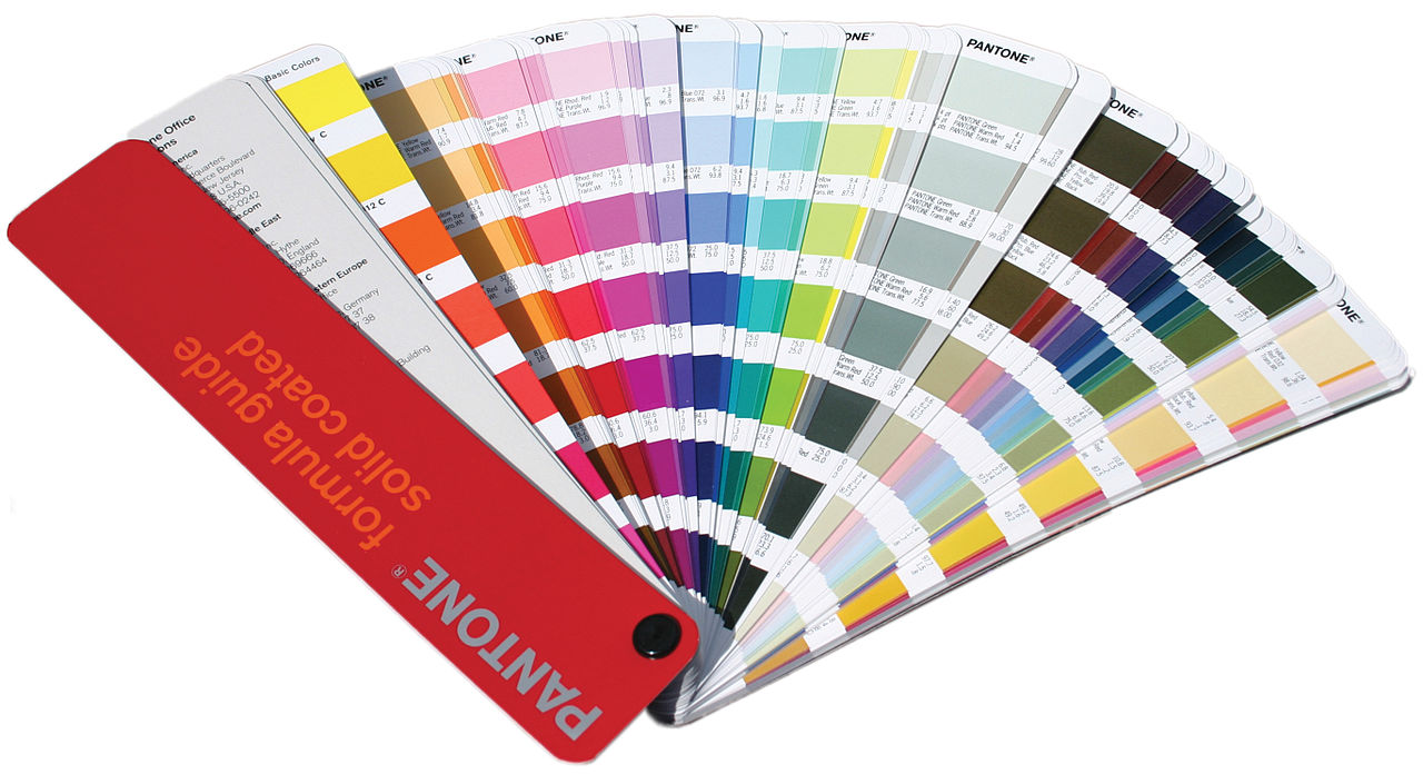
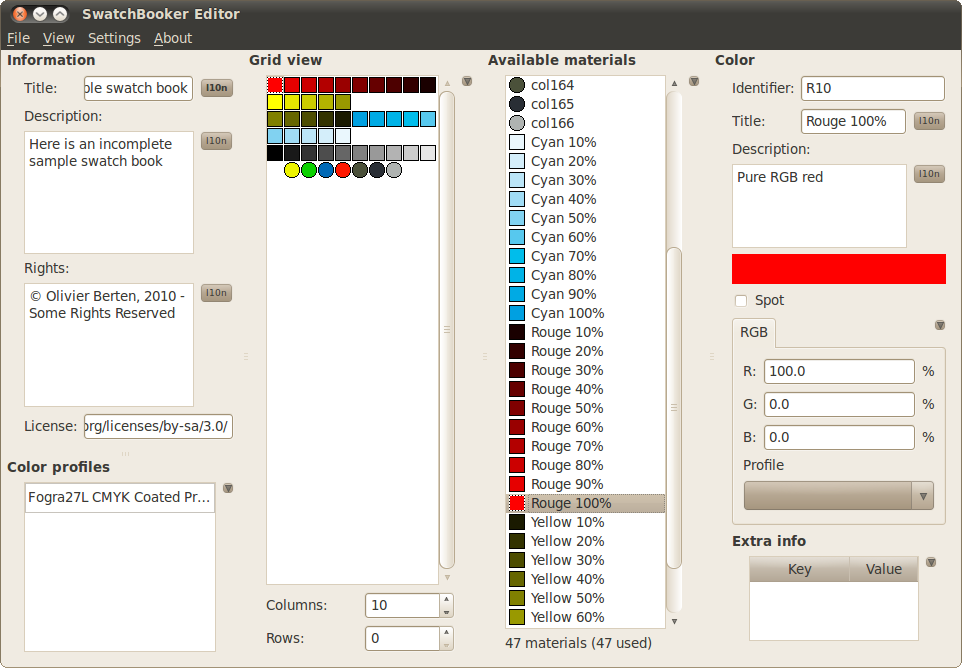
The Pantone swatch book which you’ll see in the hands of artists and designers everywhere. Céréales Killer CC BY-SA 3.0.
Stuart How it works is, if you download Freetone, you’ll find colours in there, and one of them will be called Sempletone 648C. Well, it’s exactly the same as Pantone 648C. If you do your work on the screen, use the Freetones, and then when you send it to the printer, it’s actually blatantly obvious to anyone that 648C is clearly apparent. If you’ve got the Pantone fan book and you look at the colours, it’s the same. 846C in mine is the same as 846C in the fan, in the Pantone book. I’d like to see them try and argue that they own it, but I don’t think they do in the name or the Pantone trademark, but these are Sempletones with a number. So I think it’s gonna be hard.
Hackaday My next question is probably getting more into the technology of it all. Do you think it will be possible to replace Pantone’s service completely? So if you took every Sempletone colour and threw it at a spectrometer and published the spectrum, would you then be able to say to an ink manufacturer or similar, here are the full technical details rather than just a colour, and does your paint correspond to this spectrum? I’m curious how far you could push open source in this line.
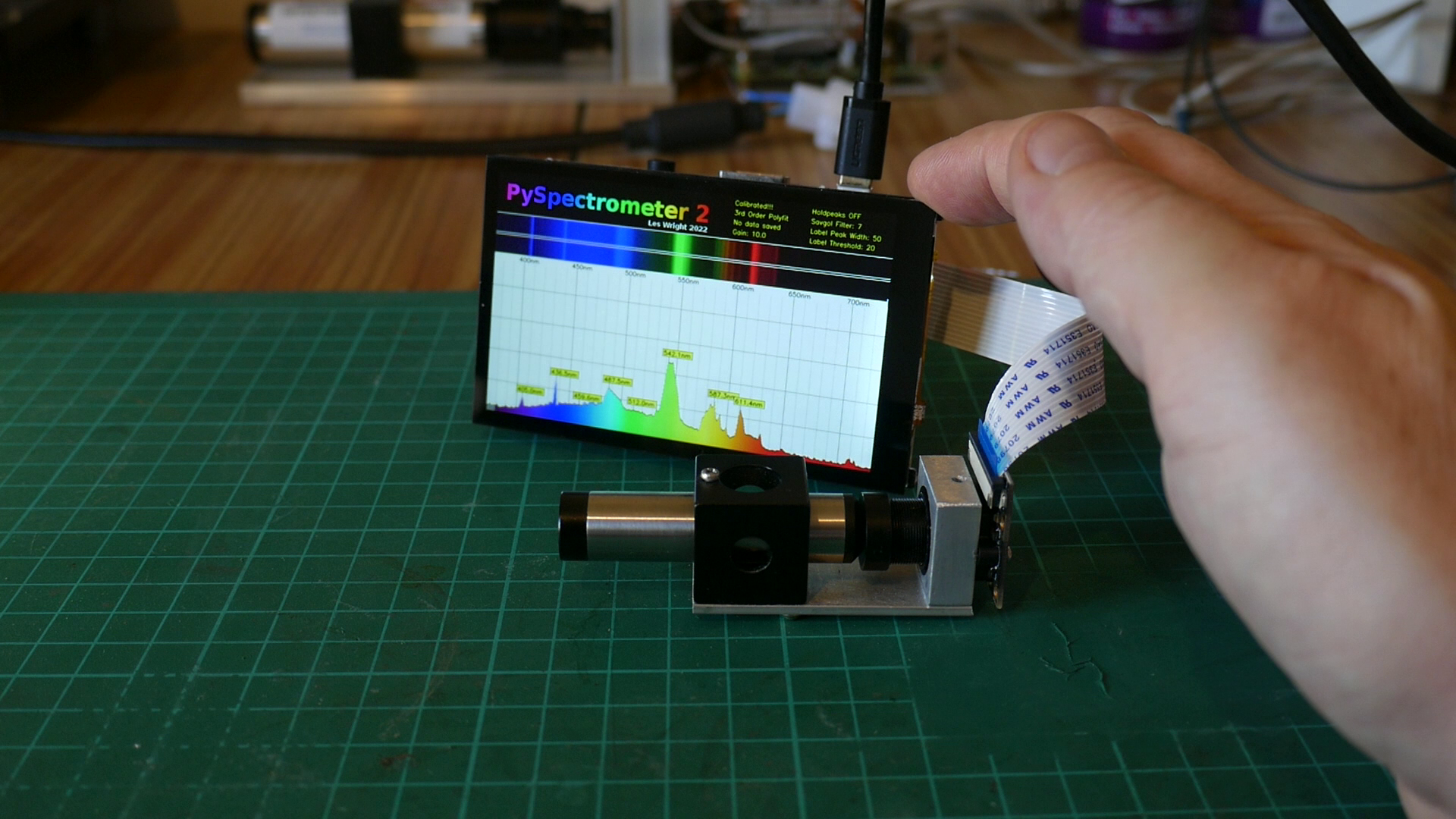
The PySpectrometer project, something for anyone with an interest in colour.
Stuart That’s really cool. I love it. Like, if you could just give them that spectral data, and if they’ve got a spectrometer they could measure it a their end. But there’s nothing that advanced at the moment, a lot of action is done by eye still. My answer is, I don’t see why not if there was a cool enough device. I don’t know if the spectrometer would be good enough to match it. I don’t see why not, I don’t see why you couldn’t publish the data. But it would have to be the whole spectral information and not just like an RGB value.
(At this point the interview digressed for a moment into a discussion of open-source spectrometers such as the Raspberry Pi project we featured recently, as Stuart’s lament was that a spectrometer can be an extremely expensive instrument. It isn’t the job of an interviewer to lead their interviewee so we’re skipping this part of the transcript, however I think we can all look forward to whatever uses Stuart makes of an affordable spectrometer. We’ll pick up the interview at the next question.)
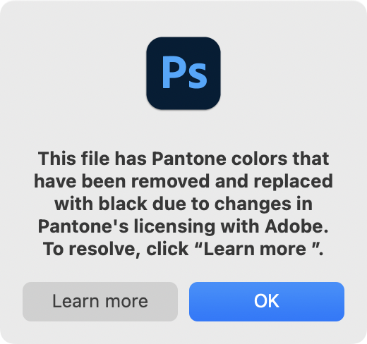
This widely shared screenshot represents the destruction of past work.
Hackaday One of the real problems with the whole Adobe suite, and this has happened in world as well with for instance the Autodesk CAD packages, is that they have gone into the cloud and become software as a subscription. So I understand completely, the frustration of artists at suddenly being told they have to pay an extra subscription to keep their Pantone support, and I’m particularly shocked to find that Photoshop isn’t just displaying black pixels over Pantone colours, I’m told it’s wiping out the Pantone information on saving. Do you think that anything in the open source software ecosystem comes close to replacing proprietary products like the Adobe suite for you as an artist?
Stuart Yes, 100%, there’s loads of stuff. I think open source is just the answer, I believe in freedom. And freedom means freedom to express yourself and freedom to own the thing and tweet the thing and change the thing and all the rest of it. So yeah, 100%. I think there’s actually better things than Photoshop, the problem we’ve got is that Adobe have the industry stranglehold. And if you want to work with someone, you have to be talking that language. And that’s still the problem. It’s like an operating system, but it’s got the monopoly.
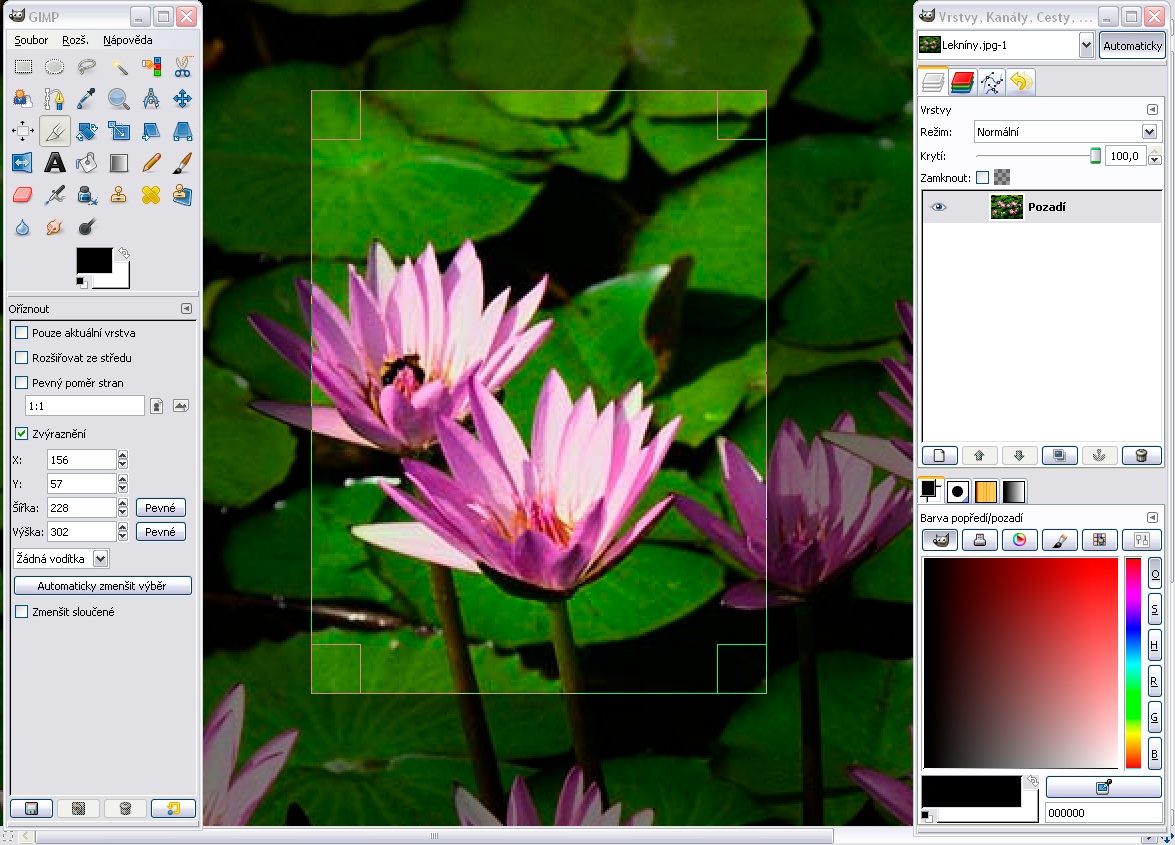
So there are other things, for instance, on a Mac, there’s something called Pixelmator, which is as good as Photoshop in my opinion, I use it every day. It’s not free, but you buy it once, and that’s it, free updates. Like software used to be. And there are other things, like GIMP is amazing. It’s awesome, but it doesn’t really replace Photoshop.
We all like using GIMP, perhaps other people could learn to love it too. (gimp.org)
Hackaday Here at Hackaday we can make noises about how wouldn’t it be great if the developers of GIMP or other software could stick Freetone into their products, because they don’t have Pantone as it’s licensed?
Stuart Yeah, that’d be a dream, wouldn’t it? I mean, why not? I made it for everybody. As far as I’m concerned, it’s out there, use it, change it. incorporate it, the more people the better, I think.
A lot of people use GIMP, and it’s good. Really good open source stuff that always has been. We know the future is in the open source stuff, proprietary stuff just won’t last, it’s just not adaptable. It’s putting greed and profits above the user, it can’t work. There’s no freedom in it.
Hackaday To me the most egregious thing is that as I understand it they will delete the Pantone information from your PSD. This really shocked me.
Stuart They’re literally holding it hostage. It’s like 20 quid, or delete from your work, which is, wow. They’re not giving me anything, anyway. I’m renting the software, paying to use the software every month, it’s not free. And the licence fee is a lot. We’re already spending hundreds and hundreds a year on this software, probably about 800 quid a year. Another 20 quid, just to pen the work we make before. I mean, it’s our work! It’s pure corporate greed, isn’t it.
Hackaday Thank you very much for the interview.
As we wrapped up, I asked him about his Black 3.0 pigment, produced as a reaction to VantaBlack and Anish Kapoor. I was curious whether it might have a specially good infra-red response for headsinks or solar collectors, but sadly he informed me that it’s primarily a visual colour for artists. It’s very cool stuff, incredibly black, and I really want to get some to play with, but probably no better than a rattle can for heat purposes. Never mind, an engineer’s curiosity satisfied.
Following the interview, it’s worth looking at the Freetone project from our side of the table as well as his. If we as a community would like to ensure that colours do not become ever more proprietary, then it is probably on us to ensure that where appropriate it is supported within our sphere. GIMP support for instance would at a stroke make open source software an easier choice for millions of artists and designers, and could I think be done relatively easily through its existing palette support. There’s SwatchBooker which appears to perform the necessary interchange, and I found the ASE2GIMP project which imports Adobe palettes into GIMP, but sadly I couldn’t make it work here. If GIMP shipped with a Freetone palette built-in, would that be too much of a development task to contemplate?
From Stuart’s side, having sat down and played with Freetone, if there’s one thing I could ask him it would be to release it as more than just an Adobe plugin, and to give it an open source licence. As it stands it’s a binary available for no charge through his web shop, I think that releasing it as a straightforward list, perhaps even as simple as a CSV file, would make it so much more accessible to developers. And coupled with an open source licence that allowed them to include it within their software, I think it would be unstopable. We’re not open source licence nerds here at Hackaday, but I’m guessing something that does the same for a palette as a library licence such as the LGPL does for libraries would be appropriate.
In our world we’re wrapped up in electronics and code, and it’s sometimes easy to forget that the work we do reaches way beyond our workbenches. If you’ve spent enough time in a hackerspace you’ll know that art and engineering are almost the two sides of the same coin, so it’s pleasing to find such a moment of crossover. Let’s hope Freetone support can find its way into the open source movement, and together we can keep the tentacles of yet another IP land grab at bay.
How can the big box store mix the perfect shade of English Wedgwood right before your eyes? The answer is in highly-concentrated pigments that come in many different sizes up to a whopping five gallons. Now, just imagine the amount of watercolor, acrylic, or other types of paint that could be made by simply scraping the walls of an empty 5-gallon tub, which you know is just getting thrown away with all that usable pigment inside.
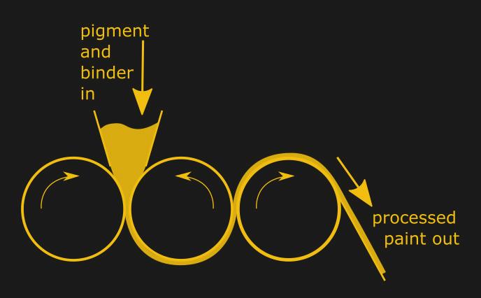
The process will likely take the form of an open-source three-roller milling machine, which are commonly used in paint manufacture. Basically you have three rollers that process the pigment and binder, and the mixture is run through as many times as necessary. Although they are fairly simple machines in design, building them to work well requires adherence to precise technical specs.
We can’t wait to see what [technoplastique] comes up with to use for the stainless steel rollers. The rest of the plan involves a Raspberry Pi Pico, one DC motor per roller, a motor shield, and a power supply, but the rollers are pretty crucial. If you have any ideas other than steel rolling pins (the kitchen kind) or pipe couplings (which are too short, anyway), let us know in the comments!
Science today seems to be dominated by big budgets and exotics supplies and materials, the likes of which the home gamer has trouble procuring. But back in the day, science was once done very much by the seats of the pants, using whatever was available for the job. And as it turns out, some of the materials the old-timers used are actually still pretty useful.
An example of this is a homemade version of “Faraday Wax”, which [ChristofferB] is using for his high vacuum experiments. As you can imagine, getting a tight seal on fittings is critical to maintaining a vacuum, a job that’s usually left to expensive synthetic epoxy compounds. Realizing that a lot of scientific progress was made well before these compounds were commercially available, [ChristofferB] trolled through old scientific literature to find out how it used to be done.
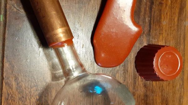
This led to a recipe for “Faraday Wax”, first described by the great scientist himself in 1827. The ingredients seem a little archaic, but are actually pretty easy to source. Beeswax is easy to come by; the primary ingredient, “colophony”, is really just rosin, pretty much the same kind used as solder flux; and “Venetian red” is a natural pigment made from clay and iron oxide that can be had from art suppliers. Melted and blended together, [ChristofferB] poured it out onto wax paper to make thin strips that are easily melted onto joints in vacuum systems, and reports are that the stuff works well, even down to 10-7 mbar.
We love this one — it’s the perfect example of the hacker credo, which has been driving progress for centuries. It also reminds us of some of the work by [Simplifier], who looks for similar old-time recipes to push his work in DIY semiconductors and backyard inductors forward.
[David Gustafik] dropped us the tip on this one. Thanks!
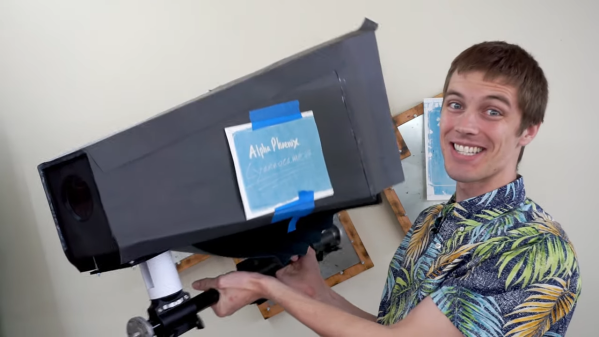
When you’re looking at blueprints today, chances are pretty good that what you’re seeing is anything but blue. Most building plans, diagrams of civil engineering projects, and even design documents for consumer products never even make it to paper, let alone get rendered in old-fashioned blue-and-white like large-format prints used to produced. And we think that’s a bit of a shame.
Luckily, [Brian Haidet] longs for those days as well, so much so that he built this large-format cyanotype camera to create photographs the old-fashioned way. Naturally, this is one of those projects where expectations must be properly scaled before starting; after all, there’s a reason we don’t go around taking pictures with paper soaked in a brew of toxic chemicals. Undaunted by the chemistry, [Brian] began his journey with simple contact prints, with Sharpie-marked transparency film masking the photosensitive paper, made from potassium ferricyanide, ammonium dichromate, and ammonium iron (III) oxalate, from the UV rays of the sun. The reaction creates the deep, rich pigment Prussian Blue, contrasting nicely with the white paper once the unexposed solution is washed away.
[Brian] wanted to go beyond simple contact prints, though, and the ridiculously large camera seen in the video below is the result. It’s just a more-or-less-lightproof box with a lens on one end and a sheet of sensitized paper at the other. The effective ISO of the “film” is incredibly slow, leading to problematically long exposure times. Coupled with the distortion caused by the lens, the images are — well, let’s just say unique. They’ve got a ghostly quality for sure, and there’s a lot to be said for that Prussian Blue color.