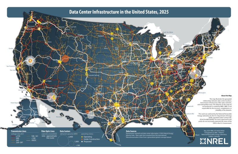
Spending time as wee hackers perusing the family atlas taught us an appreciation for a good map, and [Billy Roberts], a cartographer at NREL, has served up a doozy with a map of the data center infrastructure in the United States. [via LinkedIn]
Fiber optic lines, electrical transmission capacity, and the data centers themselves are all here. Each data center is a dot with its size indicating how power hungry it is and its approximate location relative to nearby metropolitan areas. Color coding of these dots also helps us understand if the data center is already in operation (yellow), under construction (orange), or proposed (white).
Also of interest to renewable energy nerds would be the presence of some high voltage DC transmission lines on the map which may be the future of electrical transmission. As the exact location of fiber optic lines and other data making up the map are either proprietary, sensitive, or both, the map is only available as a static image.
If you’re itching to learn more about maps, how about exploring why they don’t quite match reality, how to bring OpenStreetMap data into Minecraft, or see how the live map in a 1960s airliner worked.


Individually this type of data has a low, but not insignificant value.
As a collection of data the value is exponentially more valuable.
As a target. By your enemies.
I am glad someone pointed this out. It’s beautifully dangerous
What, you think China or Israel doesn’t have this info (or most of it) already?
The state-level actors would already have it. But arming wannabe Fifth Columnists with it might not be the brightest move. So in that respect it’s good to see the geolocation is rather poor precision.
It is not all that hard to do, obviously I’m not going to detail how to actually do it.
The only thing that would help to conceal some details, a tiny bit, would be if a really good mixture of fiber optic cable (~30% slower than the speed of light in a vacuum), long distance (line of sight) direct point to point microwave links (and LEO satellites) were used between each hop on a route. But even that can be worked around, by collecting more data points. Some quick back of the envelope calculations would make me suspect that an individual could in theory probably map out major internet infrastructure in any country to within a kilometer (~0.6 miles).
You don’t have to be a state actor to run a lot of traceroutes. You can do it in your basement in your pajamas.
And as far as I can tell, every backhoe operator on the continent.:)
Open info maps is another excellent resource for that exact kind of attack. CIKR (critical infrastructure key resources) are especially vulnerable because they’re not typically guarded like military assets despite their high civilian value.
Much of the infrastructure components are linear as well, which means there are long long stretches of wire or pipe between regional hubs. So, lots of choke points, and lots of exposed transfer medium in rural unobserved areas.
https://openinframap.org/#3.92/35.52/-89.92
I always wonder about that sort of thing when I come across a “Caution: Buried optical cable” sign while hiking in the mountains. Like, how many random people with shovels would it take to… you know…
Well, now I know how to answer that question.
Map is crap the worlds largest data center is in council bluffs Iowa , the second largest is Pryor ok they are GW + 25 building + and the map does not show it because of private network vs pop satellite Metro peering in the major cities take this map with a grain of salt
This is nonsense there at least four major carriers that are not listed in this map. NREL is only web scraping data to create this map it’s not a true representation.
The topological data is easily assembled…we did it about 25 years ago, see https://cheswick.com/ches/map/
And yes, the data can be quite valuable. We detected links lost to bomb damage (power was cut off) during the Serbian war.
The geographical data is harder to get, which they seem to have done here. We used data from the router names.
ches
“consult your local search engine” :)
I miss the early web.
404 NOT FOUND