A cardboard box (top left), set of instructions (top right), and a disassembled gaming console (bottom half) are strewn across a light blue tabletop, giving the impression that repair is impending.

Team Repair Breaks Things To Teach People How To Fix Them

Would you buy a broken device, fix it, then return the repaired item? [Team Repair] hopes you will.

Many people would rather repair what they have than have to get a new device and deal with all the annoyances of shopping and getting used to a new item. The problem is, most people don’t have any experience fixing their broken electronics and are intimidated by the process. [Team Repair] has found that helping people through the process the first time is a big confidence boost, especially when they have a test piece to work with.

[Team Repair] started with workshops and now has a “Fixers Club” subscription box for 8-14 year olds where they will send a broken device every three months to fix. After the device is repaired, it gets sent back into Team Repair, or iFixit in the US, to be broken again and sent to the next fixer. For grownups, there is a similar smartphone repair kit, but it’s currently waitlisted. If you’re in the UK, they even have a classroom program if you want to recruit larger groups into your fixer corps.

Curious about other ways to get into repairing your own things? We don’t recommend starting with smart rings, but learning analog repairs like zippers or turning a laptop into a desktop could be good places to start?

Continue reading “Team Repair Breaks Things To Teach People How To Fix Them”

A baby blue hatchback with red accents drives down a road with blurry trees and a blue sky in the background.

ICCU Monitor Logs Data In E-GMP EV Failures

EVs are less mechanically complicated than their combustion kin, but that doesn’t mean they’re immune to component failure. The Integrated Charge Control Unit (ICCU) has been the main failure point in recent Hyundai/Kia EVs, and ICCU Observer is an attempt to log data from the systems to find the culprit.

The ICCU handles all charging and voltage conversion duties from 800 V down to 12 V in the E-GMP platform EVs from Hyundai, Kia, and Genesis. The main failure mode appears to be when the circuit charging the 12 V fails, eventually rendering the vehicle inoperable. While the rate of failure is relatively low, the exact numbers are unknown, and Hyundai has remained quiet on if they know what’s causing it.

Unsurprisingly, speculation is rampant with owners experiencing failures relaying similarities and differences to others with the same problem. In an effort to bring actual data to the process, [broadwall] has started working on an open data set of information collected over the vehicle’s OBD II port in an effort to pinpoint similarities between the vehicles that have experienced failures.

Hyundai is currently replacing the failed units under warranty, which have been recently expanded to 15 years in most markets, but that’s little comfort when you’re sitting on the side of the road waiting for a tow. These failures stand out in an otherwise easy to maintain platform, so hopefully this effort will lead to a permanent fix instead of merely swapping out for a new unit.

If you’d like to explore data analysis a little further, how about using astrophotography to detect exoplanets or learning more from Stanford?

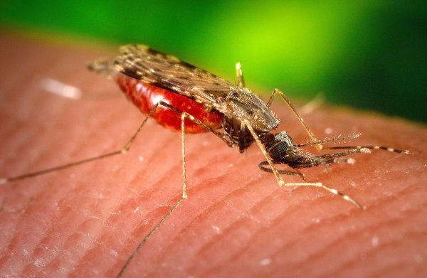
An image of a brown, red, and black mosquito on light human skin

Keeping Mosquitoes Away With Catnip-Based Repellent

Despite their small size, mosquitoes are one of the deadliest creatures on Earth, and keeping them away from you is one of the best ways to stay safe. DEET has been the mainstay of insect repellents for decades, but what if there was a repellent you could grow yourself?

Researchers at Cardiff University found that the essential oil from catnip plants (Nepeta cataria) could be as effective as DEET at repelling mosquitoes when applied as a 6% lotion. The oil has been shown to be effective against many species of mosquitoes, ticks, and mites in previous research. You can look at the paper for details, but the catnip oil was obtained through steam distillation followed by some processing with hexane. The essential oil was then mixed with “water, glycerin, emulsifying wax, cetyl alcohol, cetyl stearyl alcohol, shea butter, glycerol monostearate, olive oil, coconut oil, sunflower oil, methyl paraben, propyl paraben and silicone oil.” We suspect that list will look familiar to anyone who’s read an ingredient label of most any store bought lotion, unless it was paraben free.

The Guardian’s coverage quotes one of the researchers, [Dr. Simon Scofield]: “We did not conduct any experiments to see if it is attractive to cats, but given that the active ingredient [nepetalactone] has well-known cat-attractive properties, I would expect they would quite like it,” he said. Depending on how your cats react, you may want to consider applying the lotion shortly before departing home.

If you want some more options in your mosquito defense, how about becoming a bug zapper, using drones and sonar, or genetically modifying mosquitoes to curb their numbers.

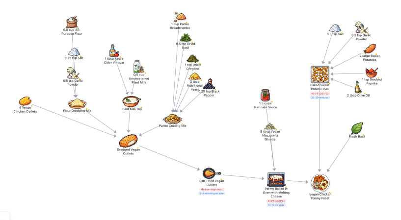
A zoomed out screenshot of a flow chart recipe. It is made of 8 bit ingredient icons with their name and amounts moving through steps to the finished "Vegan Chicken Parmy Feast."

An LLM In The Kitchen

Have you ever been looking up a recipe for something new and been stymied by the directions being a wall of text, especially to find that one detail right when you’re in the middle of making the dish? Recipe Lanes by [bohemian-miser] leverages an LLM to create flow charts to make the process more straightforward.

As someone who has mostly avoided LLM use thus far, I found the examples in the Gallery helped inform what the LLM was expecting for prompts as my first attempts were unsuccessful. Once you know the language expected from the computer, you can get it to generate icons for each ingredient and a flow chart of the steps to cook the food. While it does organize the chart when it is generated, each element can be independently moved across the canvas to put things in a more sensible order, especially as I found it can generate elements with overlapping text.

The 8-bit icon style and button text on the site give it a fun bit of flair that adds to the overall experience. The tool is still in its infancy, but it’s Open Source, so we hope to see it improve over time. If you’d like to see some more interesting kitchen hacks, how about ramen in edible packaging, this rotary phone kitchen timer, or these automated Arduino splash guards.

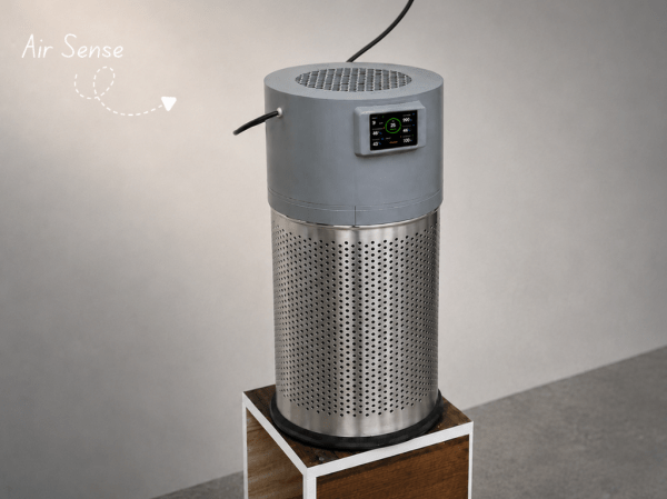
A vaguely perforated metal cylinder sits on a wooden box with a grey cylinder and LCD display atop it. There are holes in the top of the grey cylinder for air to flow through.

A Smarter DIY Air Filter

As predominantly indoor creatures, it’s important to maintain a healthy habitat for the hacker. [Kishan Pratap Singh] designed a clever solution in AirSense, an ESP32-powered air filter.

If you’re thinking of cleaning the air in your environment, you might also want to know some properties about the air coming out of the filter. AirSense measures PM2.5 dust concentration, Air Quality Index (AQI), temperature, humidity, and atmospheric pressure. The various sensors are mounted along the exhaust path of the filter, which lets your know what kind of air it’s pumping out.

The system drives a 150 mm exhaust fan mounted in a 3D printed cap that pulls air through a cylindrical Xiaomi HEPA filter inside a perforated metal trash can enclosure. The ESP32 and an LCD readout of the environmental data also live in the cap, giving the device a sleek look. While [Singh] chose to run the filter continuously, we wonder if it might be interesting to set it up to only filter the air if air quality drops below a certain level to conserve power, especially if you’re on a time-of-use power plan. That would require redesigning the sensor assembly (or running the unit in reverse), so maybe it’s over-complicating things?

We’ve seen the Xiaomi Air purifier filter mentioned before, but under the auspices of hacking it’s filter DRM, an open source air filter designed by [Naomi Wu], and even an ESP32 pressed into service to plug an air purifier into Home Assistant.

A map of the lower 48 US States with an overlay of various colorful bubbles indicating data center developments, whether proposed, contested, under construction, or operational. There are a lot of bubbles! Hawaii isn't pictured, but looks to have one project currently, but nothing in Alaska for now.

Who’s Building That Data Center?

One of the biggest “David versus Goliath” stories in tech right now is the towns beset by AI data center projects they may or may not have asked for. Powered By Who is tracking data center development in the US on this convenient map.

Currently, there are over 2,100 data centers being tracked by the project ranging from proposals to sites fully up-and-running. While you have to build bypasses data centers to keep the internet running (which we’re partial to here at Hackaday), there are certainly questions around the amount of power and water consumed by these sites, the emissions they’re sending into the surrounding community, and who exactly is reaping the benefits.

Whether you’re pro, against, or ambivalent about the proliferation of “AI” data centers, the map offers an engaging way to look at what projects are happening around the nation, especially when you start looking at clusters and how that interacts with the power generation and political makeup in a region. It’s particularly interesting how only three states account for roughly 70% of all the projects. Let us know if there’s a similar tracker in your area if you’re from one of the other parts of the globe!

Looking past the debate, there’s a lot of interesting engineering involved in keeping these data centers cool, although there are questions about where that heat ends up going. DC distribution inside the site, underwater data centers, and even putting them in space are some of the solutions for keeping the cooling loads tamed.

Two maps of London turned into hexagonal regions heat mapped from white to peach to purple. The left map is according to: density, ratings, surprise, cuisine diversity, and independent share. The map on the right of merged data assigns the dominant hub type in a region. Purple is assigned a value of "Elite", reddish orange is "Strong", peach is "Everyday", and white/grey is "Weak." The five locations deemed to be the highest scorers were Ealing-Acton, Kingston Upon Thames, Enfield, Bromley, and Havering.

Google Maps Killed The Restaurant Star

We all know that Google and other big players pick and choose what information people see, but we sometimes overlook it outside of the search and social media space. [Lauren Leek] decided to take a look at how Google Maps picks winners and losers in the restaurant scene in London.

Building a machine learning model to determine a new restaurant recommendation (as one does), [Leek] uncovered interesting, and perhaps concerning, elements of how Google Maps ranks restaurants. Broken down by relevance, proximity, and prominence, many new restaurants face the issue of not drawing traffic without reviews and vice-versa causing a vicious cycle. Relevance and proximity are fairly straightforward, but what goes into “prominence?”

[Leek] found that “it is not just what people think of a place – it is how often people interact with it, talk about it, and already recognise it.” This leads to chains and high foot traffic areas awash in reviews while more out-of-the-way places find it more difficult to draw traffic. Some of this is expected and would be happening even when word of mouth was the primary way to find out where to eat, but as with many things, the algorithm amplifies this, along with the undisclosed paid placement of restaurants in Maps results.

While still in its infancy, [Leek] built a public dashboard where people can sort restaurants in the city. The machine learning algorithm is designed to identify places that are hidden gems that punch above their Google Maps weight and may make you look like the trendy one (if you live in London).

Zooming out further, [Leek] found larger clusters that revealed restaurant “diversity, in other words, is not just about taste. It is about where families settled, which high streets remained affordable long enough for a second generation to open businesses, and which parts of the city experienced displacement before culinary ecosystems could mature.”

If you want to step outside the algorithm mayhem, how about a good old-fashioned Web Ring? We’ve also addressed what’s an AI versus an algorithm, and Cory Doctorow advised us on how to reverse course on the current wave of enshittification.