Mapping Tool Helps Identify Usable Land For Building

How would you go about identifying usable land that suits your building tastes? [Scott Sexton] was specifically looking for land that’s not too steep to build on, and realized that existing resources didn’t easily offer him this information. He thus dived into the world of GIS to try and solve this issue for himself.

[Scott] hoped that USGS maps might provide the information he needed, but found they lacked grade information, only presenting elevation and topographic data instead. From past experience reading such maps, he knew that seeing a lot of topographical lines close together tended to indicate steeper areas, but wasn’t sure on how to actually get the computer to parse this and spit out the information on steepness and grade that he wanted.

Ultimately, he set about downloading USGS elevation data in three-meter resolution. He then applied some calculus to determine the rate of change of the slope across areas of the data in order to mathematically find what he was looking for. Namely, flatter areas that would be more suitable for future construction. He then took the work even further, tweaking the output of his tools and automating until he could quickly and readily generate usability maps of areas of interest. He was even able to sanity-check his work by verifying that it correctly identified roads as obviously flat areas.

If you’ve ever tinkered with GIS work, [Scott’s] usability project may be of some interest. We’ve also seen amusing examples of what can go wrong when digital mapping data is used without sanity checks. Meanwhile, if you’ve got your own GIS hacks on the go, don’t hesitate to notify us via the tipsline!

A map of the United States showing a series of interconnected lines in white, red, orange, yellow, and green to denote fiber optic and electrical transmission lines. Dots of white, orange, and yellow denote the location of the data centers relative to nearby metropolitan centers.

NREL Maps Out US Data Infrastructure

Spending time as wee hackers perusing the family atlas taught us an appreciation for a good map, and [Billy Roberts], a cartographer at NREL, has served up a doozy with a map of the data center infrastructure in the United States. [via LinkedIn]

Fiber optic lines, electrical transmission capacity, and the data centers themselves are all here. Each data center is a dot with its size indicating how power hungry it is and its approximate location relative to nearby metropolitan areas. Color coding of these dots also helps us understand if the data center is already in operation (yellow), under construction (orange), or proposed (white).

Also of interest to renewable energy nerds would be the presence of some high voltage DC transmission lines on the map which may be the future of electrical transmission. As the exact location of fiber optic lines and other data making up the map are either proprietary, sensitive, or both, the map is only available as a static image.

If you’re itching to learn more about maps, how about exploring why they don’t quite match reality, how to bring OpenStreetMap data into Minecraft, or see how the live map in a 1960s airliner worked.

A Street For Every Date

Different cultures have their own conventions for naming locations, for example in the United Kingdom there are plenty of places named for monarchs, while in many other countries there are not. An aspect of this fascinated [Ben Ashforth], who decided to find all the streets in Europe named after auspicious dates, and then visit enough to make a calendar. He gave a lightning talk about it at last year’s EMF Camp, which we’ve embedded below.

Starting with an aborted attempt to query Google Maps, he then moved on to the OpenStreetMap database. From there he was able to construct a list of date-related street name across the whole of Europe, and reveal a few surprising things about their distribution. He came up with a routing algorithm to devise the best progression in which to see them, and with a few tweaks to account for roads whose names had changed, arrived at an epic-but-efficient traversal of the continent. The result is a full year’s calendar of street names, which you can download from his website.

Being used to significant Interrail travel where this is written, we approve of an algorithmically generated Euro trip. We’re indebted to [Barney Livingstone] for the tip, and we agree with him that 150 slides in a 5 minute talk is impressive indeed.

Continue reading “A Street For Every Date”

Meshtastic And Owntracks To Kick Your Google Habit

I have an admission to make. I have a Google addiction. Not the normal addiction — I have a problem with Google Maps, and the timeline feature. I know, I’m giving my location data to Google, who does who-knows-what-all with it. But it’s convenient to have an easy way to share location with my wife, and very useful to track my business related travel for each month. What we could really use is a self-hosted, open source system to track locations and display location history. And for bonus points, let’s include some extra features, like the ability to track vehicles, kids, and pets that aren’t carrying a dedicated Internet connection.

You can read the title — you know where we’re going with this. We’re setting up an Owntracks service, and then tying it to Meshtastic for off-Internet usability. The backbone that makes this work is MQTT, a network message bus that has really found its niche in the Home Assistant project among others. It’s a simple protocol, where clients send brief messages labeled by topic, and can also subscribe to specific topics. For this little endeavor we’ll use the Mosquito MQTT broker.

One of the nice things about MQTT is that the messages are all text strings, and often take the form of JSON. When trying to get two applications to talking using a shared MQTT server, there may need to be a bit of translation. One application may label a field latitude, and the other shortens it to lat. The glue code to put these together is often known as an MQTT translator, or sometimes an MQTT bridge. This is a program that listens to a given topic, ingests each message, and sends it back to the MQTT server in a different format and topic name.

The last piece is Owntracks, which has a recorder project, which pulls locations from the MQTT server, and stores it locally. Then there’s Owntracks Frontend, which is a much nicer user interface, with some nice features like viewing movement a day at a time. Continue reading “Meshtastic And Owntracks To Kick Your Google Habit”

Developing An Open Source Bike Computer

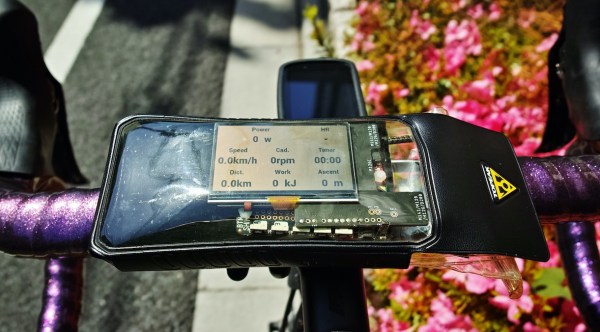
While bicycles appear to have standardized around a relatively common shape and size, parts for these bikes are another story entirely. It seems as though most reputable bike manufacturers are currently racing against each other to see who can include the most planned obsolescence and force their customers to upgrade even when their old bikes might otherwise be perfectly fine. Luckily, the magic of open source components could solve some of this issue, and this open-source bike computer is something you’ll never have to worry about being forced to upgrade.

The build is based around a Raspberry Pi Zero in order to keep it compact, and it uses a small 2.7 inch LCD screen to display some common information about the current bike ride, including location, speed, and power input from the pedals. It also includes some I2C sensors including pressure and temperature as well as an accelerometer. The system can also be configured to display a map of the current ride as well thanks to the GPS equipment housed inside. It keeps a log in a .fit file format as well so that all rides can be archived.

When compared against a commercial offering it seems to hold up pretty well, and we especially like that it’s not behind a walled garden like other products which could, at any point, decide to charge for map upgrades (or not offer them at all). It’s a little more work to set up, of course, but worth it in the end. It might also be a good idea to pair it with other open source bicycle components as well.

Thanks to [Richard] for the tip!

How Many Smartphones Does It Take To Make A Traffic Jam?

Online mapping services pack in a lot of functionality that their paper-based forebearers could simply never imagine. Adding in metadata for local landmarks, businesses and respective reviews, and even live traffic data, they have the capability to deliver more information than ever before – and also correspondingly, shape human behaviour. [Simon Weckert] decided to explore this concept with a cheeky little hack.

Pictured: All it takes to create a traffic jam on Google Maps!

The hack targets the manner in which Google collects live traffic data for display on Google Maps. When users load the app, Google takes location data from individual phones, tracking them as they travel along roadways. Large numbers of users travelling slowly down a road indicate there’s heavy traffic, and thus Google will display corresponding warnings on their maps and redirect users to take alternative paths.

To pull off the hack, [Simon] placed 99 smartphones in a handy-cart, tugging them behind him as he walked slowly down a series of streets. In the video, this is overlaid with Google’s map data captured at the time. The app updates the maps with orange and red lines down the roads which [Simon] travelled with his 99 pretend drivers, indicating a traffic jam.

We’d love to know whether [Simon] ran 99 individual SIM cards with data access, or if the hack was perpetrated with the use of a WiFi hotspot for cheaper internet access. Reddit comments note that Google will likely swiftly work on methods to prevent such tomfoolery in future. It’s simple to see that 99 individual users reporting the exact same location and speed at the same time would be trivial to filter out from traffic monitoring in future.

It’s both a commentary on the power we give these apps in our lives, as well as a great demonstration of how easily such systems can be trifled with. We first reported on Google’s traffic monitoring back in 2009, when it was a technology in its infancy. Video after the break.

Continue reading “How Many Smartphones Does It Take To Make A Traffic Jam?”

Putting That Airplane On The Map – Live And With Python

Mankind’s fascination with airplanes is unbroken. Whether you’re outside with your camera, getting an actual glimpse of the aircraft, or sitting at home with your RTL-SDR dongle and have a look at them from a distance, tracking them is a fun pastime activity. Provided, of course, that you are living close by an airport or in an area with high enough air traffic. If not, well there’s always real-time tracking online to fall back to, and as [geomatics] will show you, you can build your own live flight tracking system with a few lines of Python.

As it’s usually the case with Python, a lot of functionality is implemented and readily available from external modules, which lets you focus on the actual application without having to worry too much about the details. Similarly, plenty of data can be requested from all sorts of publicly accessible APIs nowadays. If you are looking for a simple-enough example to get into both subjects with a real-world application, [geomatics]’ flight tracker uses cartopy to create a map using Open Street Map data, and retrieves the flight information from ADS-B Exchange‘s public API.

We have seen ADS-B Exchange mentioned a few times before, for example with this ESP8266 based plane spotter and its successor. And if you’re more curious about the air traffic in your direct surroundings, it’s probably time for a DVB USB dongle.