
In the late 1800s, a railway engineer named Philbert Maurice d’Ocagne was part of a group of men faced with the task of expanding the French rail system. Before a single rail could be laid, the intended path had to be laid out and the terrain made level. This type of engineering involves a lot of cut and fill calculations, which determine where dirt must be added or removed. The goal of earthwork is to create a gentle grade and to minimize the work needed to create embankments.
In the course of the project, d’Ocagne came up with an elegant, reusable solution to quickly solve these critical calculations. Most impressively, he did it with little more than a pen, some paper, and a straightedge. By developing and using a method which he called nomography, d’Ocagne was able to perform all the necessary calculations that made the gentle curves and slopes of the French railway possible.
Interactive Graphs
The term nomogram is frequently interchanged with both nomograph and alignment chart. A nomogram is a kind of graph since it’s a visual representation of data. But unlike a graph, a nomogram is a means of acquiring a solution or some other unknown piece of data. And the answer doesn’t simply present itself as it does on a graph. Nomograms are an interactive tool.
Nomograms function kind of like a slide rule in that they use scales to make calculations. They work on the same principle, too—one manipulates the input scales and finds the unknown variable on the output scale. But unlike a slide rule, there is no standard, general-use nomogram. Each one of them is purpose-built to represent a specific idea, or data set, or intersections of data sets. And while slide rules use logarithmic scales, nomograms can use either linear or logarithmic scales depending on the requirements of the equation.
The real beauty of nomograms as problem solving tools is in their design. If a number of designers were tasked with creating a nomogram for the same equation, their results could end up looking quite different. As long as the scales are properly constructed, each one would serve the purpose with individual style.
In their heyday, nomograms were constructed on large sheets of paper so that small graduations could be easily read. Nomograms take on different shapes depending on the equation or equations being represented. They can be very simple and straightforward, with just two input scales and one output scale, or they can be curved and complex for compound problem-solving.
How Do Nomograms Work?
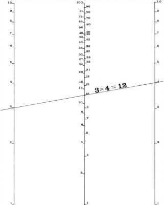
Simple alignment nomograms like the one to the right use one scale to represent each known variable and another scale for the unknown variable. In order to use any nomogram, the values of each known variable must be located along its respective scale. Using those points as a guide, a straightedge or thread is placed between them. The point at which the straightedge intersects the scale of unknown variables gives the solution to the equation. A line drawn between the two points on the known-value scales is called an index line or isopleth.
Perhaps the greatest advantage of nomograms is that a layman can use them to solve equations or perform conversions with little instruction. It isn’t necessary for the user to understand or even be aware of the equation at play when using one. Nomograms can be an excellent mathematical teaching aid for students drawn to visual aids and hands-on exposure.
It might not seem like it’s worth the trouble to create nomograms. After all, they are not general-purpose calculators and they don’t provide the precision solutions of today’s digital computers. But the humble nomogram can be used repeatedly for common problems, like converting from Fahrenheit to Celsius or deciding how much to tip your server. Nomograms can be built for any case where the known and unknown variables can be represented with graduated scales.
Engineering the French Railway
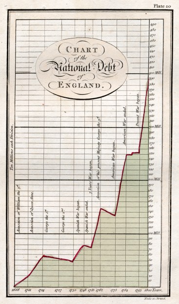
Graphical calculation did not begin with d’Ocagne’s nomogram. The idea of representing data in graphic fashion began to appear in the late 1770s, over a hundred years before d’Ocagne published his treatise on nomography. William Playfair, a Scottish engineer who is considered the father of graphical statistics created a graph to illustrate the rising national debt of England over the course of the 1700s. Playfair would go on to invent both the bar graph and the pie chart and pursue a number of occupations.
One of those occupations was working with James Watt, a Scottish inventor and engineer known for devising an improved steam engine. Built in the early 1770s, Watt’s steam engine featured an indicator that plotted a pressure-volume graph of the steam inside the engine as it ran.
At the end of the 1700s, graphs began to appear in France as the result of a push for conversion to the metric system. A cotton manufacturer named Louis-Ézéchiel Pouchet answered the call to create graphs that would help the average citizen perform conversions easily without having to do any calculations. A later version of his submission included a graphical representation of the Pythagorean multiplication table, which uses interpolation of curves drawn between values along the scales to estimate mathematical products.
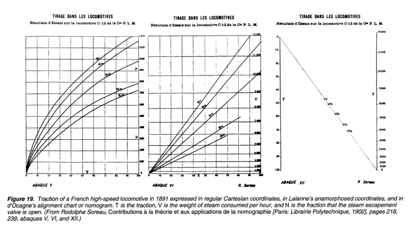
French engineer Gaspard-Gustave de Coriolis devised numerical tables that could be used for cut and fill calculations for any given profile and slope. Gustave’s tables were innovative, but they were also cumbersome and limited. Each table described only a small section of railway bed. These tables were improved upon by French engineer Léon Lalanne, who created logarithmic graphical tables that could be used repeatedly for several types of railway bed profiles. Lalanne’s tables provided much faster solutions.
d’Ocagne took Lalanne’s logarithmic graphs a step further by breaking them out of the Cartesian coordinate system. He borrowed the idea of duality from projective plane geometry, which imposes the idea of perspective onto sets of parallel lines. For example, if you were to stand between the rails of a straight section of train track, the two rails appear to converge in the distance. In a geometric projective plane, they actually do converge at a point near infinity. Graphical evolution can be seen in the progression below; the same equation is expressed left to right with a Cartesian graph, then Lalanne’s logarithmic coordinates, and finally d’Ocagne’s parallel coordinate system.
The Possibilities are Off the Charts
The nomogram enjoyed extensive use until the 1970s. They spread from civil and military engineering into aeronautics and other sciences. Though nomography has mostly gone the way of the slide rule in terms of ubiquitous problem solving tools, there are still a few fields that put them to good use. Nomograms are used extensively in the medical field for simple things like body mass index charts and pediatric dosage calculators, as well as more complex scenarios like individualizing hip fracture risk in men and women.
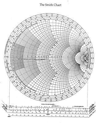
All the hams out there have probably seen a Smith chart. This is a compound nomogram designed by Philip H. Smith, an engineer who worked at Bell Labs. Smith charts are used in RF engineering to solve problems and visualize interactions. A complete Smith chart is pictured at left. In practical use, they are often broken down into subsets of scales. Typical applications of Smith charts include impedance matching and visualizing the point at which reactance meets resistance in a transmission line.

Nomograms can be useful to RPG and war game players as well. The colorful one at right illustrates the various possible distributions of weapons, defenses, and projectiles for a given ship. A couple of years ago, an enterprising Kerbal Space Program player created some nomograms to aid in rocket design.
Nomograms Forever
Do you want to make your own nomograms? Check out the wiki for PyNomo, which is exactly what it sounds like: nomogram generation software based on Python. Even if you’re not interested in generating nomograms, there is a lot of great in-depth information about their history, construction, and use.
Nomograms remain quite useful, even today. While they are not the most accurate way to solve an equation, they are fast and offer great visual insight. Each nomogram is a totally customizable analog computer. As a category they are a useful tool that deserves a widespread renaissance.
Main image source: Antoine Beauvillain
Thumbnail image source: My Reckonings


Nomograms live on long after slide rules and other “mechanical” calculators* in aircraft flight performance calculations and a lot of other applications that involve too much data to easily fit into a pocket calculator.
*Yes, yes… E6B etc. .
http://farm2.static.flickr.com/1263/1196208102_4ca3c306b6.jpg
We use them pretty regularly in our duct calculators (ductalator). A circular rotating tool which can verify duct sizing for given air flow rates and speeds
Brutal soviet version.
I actually got to use a Phychrometric chart at work for one project.
http://www.truetex.com/psychrometric_chart.gif
It’s the most beautiful chart I’ve ever seen (excluding the Smith chart above.)
the imperial units kill the beauty
We use SI ones now – then we’ll get to refrigeration and steam charts.
Still a very elaborate way of saying 25C @ 50% humidity is a nice place to be.
Thank You, it is a beauty indeed! copied on an old copier multiple times with Pantene!
I need this for an invention, the Davison waste Heat scavenging topology.
Looking for AC/Heating folks who want to be part of the future.
I will not be here to see it or make it all happen. But someone, or some group can.
The heating and air field has a use for nomographs as well.
In meteorology, tephigrams are still used for plotting temperature vs entropy, to calculations of convective stability or convective available potential energy (CAPE).
https://en.wikipedia.org/wiki/Tephigram
I’m the enterprising Kerbal Space Program player. PyNomo is what I used; it takes some getting used to, but once you work it out it’s very slick.
Very cool to see something I made here!
Very cool! Although at first I read it as “nonograms” and wondered why hackaday was veering into fun logic puzzles…
that sounds useful for internals of a computer maybe.
I have used this type of chart for calculating copper conductor fusing time during high current testing, never new they were called nomograms
And then there is the double (impedance and admittance) Smith chart:
http://www.dartmouth.edu/~sullivan/colorsmith.pdf
I love these things.. I never knew what they were called. A flight computer is such a fascinating round wheel I have used often. One thing I really appreciate about the visual nature of nonograms is that you can see the relationship of you answer to all the other answers around it. I think this really helps people visualize the relationship of cause and effect with what you are working with and will then give you a better understanding of what is actually happening even if you don’t understand the math behind it. So often our culture worries about understanding the formulas, but if someone can just visualize what is happening on a grander scale the math can become unnecessary. Not that it’s a good thing if nobody understand the math behind it, but you can do great things if you have a good working knowledge of the principles driving the math without actually understanding the calculations.
I find that seeing a graphical representation helps me understand the mathematical relationships much more quickly. Still struggling with the Smith chart ( that double Smith chart…woah)… but I haven’t given up!
Great HaD article! A very interesting and complete history AND current relevance (PyNomo).
Just yesterday I came across the term and didn’t really get it. They are still extensively used for showing the performance of pumps: volume of water pumped vs pressure needed (“head”)
Great write-up, Kristina, thanks! Smith Charts are used by Hams, but also by Broadcast/Cellular/Microwave Engineers and in the RF test and measurement industry for frequencies all the way from DC to daylight. The amount of information that can be so elegantly conveyed in a Smith Chart is impressive.
Nomograms were popular in the 20th century in the form of those cardboard sliderule-looking calculators… frequently used in across industry and advertising… numerous examples can be found on fleabay for minimal cost. I’ve got one in my office made by Ohmite (probably mid/late 40’s) for sake of calculating Ohms law plus power and for determining which Ohmite resistor style and size would best meet your needs. It’s a beautiful piece of design and the functionality is just as relevant today as it was then (resistors are still resistors, after all). Here’s a similar looking one (not mine) for reference: http://www.ebay.com/itm/331670077228
One of the best articles I’ve seen on HaD! Thanks, Kristina!
Then there is the Sverdrup-Munk-Bretschneider Nomogram
http://oceanservice.noaa.gov/education/lessons/ocean_motion_wksht.html
for “calculating” the height of ocean waves (fully developed) from wind speed and fetch length.
Nice and refreshing article.
An useful technique is to use a plastic overlay with a line scratched on it. A straight pin can be stuck through the overlay at the datum point and the line rotated to the next datum line. This will improve accuracy greatly.
Ron Doerfler has a blog that has a lot about the history of nomograms, and goes into a lot of the math to create them. There’s a series about “The Art of Nomography.”
http://myreckonings.com/wordpress/
One interesting example was a hexagonal chart created for the French Navy to correct for magnetic deviation of navigation compasses aboard ships.
A great series of posts. I highly recommend reading them.
In practical chemistry, we use nomograms to predict the boiling point of liquids under reduced pressure (for vacuum distillation), based on their chemical properties and their boiling points at atmospheric pressure.
I used PyNomo to make a resistor/capacitor divider nomograph for the OSHW 2012 conference. It didn’t get much notice, though. Probably because it didn’t convert into a rubber-band shooter.
http://www.xess.com/static/media/uploads/blog/devbisme/2012-10-02/toolbox.png
A device with a look and versatility similar to the Smith charts, but with a use in astronomy in the past, was the astrolabe.
A really good resource on them is http://www.astrolabes.org
We used a nomogram to calculate the correct gravity disc size for out purifiers on board ship. An excellent piece of outstanding yet simple logic