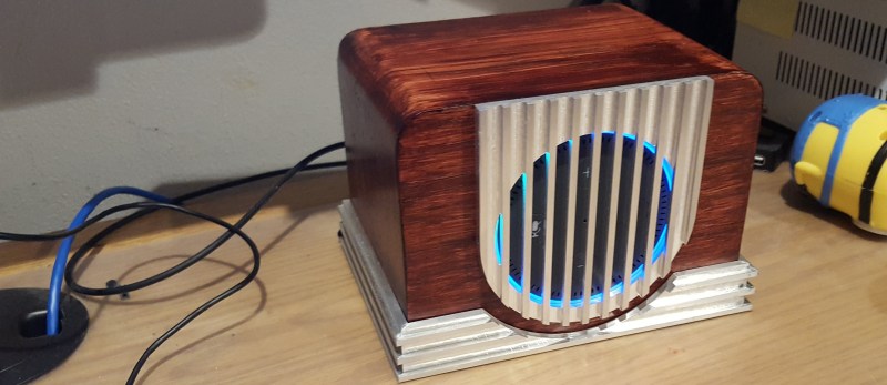
It takes a surprising amount of planning and work if you want something to look old. [vemeT5ak] wanted the Echo Dot sitting on his desk to fit a different aesthetic motivated by a 1940s Canadian radio. Armed with Solidworks, a Tormach CNC, and some woodworking tools at Sector67 hackerspace, he built a retro-futuristic case for the Amazon Alexa-enabled gadget. Future and past meet thanks to the design and material appearance of the metal grille and base molding wrapping the wood radio case. The finishing touch is of course the ring of blue light which still shines through from the Echo itself.

It took about 15 hours of modeling, scaling, and tweaking in Solidworks with an interesting design specification in mind: single-bit operation. This single-bit is not in the electrical sense, but refers to the CNC milling operation. All pieces are cut with a 1/4″ end mill, without any tool changes. Metal pieces were milled from 6061 aluminum and the hickory case (with burgundy stain) was mostly cut on a table saw, but the holes were CNC machined.
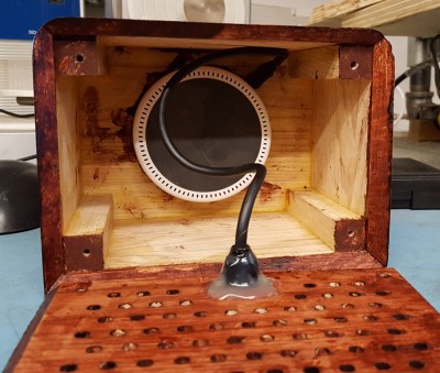
What looks like an otherwise perfect build has a single flaw that eats up [vemeT5ak]’s soul; the Echo Dot has a draft angle that wasn’t considered during modeling, and the hole is ever so slightly too wide, meaning it didn’t press fit perfectly flush. Fortunately it’s not noticeable behind the metal grill, and unless you knew (please help keep his dirty little secret), you would think everything turned out perfectly.
It turns out building a case for the Echo Dot is challenging for a few reasons; the rubbery material on the bottom doesn’t allow anything to stick to it, and the sides are smooth and featureless with a taper that makes it difficult to lock it in. Many cases resort to clipping over the top to hold it in place. Others install it into a fish or a furby.


Hmm shame you can still see the Dot through the grill, might have been better off with a layer of black lady’s tights/pantyhose to disguise it slightly better. The light ring would still show through, and mic performance shouldn’t be any worse. I like the idea of hiding Dots as they’re not the nicest things to look at really.
Was going to say exactly this, other than the fact you can see the buttons this is beautiful!
Little bit of speaker grille material would have really wrapped this one up nicely.
Nice job; the idea above about adding some fabric to hide the buttons is a good one, though, and easy to implement. Also, since you’re putting it in a nice big box, it seems a good opportunity to throw an amp and speaker or two in there, get some better sound out of it.
The rubbery bottom of the Dot peels off with a bit of work. After I got rid of that, a piece of Velcro stuck to it just fine. I used it to mount a dot under a kitchen wall cabinet.
This build is great, just needs that speaker fabric.
Nice, but I still would never put a pandora into my house…
God help us if Amazon starts selling these boxes. We may have to reconsider…
Just curious, do you use a cellphone? Does it have Siri, Cortana, Google Assistant or Alexa? Does it have GPS? Internet?
If the answer is yes for most of them, then I can’t how different is that from a device such Echo.
Great idea, and nice build.
It would be cool to pair this inspired case with some sort of retro video display, with a suitable ‘talking’ video avatar (think Max Headroom or Big Brother).
Except by changing the orientation you have messed up the multi-mic setup
And then it cannot understand you correctly from anywhere anymore.
I think it should have been mounted in a sound proof faraday enclosure.
Just wrap the whole enclosure in tin foil (available from a discarded hat).
It’s so 1948, fitting for the decor of 1984. Hiding one in the kitchen, whoa. When these become tiny and ubiquitous we will have a problem for sure. I saw an icon on one with a symbol of a ribbon microphone with a slash thru (off). A hammer would be trusted but not that button.
Oh come on someone, do a “Talkie Toaster”!
https://i.imgur.com/1gHrmKS.jpg
Vertical orientation probably messes up the ability of mics to filter out ambient noise. I’m guessing here, but it seems likely that the echodot uses the “Alexa” command to read microphone parameters that then allow it to focus on location of the sound source.
When I’m inspired by someone else’s work I always give them credit. http://slipperyskip.com/page41.html
Hey Jeff, The original text to the author did include a link back to your website. Apologies for the text getting omitted. “I decided that my Amazon Echo Dot didn’t look right sitting on my desk. I took inspiration from this site http://slipperyskip.com/page41.html . The style and fit is exactly what I was looking for for my desk. I spent about 15 hours scaling things down and making it fit the dot proportionally.”