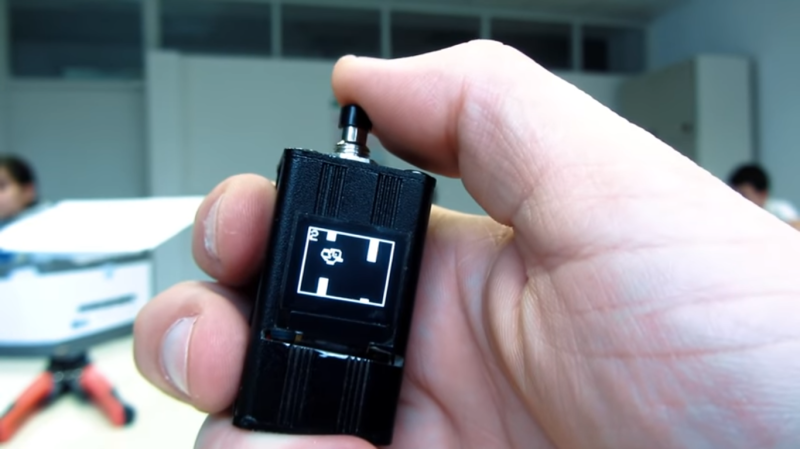
When building projects with a simple goal in mind, it’s not unheard of for us to add more and more switches, buttons, and complexity as the project goes through its initial prototyping stages. Feature creep like this tends to result in a tangled mess rather than a usable project. With enough focus, though, it’s possible to recognize when it’s happening and keep to the original plans. On the other hand, this single-button project with more than one use seems to be the opposite of feature creep. (YouTube, embedded below.)
[Danko]’s project has one goal: be as useful as possible while only using a single button and a tiny screen. Right now the small handheld device can be used as a stopwatch, a counter, and can even play a rudimentary version of flappy bird. It uses an Arduino Pro Mini, a 64×48 OLED screen running on I2C, and has a miniscule 100 mAh 3.7V battery to power everything. The video is worth watching if you’ve never worked with this small of a screen before, too.
Getting three functions out of a device with only one button is a pretty impressive feat, and if you can think of any other ways of getting more usefulness out of something like this be sure to leave it in the comments below. [Danko] is no stranger to simple projects with tiny screens, either. We recently featured his homebrew Arduino calculator that uses an even smaller screen.


You can get more functions out of a single button by using a press-and-hold. For example you can hold for 2 seconds for switching programs, or you can hold for 5 seconds and go into sleep mode.
Use it as a Morse Code key.
Have the uProc decipher the didah’s and react accordingly.
I was about to say – I control my entire smart home with a small button connected to a Raspberry Pi that decodes morsecode input.
Makes a great light switch, but basically does everything else too <3
Would you share some details of your setup? Do you have a webpage? I’m working on a home automation widget that I’ll carry around with me, and looking for inspiration from anywhere I can get it.
short or long is OK. But I know of a device where a friend implemented short/medium and long presses. I fell it difficult to use.
I did something similar with a diy flashlight. Long press to turn on/off and short presses when on to dim the light in 3 stages. A double tap can also be detected. For added functionality a accelerometer can be used to detect how the device is held, then act accordingly. Of course, you can then do away with the button altogether. Like my mobile phone, two shakes and it turns on the flash light.
Sounds much like a bicycle light I made years ago, except I used two buttons. The software understood ‘clicks’, ‘double clicks’ and ‘holds’. Also, turning it on while holding could set alternate modes, such as flashing.
Now add a second button and conquer the world!
I used double click for mode switching, long press and short press for different functions on my HID Multimedia Dial. The dial itself depending on the mode would change volume or select tracks.
I have a project that used a single momentary switch for all the ui. It has a click, 1s hold, 3 second hold, and 10 second hold. Also a double click. 5 functions in a single button! You just poll it 1 time per 5ms, Works great and minimal processor usage.
Replace button with rotary encoder with centre push button. You retain the push feature but gain rotation sensing in two directions.
this was incredibly easy !!!
https://www.youtube.com/watch?v=BGGOn-H7s3Q
I was remembering this classic…
https://dilbert.com/strip/1995-03-25
But this one also turned up in the search and had me laughing even harder…
https://dilbert.com/strip/2016-06-12
I despise one button interfaces. They’re especially prevalent (and horrible) on Bluetooth headsets. Just trying to get the #%@# things turned OFF is a PITA, let along getting them into pairing mode. To turn off, hold for just the right amount of time, but hold too long and the @#%@% things *turn back on*. Getting to pairing mode often leads to turning them OFF.
Put a slide switch on that does just one thing, turns it ON and OFF. And lay off that @#%%@#@% where plugging a device in *and* unplugging it *turns it on*. Even a two button interface can be maddening, especially when combined with any change in external power state turns the damn thing ON. Same story with the screens on phones. USB PORTS SHOULD NOT BE USED AS POWER SWITCHES! *I* pushed the button to turn the screen OFF, it should *stay OFF* until *I* turn it back on, or I get a phone call.
My PayPal card reader has one button to turn it on/off and one button to activate Bluetooth pairing. But combined with it turning itself ON when the USB charger is connected AND when it’s disconnected it requires superfluous care to ensure that it actually is OFF when putting it away to avoid draining the battery so it’s not ready for the next time it’s needed. Then when I take it out and discover the battery is flat because it sneakily managed to stay ON the last time, it turns itself ON when plugged in and takes a couple of minutes to boot, which it must complete before it allows itself to be turned OFF so that battery can charge faster. The power button also has to be held for a few seconds before it will assent to be turned off, but don’t linger on the button once it starts to shut down or it’ll just turn on again.
A further variant of this design idiocy are devices that *don’t* automatically turn on when plugged in with a flat battery, but *do* automatically power up once the battery reaches a certain charge level, and thus slow down the charging. Automatically turning itself ON when the battery is fully charged MAY be desirable with some devices.
My opinion is that all electronic devices should stay OFF when the user wants them OFF, and only turn ON when the user wants them to be ON. If the user wants a thing to automatically turn ON when plugged in, or unplugged, or when the battery gets to a certain charge %, it should be the *user’s choice*.
you can even use power buttons to change modes…. no need for buttons, just a power switch and now you can change modes. Each time you toggle power the state changes and you have a different mode.
Or you could use different button press lengths for different purposes, e.g. quick press for in-mode functions, 2s press for mode change, 4s press for power off, etc.
Single-knob TV control:
https://youtu.be/oE3lT2zFepE?t=100
Meh, it stripped off the time-start – go to 1:40