You’ve no doubt noticed by now that while some links are gold and/or bold, most links out there are blue, especially on web pages of yore. But why? the TL;DR answer is that the Mosaic browser, released in early 1993 used blue links, and since the browser was widely distributed, blue just became the norm. Okay, fine. But why did they choose blue? That’s a question that requires a deep dive into technology through the ages as the Web and personal computing developed in tandem.
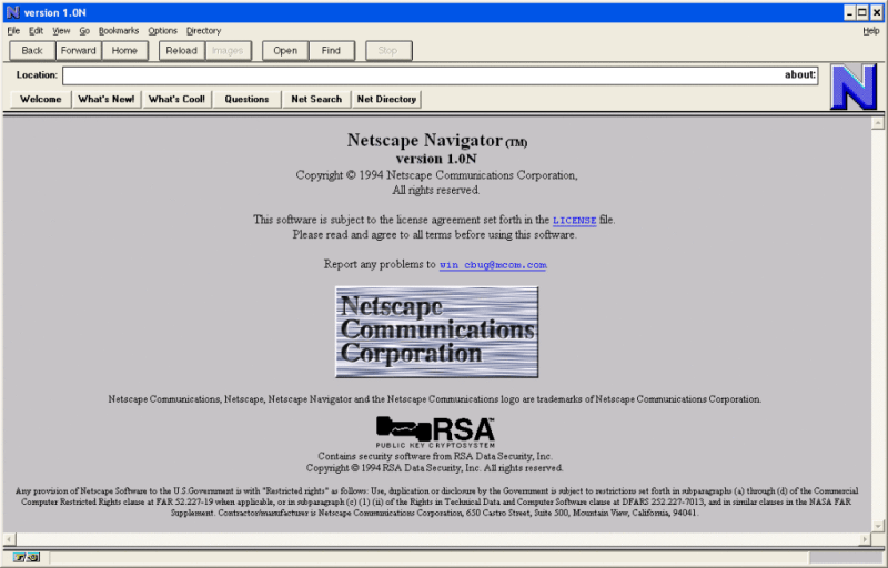
It’s important to remember that the idea of hyperlinks predates the invention of color monitors, which thickens the plot a bit. But the pivotal point seems to be Windows 3.1, released April 6th, 1992, when hyperlink blue becomes a navigational and interactive color. A year later, the April 12, 1993 release notes for Mosaic include a bullet that becomes the point of origin for blue hyperlinks:
Changed default anchor representations: blue and single solid underline for unvisited, dark purple and single dashed underline for visited.Mosaic release notes
Around the same time, the Cello browser was developed at Cornell Law, which also used blue hyperlinks. So the blue hyperlink concept was arguably browser-agnostic even before Netscape Navigator and Internet Explorer came along.
The writer speculates that blue was chosen to stand out against black and white once color monitors took over, and that seems legit to us. Can you imagine blue hyperlinks on Hackaday, though? Ouch.
Speaking of important questions in computing history — who invented the mouse?


Pre-dated color monitors? Really? I was building PCs in 1986 with 20 MB hard drives, color monitors, 640K Ram and using DOS 3.2 like a boss. Lots of the BBSs had ANSII graphics that utilized color. Even my Commodore 64 had color. You can do better than that.
BS, everything before 1980 was black and white. Literally everything. Color was invented in the 1990s. Can you explain why old photographs are black and white? Because the world was black and white. What we call blue now back then was just a shade of grey.
You just remember it being in color because you were used to see specific grey things as specific color, nothing more. Even the eyes were unable to see in color, it only evolved suddenly in the 1990s and were distributed with the vaccines accidentally. And 5g.
Obviously, you weren’t around in the 1960s when color tv became a ‘thing’.
They brought back color in the early 80’s with “Police Squad”
Other than a few times elsewhere, I didn’t see or watch color tv at home umtil 1980. It was weird seeing Star Trek in color.
The first time I saw the original TRON was on a b&w TV!
Bonanza first broadcast in September 12, 1959 I think the earliest episodes may have been broadcast in B&W but by the seconds season they were definitely color as RCA was sponsoring them to drive sales of their color sets. The entire show was filmed in color.
https://calvin-and-hobbes-comic-strips.blogspot.com/2011/11/calvin-asks-dad-about-old-black-and.html
Ted Turner hadn’t been born yet.
When we got our first color TV I was shocked to discover Oscar the Grouch was green.
I miss “Calvin and Hobbes,” too.
And the history of hyperlinks goes to 1965: https://en.wikipedia.org/wiki/Hyperlink#History
Yep, this is the answer. I thought it was clear from the article, but I’m a careful reader. If you skim you might have missed it.
The terms ‘link’ and ‘hyperlink’, referring to linking associated computer content, were coined in the sixties and predate the Internet/World Wide Web by decades.
I don’t know if there were color monitors back then. If there were they were ruinously expensive, so no surprise if original hyperlink implementations didn’t bother with color. Even into the nineties lots of businesses, universities, and home users still used monochrome monitors…
Bonanza was broadcast in color in the 60’s (and maybe in 59) $495 for an RCA TV in 1959 … which is a whopping $4,653.46 in 2020 dollars. $3,376.95 by 1965, when many people actually started adopting color sets. The first commercial color tube 15GP22 was $2,398.82 just for the tube in 1955 at distributor prices even higher retail at MSRP of $2,705.05 it originally went on sale in 1954. There was a very advanced color TV design already in 1938! http://www.hawestv.com/etv-crts/crt-flechsig/flechsig_1st_color_crt.htm
Widespread color broadcasts in the USA started in 1965. Most shows that were new that year were produced in color. For 1966 NBC switched to all color. Shows that were to be continued were switched to color (though some got canceled after 66) and all new shows were in color. Shows whose last year was in 1965 mostly didn’t get a color final season.
CBS and ABC followed in 1967 with all color shows, and also changed carried over shows to color.
Well, hyperlinks in Windows 3.x on-line help used to be green, unless colour depth was higher than approx. 256c (bug?).
http://toastytech.com/guis/win30.html
http://toastytech.com/guis/win312.html
In old Japan know
Hyperlinks change color to
The color for go
“It’s important to remember that the idea of hyperlinks predates the invention of color monitors”. At the very basic level of hypertext, maybe (early 1960s). Certainly not in the sense of Tim Berners-Lee’s implementation (late 1980s).
It’s also worth noting that Mosaic was purely an X-windows browser at the point they changed the link colours (from what, I don’t know…), and wasn’t released for Windows until September ’93.
I used a color TV with my Commodore Vic-20 in 1983.
Congratulations, yet you missed the hyperlink by about 20 years.
Could the limited palette Windows 3.1 offered back then had pushed developers to pick one of the ‘system’ colors as the one for links, so that they wouldn’t eat one of the precious configurable colors used to display pictures embedded in web pages?
This is more or less what I was thinking. Windows 3.1 was king and had a blue theme by default. I can imagine it would have been an easy choice to simply match the prevailing standard at that time.
The early www stuff was all developed on NeXT machines. They had monochrome and color displays.
Nextstation = 4 “colors” white black 2 greys
Nextstation Color = 4,096 12bit color
NextDimension = 32 bit color
So, they probably would have chosen a system pallet color even on a Nextstation Color.
In the age of grayscale monitors, we did not use black and white, but black and light gray. (or shades of green or orange)
white and light blue where brighter shades of gray and used as bold and bookmarks/links.
My family had one of the amber Hercules monitors. They were exceptionally sharp compared to color monitors, but really it was all about color in those days. Our color monitor by comparison was blurry and only produced 16 colors I believe. I think it was a Tandy. If you didn’t need color for something the Hercules was great, but for games the color monitor was king. Fast moving objects on screen look blurry anyway.
I realize now it was probably the video card that restricted us to 16 colors, but I wonder if those fat pixels might have prevented convincing blends of RGB in any case.
Yes and no. CGA and Tandy had a “digital” RGB plus Intensity signal instead of the varying RGB of VGA. There’s notably 16 options for those bits
There have been hacks to get it up to 1024 colors… but hardware wise its designed specifically for 16 colors. https://int10h.org/blog/2015/04/cga-in-1024-colors-new-mode-illustrated/
The ATI VGA Wonder 16 could do 16 bit 800×600 in 1988.
All VGA cards can do 256c in mode 13h (320×200) and 16c in mode 12h and 2c in mode 11h (both 640×480). Plus the old EGA modes. CGA is simulated in VGA. By using a mode utility, VGA clone cards can use a more faithful CGA emulation. Except for Composite CGA, which required an NTSC monitor.
SVGA cards like the Paradise Professional VGA (PVGA1A, 1B etc) can do both 800x600c in 16c (original SVGA resolution) as well as 640×400 in 256c (no typo).
640×400 was the lowest VBE mode, also. And fitted into 256KB of Video RAM, which many early VGA cards had. The early cards support it via TSR driver in DOS, because they don’t have VBE in VGa BIOS yet.
Last but not least existed many unofficial VGA resolutions, because the VGA core was very flexible to program.
Btw, Hercules InColor also existed before VGA.
720×348 pels in 16c.
And then there was Plantronics, too. Also supporting many colours, but few software titles knew about it.
For professionals, there was IBM PGC in 640×480 in 256c.
TIGA, 8514A and XGA existed, too.
All doing high resolutions (1024×768 up) in 16/256c.
I have never wondered about the color of links. And this entry sets things up as a mystery, and then doesn’t come through with a concrete answer.
I didn’t really see color until June 2001, switching to Linux and buying a used color monitor. (When I sampled Debian six months before, all the fussing about dependencies was made worse because color was expected.)or
More importantly, Lynx was my primary browser until 2012. Text only. Yes, Linux let me run a graphic browser at home, but I used it rarely until high speed in 2012.
No color until 2001 & Lynx as primary browser until 2012?! Congrats on being some sort of techie luddite. Let me guess – you still don’t have a smart phone?
What’s a smart phone? I have to carry a i-phone for work … but it isn’t smart by any means…. Can’t wait to deep six it when I retire in a few years ….
16 colors in 1985 here.. IBM 5150 + 5153
Adobe Acrobat was released in ’93 and also used blue hyperlinks by default, IIRC. And there were pre-release versions of Acrobat codenamed “Carousel” (a trademark Adobe hung onto for photo-management software) before ’93.
>Can you imagine blue hyperlinks on Hackaday, though?
Yes, actually. I can’t stand “night mode” color themes, so I use custom CSS with a lot of “!important” lines in it. It has a black-on-grey theme, and restores the standard link colors.
And I can tell you that Sᴍᴀʟʟ Cᴀᴘs looks so much better for titles and headings than ALL CAPS.
Oh, I know, right? Night mode is horrible when only a few web pages use it, constantly adjusting between the two is hell on my eyes. I’ve resorted to having Privoxy strip out and replace the vast majority of CSS it encounters and replaces it with more comfortable formatting. For me, the internet looks like Wikipedia if it was built entirely in strict HTML 4.01.
I’ve also built some Privoxy configurations to clean up or outright drop a lot of JavaScript, the vast majority of the JavaScript I encounter is useless fluff, compatibility stuff for platforms I’m not using, or stuff that can be re-implemented as plain HTML without any loss of functionality.
My eyes and computer are so much happier. It also means I can browse the internet just fine without a mouse (My first personally-owned computer lacked a mouse and I just got used to not having one).
>Can you imagine blue hyperlinks on Hackaday, though?
It’s not that bad: https://j0h.nl/y2MC/full
> Can you imagine blue hyperlinks on Hackaday, though? Ouch.
My eyes! What you did to my eyes?!
Title asks “Why are hyperlinks blue?” on a webpage peppered with multicoloured hyperlinks (white, grey, light-yellow and dark-yellow).
The answer is obviously: “They don’t have to be, it’s just an agreed upon default by web browser builders for when the page coding doesn’t specify.”
The irony, right?
In addition to the comments about other hypertext systems, I remember the Amiga systems had a help-file format that was hypertext too – you could insert links (buttons) and images into documents and navigate around.
I want to say it was called “AmigaGuide” format but I could be imagining it.
Yes, it was AmigaGuide, and it used a lot of curly braces and @s.
It was interesting as they went for the button style link rather than underline/colour. This was probably because the low-end Amigas at the time booted into a 4 colour workbench (v2, so white, black, grey and blue colours by default, the blue and grey were not high contrast and the grey was often used as the background colour).
http://ale.emuunlim.com/guides/amigaguide-create.shtml