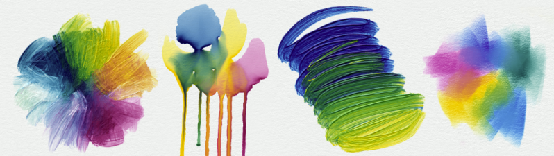
You might not have noticed if you’re not a digital artist, but most painting and image apps still get color mixing wrong. As we all learned in kindergarten, blue paint and yellow paint makes green paint. Try doing that in Photoshop, and you’ll get something altogether different—a vague, uninspiring brownish-grey. It’s the same story in just about every graphics package out there.
As it turns out, there’s a good reason the big art apps haven’t tackled this—because it’s really hard! However, a team of researchers at Czech Technical University has finally cracked this long-standing problem. The result of their hard work is Mixbox, a digital model for pigment-based color mixing. Once again, creative application of mathematics has netted aesthetically beautiful results!
Come Up Off Your Color Chart
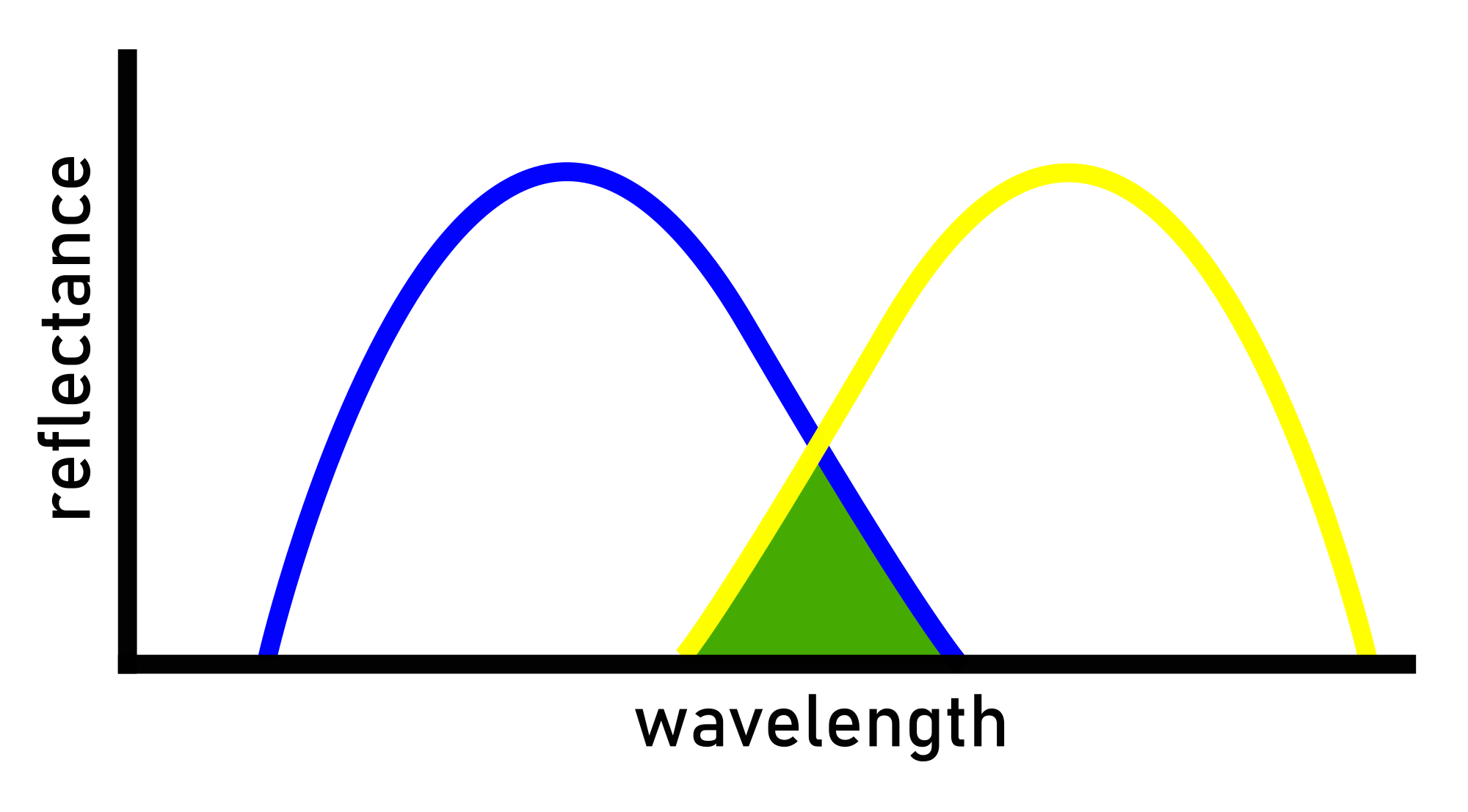
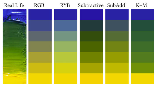
The core issue lies in how digital art apps handle color. Most are built around the RGB color model, which is exactly how our monitors display color—but it’s nothing like how paint and color work in the real world. When you mix blue and yellow light, you get gray – exactly what happens in most digital painting software. Actual paint pigments interact with light in a much more complex way.
What we see when we look at paint is the light reflected from the pigments, not what was absorbed. Mixing paints ends up with a more complex situation, with the combined paint absorbing and scattering different wavelengths as light bounces around between pigment particles. Combine two paints, and you’re left with less reflected light because each different pigment absorbs a different part of the spectrum. You only see what’s left. This is also why you get a murky brown or black result when you mix a whole ton of different colors—the different pigments absorb light from all different parts of the spectrum, and reflect precious little to your eyes.
There’s actually been a mathematical model for the behavior of mixed paints since 1931 – the Kubelka-Munk (K-M) equations. Computer graphics researchers have known about it for decades, but it’s never widely been implemented in commercial software. That’s because implementing it would require tracking multiple pigment channels for every pixel instead of just three channels to cover red, green, and blue values. That was a particular deal-breaker in the early days of computing, but it remains a hurdle to this day. Most art software still relies on graphics pipelines built entirely around RGB. Beyond that, pigments don’t readily map to the whole gamut of available RGB colors.
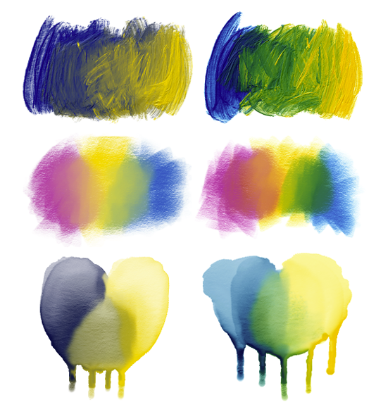
The breakthrough came when researchers realized they could knit the principles of the K-M model into the RGB space. Their hack works by decomposing RGB colors into a combination of four basic pigments. The team chose Phthalo Blue, Quinacridone Magenta, Hansa Yellow, and Titanium White as a reasonable basis. Then, they coded a routine to calculate how RGB colors should mix based on their component pigments, using the K-M model. For RGB colors that can’t be made up purely with pigments, there’s also a special “residual” term that accounts for “the missing part of red, green, and blue light that needs to be supplemented to the light reflected off of the pigment mixture in order to exactly match the original RGB color.” It lets the K-M model do its mixing magic without compromising the color space available to the user. The team then had to perform some pigment manipulations to ensure their model wouldn’t end up creating colors that lived outside of the RGB color space, either.
Getting this model to run at speed was a must; after all, nobody wants art software that lags when dragging a brush across the screen. The biggest hurdle to overcome was the mathematical operation to decompose RGB colors into their base pigments. To run this quickly, they pre-compute massive lookup tables that handle all the complex K-M math ahead of time. At runtime, the software only needs to do a few quick table lookups to figure out how colors should blend. The whole system acts as a drop-in replacement for regular RGB color mixing, requiring minimal changes to existing software.
The performance overhead is surprisingly minimal, with the model running only about two to three times slower than regular RGB mixing. On modern hardware, that translates to just milliseconds of lag. In most cases, the model can run at over 60 frames per second on a modern computer. The lookup tables add about 96MB of memory overhead, which is pretty much unnoticeable compared to the gigabytes of memory bloat in most modern software.
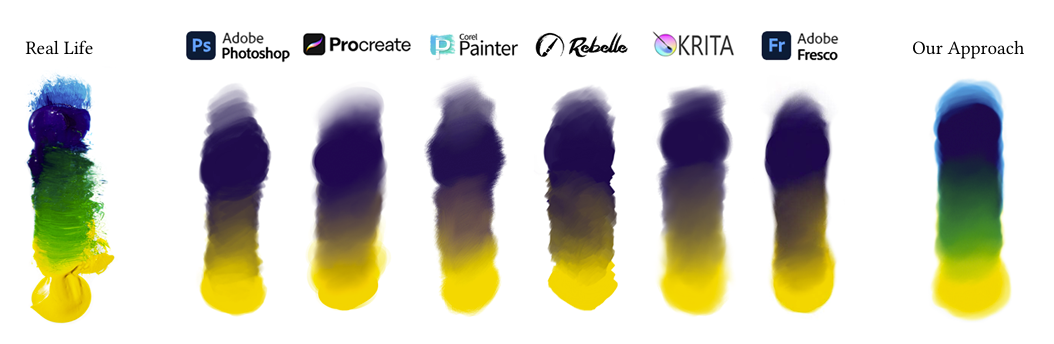
The team has released their implementation on GitHub, opening the door for other developers to integrate proper pigment mixing into their own projects. The code has also been implemented in a simple web painting app that you can try for yourself, right in a browser. Alternatively, the system has been implemented in a commercial painting app called Rebelle. Whichever way you try it out, though, the results are equally impressive. With the mixing model at play, not only do blue and yellow finally make green, but you get all sorts of subtle effects that happen with real paint. For example, colors actually become more saturated when mixed with white instead of getting washed out.
The main limitation is that the system can only handle four base pigments at a time – adding more would make the lookup tables impractically large. More pigments might make it easier to cover the whole RGB gamut, but they also introduce issues for handling the maths in a neat and tidy manner. The researchers have suggested such expansion might be a valuable area for future work.
In any case, this could be a game-changer for new digital artists coming from traditional media, where color mixing is so much more intuitive. It’s beautiful to see vibrant colors erupting from a canvas, whether real or digital. Now, the latter can more accurately approach the former, giving digital artists greater opportunity for rich expression, colors and all.


My mom was an art teacher (and a formally trained artist) and did the arts class in my primary school, and only really late in life I realised that not everyone has had such an extensive knowledge of houw colours work as what I was taught in school. Mixing paint (or print) colours works exactly opposite from how mixing light (on a computer) works and the primary colours are different.
In print, they are cyan, yellow and magenta (often simplified as blue, yellow, red) while in light they are blue, green and red.
I am amazed that many people don’t know how to mix green from yellow and blue, which is really easy to do with e.g. highlight markers on a flipover. And then there is a vast, vast space of color information (pun intended) that I don’t know about. Basically: A conputer can not show all colours!
It’s ironic that painters struggle to mix the colors of a sunset, because you have to mix red and yellow to blue without getting green, because the sky is additive color, not subtractive as with paints.
+1
It’s also handy to know when working with cameras and color filters.
Or when working on stage with headlights.
To be precise, in print they’re CMYK – cyan, magenta, yellow, and black – and the school simplification to blue/red/yellow is the source of so much misunderstanding and misinformation about colour even amongst professional artists.
i called a teacher out on that and she “corrected” me. i was already familiar with both additive and subtractive methods. translucent paints do exist if you want a more to light painting, but im no artist.
To be even more precise they’re CMYK in print because they’re secondaries and each (excluding black) reflect 2 primaries so when you mix 2 together you end up reflecting a single primary, but then need to also add black to give a “brightness” so we descibe them as subtractive. On the other side of things monitors, and by extension computers need to work in primaries (RGB) because they are emissive (or transmissive) and we describe them as addative because we assume that we see in RGB.
BUT, and it’s a big but, light is neither, it’s a spectrum which we model primarily in RGB because most people have 3 sensors sensetive to ranges of these wavelengths which are overlapping, and while similar they are not identical for everyone and certain wavelengths can even create negative responses in one colour sensor while stimulating another, something no display can replicate. This also doesn’t take into account that the majority of our vision is “black and white” and our brain colours in the rest based the minority colour sensors. To make matters worse the maths for our displays have traditionally been based of the emmisive spectra of three different phosphorescent compounds which were used to make CRT monitors (the CIE illuminants) which make up the basis for our most common colour systems (Rec709 and sRGB) the maths for which also comes from 1931. These colour spaces don’t even cover full gamut of our eyesight. Of course here in 2025 CRTs are mostly consigned to history, and the exact wavelengths any given display actually emits for its RGB depends on plenty of other factors and there are several more competing colour spaces. I could go on.
Back on the paint/print side of things the ratios and wavelengths of refelcted spectra are different for different chemical compounds that make up our inks, pigments or paints that we loosely describe in terms of colour which are also bound by the spectral content of the light we bounce off them.
That then brings us to colour temperature and CRI, or in simpler terms how much red, green and blue make up white, and how well spread out they are…
What I’m getting at here is that colour theory isn’t just one rabbit hole, it’s a whole field full of them and they’re all deep. School has to simplify, and artists might need a bit better understanding, but if you think you fully understand it (I know I don’t) you just haven’t looked hard enough.
After all that it’s still good to see another modelling system that may offer a more intuative method for getting to the asthetic an artist is after.
Fun additional fact, magenta is the only colour that doesn’t exist. All other colours can be described by a singular wavelength upon the electomagnetic spectrum, but magenta is made up by our brains as a mixture of red and blue wavelengths with an absense of green in the middle.
Teaching kids about supernumerary colour is a fun way to break the ice when talking about their literal visual perception of the world.
“Primaries” are just mutually exclusive values wherein one cannot be made with the other two. They are not an absolute thing, but a relative thing. There are an infinite number of primary color combinations. There is a good lecture by Feynman about the physics of color. I suggest everyone interested read it.
Subtractive and additive blending have different primaries, though, and there is not combination of subtractive primaries that yield the same behaviors of additive primaries. The combinations of colors that are mutually exclusive are different in subtractive blending from those in additive blending. They ARE NOT congruent to one another, as is obvious with the behavior of what happens you mix all different colors together. This is due to the physics of light and the physics of light interacting with pigment. In one case, you’re dealing with simply additive blending of light. In the other, you’re dealing with the physical interactions of light with pigment and then the blending of that from however it might scatter before reflected back to your eye — these do not equal one another.
How colors change when light is combined IS additive blending. That’s how it behaves when you isolate wavelengths and then combine them. Pigments ARE subtractive blending. That’s how it behaves when you blend pigments.
And magenta exists. Otherwise you wouldn’t see it. Color is the interpretation of neural responses from our eyeballs and existence of a color is only dependent on your hardware interpreting things. Magenta is a whole range unto itself of different colors that do not have a single frequency (or energy level of a photon) associated with them that exist where our brains combine the two ends of the visible spectrum together.
And magenta isn’t the only color. What do you think “pink” is? Some various shade or another of red with varying amounts of white light mixed in. Pink is not associated with a distinct wavelength of light. Most colors we see, in fact, are not.
“BUT, and it’s a big but, light is neither, it’s a spectrum which we model primarily in RGB because most people have 3 sensors sensetive to ranges of these wavelengths which are overlapping [..]”
These are the so-called cones, right.
The human eye also has sensors for grayscale/brightness.
These rods are used for night vision, for example.
When walking under a moonlit nightsky.
What’s also interesting, though, there’s a fourth primary color, yellow.
But primarily for pigments on paper, here it takes the place of the green color (red+yellow=green neg mix; red+green=yellow pos mix).
So we have red, green, blue for light (additive mixing) and red, yellow, blue for pigments (subtractive mixing). In a nutshell.
A few years ago, flatpanels made by Sharp had yellow sub pixels for enhancement.
Displaying large corn fields had never looked better before, I assume.
https://en.wikipedia.org/wiki/Quattron
Personally, I think Ukraine is pretty neat.
Sadly MixBox is non-commercial only. If you want an MIT-License, check out spectral.js :)
This exactly, I’ve been hoping the libmypaint ( brush engine used in mypaint/Krita/GIMP) devs would add an implementations, but it’s a tiny project with few people.
MyPaint already does a pigment emulation by default, blue and yellow make green, etc
There have been a many real world paint inspired apps that mix colours differently. Including type of paint and everything. Try MyPaint for example.
Yup, and lots of other colour mixing modes (like multiply and subtract) which are more representative of how transparent paints mix.
Still, this is nice.
Mypaint is pretty good, which is why both Krita and GIMP use the libmypaint engine, but it doesn’t do this. I’ve been hoping they would implement it based on spectrum.js, but it hasn’t happened. They are a tiny project.
What about different color spaces like LAB instead of RGB?
good luck using that on a rgb monitor… out of gamut is an interesting country
Yes, but that’s a different question. You can very well use it – just don’t venture beyond the color primaries of your monitor.
Dan Margulis has proposed using LAB for decades, but IIRC he did not cover painting just color correction. You can get an old version of “Photoshop LAB Color: The Canyon Conundrum” book from archive.org. While searching there for the title, I discovered the video “CMYK and Skintone color correction” which looks interesting at first glance too.
In last years I have seen proposals for better color pickers, etc, based around OKLab and other spaces. raphlinus’s oklab-critique.html page (use as hints for search) provides an interactive tool with gradients, and some spaces go thru green when setting the ends as blue and yellow.
I’m no saying they will behave like paints, but that the color space used will give different things. Just compare sRGB vs LinearRGB.
Like HSL: you’re rotating through the color wheel from red, yellow, green, blue, to magenta. Taking the average Hue value between yellow and blue gives you a shade of green – but technically so does mixing red and violet which wouldn’t work with real paints.
While this is neat it seems kind of DOA. It’s been untouched for over 3 years so if anyone wants to use it they are going to become the maintainer of something where the license is not MIT. Don’t think many people will sign up for that.
Says it’s in Rebelle Pro and a Blender plugin.
I’m not much of a painter, but I do love watching watercolours dry in Corel Painter.
I wonder if this will be ported to commercial software?
This has already been implemented in Rebelle for a while. (Rebelle gets a very brief mention in the article but deserves much more attention. Honestly I’m a bit surprised this article is only being written now.)
The way Rebelle handles interactions between artistic media is simply hypnotic and breathtaking, as opposed to siloing watercolor, oils, etc, to different layers Perhaps this has changed since I last used the alternatives, but I abandoned Corel Painter after trying it out. It’s also very reasonably priced – I highly recommend it to anyone who hasn’t given it a go.
I had to delve into this stuff when I built my painting machine and wrote the software,
https://vimeo.com/258538605 My understanding was that colour from a monitor was imissive and paint reflective. CMY are the inverse of RGB, CMY added together make black, although not deep black and RGB added make white on a monitor.
Should have wrote emissive, I know how pedantic HAD readers can be.
it’s neat work…i imagine it’s not really that obscure among people who actually know how to use graphic art software
a thought on framing. i gagged on the phrase “unnoticeable compared to the gigabytes of memory bloat in most modern software”. i do often face the dilemma posed by the researchers…is this feature worth so much memory? in 2025?? but i never ever ask, is this thing bloated compared to a web browser! the existence of web browsers and other environments where people waste literal gigabytes of ram to achieve an inferior user experience to 1995 doesn’t have any bearing on my own technical decisions. the guys at the drinking water plant don’t say “well our product is pretty clean compared to a sanitary sewer overflow”!
i always compare it to the available resources instead. “the memory overhead is nothing compared to the gigabytes of ram that all of my customers have.” “the computation overhead is nothing compared to the gigahertz cpu in the average toaster oven.” “this table would be great except you know it’s gonna trash the cache.” that’s how i think.
it’s a subtle distinction maybe but i’m never going to excuse my engineering practices by someone somewhere else doing worse, unless maybe if i’m their competitor and i can get a zillion dollars for just having a slightly less nauseating turd sandwich.
but indeed 96MB for a look up table does seem like small potatos compared to modern resources :)
When people say such things it’s fully intended to express what you just pointed out. It means your target audience has to own something good enough for your purposes because they already do things that are even more intensive. Example: “This road we’re going to build will have a bit of a steep grade, but it’s nothing compared to a lot of the roads in the area” implies that someone who gets to your road has already driven on something much steeper, so yours isn’t the limiting factor. No need to explain what they have, just that they obviously already have it.
I read that completely differently. Most modern graphics software already have gigabytes of memory bloat, so adding 96MB to it doesn’t register. Which is a reasonable thing to say. I don’t think the point was to compare this lookup table to a web browser.
Quinacridone Magenta Is an interesting choice, it’s basically anti-green and has a non intuitive spectra. The paints they chose are easy to mix but no professional artist woul use them on because they aren’t very stable
As an artist with a MFA in both painting and photography (I wanted to be an art professor bit ended up in software) I am well aware of the differences between additive colors and subtractive colors. Interestingly, although you use RGB to take photos because film is sensitive to red green and blue, prints, slides, and movie projection prints use cyan, yellow, and magenta dyes. The negative film uses cyan, yellow, and magenta dyes too, for some reason some people think otherwise.
Mixing real paint is even more complicated than you describe, however. Real paint is made up of pigments That have there a discontinuous and spiky spectrums of light reflection and absorbing characteristics, and sometimes absorption of one wavelength and emission of another. You can have two paints that look identical and behave completely different when you mix them with other paints.
Also, professional artists who are concerned about the longevity of their paintings use pigments that are less intuitive to mix because they are more light stable. The qualities that make some pigments easy to mix also make them less light stable. Anybody that wants to go down that rabbit hole can investigate the difference between dyes and metallic pigments. Some high-end inkjet printers that use 12 different colors of ink are grappling with the same problems.
Another interesting dies versus pigments is Polaroid SX 70 film. Polaroids taken in the 1970s look pretty much the same today but Prince made on Kodak paper using conventional photographic dyes have faded away to nearly nothing. This is because the Polaroids use metallic dyes and pigments.
Got to stop before I get into the history of color. But I have to point out that Photoshop has always had LAB, HSV, and CYMK color spaces available to work in.
“Also, professional artists who are concerned about the longevity of their paintings use pigments that are less intuitive to mix because they are more light stable.” this shouldn’t surprise me but it does! i ponder the enormous volume of PLA trinkets that mostly won’t last 10 years without becoming too brittle to survive casual contact. i wonder how many of the people making them know they’ll decay like this. and mostly i wonder how that awareness will spread through the practitioners. seems like we’re not the first art to face this challenge…it’s a road well-traveled
This is fascinating from a base curiosity perspective (largely in part from the fact I’ve dealt with coding color blending, as it’s rather involved to actually do it well). But practically I don’t think it would mean anything to digital artists except for something fun to try. It’s quite clear that the color blending model isn’t a detriment to the production of high quality art. You just approach it slightly differently from physical art, which should be expected anyways.
Well, I feel compelled to point at https://ciechanow.ski/color-spaces/ for a very nice write up of color handling in computers, on screen.
Quinacridone Magenta Is an interesting choice, it’s basically anti-green and has a non intuitive spectra. The paints they chose are easy to mix but no professional artist woul use them on because they aren’t very stable
As an artist with a MFA in both painting and photography (I wanted to be an art professor bit ended up in software) I am well aware of the differences between additive colors and subtractive colors. Interestingly, although you use RGB to take photos because film is sensitive to red green and blue, prints, slides, and movie projection prints use cyan, yellow, and magenta dyes. The negative film uses cyan, yellow, and magenta dyes too, for some reason some people think otherwise.
Mixing real paint is even more complicated than you describe, however. Real paint is made up of pigments That have there a discontinuous and spiky spectrums of light reflection and absorbing characteristics, and sometimes absorption of one wavelength and emission of another. You can have two paints that look identical and behave completely different when you mix them with other paints.
Also, professional artists who are concerned about the longevity of their paintings use pigments that are less intuitive to mix because they are more light stable. The qualities that make some pigments easy to mix also make them less light stable. Anybody that wants to go down that rabbit hole can investigate the difference between dyes and metallic pigments. Some high-end inkjet printers that use 12 different colors of ink are grappling with the same problems.
Another interesting dies versus pigments is Polaroid SX 70 film. Polaroids taken in the 1970s look pretty much the same today but Prince made on Kodak paper using conventional photographic dyes have faded away to nearly nothing. This is because the Polaroids use metallic dyes and pigments.
Got to stop before I get into the history of color. But I have to point out that Photoshop has always had LAB, HSV, and CYMK color spaces available to work in.
Strange how the completely obvious and totally predictable issue of unnatural coloring doesn’t come into focus. I’d call this “computer-screen-induced chromatic aberration” :]
Meaning, ALL colors when shown on a computers screen are the additive kind – because they are GLOWING colors, not reflected colors.
Same difference was with the CRT monitors – the colors that in real life would appear dull at best were unnaturally bright, hence, the color mixing was different for the CRT/comp-monitors-in-general compared with anything reflecting the light (like, say, paintings). Hence, some things that in real life will never shine under any sunlight.
(one exmaple of odd aberration are red bricks in the McCallister McMansion from “Home Alone” – bricks appear nearly glowing in the morning scene – real life red brick colonial houses in comparison are universally drab and reek of dull ochre, which is likely where it comes from to start with)
Whoever invents the magical monitor that would show BOTH, ie, reflected and “glowing” colors properly not only would be a billionaire, he/she would finally invent something closer to real life. eInk kinda started the thing, reflected coloring, tho, I have yet to see an eInk that would also have a way of opening certain pixels transparent so that some kind of OLEDs situated behind can shine through properly.
Something like that. Discard once read.
I mean if cost is no limit, you can have transparent OLED panels on top of an E-INK display. Turning on the OLED pixels only when you need illumination/glow.
Excellent idea, I haven’t thought the obvious :-]
Only tangentially related, decade ago I gave a mighty try inventing a tiny 3D display with three LCDs packed into one block. I largely failed at programming the LCDs, but I also found out that they are only marginally transparent, and the third LCD was barely visible behind the first two. I was not aware the transparent budget-friendly OLED panels exist, now the project may be revisited/rebooted, and I thank you for the pointer :-]
Clip Studio Paint already implemented this years ago. Same with Rebelle. Just showing how other programs are ahead of Adobe in some ways.
FocalPaint for iPad does pigments the hard way that MixBox avoids; it doesn’t use a lookup table but instead stores 12 channels (instead of 3) of color reflectance data that allows more degrees of freedom for color mixing. You can manipulate each channel to achieve some unique color properties and blending behavior (including blue+yellow = green).
“As it turns out, there’s a good reason the big art apps haven’t tackled this—because it’s really hard!”
But it really isn’t hard, as the article also goes on to explain…