When it comes to text, how small is too small? The experts say a six point font is the minimum for readability, but as [James Bowman] shows us, you can get away with half of that.
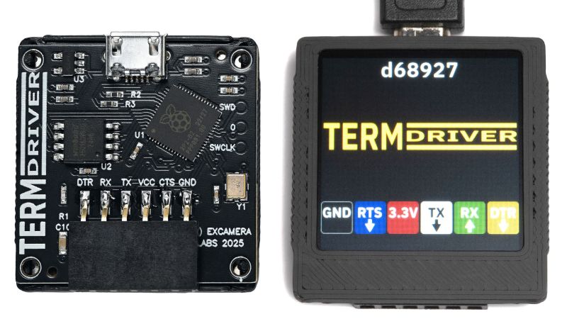
The goal is to produce a 40-character display on a 24 mm x 24 mm LCD that has a resolution of 240 x 240 to show a serial terminal (or other data) on the “TermDriver2” USB-to-Serial adapter. With 24 lines, that’s a line per millimeter: very small text. Three points, to be precise, half what the experts say you need. Diving this up into 40 columns gives a character cell of six by nine pixels. Is it enough?
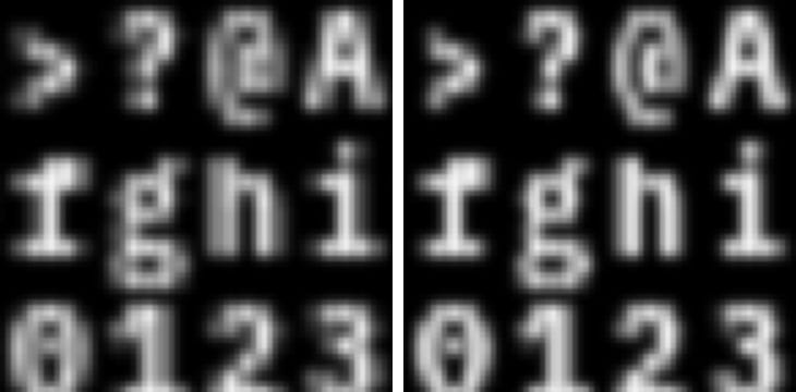
Not by itself, no. That’s where the hack comes in: sub-pixel rendering. After all, a “white” pixel on an LCD is actually three elements: a red, a green, and a blue subpixel, stacked side-by-each. Drive each of those subpixels independently and 240 pixels now becomes 720. That’s plenty for a 40 column terminal.
The article discusses how, in general terms, they pulled off the subpixel rendering and kept the font as legible as possible. We think it’s a good try, though the colored fringe around the characters can be uncomfortable to look at for some people — and then we can’t forget the physical size of the characters being 1 mm tall.
If this trick were being used on a larger display with a 240-wide resolution, we’d say “yes, very legible, good job!”– but at this size? We hope we can find our reading glasses. Still, it’s a neat trick to have in your back pocket for driving low-resolution LCDs.
It may not surprise you that aside from improving legibility, subpixel rendering is also used for pixel (er, sub-pixel) art.


Older character generators used a cell of 5×7 pixels, or 5×9 if you wanted decenders. I like that look better than the color fringing.
The color fringing can be removed with math but the process was long patented by Microsoft Truetype. I suspect that patent has expired now.
I believe the technique is “box filter RGB decimation process”.
Indeed. The article claims the opposite:
“But the slight color fringing is a small trade-off against much better readability”
I’ve disabled sub pixel rendering for around 15 to 20 years. I much prefer sharp edges even though lines may look a bit jagged, then those weird colors all over the letters.
The article also states:
“But on LCD displays a pixel is really three vertical emitter elements, for red, green and blue.”
Which is an over simplification, Over the last 20+ years a gazillion amount of LCD’s have been made (and CRT’s before that) and among them, there has never been a standard of sub pixel order. In more modern times there are also LCD’s with a bayern pattern that have twice as much green pixels then of the other colors. Sizes of sub pixels may also depend on LED efficiency in for example OLED’s. Another problem is that I used a swivel stand for my monitor for a long time. In portrait mode for text, and I rotated it to landscape for CAD work.
And now I’m getting older, and eyesight is slowly diminishing. I can still easily read text with a “base height” of around 8 pixels, but I can barely see any difference whether subpixel rendering is on or off. On that level, my eyes themself blend in the edges. As a result, only the color fringes remain, especially when the sub pixel rendering settings don’t match the actual panel in the monitor.
I was also confused by that “3 point” thing. Those have nothing to do with pixels, but only with size. Apparently that was used as a certain fraction of a banana by some ancient and scrubby letterologists.
Some words to defend the author:
If you’ve got a know display, then sub pixel rendering can be made to (at least sort of) work, and on the real 240×240 LCD, the color fringing would nowhere be anything like in the 720×720 pixel screenshot shown here on hackaday.
I’ve tried a bit to look around, including on:
https://excamera.substack.com/p/what-ive-been-making-termdriver2
and as of yet, I have not found a (clear enough) photograph of the whole thing that actually shows the tiny letters rendered clearly. Showing some good photo’s that it actually works as intended is probably a good sales argument. But still, it’s not a product for me. I bought a 107cm 4k monitor partly because I’m getting older and don’t want to wear glasses to stare at text on a monitor.
If I was interested in a similar product, I’d tend to go towards a bluetooth to serial adapter and use a regular phone or tablet screen to show the text.
Yea ok you are old and wrote a book on a blog pertaining to a thing that is 30 years old
Yes we all age congratulations on this tragic discovery
I don’t mind the fringing – it reminds me of old computers with composite video – charming in that 5.25″ floppy kind of way. Alas, not everyone sees it that way.
Typo:
“Diving this up into 40 columns gives a character cell of six by nine pixels.”
Diving>>Divvying
Using leaded solder in a 2025 is just plain stupid. It’s not 2003 anymore where lead-free joints would go bust even if done at the factory. Today even a $3 soldering iron from Aliexpress can do lead-free joints like it’s nothing. Lead, just like asbestos, is not safe in any amount.
You can pry my lead from my cold dead hands
Just because you’re running to the finish line doesn’t mean I intend to pry poison solder out of you once you get there.
Lead does do wonders to my wine.
Lead is all around you. It’s still used in roofing, batteries, and light aircraft, where the lead is distributed in the atmosphere for all who live close to small airports to have a slightly lower IQ.
Leaded solder is a worry on the scale of lead acid batteries. It’s contained unless the landfill it ends up in leaches into ground water. As long as you wash your hands before sticking your fingers in your mouth.
Actually, modern batteries use Lithium. Lead and Cadmium batteries were used in hobby toys up to early 2000s but there were phased out as LiPOs became cheap and powerful.
Don’t cars still use lead-acid batteries though?
UPS too.
Yes, most car batteries are lead acid. Most UPS batteries are lead acid too.
Literally nobody, not in the article or in the source or any other comments here, mentioned lead.
What are you on about?
Lost his mind due to tin poisoning.
He assumed there’s leaded solder being used because the joints look too good.
Spoken like someone who clearly knows little about soldering conditions or asbestos.
As someone with a dozen old multi-core 1 pound rolls of fine eutectic ratio solder, not using it would be the stupid part. 63/37 tin/lead. The best!
I wonder if reverse video (black text on white background) would improve perception of fringing?
Turns out that this is physiological, and depends on the viewer. For different audiences, the proportion can be different, but this is partly a selection bias. People go find things that work for them and thus tend to cluster with other people similar to themselves.
So, the answer is “it depends on the audience and the use-case”, with neither solution being “always better”.
And it further turns out that light/dark isn’t the only physiological factor. Sensitivity to color-fringing is higher in people with greater perceptual sensitivity to color, and sensitivity to jaggies is higher in people with greater perceptual sensitivity to positioning.
In the old days, some people exhibited greater or lesser sensitivity to CRT refresh rates, too. I had two coworkers on opposite extremes, at one point. One could stare at a 15 hz display (with short duration phosphor so that the early part of the image was less than half brightness by the time the beam traced the last pixel) and had no problems at all. The other would routinely have to puke into a trashcan if forced to stare at a 60 hz refresh display for more than about 30 minutes. They both were exhibiting their true perception, and neither even slightly understood the other’s capabilities and limitations. Oddly, they got along quite well, other than on this one topic.
As to why people vary this much, there are many theories, some of which even partially align with observational data, but that begins to digress from this topic :)
Interesting idea. Does not look right on my monitor, but it’s probably not the right pitch.
But 6×9 is not that squishy. I recall C64 terminal emulators giving users 80 columns, with a 320 pixel display ( https://en.wikipedia.org/wiki/CBterm ). Not pretty.
Also recall text adventures, “You know, for those intellectual people with better imaginations. ‘You can’t get ye flask'”, using a 5×7 font.
Yes, 40 column on a VIC-20 display using the same technique, and that’s only 160×176 resolution!
Also, 64 columns on a ZX Spectrum (256×192); 40 columns on an Oric-1 (240×200).
Rendering a legible terminal in a specific modern antialiased font, on a tiny-in-all-ways screen (both small size and low resolution), is no small feat.
That said, for anyone working with a larger low-res display, or someone who wants to really push the limits of their eyesight and sanity, you can go way smaller than 6×9 pixels and still have quite legible text.
For an example of a subpixel font that really pushes the limits, look up Ken Perlin’s famous Tiny Font, which is proportional, but probably averages out to around 6×4 pixels.
There’s also an impressively legible 6×5 font that doesn’t use subpixels at all, just a tiny bit of grayscale antialiasing, by Adam Borowski (angband.pl)
Even as small as a 6×4 monochrome font can be surprisingly readable if you’re willing to limit yourself to alphanumerics and the most common punctuation. Not versatile enough for a terminal, but ok for rendering text. (also bear in mind that all my dimensions here include spacing between letters, so except for descenders like p and q, the actual characters in the font are only 5×3!)
Excellent points – was going to comment, but this is even better.
Also, non-serif fonts, and english part of ASII only works quite well. Caps and no caps still work.
Totally! For the small display I prefer the extra resolution and am OK with color aliasing. For a large display I’d prefer blockier text and no color aliasing. I bet there is a name for this dilemma, but I have no idea what it is…
To me it comes down to the fact that with a small display being able to read it at all is a miracle and only when it gets big do aesthetics enter into it at all. Also, it is vaguely nostalgic to me because the color fringe reminds me of the text from my old Franklin Ace 1000 when output on a color monitor rather than the Gorilla green screen.
More than a decade ago I designed* a black-and-white 4×6 font for a 240×128 screen. The display was about 85x45mm (about 2.8 px/mm or 0.35 mm/px). This font gave me a 60×20 terminal with 8 rows of pixels reserved for status info. So it’s not as small as the one in this post (1.77mm vs 0.6mm X-height).
I later added a 4-level grayscale mode to my display driver using two separate bit planes. I converted the font to grayscale by changing some black pixels to dark gray and some white pixels to light gray (particularly in the “curved” parts of strokes). This left the first bit plane untouched so the same font data could be used in either BW or grayscale mode using one or both bit planes. If I wanted to, I could’ve extended it to 8- or 16-level grayscale by adding more bit planes, but 4-level was already “good enough” for most purposes on that display (and I believe more gray levels caused noticeable flicker with the way the driver did grayscale).
(For those curious, this was on the TI-92+ graphing calculator. It worked on the TI-89 as well, but its 160×100 screen gave me only a 40×15 terminal. Eh, better than nothing.)
I can’t really claim that I designed the font. It already existed for the most part as the small font (compared to the standard 6×8 font) available on the TI graphing calculators. The biggest difference is that the TI small font is proportional whereas mine is monospace (for what should be obvious reasons).
Throw some optics in front and a esp32 behind them mount it all to a headset and pair with a wrist mounted keyboard/touchpad. Now you’re cyber decking
Find another friendly nerd with similar gear and you can engage in cyber docking 😛💀
We did subpixel rendering to get 40×24 and 80×24 on the Nintendo DS’s 256×192 screen. It was just barely readable for 80×24.
Just call it Apple II hi-res color text mode emulation.
It reminds me of Bank Street Writer’s 70-column mode on Apple II hires. One the one hand, 70 columns without an 80-column card! On the other hand, unreadable on a color screen. But in those days a lot of screens where amber anyhow…
Not sure how it translates to Points, but I once bought a laptop replacement battery and the little booklet that csme with it, with all the safety blurb, had tje lettering less than 1 mm tall. It was still readable.
Had a two volume dictionary that required a magnifying glass to read.
A 5×5 font on a monochrome display is really pushing it and somewhat hard to read already. Any smaller than that and you’ll have a hard time distinguishing each glyph from another. Been there, done that.
https://social.tchncs.de/@lasse/113413254427877480
What’s the point in publishing an article about tiny fonts along with a massive, expanded, ballooned image of what it’s supposed to look like?
This lacks a comparison of fonts from a reasonable distance, not this zoomed in anti-aliasing artifacts riddled close ups.
I know right? Even worse, it’s compressed to JPEG!
I scaled that 720×720 image down to 240×240 with nearest-neighbor interpolation (aka “none”) and it’s probably back to the actual pixels (modulo JPEG artifacts). It looks decent on my computer screen at 100%.
What I don’t like is the too-large spacing between characters. It’s more than it should be.
I tried my hand at creating a 6×9 font with subpixels (using FreeMono Bold), and I think it looks better on my computer screen (at 100% scale) than the one in this post: https://imgur.com/a/GPW7oSx. I did it all in Gimp by laying down the text at 3x the size (24×27), multiplied it against a layer of RGB columns, scaled it down to 6×9 with linear interpolation, then multiplied the brightness by 3.
For my eyes, anything smaller than, say, 3 inch screen, now needs a magnifying glass attached/included.
I remember that eInk promised to do better; however, looks like it is about the same with the average LCD (not sure about OLEDs – maybe they are leading the way). I am talking about what’s available on them alibabas for the average Sam, not limited run experimental freshly out of the lab things looking for investors. I am pretty sure there are excellent eInk displays out there that rival the el-cheapos.
IMHO, some of the BEST compact (non-serif, obviously) mostly proportional fonts I’ve seen where invented for the printed paper – not paperbacks, where they went with the cheapest/narrowest possible ones on as few pages as possible. There are very well thought-through 3/4 sized and 1/2 sized books of the past, good solid non-acid paper, nice margins, etc. They are readable under any light, and the font is amazingly simple, even though only slightly wider than the newspaper kind. I’ll have to track down the inventor, since the font seem to be limited to few batches printed some time mid- or late-1970s (NEVER seen any other books printed with that mysterious font – must be some kind of limited run).
I had an old Tandy 102 back in the day and recall there were special Roms or something that reduced the font size as iirc it was only 40×25 text. i think it went as small as 4 pixels wide? but it was a monochrome LCD so no subpixel rendering even possible. the fonts were really quite clever for the day in making them legible.
Some fun old reading on Sub-Pixel Rendering
https://www.grc.com/cleartype.htm
“There can be no doubt that the NEXT BIG THING to happen to personal computing color LCD displays will be their adoption of sub-pixel font rendering technology.”
In January 1990 the first issues of Apple’s developer journal, “develop” was published (with lower case being the editors choice). It featured several in-depth papers on the new 32bit Color Quickdraw including detailed analysis of text characters with anti-aliasing – I think. I could be recalling things I saw when looking for topics of future editions. I’m guessing this is the same as “sub-pixel rendering”? The big deal was doing this at the same refresh rates as the previous desktop and making Apple’s printers get it right. I was the “code checker” on that issue plus spent some time with each team leader making sure the explanations and code snippets and diagrams were all correct. I can not remember the details but I have a copy somewhere. I wonder if it is online….. http://preserve.mactech.com/articles/develop/issue_01/realistic_color.html
Fun fact: The Loma Prieta earthquake happened as the issue was near finalizing to go to the printer. I have some photos some place of trashed labs at Apple.
Sure the font is cool, but what about the gizmo itself? The TermDriver looks super-useful for debugging serial stuff.