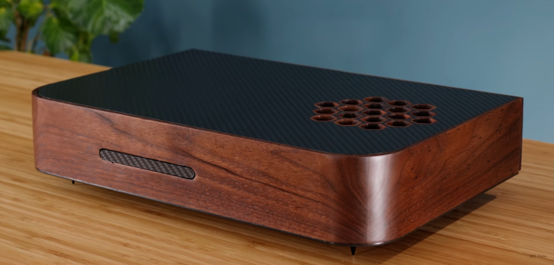
The PlayStation 5 has a very distinctive enclosure that some love and others hate. Its design certainly does not lend itself to lying on its side, even though this is a more practical orientation for putting on a shelf in a TV console. [Matt] from [DIY Perks] decided to address this and built a custom wood and carbon fiber PS5 enclosure that looks good in any orientation.
He started by disassembling his PS5 and taking out only the main electronics unit, fan, and power supply. These were mounted on a carbon fiber baseplate using hexagonal threaded standoffs. The sides of the enclosure were constructed from dark walnut, with holes cut in the front and back for connectors and airflow. A long recess was cut in the front hole and covered with an ingenious carbon fiber cover which opens if you press it at one end and acts as the power button if you press it at the other end.
Matt paid close attention to the airflow routing of the original enclosure and copied it to the new one. Like the original, he used adhesive foam strips to direct the air through the heat sinks. The top cover is also carbon fiber, with an elegant honeycomb hole pattern with wood inserts for the air intake.
This is not [Matt]’s first custom PS5 enclosure. The other was a significantly more flashy brass incarnation of the original. Other custom enclosure he’s made include a wood PC case and a brass encased USB-C monitor.


Ewwww. That’s my reaction to the original case, not the wooden one. I know everyone hates a plain beige box these days but I’ll take one over something so awkward as that any day.
The wooden case is beautiful!
I’m not as into the carbon fiber bottom though. I’d go for metal so it acts as a ground plane. Also not sure about the recessed ports. My experience is that however wide your recessed area is you will always find an accessory with a plug that is just a little too wide to fit!
The sponsored dark plates at the end are kind of cool. They do make it look better. Still though, they don’t change that awful shape and the problem isn’t really fixed until that shape is gone and forgotten.
Agree on the recessed, although hopefully you wouldn’t end up with all that much plugged into a PS5 (HDMI, Power, Ethernet, maybe an optical if no audio over HDMI).
Similar situation with some of my Dell monitor stands – Have to grind off the ferrules to get them to stick through the slot in the stand!
Some carbon fiber is conductive and in theory it might provide some ground-plane functionality.
The dreaded self adhesive foam strips, yuk! The goo and or crumbs of these are an abomination.
First the pros… There are many. This is a breathtaking cabinet build. Absolutely beautiful, and it evokes the “fine furniture” ethic previously expressed in 1920’s or 1930’s radio manufacture. One of my favorite stylistic features is that intake vent with the hexagonal ports. (You might consider gluing a piece of aluminum window screen inside, though. Stuff WILL fall in those vents. What stuff? I don’t know… the stuff that always manages to fall into an upward-facing vent under suction.
The cons… Two things:
Because of the moment arm, I expect the port cover hinge to be broken the first or second time it is ever used. The port cover should have been widened a bit, and the hinges placed on the top horizontal edge (instead of the single vertical hinge.) A top horizontal hinge arrangement would not only be a lot stronger, the cover would be self-closing.
The one fail in this design are those spiked feet! WTH? No useful friction with the surface on which it sits, and guaranteed scratches on any nice surface you place it on. Four black rubber stoppers would have made MUCH better feet… They’re black, stylishly tapered, provide non-scratch footing, friction, and sufficient compliance for damping, so that fan noises aren’t conducted into your shelving/entertainment cabinetry.
Finally, while I don’t find the use of carbon fiber aesthetically offensive here, kc8rwr ‘s point is well taken. Metal sheet might offer some electrical shielding and, in fact, another heat-exchange surface.
All in all, this project still gets an “A” in my book.
I don’t get the hate for the design. You stare at the TV when you’re playing games, not the console. Who cares what the console looks like?
The weird shape is to prevent kids and other items on the shelf from obstructing airflow. Rectangular shapes like those used with Xbox are prone to overheating because kids have a tendency to leave toys, food, drinks, etc. sitting on top of whatever flat surfaces are nearby while playing, they don’t realize the console needs good airflow to function. An awkward shape like this prevents anyone from using it like a shelf, so you’ll have far fewer cases of overheating caused by misuse.
Please bring down the kids from the shelf!
Funny to have so many modding project around a PS5 while it is difficult if not impossible to get one for the moment.