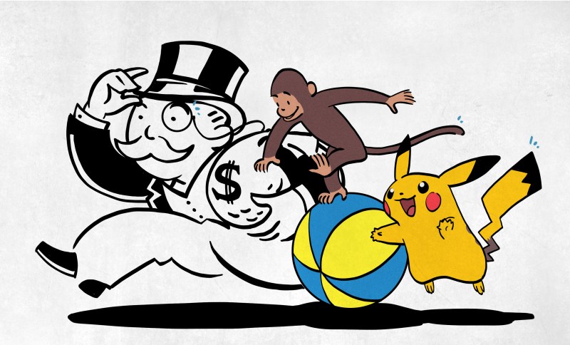
Pop quiz, hotshot: does the guy on the Monopoly box (standard edition) wear a monocle? Next question: does the Fruit of the Loom logo involve a cornucopia? And finally, does Pikachu have a black-tipped tail? If you answered yes to any of these, I am sad to say that you are wrong, wrong, wrong.
So, what’s the deal? These are all examples of the visual version of the Mandela effect (VME), which is named after the common misconception/mass false memory that anti-Apartheid activist Nelson Mandela died decades ago in prison, despite leading South Africa in the latter half of the ’90s and living until 2013. Many people even claim having seen TV coverage of his funeral, or say they learned about his death in school during Black History Month. The whole thing has VICE wondering whether CERN is causing these mass delusions somehow with the LHC.
The more attention VME gets, the more important it seems to be to study it and try to come to some conclusion. To that end, University of Chicago researchers Deepasri Prasad and Wilma A. Bainbridge submitted an interesting and quite readable study earlier this year purporting that the VME is ‘evidence for shared and specific false memories across people’. In the study, they conducted four experiments using crowd-sourced task completion services.
Experiment One: Characterizing VME
First, the team generated sets of images using forty different image concepts (e.g. Pikachu-the-idea and not surprised_pikachu.jpg or some other specific image). Of these forty, six of them had already been casually reported to elicit VME — including C3PO, the Fruit of the Loom logo, Curious George, the Monopoly Man, Pikachu, and the Volkswagen logo. The rest were image concepts like the Bluetooth icon, Hello Kitty, and Bugs Bunny.
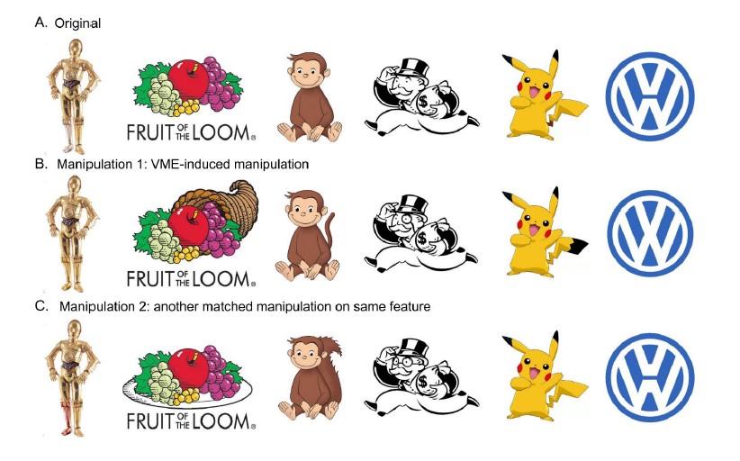 Then they made an image set comprised of three images of each concept — one unaltered, and two manipulated in GIMP. For the six VME-inducing image concepts, one of the altered images represented the reported VME version.
The participants were instructed to choose the canonical image from the set. In addition, they were asked to rate their familiarity with the image concept, and estimate the number of times they’d encountered it in their lifetime.
The team determined that for an image to exhibit VME, it must have five characteristics:
- a low ID accuracy (a lot of people make that same mistake)
- there has to be a specific incorrect version of the image that is being falsely recognized (everybody agrees it’s a cornucopia in the Fruit of the Loom logo and not an alpine horn, for example)
- the incorrect responses must be highly consistent across people
- the images show low accuracy even when rated as familiar
- responses on these images have a high incidence of being confidently incorrect (everyone is sure that Pikachu’s tail is black-tipped)
Their results suggest that people are just as likely to commonly mis-remember the same images as they are to correctly remember the same images. What’s interesting about Experiment One is that they picked up a seventh image concept that people commonly misremember: Waldo of Where’s Waldo? fame carries a simple brown cane, which people frequently forget about when asked to draw Waldo from memory. The team labeled these seven images as ‘VME-apparent’.
Experiment Two: Understanding the ‘V’ in VME
Here, the team tried to understand why the VME-Apparent Seven do what they do — induce a memory that is specific, shared, and false. They tested the study participants’ attention and perception using a program called MouseView, which is analogous to eye tracking.
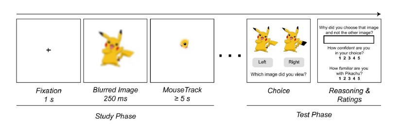 The participants viewed the canonical versions of the VME-Apparent Seven one at a time on a computer screen. Each 500×500 image was obscured with a white overlay, except for a small aperture (5% of the viewing window) that moved with the mouse — move the cursor around, and you see a little bit at a time.
Before seeing each image with the overlay, the participant was shown a blurred version of the whole image for 250ms in an attempt to imitate the way people take in the gist of an image at first, and use points of visual interest to guide further inspection. Then the team created a map of the points where participants fixated.
In the testing phase, the participants were shown the canonical image and the VME version and asked to choose between them. Surprisingly, many people chose the VME version to indicate what they’d seen during the trial.
Experiment Three: Quantifying VME
In the previous experiment, the team found no link between inspecting behavior while the canonical images were overlaid with white and false memories. But they believe it’s “possible that these false memories were caused by differences in the accumulated viewing experience of the cultural icons over time.” They don’t show C3PO’s legs that often in the films, so it seems reasonable that a large group of people would mis-remember both legs as being gold.
 Another explanation of course is that they’ve been exposed to the VME version of C3PO given the nature of Internet phenomenons and the fact that the Mandela Effect has been covered in the media.
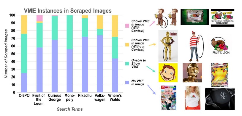
In order to quantify the weight that VME versions have on the public, the team auto-scraped the top 100 images for each of the VME-apparent concepts from Google.
They separated them into three groups — those that don’t show the VME because it isn’t there (e.g. a head shot of C3PO), those that show the whole but have no VME element (a full-body shot of ‘3PO showing the silver leg), and those that show the whole and do contain VME manipulation.
The results of people’s natural experiences varied widely among the seven image concepts. For one thing, most of the images of C3PO (51%) don’t show his legs, or do show the VME (24% have two gold legs). The number of Waldo and Volkswagen images showing VME where substantial, but not as high. Most of the rest do include the full figure, but lack elements of VME. Here, the team concluded that VME can occur even though a person has extensive experience with the canonical image.
Experiment Four: Testing for VME
 Lastly, the team tested the power of VME across memory paradigms as encountered in the first three experiments. The first two tests were visual, but the team proposes that a stronger test would be to see whether people produce VMEs without prompting. So this time, they had participants complete a web-based drawing task to see if VME occurs during free recall.
First, the participants rated their familiarity with an image concept on a scale from 1-5. People with scores less than 3 where shown the correct image for three seconds. After a one-second delay where a white screen with a fixation cross was shown, they were to draw the image from memory, spending as much time as they wanted, but with a minimum of two minutes.
People whose familiarity was ≥ 3 were asked to prove it by drawing the image from memory under the same time frame, but without seeing the image for reference at any point.
In long-term recall, C3PO, Waldo, Curious George, and Volkswagen had the highest instance of VME error in the drawings. If I may interject and defend the participants a bit — most monkeys do have tails, which suggests that Curious George is either an ape or a Barbary macaque. Since drawings from both short-term and long-term recall exercises include spontaneous VME errors, the results suggest that VME is not only an error of recognition, it can also be conjured during recall.
So What Does It All Mean?
We already knew that human memory is often unreliable, but this is usually held up in the context of eyewitness reports of events that people saw occur only one time. To study the impact of false memory among so-called image concepts that we all feel so intimately familiar with is certainly important, and quite interesting to boot. We wait with bated breath to see how the Mandela effect mutates over time, both in the standard sense and the visual.
Speaking of the visual: could you draw the Jolly Wrencher from memory? We mean accurately, of course. Try it, and let us know how you fared in the comments.


There’s an easy answer for the C3PO leg… most of the first film he was stumbling around in the sand when we saw his legs so silver leg was reflecting sand, which made it look gold just a bit off shade from the other leg. Then also the initial ranges of toys, they didn’t make his leg in silver, he was gold all over.
Also I’d argue that the VW symbol thing is due to previous iterations of the logo in chrome, as kept alive in popular culture though the beastie boys etc, did not show the V and W separation very distinctly unless the lighting and shadow was right. Even in large expressions like on the front of a “bus”
https://www.2040-cars.com/_content/cars/images/2/72402/001.jpg
Agreed I think these all have simple explanations. The Fruit of the Loom logo just reminds everyone of a cornucopia, and I bet many people are confusing Thanksgiving decoration memories with the company logo. Waldo is often drawn very small in the books and it would be easy to miss the cane against the background – it is much less visible than his brightly colored clothes. Pikachu’s tail coloring is just mis-remembered as matching his ears, or we just like to add detail… Perhaps the monopoly man looks a lot like the Planters Peanut man?
I think most people would be pressed to tell you what the Fruit of the Loom logo was without some sort of prompt.
Just take ’em off and look. xD
Heh, I just picked up a pair, had that “tag free” monocolor printing on them… the logo is such poor quality that you could say it was a cat sleeping curled on a pebble beach, or a donut on a bed of caviar.
Maybe this is influenced by when you were born, and what logo was used at the time. The Fruit Of The Loom logo from the ’60s and ’70s had brown leaves in the back ground, which I’d thought was part of a basket. This wasn’t changed until 2003 when the leaf color was changed to green:
https://blog.logomyway.com/fruit-of-the-loom-logo/
But yeah, the fruit arrangement looks like it would for a cornucopia or fruit basket.
Although, why would researchers expect people to remember every detail of a corporate logo? The VME logos in the examples are very close to the original, and the original logos look close to common icons in society. A pile of fruit representing harvest. A caricature of a rich upper class white man (often depicted with a monocle) who’s probably going to con you. Why should people have an exact recollection of these logos, rather than just an approximation, or just a reference to the common icon it was based on.
On the other hand, if people had perfect recollection of corporate logos, I would be (even more than now) greatly concerned about the effect advertising and marketing was having on people. Maybe it’s a good thing we don’t remember these perfectly.
As for Nelson Mandela, that’s more important than some random corporate logo, sad that people forget he became President of South Africa. Although I do remember in 1988 there was a lot of news coverage when he fell ill and was hospitalized. Perhaps to some people the living/dying outcome for Mandela is as unimportant to them as the monocle on the gentleman-aristocrat-conman icon.
Ok great. I was worried I was having VME. (My comment was actually posted yesterday, and only showed up today…).
I had a shirt with the cornucopia logo – because it was a fake bought from Estonia.
I would love to see a picture of that tag.
It wasn’t a tag, it was a print on the chest of a sweater.
Maybe technology has a role in VME. For example, I’d written a reply to this post, which looked like it was successfully posted, but now there is no trace of it. Maybe I wrote it, maybe I never wrote it and just imagined I’d written it.
There are plenty of other products/systems that treat factual artifacts (comments, emails, chats, etc.) as something that is disposable outside of the users control. I can’t help but think this has an impact on how the human brain recall information.
Also, the Volkswagen logo changed every few years (with the chrome versions from maybe 15 years ago being “fatter”) – and the test even displays an incorrect version as the “original”!
Have a look here: https://www.tagesschau.de/multimedia/bilder/vw-805~_v-gross20x9.jpg – the perspective makes the gap between the V and the W hard to see, but you can still see that the W does *not* touch the circle at the bottom. Yes, that’s the correct version after the latest change in 2019.
Pokemon fans know which tail is correct for a Pikachu. The tail the only way to tell a male from a female.
“The tail is the only way to tell a male from a female.”
Yes. But that wasn’t always the case.
Originally, in the 90s, both had the same tail.
The heart shaped tail wasn’t popular until the mid-late 2000s, afaik.
At the time, if memory serves, they introduced that show element in the games were Pokémon could attest beautiy contests etc.
That being said, it’s hard to prove such things these days.
Best is go back and read scans of old magazines, watch un-altered VHS copies of the anime etc.
Maybe the classic ’98 episode “Legend of Surfing Pikachu” can help, too.
Here we met Puka, an aged Pikachu with blue eyes and an ordinary tail.
But since there’s a moment (-that’s what I remember, at least-) were Puka watches the sunset with Ash’s Pikachu in a romantic moment (both sitting side by side and touching tails), it’s possible that she’s a female. Of course, that’s just a hint. Maybe Puka’s also a kind-hearted male, nothing wrong with that, either. I’m glad this is wasn’t really explained yet. A bit of mystery still beeing there is always nice, adds to the charme.
Surprising though that black tail with yellow tip isn’t more of a thing, since on original GameBoy it looked like this…
https://cdn.themis-media.com/media/global/images/library/deriv/1292/1292581.jpg
There used to be different art styles, I recall, which makes this matter very difficult. 😅
I vaguely remember Pikachu with yellow cheeks, at some point, even. I think that was used in the art work of the early Pokémon cards (Trading Card Game).
Especially the early Japanese editions (“Green” edition) differed greatly from the western Red/Blue editions we knew and loved.
Pokémon Yellow Edition upgraded the graphics again, making them more consistent with the Anime.
Yellow also was the first one to support the Gameboy Colour (in addition to SGB). The previous games had Super Gameboy support only (allowing for a limited colour palette of ~12 colours vs ~50 of the GBC).
Btw, Mew was drawn in at least five different ways, I believe. The Manga art had Mew depicted with a white body/pink paws and a pink tail tip. That was the old style by Sugimori, I think.
https://pokemondb.net/artwork/mew
Fanart with that art style:
https://www.deviantart.com/minidragonfly/art/Mews-playing-in-the-sky-832524033
This is no big surprise. If anyone’s interested, I can recommend the paper “The magical number seven, plus or minus two”. It’s an easy read, and quite surprising.
http://www.u.arizona.edu/~fiala/readings/Miller,%20George%20(1956)%20-%20The%20Magical%20Number%20Seven,%20Plus%20or%20Minus%20Two.pdf
As an example from the paper, humans can perfectly distinguish between 5 tones, whether it be in a low register (low end of a piano) or high register (high end). You might think that you could combine the two and distinguish between 10 tones, but the channel capacity of human auditory perception is 5, so when you combine the tones the human makes many mistakes.
Humans recognize things in terms of what they’re familiar with. Memory is a “descriptive distance” from what we already know, it’s the reason why certain optical illusions work, such as this one.
https://openclipart.org/detail/217727/triangle-optical-illusion
It’s basically that your mind is evolved to compensating for noise and occlusion by filling in details you already know. This is useful because minor differences in things usually don’t matter.
The human brain has a set of low channel capacity inputs, and relies heavily on what it already knows.
Why blame CERN and the LHC?
Fluoride in water is much more prevalent.
B^)
Chemtrails FTW! ;-)
5G windmills that spray vaccines
Don’t give them any ideas!
B^)
If I had to guess, it’s because the smashing of atoms has scrambled the multiverse and we now live in an alternate reality with an altered history from what we actually experienced.
Good point!
And jurists give a lot of weight to eye witness testimony.
(sigh!)
Besides, everybody knows C3PO has a red arm!
But which arm?
B^)
I’m always amazed by how much discussion the Monopoly guy’s monacle seems to get. Is it really that odd that most people don’t spend the effort to minutely memorize the details of cartoon characters or corporate logos, and when presented with a reasonable facsimile would agree “yeah, sure, that’s Curious George” ?
I used to have two cats that were almost identical. I could tell them apart with no problem but I didn’t find it amazing that other people could be fooled if I pointed and said “You’re holding Oscar, right?”
Also with any symbols and logo that have been around so very long and used many many times you do get variations on the theme even from the ‘official’ source, for instance the VW logo often appears on their vehicles in chrome not blue as a 3d sculpture of sorts with varied scale and line thickness to suit the vehicle and is often printed in black on all their paper work it seems… In the case of animated stuff and comic books perhaps its because the series has run on long enough all the original artists are dead/retired, or they just got so damn bored of drawing basically the same thing time and again there is a shift in the art style.
So any reasonable facsimile can really quite easily be a version of the ‘real’ thing, as its not some one off monument so unique when you look at it you know exactly which one it is – even things like the Eiffel tower a nearly entirely pointless vanity structure are replicated or paid homage to in many other similar towers that without context or true expert knowledge you won’t know for sure…
Yeah!
Yes too, that logos “evolve” ,
Who would guess the Bosch logo was originally an electric motor,
or that Hitachi’s logo was originally a super posed man and sun.
Bosch logo is based on a magneto, or better a cross section thereof
I can recall numerous incidents where I was confused by similar things or similar people, and couldn’t tell them apart until I saw them together and could note differences. I think memory works in a top-down fashion, recording enough detail to make the subject distinct in context. E.g., C3PO is recognizable without looking at his legs; and the striped shirt and tasseled hat is enough to recognize Waldo, so no need to look for a cane.
In the Netherlands, we got a new model of voting booth after an exceptionally long period where noone voted. Everyone questioned why the new model did not have curtains, as everyone remembered the old model to have had curtains. A history programme dove into this and did not find that we ever had curtains on voting booths. This question since reappears almost every voting opportunity: where have the curtains gone?
People have a better memory of booth they saw on TV shows than of the real thing.
VME = Visual Mandela Effect
(Was not clear to me from the article what VME actually stood for.)
Ah, I see. I always think of Virtual Mode Extensions when I read VME. That’s an enhanced form of V86, a sub mode of x86 processors by Intel.
You know, the kind of VME which AMD’s Ryzen CPU has messed https://en.wikipedia.org/wiki/Virtual_8086_mode
Anyway, that kind of misunderstanding happens very often when using acronyms without considering international readers.
For example, RAF is often associated with Royal Air Force.
But in Germany (esp. former West Germany), it brings back bad memories of Rote Armee Fraktion (Engl. Red Army Fraction), a “terrorist” group.
I was thinking bus actually.
https://en.wikipedia.org/wiki/VMEbus
#metoo!
I remember the Sun 3 and 4 models having VME.
Sun even supplied a small standard bit screwdriver with an Allen wrench on the opposite end. The screwdriver helped remove the AUI and Serial connectors from the card and the Allen wrench helped remove the card from the cabinet.
Cool, that’s new to me. Thanks for your reply my friend! 😃👍My father used to work with “Europakarten” (Europa cards) installed in Z80 systems many years ago. It seems to be a partially related to VMEbus, at least.
https://en.wikipedia.org/wiki/Europe_Card_Bus
initialisms.
acronym implies it sounds like an existing word.
I spent about two decades in various technology roles where I had to communicate various technologies and their use case to people who had zero experience in anything technical at all. I would try my best never to use short hand, and I got really good at identifying the slight changes in their face when I’d mention a word or phrase they did not quite understand. At that juncture I would go further into the specifics.
I agree, just as you said, such shorthand can have different meanings depending on locality or depending on which wheelhouse you are speaking in. The use of shorthand should only be employed after it has been clearly defined for the purposes of said communication. You see this in properly written papers and articles.
Try being a physician and scientist. Not downplaying missed acronyms in tech fields but when it’s medical decision making it can be a disaster. Obstetricians are absolutely the worst at impenetrable acronyms and yeah, I have no problem calling them out specifically.
That’s “Faction”. =]
Platonically speaking, these VME images were drawn incorrectly when they were produced and trademarked.
our group consciousness is setting the record straight.
+1
the one that got me a while back was the berenstain bears.
There are copies in existence with both spellings. https://imgur.com/ApeMOxF
As MaMa Bear says “Things are not always as they seem”
http://www.qrz-jesus.com/docs/0007_PaPa_Bear_Bernstein_Arkancided_!_Berenstain_Bears_Mandela_Effect_solved.html
BTW: Though it is 40+ years old, I have the FIRST google review of “the American Bridge” where I commented on it’s well known mandela construction. Because I commented after I saw it pop up.
Thanks to me, while I saw it being created when doing some slight genetic research related to the Bible, you now have the first bat (hammerhead) in history that honks :-D because I asked google stupid bat questions such as “what sound does it make”. So, the question really is do YOU remember bats with six plus foot wing spans, so big they had to be held up by two men, with personal parts the size of baseballs.
Being a technical guy, maybe you can appreciate what the ACTOR called Hillary help do to PaPa bear and why. The guy that worked on the Blackberry video was killed to.
did someone let googles latest chatbot loose in here?
LOL!
Holy hell. I just went down the rabbit hole that is your website. I’m at a loss for words. I mean no disrespect but the irrationality of your thinking is frankly fascinating to me. And the depths you’ve gone to document it and make your case…your dedication to it. It’s like you’ve supplanted reality and replaced it with an all-consuming fantasy world of your own construction. Again, no disrespect here. I’m just genuinely curious. Would anything convincing that the “Mandela effects” you claim are fictitious? What do your friends, family, coworkers, etc think about your beliefs? Have you ever been professionally diagnosed with any mental health problems?
Hey, I’m crazy too. We’re all crazy, right? I’m just trying to understand your brand of crazy.
I swear I saw some animation where the Monopoly guy puts on a monocle. Real or false memory?
Or am I just confusing him with Mr Peanut?
McDonalds commercial for their Million Dollar Prize?
I’m thinking he appeared in The Simpsons, but maybe another cartoon. A monacle might have made it parody rather than infringement.
Regarding C3PO, for most of his screen time, you see only his upper body. It’s rare to see his full body clearly. Even when there are such scenes, you’re usually not paying attention to his lower leg. Except for that one scene, where he’s standing on his silver leg and holding the other one in his hand, complaining about being in pieces.
If I ask “does the guy on the Monopoly box (standard edition) wear a monocle?” you will start thinking about monocles. Can you see what the real (pink elephants) psychological phenomena is?
+1
Why?
How do we know this is a scammer? (Maybe you are!)
Maybe you are trying to harass someone and want us to be accomplices.
Who are you?
I thought it was the MEDULLA effect?…
Reading this article and the comments makes me hungry. Time for a bowl of Fruit Loops. ;)
That effect was discussed in one of the funniest X-Files ever, “The Lost Art of Forehead Sweat.” Fox Mulder from the conclusion of that episode, “So, that’s The Truth? We’re not alone in the universe… but no one likes us?”
The obvious answer for this is that we are actually correct about what they originally were, but then the Ministry of Truth changed history so we all think we were wrong. VME is just the explanation they came up with to explain it to the masses. George Orwell warned us about this.
An interesting follow up to this would be to test if Stable Diffusion or any of the other AI image generators include these mistakes. I bet they would, given that they’re trained on image sets pulled from the internet.