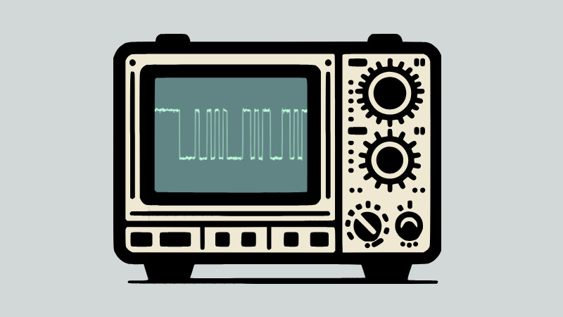
When it comes to novelty typefaces there is no shortage of weird and wonderful fonts to be found when you have finally tired of Comic Sans. Everything from bananas forming letters to Wild West saloon lettering can be yours, plus of course our favourite, the embossed Dymo label. But there’s a new kid on the novelty typeface block, and for us it sweeps all before it.
Scopin’ Sans is as its creator [Guy Dupont] calls it “A typeface for hardware people”, and its party trick is that it doesn’t produce letters. Instead it forms an oscilloscope trace that displays what it would look like as serial data. Instantly your text jumps straight to 1337, and you win the internet.
We have shamefacedly to admit that we don’t know binary ASCII by sight, so we’ll have to take his word for it. But for the curious there’s a demo from which you can amuse yourself creating traces, and if you can’t recognize serial ASCII then the chances are few of the people around you can either. We take our hats off to [Guy], and it’s something we’re sure we’ll use at some point to delight and confuse our friends. It’s not the first font we’ve brought you, here are some more if you come from the bitmap era.


This is my kind of humor. I love it!
Bought to you by the thought process that gave us Morse code for the deaf and floodlit sundials
morse works just fine with light…
I believe there’s a half phase delay of doing / publishing this. It ain’t April yet.
Joke aside, this seems like it could actually find potential use for documenting bit patterns.
I was thinking the same thing, JR… no need to take an actual scope shot, but very useful for writing instruction manuals, tutorials (school lab writeups would be cleaner!), etc.
These fonts are useless for documentation, for at least two reasons: you have to distribute the fonts with the documents and the waveforms use the same code points as the base latin alphabet, which machine translation and text-to-speech will interpret just like normal text. Older readers might remember the confusion brought up by using Greek letters from M$’s Symbol font. Unicode provides Private Use Area code points to fix that. In the real world, a conventional drawing is still the better option.
Just do the right thing for documentation, and make sure you write it all in plaintext.
Maybe as source for something to view it nicely:
E.g. wavedrom in markdown for plain text documentation of waveforms. I’m sure someone has written an extension to render it in html properly. Oh hey: pip install markdown-wavedrom
There’s also tikz-timing for latex. Latex also has bytefield, which also has \bitbox for when you document register bit field layout.
Probably better to write in markdown, use pandoc to get most of the latex, then annotate and process that when (if?) you want it to go to pdf formally.
There are real font for hardware people with wich you can draw waveforms
Timing Font : http://www.pcserviceselectronics.co.uk/fonts/index.php
XWave : http://www.josephpalmer.com/cgi-local/View_Permalink.cgi?entry=2004/6/30/02:31:40:162 (search for xwave)
For xwave open 2004 history and search january, 20
In this case, Scopin’ Serif would be the signal with voltage spikes ?