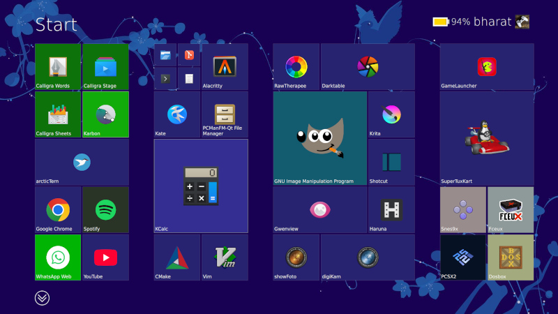
If you were asked to pick the most annoying of the various Microsoft Windows interfaces that have appeared over the years, there’s a reasonable chance that Windows 8’s Metro start screen and interface design language would make it your choice. In 2012 the software company abandoned their tried-and-tested desktop whose roots extended back to Windows 95 in favor of the colorful blocks it had created for its line of music players and mobile phones.
Consumers weren’t impressed and it was quickly shelved in subsequent versions, but should you wish to revisit Metro you can now get the experience on Linux. [er-bharat] has created Win8DE, a shell for Wayland window managers that brings the Metro interface — or something very like it — to the open source operating system.
We have to admire his chutzpah in bringing the most Microsoft of things to Linux, and for doing so with such a universally despised interface. But once the jibes about Windows 8 have stopped, we can oddly see a point here. The trouble with Metro was that it wasn’t a bad interface for a computer at all, in fact it was a truly great one. Unfortunately the computers it was and is great for are handheld and touchscreen devices where its large and easy to click blocks are an asset. Microsoft’s mistake was to assume that also made it great for a desktop machine, where it was anything but.
We can see that this desktop environment for Linux could really come into its own where the original did, such as for tablets or other touch interfaces. Sadly we expect the Windows 8 connection to kill it before it has a chance to catch on. Perhaps someone will install it on a machine with the Linux version of .net installed, and make a better Windows 8 than Windows 8 itself.


Love how you make everyone feel welcome and valued in this wonderful space
This information will definitely change how I handle similar situations going forward
Your work matters tremendously
it is faster than sailfishos gui? or x11 ?
less resources?
hm…..
This post 🔥 touched my heart today in ways I cannot explain
“Unfortunately the computers it was and is great for are handheld and touchscreen devices where its large and easy to click blocks are an asset. Microsoft’s mistake was to assume that also made it great for a desktop machine, where it was anything but.”
Least it wasn’t a Minority Report style interface. Directing the wrong kind of traffic.
The start menu you could opt to just not use, but the bipolar PC settings and control panel was sheer madness. Still is, even after more than 10 years.
You had to wait for 8.1 for any options approaching a normal desktop experience. Or use a 3rd party launcher in the meantime.
This, or Microsoft Bob’s interface?
Microsoft Bob was a masterpiece! fond of some of the other shells like it, too. if I had the time and will, I’d make all my web interfaces like it; I tried it on a public web server for navigating to games and utilities but it was just too much of a trouble to maintain and wound up being the fastest I’ve ever abandoned a rewrite (I think it was live for only maybe 2 months).
Very well presented. Every quote was awesome and thanks for sharing the content. Keep sharing and keep motivating others.
Not a huge fan of the Win 3.1 interface… but… I did kind of skip the whole Metro UI so…
It is kind of amazing that Win95 still is the standard.
That’s because Win95 was designed by a definite paradigm. Everything had a point and a purpose.
Then everyone started to “think outside the box” and make cool shit instead.
Like most Linux distros that tried to borrow elements from macs and windows machines haphazardly without really thinking what it’s supposed to mean. Is a window a program or a document? Should we have two taskbars or one, or something else? Nevermind, we’ll just add virtual desktops and make them into a spinning cube!
That’s my gripe with modern interfaces in general. If you take HMI-101 in univ, the first thing they teach you are cognition models and perception, basically you have to design a user interface (digital or physical, doesn’t matter) for a particular user, and keep the user’s perspective in mind, what info he wants to see, what he doesn’t need right now etc.
Yet when you talk to the average UI/UX designer, they literally have never heard of these terms before. What gives? Where is the pipeline leaking?
If you want actually good user interfaces, take a look at industrial process control software in factories and plants. They are incredibly information dense usually, but still easy to use and everything is clear. Better yet, look at aircraft control panels, they do a lot of cognitive modelling to group individual gauges and buttons together so that they’re easy to recall. Yet simple CRUD webapps have such terrible UIs, I can’t understand why.
The kid who actually got the job didn’t waste time on trivialities – they were too busy hacking away at highly technical problems and gaining expertise in the actual coding.
The people who took psychology and human interface design etc. didn’t do as much actual programming and didn’t become as proficient in it, so they ended up selling you fries.
One notable difference in how it was made: usability testing and iteration. Microsoft hired actual designers rather than engineers to build the user interface, and they quickly iterated different designs with actual users, so it wasn’t just software developers going “This is how I would use it.” or “Here’s how Apple does it”.
https://socket3.wordpress.com/2018/02/03/designing-windows-95s-user-interface/
It’s an interesting read of the troubles and problems they had to solve:
Oh my! 😥 Such users shouldn’t never create a child process!
It was when 2/3rds of the population had never used a computer. People had no idea how anything is supposed to work.
Example: user wants to paste a file into the same folder, so they can then drag the duplicated file somewhere else with the mouse. Operating system doesn’t allow that action.
The action makes sense if you think of the files as physical objects: first it needs to exist before something can be done with it. First you make a copy, then you move the copy. The copy of the file existing invisibly “in potential” is not intuitive. You could try to fight the user over this point and demand them to browse to the destination folder before selecting “paste”, but that’s not helpful. Throwing an error message is the last thing you want to do, because that would be hostile to the user. That will just put the user off by denying their intuitions, and stop them from completing the action.
Solution: let the user do what they’re trying to do – just change the file name slightly so both copies can exist in the same folder.
Eventually they’ll learn better ways to it.
Hm. Sure, in some ways that makes sense, I guess. 🤷♂️
But personally: I don’t mean to be a d*ck, but I never had a problem with abstract thinking,
I thought it was a natural skill of all modern humans.
(I started using a home computer age 5-6, used DOS/Norton Commander and Windows 3 at age 7.)
What I think I do really struggle with is that “thinking down” to the level of the so-called “normal” users, apparently.
Like Marvin from “The Hitchhiker”. And trying it hurts me, just like him.
Interestingly, just recently, I’ve found myself into the situation that I couldn’t understand certain puns or jokes
told by some baby boomers because they were too simple to me to understand.:
It caused me headaches, because my mind tried so hard to detect the clever pun/joke/reference
that was supposed to be hidden somewhere but then it turned out there was none.
Same goes for PCs. I often found the user troubles to be strange and trivial,
because everything perfectly made sense if you were thinking rational, logical, step-by-step.:
All you had to do was to simply see things from the other “person’s” point-of-view – the point-of-view of the computer in that case.
And seeing users failing to do that is just disturbing, scarry.
It’s like watching a person with dementia, maybe. Not funny.
To me, most “normal” users are more and more like this (dude on the right side):
https://www.youtube.com/watch?v=baY3SaIhfl0
That reminds me of 90s memes of the broken “coffee cup holder” aka the CD-ROM drive, by the way.
There were users, probably “normal” users, who seriously put their coffee cups on the CD-ROM drive’s drawer.
Because they had no idea what else that thing was supposed to do. Or so it seems. I hope that was just a joke and not a real “thing”.
Not only does it make sense, not fighting the users lets you evolve the system into something better by following what the users are doing naturally. Some wise guy once said that every system runs better downhill.
There are legitimate reasons why someone would want to duplicate a file into the same folder. They may edit the copy so they don’t destroy the original. Okay, so what’s the quick way to do it? You copy and paste the file into the same folder. That way you don’t need a separate menu option or dialog for it, and it’s already intuitive to the users so you don’t need to teach them another trick.
If you were fighting the idea, you would throw the user an error dialog, and then what? Do you demand them to open up a command prompt and type it out manually, or do you add yet another context menu item that says “Duplicate here…”, just so the user wouldn’t be “abusing” copy and paste? That’s complicating things for you and the users, and everyone’s worse off.
It isn’t. You just don’t remember how it was when you hadn’t learned it yet. Once you’ve mastered a skill, it’s very hard to remember how it was before you had it.
How did it feel like when you couldn’t count numbers yet? Could you always do it?
Yes, but what should that be?
There are different assumptions for how the system can work. For instance, most household appliances are “stateless”. Pressing one button does one thing, and the meaning of the action doesn’t change, so the machine has no hidden modes that you would have to keep tracking to know what that button is going to do. A computer on the other hand can have any number of hidden variables and modes, and a person just sat in front of it with no prior experience cannot know what the computer is or should be “thinking”.
The fact that you know just means you’ve internalized some version of how it happens to work, designed by people who couldn’t think of any better way to do it at the time it was made, which you just took as gospel because you started doing it when you were five.
That’s actually a valid solution: if all the blocks fit in the bucket through the same hole, why seven different holes? Why should you need to put each shape in its own hole? Who made this demand and why? What does it even accomplish?
Recognizing that every shape fits through one cross-section is actually smarter than you give him credit for. It’s looking past the immediate problem and analyzing the situation before acting, which is what “normal users” generally don’t do.
The problem from a computer point of view is, however, that there might not be enough space on the source medium.
Making a “duplicate” requires having enough space.
Good luck doing that on a 720KB floppy disk, when there’s merely 100KB left.
Also, it will destroy data, eventually.
Files marketed as “deleted” will might be overwriten if such a “copy” (a duplicate really) is being created.
That’s why file recovery is never done on same medium.
You boot up using DOS or a Linux live medium to make sure that source medium is read-only.
Then you use a file recovery software to save the files on an USB pen drive or external HDD.
So to me, making a copy on same drive/folder is not logical behavior.
A copy operation involves a source and a target (destination).
In analog world, I would use two audio devices to make a copy, too!
The CD or record player would be the source, the cassette recorder the target (destination).
And then
fsckdecides to fsck with the drive you’re trying to recover 😂 Or some other service decides it knows better and tries to “help”. Been there, had that happen.To perform proper file recovery you should put the drive / thumbstick / NVMe into a forensic write blocker device. Then you can use whatever recovery tools you want. Risk of data getting damaged due to software fault, cosmic radiation or person behind the keyboard suffering a momentary brain fart is pretty negligible.
I wonder, what makes you think you know about me?
Or do you mean us by “you”; “we” as in everyone? 🙂
Anyway, personally, I’ve simply observed things for a while
when I was little and then it didn’t take too long until I’ve found out myself.
There was no lengthy learning process involved, I mean,
it rather was a matter about certain concepts being self-evident through drawing simple conclusions.
Strangely, though, I remember how often I thought that
the grown up people in my surroundings had acted unrational, “childish”, including teachers later on.
Years later when I worked a bit in PC repair field,
I’ve also noticed how irrational certain thinking patterns of users were to me.
More than once I thought they were better off with a Macintosh or a mechanical typewriter.
What me striked the most, though, was how learning resistant users were.
When I was tired, I often suggested them buying a “for dummies” type of book that would explain things better than me.
I even suggested them to consider a Macintosh,
which uses a lot of drag&drop and focuses on mouse use.
Yes, but that’s a different issue not under question here.
Yes, but we’re not marking any file as deleted here. Just creating a copy. Again, a different issue.
Yes, but that’s an entirely different topic.
So, let’s say you have a picture file, and you want to edit it, but you want to leave the original intact. You don’t want to open the original file, in case you accidentally save on top of it. Therefore you need a copy – do you always make the copy on a different folder or drive? Why?
Yes, by necessity because you can’t access the same recording at two different places at once. If you could read and record an audio tape at two different places, you could make the copy somewhere else on the same tape. In fact, the distinction is artificial: if you cut the tape between the copies, it would become two tapes. If you splice two tape reels end-to-end, they become the same tape.
On the computer, the user is presented with a conceptual analog where two files are like two tape cassettes, while the actual hard drive is abstracted as the storage cabinet or the room where those two objects exist. When you’re copying audio from one cassette to another, you don’t wire up the decks into two different rooms, because two identical tape cassettes couldn’t exist in the same room for some arbitrary reason.
I can make some inferences from the way you’re responding. Particularly, you seem to be the type who has trouble maintaining multiple personal points of view simultaneously in the manner of ASD. Such people also have trouble considering their own past self; they are more likely to feel as if they’ve always held their opinions or ideas the same as they are now.
There’s a subtle catch here: arbitrary things may seem self-evident and necessary because you can rationalize them after the fact. The order of operations switch in your memory: it seems like the reason you made up after the fact to explain your action was the reason why you originally did it. This is a mental mouse trap – once you get in, it may be difficult to get out and think from another perspective. Everybody falls victim to this effect to some degree.
Seeing that there’s always multiple ways to do something, even with computers, it’s far likely that you as a 5-year-old simply assimilated the ideas as given and then rationalized them after. That’s the point here: what you think is correct is not the only way to do it, just the way you were exposed to it, and other people aren’t dumb for not automatically thinking the same way.
Of course some methods may be better than others, but that is never self evident without comparison.
The way you do things may be rationalized to make sense, and you may come to believe that it is the only way that makes sense, or the best way, since you have little experience of others – therefore you conclude that any sane thinking person should come to the same conclusions as you. That however is irrational and sloppy thinking without experiment and evidence.
You have to walk a mile in the other guy’s shoes before you can truly understand their pains. The trouble for the kind of person who cannot maintain multiple points of view is that they cannot take their own proverbial boots off, so they end up walking the mile in those and making false conclusions.
What the user sees is, “Stop what you’re doing, do this other thing that requires effort for no direct result, and then you may pick up what you were actually trying to accomplish.”
Learning isn’t a simple matter of “here’s how it works, now learn it.” It’s possible for children because their brains are wired up to soak up whatever ambient information is floating around, but for adults you have to work for it. The person cannot choose to learn something arbitrarily, they must focus and train for a while, repeatedly, before they can retain the skill. If bothering IT is what gets them out of it, that’s actually the better solution – from the user’s point of view. The IT support may beg to differ.
So, every time you ask people to learn something, you’re asking them to risk time and effort for a thing they may not even need. The reason why this seems so incredible is that you already know the result, so it’s difficult to see why someone would refuse it – if you’re ignoring their side of the matter.
Speaking of semantics, that’s a duplicate then, rather than a copy.
A copy always has a source and a target, even if the latter one is in same directory.
– Just like a rectangle can be a square sometimes, but they aren’t the same by definition.
Some more recent OSes do distinguish properly between a “copy” and a “duplicate”.
Mac OS X has them both in context menu to chose from, I believe.
Windows ads “copy of” to a copied file if has a target in same place.
It compensates for the user here, to avoid desaster.
One of the few wise things my teachers said was that “life is a neverending learning process”.
Learning new things never is a waste, it’s part of life.
It keeps the mind flexible, helps to avoid mental illnesses.
Learning a second language, for example, keeps someome young.
Because there’s like a duplicate of vocabulrary, of thoughts etc.
That being said, I’m grateful for our little discussion here, even if we see things a bit different! 🙂
Maybe, maybe not. I’m not sure what to make of it anymore. 🤷♂️
But I forgot to mention, I don’t like to think of others being dumb or something.
In fact, my personality is rather that of a self-critical individual.
I’ve been often double-checking things or wonder if something was my fault or if I could have done better in the past.
Not to my own advantage, but to everyone else. Family, friends etc.
At nights, when I was being sleepless, I often questioned myself how many times I’ve made mistakes.
Still, I’ve noticed more than once that certain people show irrational acting when the evidences or situation prove them wrong.
They did tend blame their surroundings rather than accepting facts and fixing their own behavior.
They called the PC being stupid or said it was broken, when the culprit was something else.
Like for example, the HDD simply being “full”.
Which in turn caused insufficient memory to the swap file and virtual memory.
That’s why programs got slow, unstable and sluggish.
Same happenes to smartphones, when internal storage is exhaused.
Anyway, just saying. I’m not saying they’re dumb;
doing so would be dumb of me (remember to never underestimate your opponent).
I’m no saint, either. I have my flaws, too but I try improve and to become a better person same time.
Not sure if I will ever succeed, but the way is the goal.
It’s just confusing to me why such people don’t approach things logical, methodical.
That’s the 101 of trouble-shooting, to my understanding.
To sit down, be calm and try to analyze situation from various sides.
To me, that’s not about being smart or dumb, not about cognitive processing power per se,
but about a certain mindset or about how to approach things, about being patient.
I wonder if that’s in parts because of my 8-Bit home computer background, also. 🤷♂️
Anyhow, I simply have problems to follow certain thinking patterns that seem “normal” people/users to get stuck so often (those patterns that objectively speaking don’t turn out to work).
While I was kinda able to figure out to think their way (sometimes), it really hurts.
It’s like going through a checklist of doing everything the “wrong” way on purpose.
To give an example, someone had trouble using an USB-serial adapter.
After no success of finding an error, I tried to use my phantasy to imagine the most “stupid” cause. And I hit the nail.
What happened? The “clever” user had wired TX, RX and GND of an RS232 connector to an USB connector.
The adapter was a homebrew solution, that he didn’t tell me about it.
That was never going to work, of course. Voltages and protocol were totally incompatible.
Sadly, during the years, I’ve met a very few people that indeed met the true definition of “stupid”.
Same time, these people had the talent to take advantage of others or make others believe they know what they’re doing.
I wished I’ve never found out that such really people exist (-> see current news on TV, for example).
I’d rather liked to believe that things can’t be that black/white but always have different shades.
And that people have a certain potential and can grow beyond their current limitations.
Again, I don’t mean to blame them for just being themselves.
It’s just that I think it’s sadly hard to deal with such “normal” users if you’re working in support (IT or elsewhere).
Be it privately or commercially.
Because you literally have to harm yourself mentally to get on their level.
It’s a sacrifice that isn’t being valued by others.
It likely also ruins all your previously existing ambititions of working with people/end-users and helping them (with real problems).
In the end, you might be worn out and wonder if there’s something wrong with you for being different, for being not like them.
Again, just saying. These are my two cents, merely. Thank you for your time. 🙂
What is different now?
https://microsoft.design/articles/a-glimpse-into-the-history-of-windows-design/
Translation: “Our bosses don’t bother to read our test reports anymore and just let us do whatever.”
” In the past, design had to prove its value to our business and show how good design positively affects user experience” – that sounds like the way to go, unlike the current mess – where change for changes sake is now the norm.
The system works this way because the management no longer knows what they’re doing. They’ve “inherited” this massive project like a runaway train, so they’re hiring the designers to tell them what’s what.
That’s the “value we bring in”. Not just “Design me a better X”, but “Tell me what a better X is and then design it.” It’s tail wagging the dog – the PM hires the designers to do his job as well as theirs. Of course the designers are going to do whatever fancy trendy thing they want, like it or hate it.
Nearly everyone e in 2026 still freak out when they click on a link in a chat during a Zoom meeting, and think that they ‘lost” the zoom software. Running multiple programs at the same time, even though you can’t see them, is a concept nearly nobody graps.
Yep, and why people using Android phones have oodles of apps and tabs open, re-opening the same web page over and over…
Android doesn’t let you halt processes! It’s like the Zak McKracken aliens have taken over and we’re all reduced to the worst possible denominator.
It replaced Motif standard, I guess. (OS/2 1.2 and Windows 3 were Motif-like, too).
Perhaps it also took inspiration from OS/2 Warp and NeXTSTEP OS?
Anyway, I just remember how PC GEOS copied Windows 95 look&feel pretty soon.
The successor of GeoWorks Ensemble, -NewDeal Office-, used it rather proudly.
https://en.wikipedia.org/wiki/GEOS_(16-bit_operating_system)
Yep, and as the Win95 usability study pointed out:
What’s the main menu feature in Motif? A pop-up menu you get when you click the desktop. The complete opposite of what users found intuitive and useful. That’s why the Start button.
the win2k start menu was about all i ever needed. i really didn’t like that they upgraded it in windows 7, of course that menu kind of grew on me, metro i wasn’t even doing that and i didn’t upgrade to 8/8.1 without classic/open shell.
It sucked at the time but pales in comparison to the ad-riddled nonsense in Win11
What ads? I see no ads in mine. Nor any other “online content” either.
Maybe your just too computer illiterate to change a few basic settings 😂
You’re*
I unironically enjoyed windows 8.1 over windows 11 ui/ux. The original start menue could be enabled if you want, search was still sane, and notepad launched in milliseconds.
Did you use it on a touch screen? I tried out Windows 8.1 on a friend’s desktop and did not really like it. However, the article mentioned that it was a touch focused UI, and for that it was brilliant. I really still mourn the loss of my Windows 8.1 phone. It was a cheap Lumia but launched programs really quickly, the interface had some very interesting descisions that made reacting to incoming messages, calendar reminders etc. really convenient. I would love to have a phone like that again.
The main problem was the lack of supported apps. In the beginning, a number of apps were available, but then they pissed off their devs (again), apps did not get migrated to the new version (because it was a hassle), fewer apps meant people did not buy the windows phone, so people stopped writing their apps for it and the whole system just collapsed. I’m still mad at Nokia and Microsoft for that.
The fullscreen start menu can also be enabled on Windows 10 and I use it like that. It gives me enough surface to add as much shortcuts as I like, and have them organized and easily accessible.
It might have been fine, but Microsoft repeated their usual strategy of ramming it down everyone’s throats with no choice whatsoever. It was a bridge too far in this case. It was very different from what people were expecting and used to.
I personally hated it. The presence of a “desktop” where multiple programs can be “sat down” in their own physical space used side by side makes intuitive sense to me. The lack of it felt claustrophobic.
I manage multitasking on my phone ok, but I still hate it.
“[er-bharat] has created Win8DE, a shell for Wayland window managers that brings the Metro interface ”
But Gnome already runs on Linux and it works exactly the same as Windows 8. All those people that keep complaining that there is so splintering within Linux, I get it now. Two different versions of the Gnome/Windows 8 interface.
Wow whats up with all the bot comments!
This is something i would like IF it was like a display on an AIRCRAFT…. all the touch boxes at the edges out of the main area in centre.
Look at GARMIN thinking, then get it on for a touch screen laptop.
Oh…. Another thing…. We need 3D and desktop zoom controls.