“Good Code Documents Itself” And Other Hilarious Jokes You Shouldn’t Tell Yourself

Code documentation — is there anything more exciting than spending your time writing extensive comments? If I had to guess, your answer is probably somewhere along the lines of “uhm, yes, everything is more exciting than that”. Plus, requesting to document your code is almost like an insult to your well thought out design, this beautiful creation you implemented so carefully that it just has to be obvious what is happening. Writing about it is just redundant, the code is all you need.

As a result, no matter if it’s some open source side project or professional software development, code documentation usually comes in two flavors: absent and useless. The dislike for documenting ones code seems universal among programmers of any field or language, no matter where in the world they are. And it’s understandable, after all, you’re in it for the coding, implementing all the fun stuff. If you wanted to tell stories, you would have chosen a different path in life.

This reluctance has even formed whole new paradigms and philosophies claiming how comments are actually harmful, and anyone trying to weasel their way out of it can now happily rehash all those claims. But, to exaggerate a bit, we’re essentially villainizing information this way. While it is true that comments can be counterproductive, it’s more the fundamental attitude towards them that causes the harm here.

In the end, code documentation is a lot like error handling, we are told early on how it’s important and necessary, but we fail to understand why and instead grow to resent doing it again for that same old teacher, supervisor, or annoying teammate. But just like error handling, we are the ones who can actually benefit the most from it — if done right. But in order to do it right, we need to face some harsh truths and start admitting that there is no such thing as self-documenting code, and maybe we simply don’t understand what we’re actually doing if we can’t manage to write a few words about it.

So let’s burst some bubbles!

Continue reading ““Good Code Documents Itself” And Other Hilarious Jokes You Shouldn’t Tell Yourself”

Forget The Kiln, These Tiles Were Made On A Prusa

Where does your mind go when you think of 3D printed parts? Running off hard to find replacement components? Maybe spinning up a bespoke electronics enclosure? Occasionally the little boat that you can compare to the little boats of others online? All reasonable enough answers. But thanks to the work of [Matthew Wentworth], you might have a new mental image to associate with the smell of melting PLA: decorative Portuguese Azulejo tiles.

As difficult as it might be to believe, the tiles you’re seeing here weren’t made on some exotic ceramic printer, but a standard Prusa i3 MK3. Well, at least they started on the 3D printer. As you might have guessed, there’s a bit more involved than that.

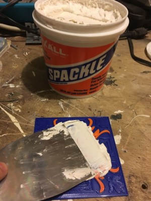
That said, the idea is actually quite simple. The printed “tile” is just the base plate, plus the raised elements that will eventually be seen on the surface. Everything else is just a void, which naturally saves a lot on printing time and material. Once the print is done, premixed spackling paste is pushed into all of the open areas and the top is made as smooth as possible with a putty knife. The filled tile is then left to dry for 24 hours or so.

Once it’s dried, you take the tile outside and sand the top down with a palm sander (or by hand, if you have the patience). This not only smooths out the spackle, but eventually will expose and then smooth the top parts of the print. Once everything is nice and silky, it gets sprayed with a semi-gloss clear coat to both protect it and give it that authentic looking shine.

[Matthew] actually created his designs based on images of real Azulejo tiles he found online, but really any sort of image that has raised elements like this could be made to work. If anyone out there decorates their home with 3D printed Jolly Wrencher tiles, you know where to send the pictures. Interestingly, these aren’t the first tiles we’ve seen made out of plastic, but we’ve got to admit these ones would look quite a bit more appealing on your kitchen walls.

Making A Hammer With Beautiful Engravings

Tools are a key part of any maker’s pursuit of their work. For most of us, our tools come from the local hardware store or are purchased online. Some prefer to craft their own, however, and [Uri Tuchman] is just one such person.

[Uri] starts at the absolute beginning, with a piece of unfinished rectangular stock. The workpiece is marked up, and the shape of the hammer head meticulously filed out by hand. The wooden handle is similarly prepared from raw stock with a combination of planes, chisels and files.

It may not be the fastest way to work, but careful hand craftsmanship is always impressive to watch. The build also showcases [Uri]’s talent at engraving, with the complex designs all carved out of the surface a millimeter at a time. [Uri] recommends enamel paint to highlight such works, for its rich color and the ease of removing excess paint.

Where [Uri] has built a beautiful piece of art that moonlights as a hammer, it’s possible to go in completely the opposite direction with a build. Video after the break.

[Thanks to BrightBlueJim for the tip!] Continue reading “Making A Hammer With Beautiful Engravings”