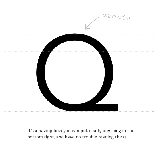
There’s an interesting cultural observation to be made as a writer based in Europe, that we like our sans-serif fonts, while our American friends seem to prefer a font with a serif. It’s something that was particularly noticeable in the days of print advertising, and it becomes very obvious when looking at government documents.
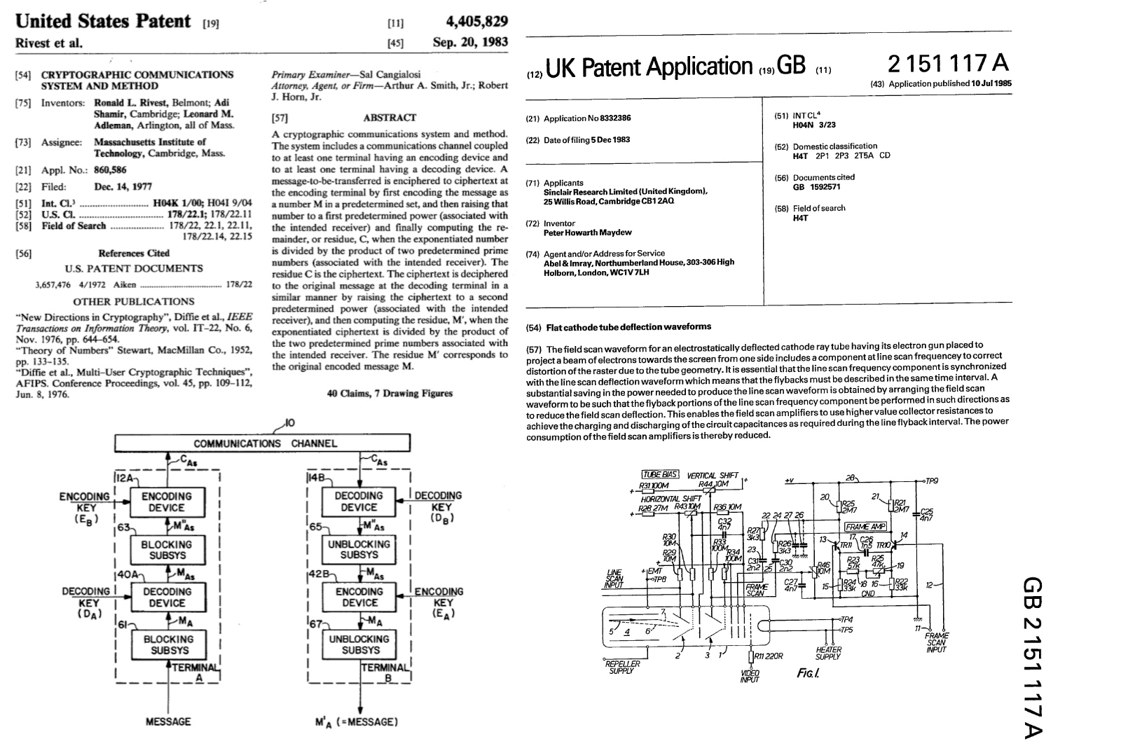
We’ve brought together two 1980s patents from the respective sources to illustrate this, the American RSA encryption patent, and the British drive circuitry patent for the Sinclair flat screen CRT. The American one uses Times New Roman, while the British one uses a sans-serif font which we’re guessing may be Arial. The odd thing is in both cases they exude formality and authority to their respective audiences, but Americans see the sans-serif font as less formal and Europeans see the serif version as old-fashioned. If you thought Brits and Americans were divided by a common language, evidently it runs much deeper than that. Continue reading “Ask Hackaday: What Goes Into A Legible Font, And Why Does It Matter?”