From the banks of levers and steam gauges of 1927’s Metropolis to the multicolored jewels that the crew would knowingly tap on in the original Star Trek, the entertainment industry has always struggled with producing imagery of advanced technology. Whether constrained by budget or imagination, portrayals usually go in one of two directions: they either rely too heavily on contemporary technology, or else they go so far in the opposite direction that it borders on comical.

But it doesn’t always have to be that way. In fact, when technology is shown properly in film it often serves as inspiration for engineers. The portrayal of facial recognition and gesture control in Minority Report was so well done that it’s still referenced today, nearly 20 years after the film’s release. For all its faults, Star Trek is responsible for a number of “life imitating art” creations; such as early mobile phones bearing an unmistakable resemblance to the flip communicators issued to Starfleet personnel.
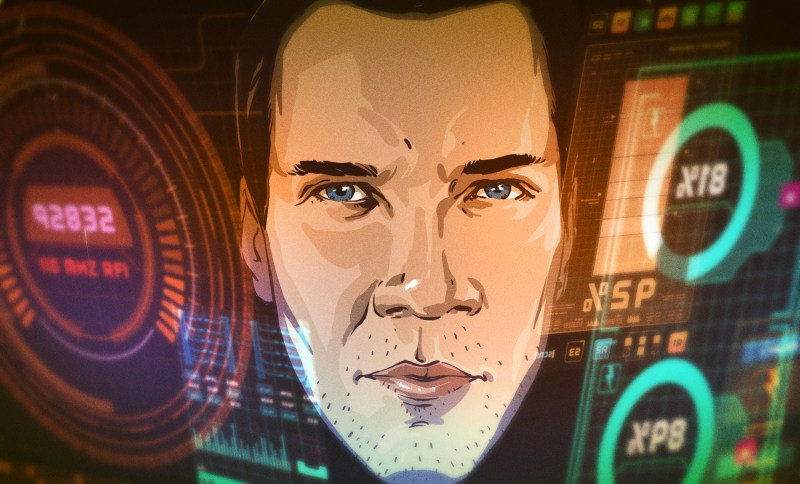
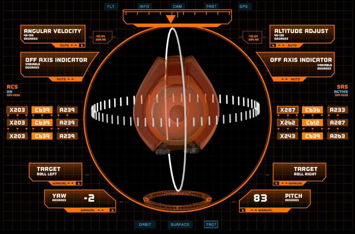
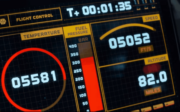
So when I saw the exceptional use of 3D printing in the Netflix reboot of Lost in Space, I felt it was something that needed to be pointed out. From the way the crew made use of printed parts to the printer’s control interface, everything felt very real. It took existing technology and pushed it forward in a way that was impressive while still being believable. It was the kind of portrayal of technology that modern tech-savvy audiences deserve.
It left such an impression that we decided to reach out to Seth Molson, the artist behind the user interfaces from Lost in Space, and try to gain a little insight from somebody who is fighting the good fight for technology in media. To learn how he creates his interfaces, the pitfalls he navigates, and how the expectations of the viewer have changed now that we all have a touch screen supercomputer in our pocket.
Becoming a Playback Designer
You might not recognize Seth’s name, but if you’ve been watching science fiction TV shows for the last decade or so, you’ve very likely seen his work. His IMDb page reads like a list of fan favorite contemporary sci-fi, with his art appearing in shows such as Timeless, Continuum, and Stargate Universe. He’s usually listed as a “Playback Designer”, which is one of those titles that can be hard to wrap your head around if you aren’t in the industry.
Put simply, a Playback Designer creates animations or videos that are played on set. If an actor is looking at something displayed on a computer or TV screen in a show or movie, that’s called “playback” in industry parlance.
When a character needs to be shown using a computer or some other device with a visual interface, a Playback Designer will be tasked with creating the necessary animations and graphics. “My job ends where an on set operator’s starts,” explains Seth, “I hand off my completed video loops or interactive programs to the operator who rigs the set and controls everything accordingly.”
For Seth, it wasn’t an intentional career path so much as something that he stumbled upon after studying design and animation in college, “I’m living in Vancouver, interning at a VFX company where I accidentally fell into playback design and really had no idea what I was doing”. But after his work on Stargate Universe, he started making a name for himself in the industry. “Eventually I became “that guy” who animated UI for TV shows, jumping from studio to studio working on all kinds of projects in various art departments.”
Bringing a Design to Life
When starting a new project, Seth likes to walk around the physical set to not only get an idea of the aesthetics, but to gather technical details such as the size and location of the displays his interface will be shown on. If it’s a particularly complex configuration, such as where multiple displays need to work in unison, he’ll start his design process by sketching everything out on paper to better conceptualize how it will all work together. From there he creates the initial version of the interface in Adobe Illustrator, which he’ll present for approval. Once he gets the OK, he moves onto animating the interface in After Effects.
Sometimes his interface will simply be added in post using green screen techniques, but ideally it will be shown on a real display and offer some interactivity for the actors. It makes the performance more authentic if the actors can actually see and touch Seth’s animated interface. Often the interface can simply loop through a preset animation, but if it needs to be more dynamic there are a few more steps involved, “if script specific story points need to be addressed, they are animated and authored for interactivity in Flash, Director, or Resolume.”
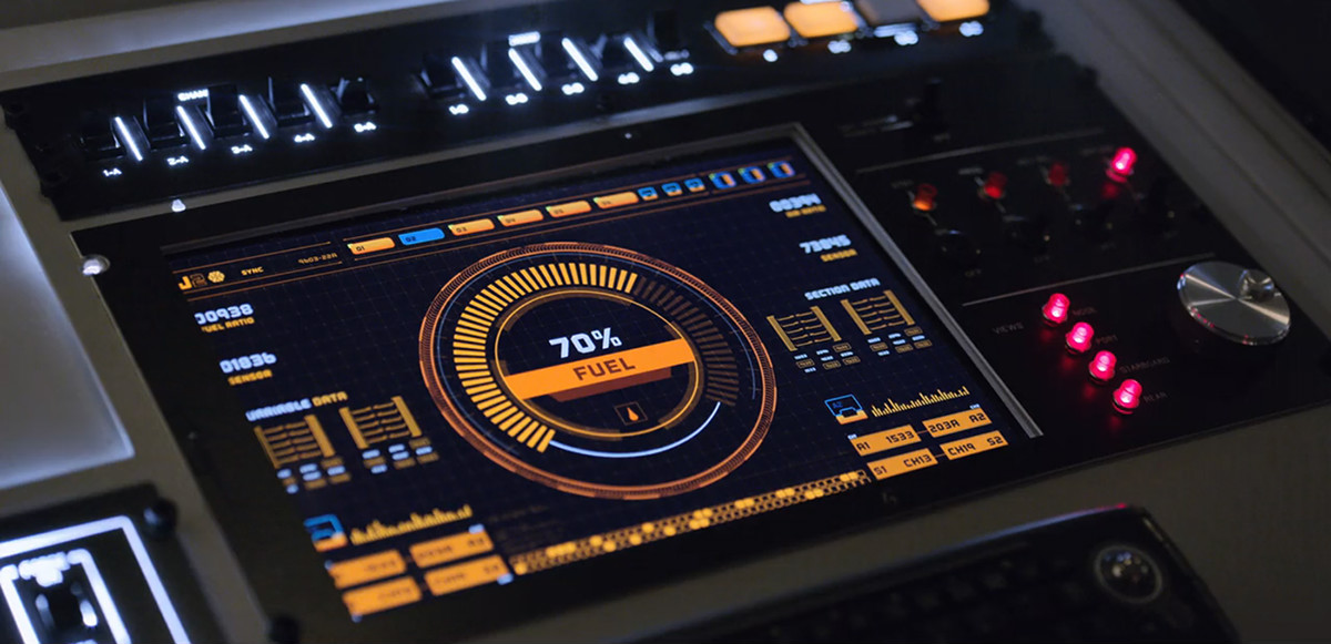
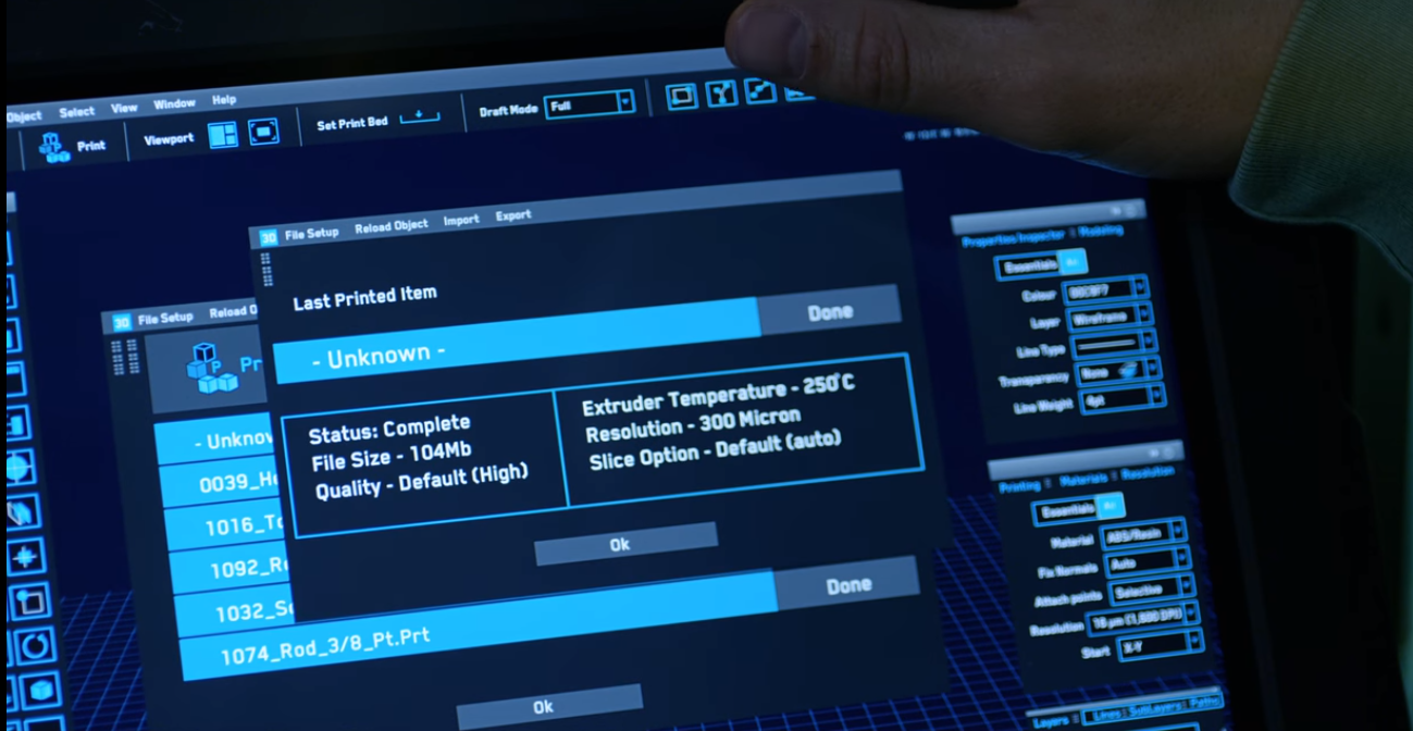
One of the most noticeable details in Seth’s interfaces is the inclusion of plausible numerical values rather than just a scattering of random numbers. It makes for a much more realistic portrayal, and it’s something that he always keeps in mind while designing. Sometimes there will be technical consultants available that he can lean on to get that kind of information or data, but due to cost constraints it isn’t always practical. He often has to do his own research, or personally reach out to subject matter experts. “Sometimes I call up friends who are professionals in their respective fields and ask for advice,” says Seth. “I have a nurse friend I call a lot to make sure my heart rate monitors and medical graphics are accurate.”
This characteristic of Seth’s work is what first caught my eye while watching Lost in Space. As somebody who’s spent quite a bit of time using desktop 3D printers, I was really impressed to see how familiar the interface of the crew’s 3D printer was. Details like layer height and extruder temperature were exactly what you’d expect to see on a contemporary machine, but the interface had a distinct futuristic quality that still conveyed the idea that you were looking at something that was beyond our current technology. All without resorting to “cheap tricks” like random variables or over the top animations.
Viewer Expectations
In the 1980’s when Star Trek: The Next Generation began, they got away with throwing a bunch of colored shapes onto a touch screen, and the audience bought it because there was nothing else like it in their lives. Today something like that just wouldn’t fly; designers and artists are keenly aware that the bar has been raised. But Seth says it isn’t just high-budget productions like The Martian and Iron Man that have raised audience expectations for user interfaces. He says it’s also the technology they interact with on a daily basis, “Companies like Apple and Samsung employ experience designers to make their software/hardware state of the art. You can play A-level games on just about any smartphone now.”
But the viewer’s expectations aren’t limited to slick visuals and smooth animations. When creating a user interface, even a fictional one, it still has to make sense. A viewer should be able to look at the interface and understand what it does and the information it conveys, whether it’s the cockpit of a spaceship or an application on a character’s smartphone. This is especially important if the technology being shown on screen is meant to be contemporary.


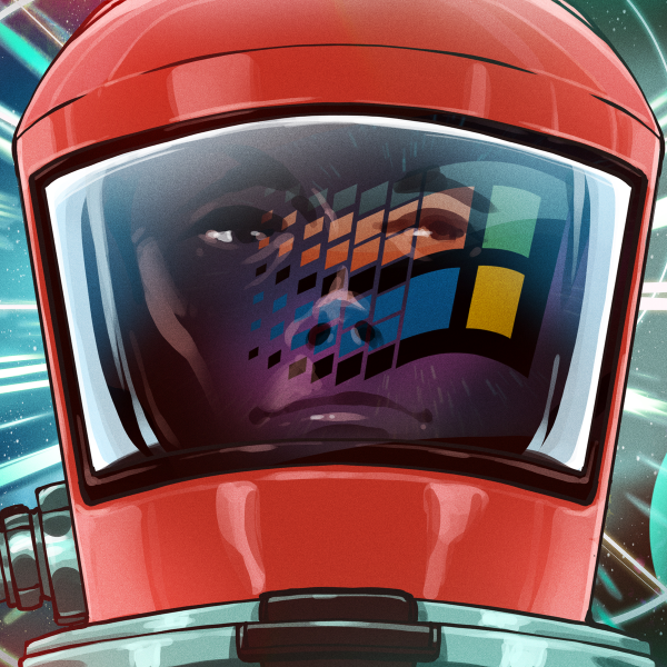
In the film AIR, Seth had to develop user interfaces that mimicked the sort of DOS and Windows interfaces that viewers would identify with. It might seem like this would be easier than creating something futuristic, but it actually brings its own set of challenges. “Real looking UI is generally harder to create because there are boundaries to stay inside of,” says Seth. “When the design is supposed to look realistic, it should mimic real life and the viewer shouldn’t have to guess what the design is all about.”
Avoiding Common Pitfalls
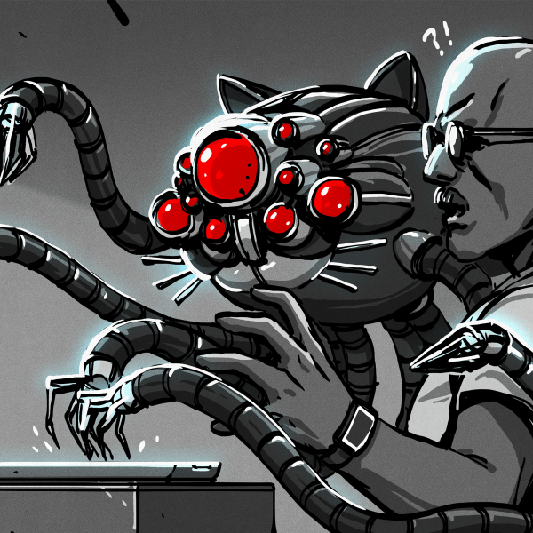
Examples of poor computer interfaces in TV and movies are unfortunately not hard to find. With precious few exceptions, any scene that involves “hacking” usually features particularly groan-inducing visuals. They always seem to have certain elements in common: pointless graphs and visualizations, flashing text, and without fail, lines of source code. For whatever reason, lines of seemingly random source code going down the screen seems to be a common trope to show the audience that some high level hacking is going on.
It’s something that Seth is well aware of, and he actively tries to avoid these clichés in his designs. Though sometimes pressure is put on him to conform to the “Hollywood Hacking” style. “Every director seems to want it,” admits Seth. “I guess it’s a universal way of showing a tech savvy character or technologically advanced set which viewers pick up quite easily.” Though he doesn’t always give in.
Once he was asked by a director to change a straight-forward interface he created into a Matrix-style display of scrolling code and symbols that would be indecipherable to the viewer. Knowing it wasn’t in the spirit of what they had done so far in the show, Seth pushed for the design more in keeping with the show’s style. “The idea didn’t serve any purpose at all and was eventually shot down by the show creator when I asked if this is really the direction we should be going in.”
 That said, Seth does frequently use programming expressions in After Effects to create his interfaces. This gives him the ability to automatically generate animations within a specific frequency or modulation, which gives them a “busy” look without falling into the trap of being truly random. Depending on how abstract the designs need to be, he’ll occasionally take this concept all the way out to generating fractals.
Of course, there are occasions where truly random or “glitched” graphics have their place, depending on the story. For those cases, he’s developed a few tricks to produce interesting visuals without resorting to hokey effects. “There was one show which had a lot of glitching and tearing,” recalls Seth. “So I found an interesting way to break apart the image using a text editor. You can open up the binary encoding of an image and delete parts of it, resulting in a glitched out effect.”
A Promising Future
It’s encouraging to see artists like Seth Molson who are willing to fight against the low-effort representation of technology which we’ve suffered through for decades. It’s not going to be an overnight change, but with audience expectations rising and the budget and production values of even network television programs approaching film levels, it feels like the tide is finally beginning to change.
While it may not be intentional, portrayals of technology in media often serve as a guide for real-world hardware and software of the future. Consciously or otherwise, the artists of today are taking on the enormous responsibility of helping to shape the devices we’ll be using in 10 or 20 years. For Seth, this responsibility is part of what keeps pushing him forward. “It’s a little over the top and very challenging, but I think it’s all part of the fun and gives us a direction to strive for in the real world.”
We’d like to thank to Seth Molson for taking the time to answer our questions and allowing us to use the fantastic images from his portfolio. Seth is currently hard at work on Season 2 of Lost in Space, and is looking to expand his work into content for live events and interactive art pieces.


An article outside the mainstream of HaD.
I like it!
UI/UX are interesting in their own right. Fiction just takes away some of the hand-holding that convention lends.
So…
Has Seth Larson teamed up with Seth McFarlane for The Oroville?
Seth^2
B^)
s/Larson/Molson
Orville has some pretty slick visuals as well. Definitely good time to be a sci-fi fan.
If anyone likes to see different scifi interfaces, here is a collection on concept-art for different films: sciencefictioninterfaces.tumblr.com
Trim that URL to the root and you’ll get some interesting commentary on Jarvis and the Iron man suit.
Do you mean: https://scifiinterfaces.com/tag/iron-hud/?order=asc
Is any of his work available for download?
I’m thinking along the lines of the ST:TNG interfaces/wallpapers for phones and such.
His website has a pretty extensive collection of his work from the different shows/movies he’s worked on. I imagine Seth wouldn’t be terribly cross if somebody picked through there for some new wallpapers.
The STTNG ones are by Michael Okuda, famously known as Okudagrams. Search for that, might find you something, you’re not the only person who likes their design.
I used to read scifiinterfaces.com quite regularly as they offered an interesting perspective on the UI design used in films and tv so it’s nice to read about the process from the other side of the fence
” With precious few exceptions, any scene that involves “hacking” usually features particularly groan-inducing visuals. They always seem to have certain elements in common: pointless graphs and visualizations, flashing text, and without fail, lines of source code. For whatever reason, lines of seemingly random source code going down the screen seems to be a common trope to show the audience that some high level hacking is going on.”
And then we have the Zachtronics games that have to take the same real activity and make it just as attractive, AND functional which fakes don’t.
“Put simply, a Playback Designer creates animations or videos that are played on set. If an actor is looking at something displayed on a computer or TV screen in a show or movie, that’s called “playback” in industry parlance.”
So he doesn’t do Okudagrams?
I’ve done a few “Okudagrams” before. They are still used today actually in different ways. The last one I did was actually etched into clear plexiglass and then lit so the etched parts appear to be floating in the glass. It’s a cheap alternative to transparent display graphics.
Thanks for checking in!
“For Seth, this responsibility is part of what keeps pushing him forward. “It’s a little over the top and very challenging, but I think it’s all part of the fun and gives us a direction to strive for in the real world.””
For those fully sense capable. Now start doing interfaces for those who have different senses, or diminished, or absent senses. Never mind the west POV with things like text being left to right, top to bottom, instead of forward-backward, or bottom-top.
or spiraling outward!
It is not just the “west” that structures text like that. Most cultures start top left, a few top right, and all work downward. Whether it is vertical first then horizontal (Asian dialogues) or horizonal then vertical (western, and most others).
I suspect there is something more fundamental that favors that style, instead of bottom-up, or spiral…
that orange looks like elite dangerous UI. as do most of the reticulated splines.
“…it wasn’t an intentional career path so much as something that he stumbled upon after studying design and animation in college…”
So professionally jealous of that statement. Why couldn’t I have “stumbled” into something like this? Never mind that I’ve no talent whatsoever in design, animation, creativity, etc., but still. (c:
Anyhow, I’m impressed to find out that some of these effects are interactive. I’ve always thought that they’re all added post-production (is that the right term?) or are just preset animations.
In the original Tron, the computer “console” was a platform covered with non-reflective black cloth/felt.
The actors were told to touch the cloth in random places and the artists would draw in the interface later.
Seth, as you expand your artistic horizons, I would be thrilled to see you in the demoscene :) .
Thanks! I’ve never heard of the demoscene. Looking into it!
Nice work, Seth. I think the little details like this do eventually show through.
I’d love to know who worked on the Chariot vehicles for Lost in Space. I’ve tried doing a bit of digging, but there doesn’t seem to be a ton of info out there. If anyone does have any leads, I’d love to follow up on them.
I’m shocked that Flash and Director have not been replaced yet. It’s been 8 years since Flash was deprecated and nothing has really been able to match its flexibility and speed of use coupled with amazing power. Is there really nothing modern that could take its place?
Great, I was always a little bit interested in the background on how and who made all that blinky stuff. But as working professionally also on user interfaces for new fancy laboratory machines, there is always this tension: It has to look a little bit like Hollywoods Idea of “future” technology, while there is a really good reason not to: Since the machines get smarter and we know more and more about ergonomic design we have a huge problem. The future will be a lot easier, less information, not that cryptic fancy stuff. Less is better, meaning more and precise focus. The machine only shows little state information and only what is currently an issue. Everything else is blended out! E.g. take a comparison in modern airliner cockpits now and 30 Years ago. So how we solve this issue?!?
How about the minimalist interfaces of the band’s instruments in the “Space Rockers” episode of Buck Rogers in the 25th Century? With current technology, those instruments could be made real.