A More Conspicuous Computer Assistant

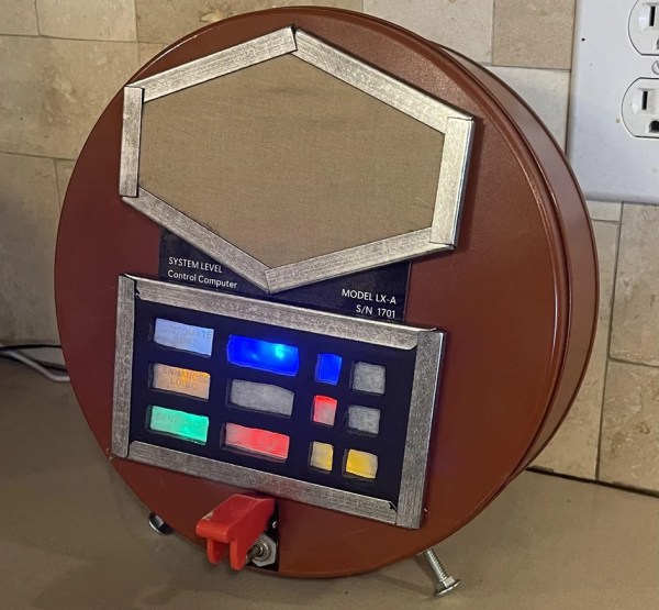
Back in the last century, especially in the ’40s to the ’60s, one of the major home decor trends was to install various home appliances, like the television or stereo, into its own piece of furniture. These were usually bulky, awkward, and incredibly heavy. And, since real life inspires art, most of the futuristic sci-fi technology we saw in movies and TV of the time was similarly conspicuous and physical. Not so with modern technology, though, where the trend now is to hide it out of the way and forget it exists. But [dermbrian] wanted some of his modern technology to have some of the mid-century visibility aesthetic so he made some modifications to his Amazon Echo.

The Echo itself remains largely unmodified, other than placing it inside a much larger cookie tin with some supporting electronics. For that, [dermbrian] found a relay board with a built-in microphone which switches the relay off when it detects sound so that when the Echo is activated, the sound from its speaker activates the module. From there it drives a series of blinkenlights which mimic the 60s computer aesthetic. Some custom fabrication and light diffusion methods were needed to get it to look just right, and a switch on the outside can disable the mechanism if it is getting triggered by background noise like music from his stereo.

While the appeal of this style may be lost on anyone who wasn’t a fan of the original Lost in Space, Star Trek, or Jetsons, it certainly holds a special significance for those who grew up in that era. It’s certainly not the first project we’ve seen to take a look back at the aesthetics of bygone eras, either. Take a look at this project which adds lenses to modern displays to give them the impression of antiquated CRT displays.

Continue reading “A More Conspicuous Computer Assistant”

High-Tech Paperweight Shows Off Working 60s-era Thin-Film Electronics

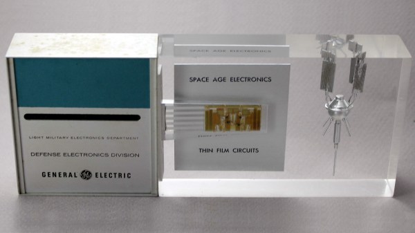
[Ken Shirriff]’s analysis of a fascinating high-tech paperweight created by GE at the height of the space race is as informative as it is fun to look at. This device was created to show off GE’s thin-film electronics technology, and while it’s attractive enough on its own, there’s an added feature: as soon as the paperweight is picked up, it begins emitting a satellite-like rhythmic beep. It is very well-made, and was doubtlessly an impressive novelty for its time. As usual, [Ken] dives into what exactly makes it tick, and shares important history along the way.

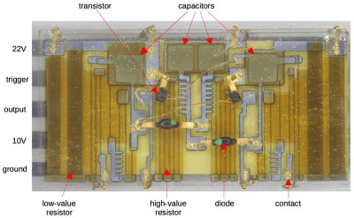
Thin-film module with labels, thanks to [Ken]’s vintage electronics detective work. Click to enlarge.
In the clear area of the paperweight is a thin-film circuit, accompanied by a model of an early satellite. The module implements a flip-flop, and the flat conductors connect it to some additional components inside the compartment on the left, which contains a power supply and the necessary parts to create the beeps when it is picked up.

Thin-film electronics reduced the need for individual components by depositing material onto a substrate to form things like resistors and capacitors. The resulting weight and space savings could be considerable, and close-ups of the thin film module sure look like a precursor to integrated circuits. The inside of the left compartment contains a tilt switch, a battery, a vintage earphone acting as a small speaker, and a small block of components connected to the thin-film module. This block contains two oscillators made with unijunction transistors (UJTs); one to create the beep, and one to control each beep’s duration. The construction and overall design of the device is easily recognizable, although some of the parts are now obsolete.

If you’d like a bit more detail on exactly how this device worked, including circuit diagrams and historical context, be sure to click that first link, and pay attention to the notes and references at the end. One other thing that’s clear is that functional electronics embedded in clear plastic shapes simply never go out of style.

All The Good VR Ideas Were Dreamt Up In The 60s

Virtual reality has seen enormous progress in the past few years. Given its recent surges in development, it may come as a bit of a surprise to learn that the ideas underpinning what we now call VR were laid way back in the 60s. Not all of the imagined possibilities have come to pass, but we’ve learned plenty about what is (and isn’t) important for a compelling VR experience, and gained insights as to what might happen next.

If virtual reality’s best ideas came from the 60s, what were they, and how did they turn out?

Interaction and Simulation

First, I want to briefly cover two important precursors to what we think of as VR: interaction and simulation. Prior to the 1960s, state of the art examples for both were the Link Trainer and Sensorama.

The Link Trainer was an early kind of flight simulator, and its goal was to deliver realistic instrumentation and force feedback on aircraft flight controls. This allowed a student to safely gain an understanding of different flying conditions, despite not actually experiencing them. The Link Trainer did not simulate any other part of the flying experience, but its success showed how feedback and interactivity — even if artificial and limited in nature — could allow a person to gain a “feel” for forces that were not actually present.

Sensorama was a specialized pod that played short films in stereoscopic 3D while synchronized to fans, odor emitters, a motorized chair, and stereo sound. It was a serious effort at engaging a user’s senses in a way intended to simulate an environment. But being a pre-recorded experience, it was passive in nature, with no interactive elements.

Combining interaction with simulation effectively had to wait until the 60s, when the digital revolution and computers provided the right tools.

The Ultimate Display

In 1965 Ivan Sutherland, a computer scientist, authored an essay entitled The Ultimate Display (PDF) in which he laid out ideas far beyond what was possible with the technology of the time. One might expect The Ultimate Display to be a long document. It is not. It is barely two pages, and most of the first page is musings on burgeoning interactive computer input methods of the 60s.

The second part is where it gets interesting, as Sutherland shares the future he sees for computer-controlled output devices and describes an ideal “kinesthetic display” that served as many senses as possible. Sutherland saw the potential for computers to simulate ideas and output not just visual information, but to produce meaningful sound and touch output as well, all while accepting and incorporating a user’s input in a self-modifying feedback loop. This was forward-thinking stuff; recall that when this document was written, computers weren’t even generating meaningful sounds of any real complexity, let alone visual displays capable of arbitrary content. Continue reading “All The Good VR Ideas Were Dreamt Up In The 60s”

“Strong Enough To Lift A Person, Yet Gentle Enough To Embrace A Child.”

Tentacles have inspired fear and respect in humans long before anime came into the scene. Sailors shivered in their timbers at the thought of the great Kraken, or that octopus from 20,000 Leagues Under the Sea. It’s no surprise to know that humans have been trying to harness this fear and respect in technological form since the mid-20th century at least.

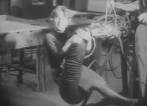
The fascinating world of tentacle robots has come a long way. It used to be that every breakthrough in tentaclebot technology had to be justified with either a military or misogynistic application, as demonstrated in this remarkable MIT project from 1968.

Thankfully our society has moved on since those misguided times, and while there is still the ever-present military-industrial complex to push for tentacled combat-omatons, forward-thinking people on the domestic front like [festo] demonstrate that at least some of us want to use tentacle robots for peace, love and food handling.

Catch the video after the break.


Continue reading ““Strong Enough To Lift A Person, Yet Gentle Enough To Embrace A Child.””