Solar Powered Split Wireless Mechanical Keyboard

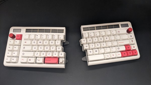
When thinking about a perfect keyboard, some of us have a veritable laundry list: split, hot-swapping, wireless, 3d printed, encoders, and a custom layout. The Aloidia keyboard by [Nguyen Vincent] has all that and more.

One of the first things to notice is a row of solar panels on the top, which trickle charge the keyboard. The keyboard uses 65uA in idle and 30uA when in a deep sleep. With the solar panels providing anywhere between 600-1200uAh a day, the battery should last a year and a half under even harsh conditions. The encoders were specially chosen to reduce pull-up power consumption. Given the focus on power and the lack of wires between the halves, you might wonder how the connection to the computer is handled. Does one-half handle the connection and use more power? The answer is that both talk to a dongle based around an nRF52840. This lets the keyboard halves idle most of the time and enables the dongle to handle the expensive communications to the host PC.

Instead of an e-paper screen in the top left, [Nguyen] placed a Sharp memory display. The 3D-printed case is stunning, with no visible screws on the top and tenting feet on the bottom. The two halves snap together very satisfactorily with the power of magnets (the printed palm rests also magnetically attach). Overall it is an incredibly well-thought-out keyboard with all sorts of bells and whistles.

There are project logs with detail to dig into and more videos and photos. We love a good keyboard journey like this one that went for a more ergonomic shape that meant more custom wiring.

Schematics are up on hackaday.io in the files section—video after the break.

Thanks [Shantanu] for the tip!

Continue reading “Solar Powered Split Wireless Mechanical Keyboard”

A sandbox for ergonomic keyboard makers.

Dactyl Chimera Leaves The Learning Out Of The Curve

Have you been wanting to build your own keyboard, ergonomic or otherwise, but are hesitant to spend all that time and filament on something that may not be a good fit for your hands? Glad as we are that the dactyl is open-source, to get in there and really mess around with it requires intimate knowledge of either OpenSCAD or Clojure.

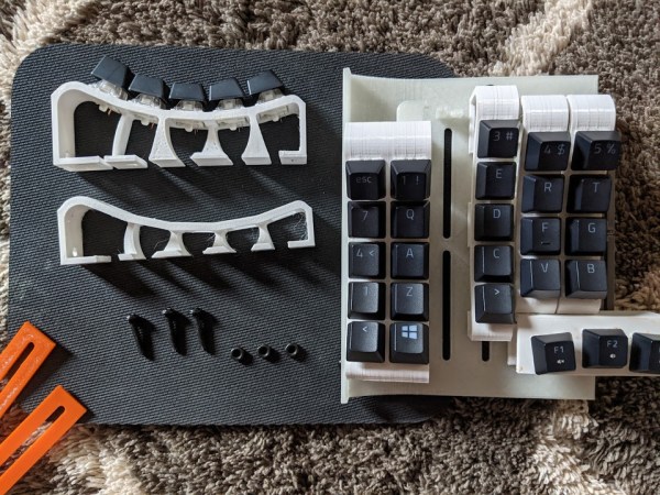
Well, not anymore. [WolfIcefang]’s dactyl chimera is an ergo sandbox, a test bench for column curvature, stagger, and height that should keep you from having to iterate all day and night. It was designed in FreeCAD and has three parts — the rack, the tenting foot, and the arches. The rack acts like a bottom plate and has slots for holding the columns (arches) in place. Underneath that is the tenting foot, which changes the lateral inclination. Thirdly are the arches, the business part where the switches go.

[WolfIcefang] says it’s sturdy but not portable, and for some reason feels the need to apologize for the looks. We think it’s beautiful, but then again are easily captivated by such practicality. It’s not quite a keyboard yet, as [WolfIcefang] has neither wired it up nor burned in any firmware. This is still in the early stages, and [WolfIcefang] wants to open it up to collaborators. Plans for the future include interchangeable thumb clusters and a complete build guide.

Even if you aren’t that fluent in OpenSCAD, you’ll have fun messing around on the keycap modeling playground.

Via r/ErgoMechKeyboards

Where We’re Going, We Don’t Need Keycaps

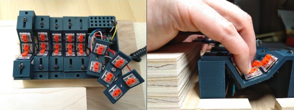
Just when we thought we’d seen the peak of ergonomic, split keyboards, along comes [Peter Lyons] with the Squeezebox — an adjustable, column-staggered, streamlined beauty with 21 keys per hand. Much like the Kinesis Advantage and the Dactyl, the user’s fingers are allowed to dangle comfortably and stay in their naturally curled position, moving as little as possible between keys, rows, and columns. But the Squeezebox goes a few steps farther to reduce finger travel.

For starters, each column of keys is adjustable on the fly in the Y-direction by loosening the screw and sliding it until it’s just right. The columns are also adjustable in the Z-direction, but for now, this requires reprinting a few parts. In case you didn’t notice, the grid is pretty tightly packed, and those low-profile Kailh choc switches are naked to the world, mostly because keycaps wouldn’t fit anyway.

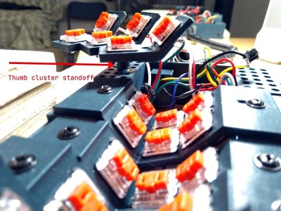
At that angle, there’s no reaching required at all between the middle and bottom rows. The 100° corner that they form both invites and supports chording — that’s pressing multiple keys simultaneously to do some action. There’s no real need to reach for the top row, either, because [Peter] merely moves his finger upward in the Z-direction a little bit to hit those. The similarly-angled thumb clusters are chord-able as well, and their position relative to the mainland is adjustable thanks to a grid of holes that are meant for threaded inserts. Genius!

For the next version, [Peter] plans to bring the three sets of thumb cluster switches closer together, and arrange them like a tri-fold science fair display board. Be sure to check out the super cool but somewhat impossible-to-solder prototypes in the build log, and stay for more stuff in the huge build gallery. Typing demo is after the break.

Still too much travel for your taste? How about a 5-way for each finger?

Continue reading “Where We’re Going, We Don’t Need Keycaps”