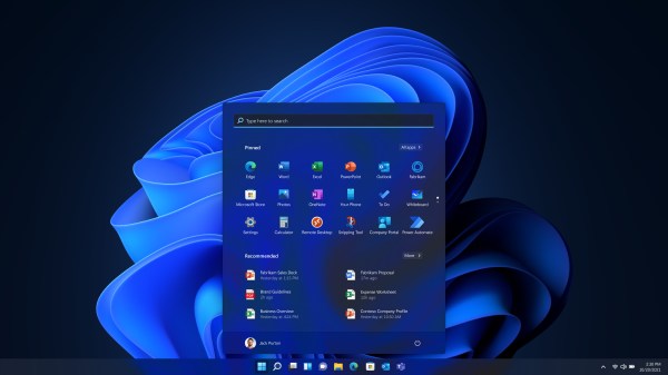
Once the nerve center of Windows operating systems, the Control Panel and its multitude of applets has its roots in the earliest versions of Windows. From here users could use these configuration applets to control and adjust just about anything in a friendly graphical environment. Despite the lack of any significant criticism from users and with many generations having grown up with its familiar dialogs, it has over the past years been gradually phased out by the monolithic Universal Windows Platform (UWP) based Settings app.
Whereas the Windows control panel features an overview of the various applets – each of which uses Win32 GUI elements like tabs to organize settings – the Settings app is more Web-like, with lots of touch-friendly whitespace, a single navigable menu, kilometers of settings to scroll through and absolutely no way to keep more than one view open at the same time.
Unsurprisingly, this change has not been met with a lot of enthusiasm by the average Windows user, and with Microsoft now officially recommending users migrate over to the Settings app, it seems that before long we may have to say farewell to what used to be an intrinsic part of the Windows operating system since its first iterations. Yet bizarrely, much of the Control Panel functionality doesn’t exist yet in the Settings app, and it remain an open question how much of it can be translated into the Settings app user experience (UX) paradigm at all.
Considering how unusual this kind of control panel used to be beyond quaint touch-centric platforms like Android and iOS, what is Microsoft’s goal here? Have discovered a UX secret that has eluded every other OS developer?
Continue reading “A Windows Control Panel Retrospective Amidst A Concerning UX Shift”


